Fresh Daily

Key Visuals

Nutrition at Your Fingertips

Fresh Daily

Nutrition at Your Fingertips

THE BRAND

Fresh Daily is a meal planning assistant that simplifies healthy eating for busy individuals and practical homemakers.

scope of work

Brand Identity
Branding
Illustration
Creative Direction
A wall advertisement with illustrations of food ingredients, a person biking with a bag of groceries and photos of a person cooking and a bag of vegetables.
Founded in the late ’80s, Fresh Daily started as a retail store serving meat products until it closed its doors in the ’90s. Today, it is re-introducing itself as the family continues its legacy by offering a healthy and convenient solution to homemakers around the city. 
More than just another delivery service, Fresh Daily aims to assist modern-day families and busy individual effortlessly cook healthy meals at home. Fresh Daily helps members bring order to their homes through an intuitive and reliable AI system that allows them to organize meals and pantry needs, and adjust weekly budget. Through this process, Fresh Daily helps busy professionals and practical homemakers save time and money, cooking more often while promoting a healthier lifestyle.

We positioned Fresh Daily as a “meal planning assistant” and developed a brand bursting with personality and color that helped customers feel like they have better control of their home lives.

Fresh Daily’s vibrant visual system centers around the idea of freshness and sensibility. The brandmark is notable for its key attributes; fresh, healthy, and sensible. We developed delightful imagery, honest typography, and a vibrant yet sophisticated color palette based on their highly tailored, human-centered approach in the delivery space.

Custom illustrations feature happy families, home-cooked meals, and cheeky pantry ingredients. To make the brand assets adaptable, we designed the brand as a foundation for future growth.

The result is a food tech brand that illustrates a personalized customer journey that feels like a one-on-one relationship. We were also engaged in a post-project creative consultancy to help guide the execution of the brand from user testing, packaging to UX design.

“They were very thorough. They brought structure and discipline to our very “rough” ideas at that time. They took care of everything that we didn’t need to worry too much on follow ups and deadlines. We were able to focus on developing our technology and prototype.”

Shyrwinsteel Sia, CEO

Like what you see?

Balik Toledo

Business cards with illustrations icons that represents energy, home, sustainability and conservation

Key Visuals

Empowering Communities

Balik Toledo

Empowering Communities

THE BRAND

Balik Toledo is an organization focused on gratitude. Founded by three women, born and raised in the said community, it aims to emphasize the diverse cultural city through creating programs, livelihood, and products proudly made in Toledo. 

scope of work

Brand Identity
Branding
Illustration
Creative Direction
Balik Toledo is an organization focused on gratitude. Founded by three women, born and raised in the said community, it aims to emphasize the diverse cultural city through creating programs, livelihood, and products proudly made in Toledo, Cebu PH. 
 
Toledo city is known for its rich history and magnificent natural resources that created thousands of livelihoods through tourism, agriculture, and products. Balik, which means to return, was the central focus of designing the identity. 
Photo of people in the market

We engaged in in-depth brand discovery meetings with Balik Toledo’s founding mothers and uncovered what ‘balik’ means to them. We left with a profound understanding of each member’s admiration for the city and convened to personify Toledo City, from the environment to culture and encounters.

Building off of our brand strategy, we decided that Balik Toledo’s visual system should be as flexible and dynamic as its vision — To champion Toledo as a multi-faceted city full of gifted individuals and overflowing natural resources. ​​​​​​​
Invitation for an event
Poster with images of Toledo City, Cebu Philippines

We designed a vibrant and warm brand identity that centers around the strengths of the city at the same time embodies the intricacy and dedication towards their work. It features the four icons that represent Toledo; earth, power, coast, and home ensuring that humanity is always at the heart of their work.  

Image of calling cards with icons of Home, nature and Sustinability
Illustration of wheelbarrow, bucket of fish , sack of rice and a logo of the brand Balike Toledo
Illustration of a woman holding a wheelbarrow and a bearded fisherman holding a fish

To accentuate Balik Toledo’s commitment to versatility, the brands’ primary mark features icons that demonstrate the different programs and events that they are working on. Whether it’s about conservation or trade shows, the identity is adaptable varying its form across different functions. 

Poster design highlighting Toledo Cebu's tourist spot
Graphic poster design of the brand highlighting nature and power
Our work revolved around a beloved phrase ‘Empowering Communities’ that encapsulates the brand’s promise and commitment to the community. This resulted in a visual narrative that celebrates the local bounty and a playful harmony between nature and the community. ​​​​​​​
Sample invitation card and wrapper design of the brand

Like what you see?

Aroma Art Atelier

Key Visuals

Tradition of Excellence

Aroma Art Atelier

Tradition of Excellence

THE BRAND

Aroma Art Atelier is an art academy dedicated to nurturing homegrown artists from Toledo city, Cebu, Philippines, and leading the city as the cultural hub of representational classical art.

scope of work

Brand Refresh
Brand Identity
Creative Direction

SPECIAL THANKS

Photography by
Rae Cabradilla
Founded by multi-awarded Filipino contemporary realist, Orley Yu Ypon, the atelier’s practice-based approach encourages students to master the foundations of painting while developing their styles and creative aspirations. 
 
It began as a casual gathering of local artists, a means for them to foster long-standing ties, to share common practices and philosophies in painting, and to introduce new aspirants in the field. Two years later, Aroma Art Atelier became incorporated as a non-profit organization, dedicated to helping emerging artists exercise their full potential by providing basic art training.​​​​​​​
Inspired from a native bush in Toledo City, Aroma Art Atelier speaks for resiliency and passion for the art and community. Taking inspiration from its name, Aroma is recognized by its thorns that define strength, tradition, and commitment to excellence. 
 

With the identity focused on the tradition of excellence and the commitment to student’s personal growth in representational art, color palettes resemble the classical art movement and added a touch of sophistication and prestige. 

In the pursuit of excellence, the atelier provides its students a safe space conducive to productivity and access to applied arts education with the right tools and materials where they can discuss freely with their mentors and turn theory into actual manifestations.

an invitation card on the table with a picture of an artwork and two empty mugs

Aroma Art Atelier hopes to help develop Toledo City Cebu into a flourishing cultural hub destination, a haven for Cebuano classical art to thrive and evolve. Check out their website for updates.

“The Backbone really helps builds the brand and promote our paintings efficiently, most especially the customer-friendly staff. We highly recommend them.”

Angie Garbo, Gallery Director

Like what you see?

Superior Metalcraft

sparks appearing from the metal grinding machine with a logo of their brand

Key Visuals

Exemplary Craftmanship

Superior Metalcraft

Exemplary Craftmanship

THE BRAND

Superior Metalcraft is a welding and fabrication shop in Chicago that specializes in custom steel fabrication. They have been in the industry for more than 10 years.

scope of work

Brand Refresh
Brand Identity
Creative Direction

The first part of the process was to familiarize their organization and the industry in general. In contrast to a large manufacturing company, they essentially follow the processes of a job shop, where they produce bespoke items.

The brand identity was focused on their core values, which are integrity, versatility, and creativity. The colors blue, red, and white are very all-American and symbolize the blue-collar worker. 
Images of the logo being used on paper stamp and calling card
Robust, bold, and straightforward, the overall identity reflects their hardworking culture and commitment to the highest quality of service and craftsmanship.
Image of the mask that is used in welding and image of a welder welding with metal sparks
The narrative of them having a strong foundation continued with the integration of the blueprint concept. It shows how they are experienced steel artisans who plan everything first prior to execution. Being grounded in their core values is what drives their identity as a brand and processes as an organization.

Learn more about the brand on their website.

” They did an excellent job distilling down information in a way that made sense to us. Overall, working with The Backbone was a great experience, and they hit the mark. “

Like what you see?

Hemera Spa Lounge

Key Visuals

Your Wellness Escape

Hemera Spa Lounge

Your Wellness Escape

THE BRAND

Positioning itself to be the ultimate wellness destination, Hemera promotes accessible luxury, signature services, and an overall experience of warmth and comfort. Their goal is to give your weary spirit a glow-up you never thought you needed.

scope of work

Naming
Brand Identity
Print Design
Verbal Identity

ACCOLADE

ASEAN-KOREA Excellent Design Semi-finalists

‘Hemera’ came about when we played around with the idea of clients as royals taking a break from their queenly and kingly duties. Hemera is the goddess of daytime or the sun, a symbol for energy and vitality, which what the brand is all about – a place to relax, rejuvenate, and pamper oneself.

Images of a marble top, ocean see and gold dust from above
The identity is inspired by lightness and fluidity. As its namesake stands for life, the brand encourages a lifestyle of wellness and skincare through creating novel relaxation experiences unique to them.
Image of the brand logo on a glass wall
Brand application on calling card, envelope, and letterform
Brand logo on menu design and calling card
It was a natural progression to use the sun as the emblem of the logo, which denotes strength and good energy. We paired it with a sleek sans-serif font for sophistication and professionalism. The color landscape is composed of earth tones with a more quiet shade of yellow to maintain the brand’s position of being gender-neutral.
Image of the Brand Illustration on a box
The product packaging adapted a sophisticated design to continue the narrative of Hemera being a premium brand, because first impressions are very important. Clients are treated to a very personalized experience, as they can test out the oils prior to using them and choose what they like best. 
Brand application of the logo on a business card

Like what you see?

Bez Acre

Key Visuals

All-Natural Produce

Bez Acre

All-Natural Produce

THE BRAND

Bez Acre is a family-owned farm in Toledo, Cebu PH selling preserved jams, spices, and produce fresh from their backyard. Initially for personal consumption, what they harvest from their farm now is being shared to others, giving a richer meaning to reaping what you sow.

scope of work

Brand Identity
Verbal Identity
Naming
Packaging

ACCOLADE

ASEAN-KOREA Excellent Design Semi-finalist

The vacation home of the Enriquez family in Toledo was a place where they could pause and bond. They would devote their time into taking care of their land, bearing in mind their roles as stewards of the earth. 

The farmer’s hat is a symbol for the hard work, integrity, and diligence in tending their fields with their very hands. Bez Acre’s philosophy is to cultivate the earth with attention and gratitude.
Illustrations of farm essentials
Bez Acre is all about planting with care and harvesting with thanks. The verbal identity of the brand is modeled after a prayer – a gentle expression of gratitude to the Creator for everything. This significant aspect of the family’s belief system is also emphasized in the packaging. 
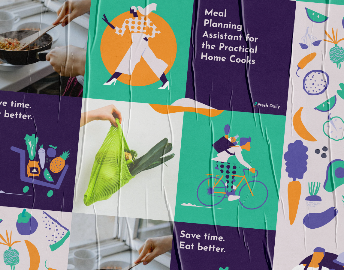
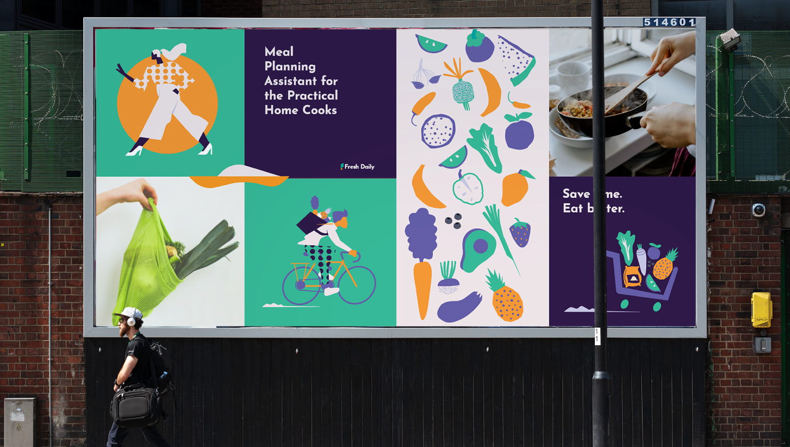
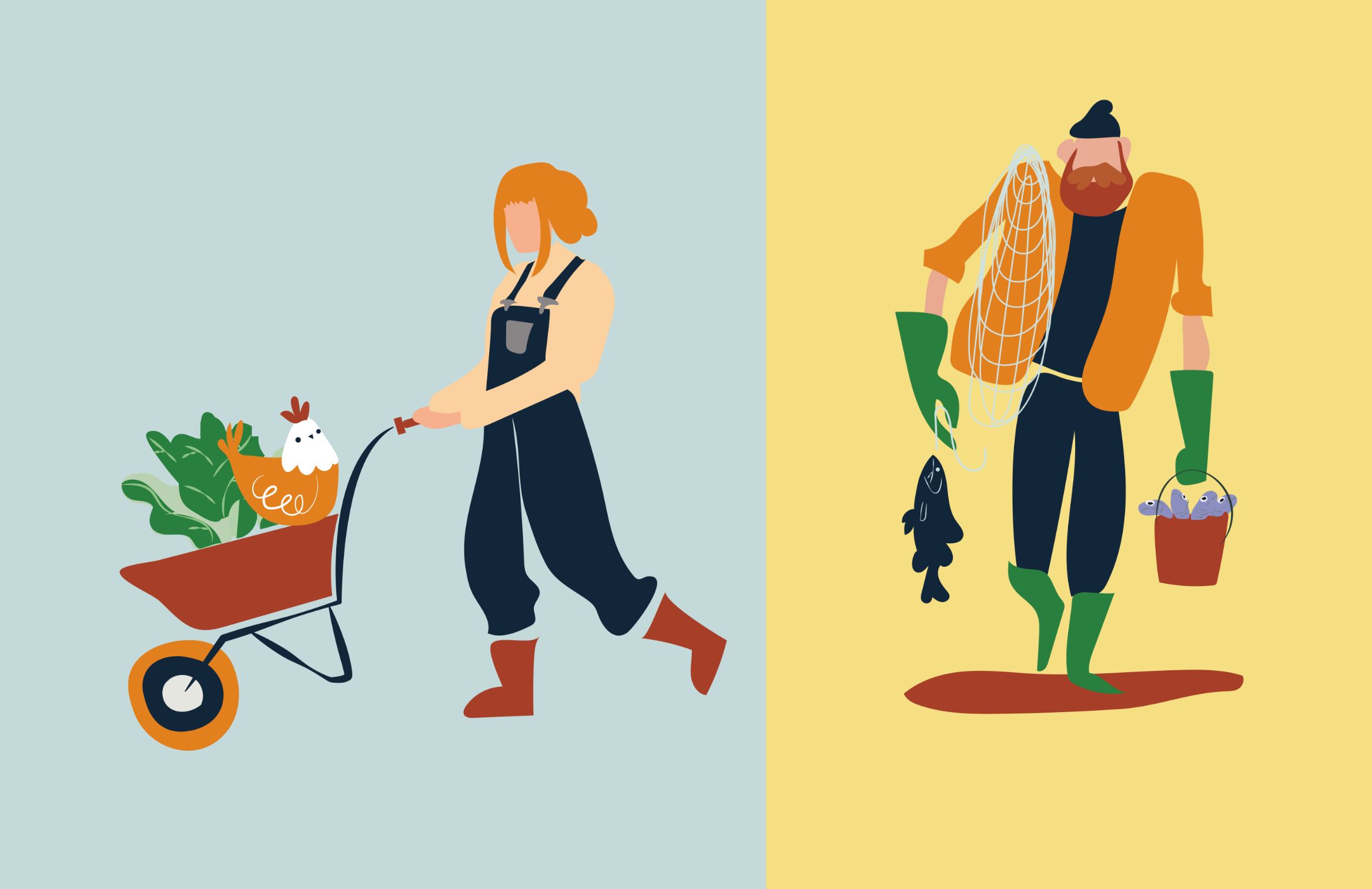
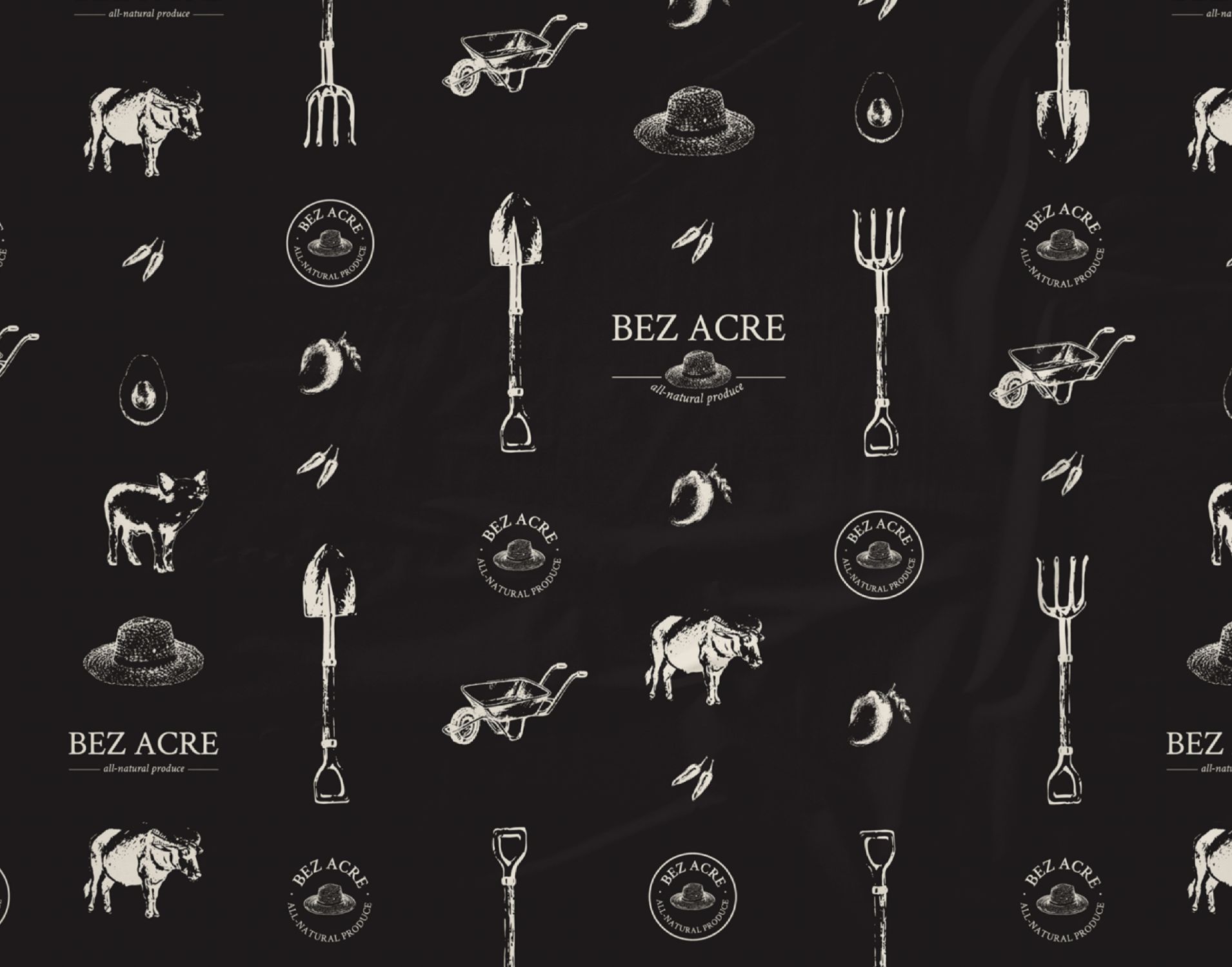
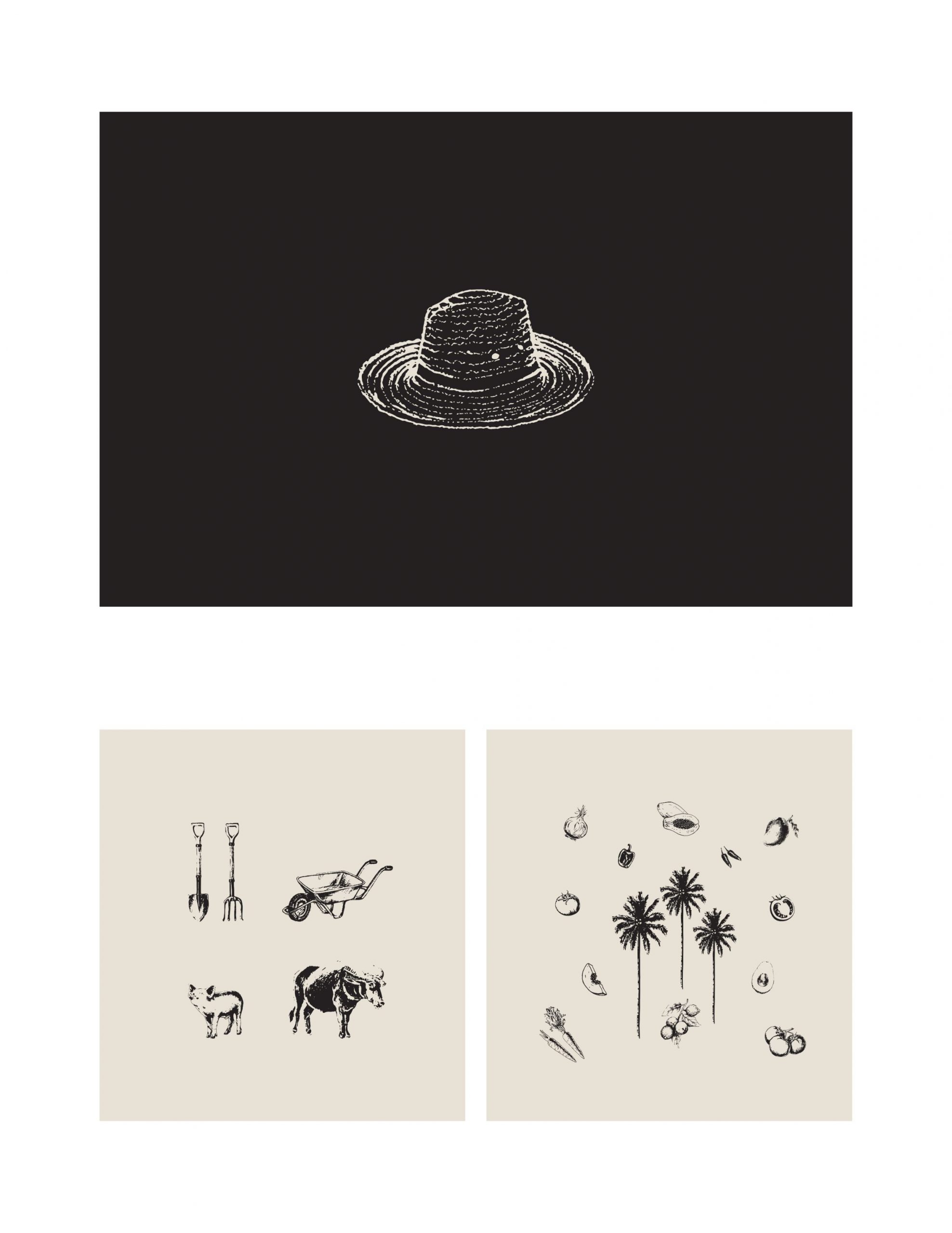
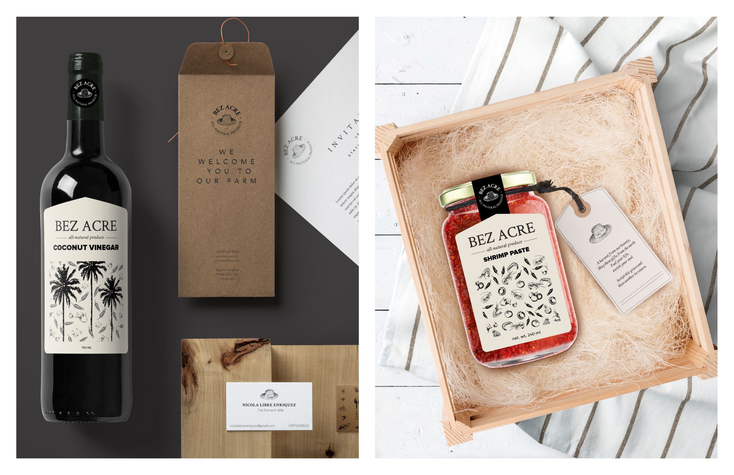
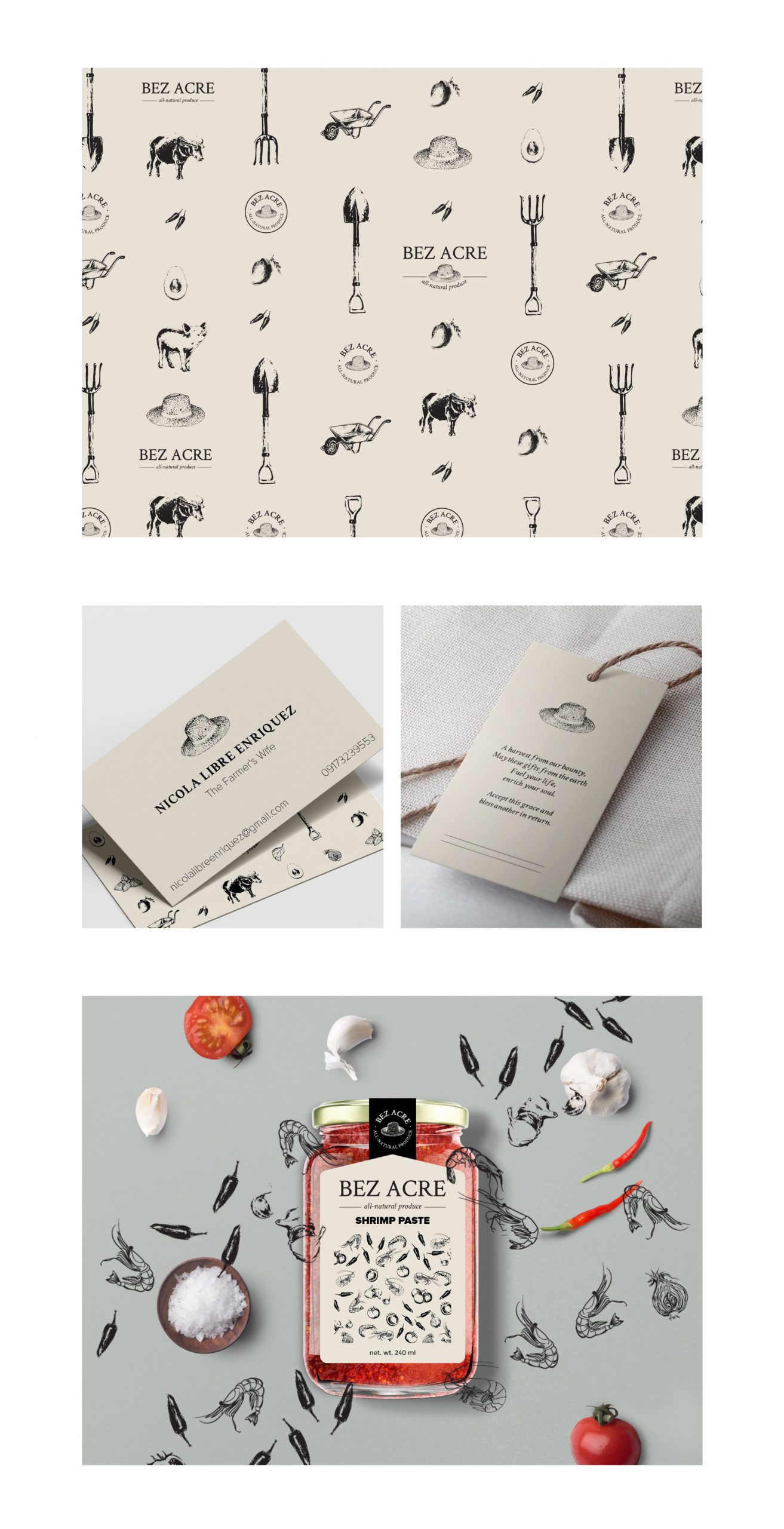
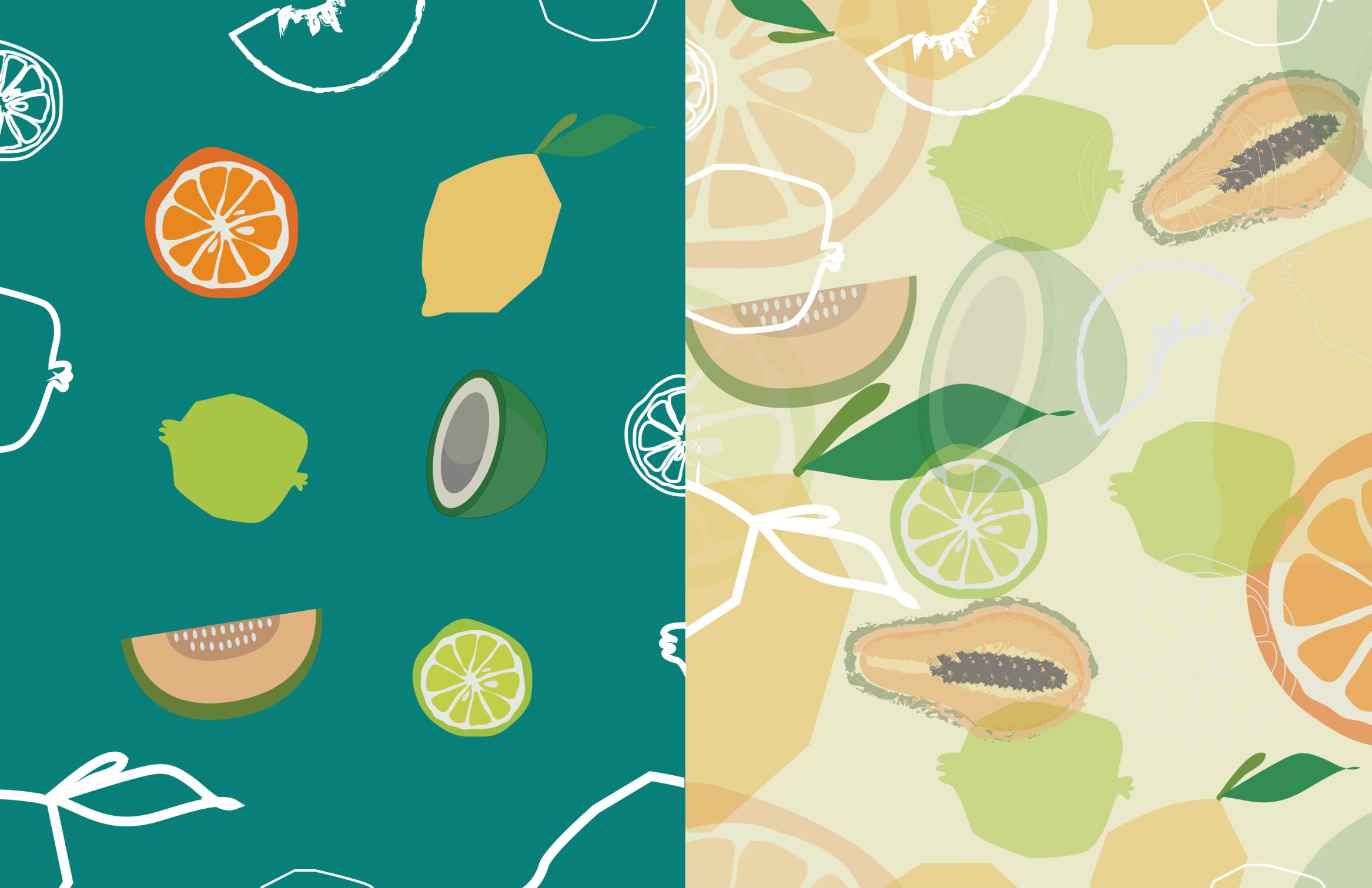
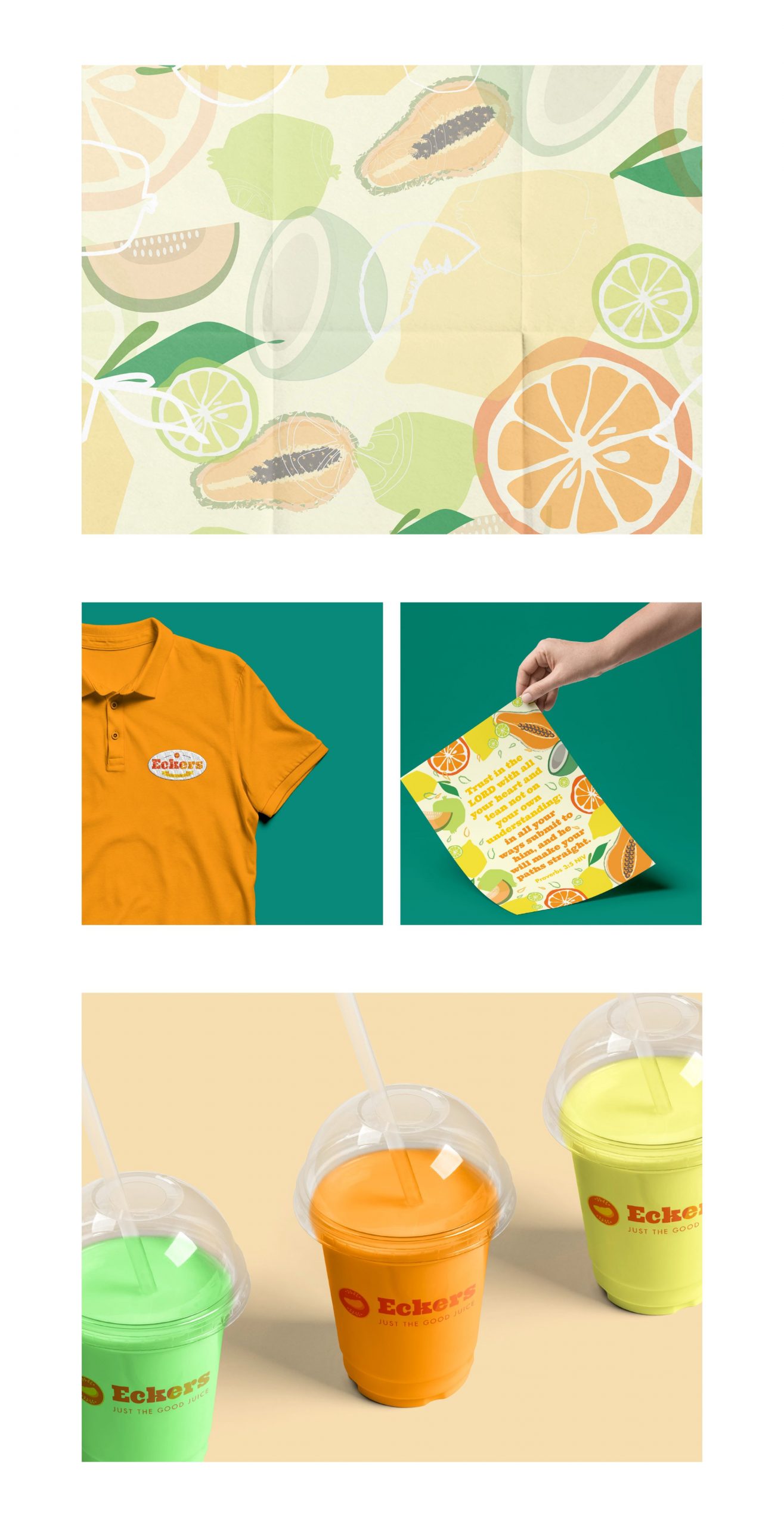
Earth tones and illustrations of farm elements like fruits, vegetables, animals, and tools, make the overall brand voice and identity rustic, warm, and full of care. As hearty as a cup of hot cocoa on a rainy day, the Enriquez family welcomes their customers into their family with open arms too.
Illustrations of the brand

A family that plants together, stays together. Check them out at their Facebook page and get some soulful goods for yourself.

Like what you see?

Hempier

colorful stickers on a poster wall

Key Visuals

Cannabis Expedition

Hempier

Cannabis Expedition

THE BRAND

Hempier is a curated cannabis dispensary case study we did while in quarantine. This concept brand aims to elevate the personal well being through shared and curated cannabis selection to young and responsible adults in the US.

scope of work

Brand Identity
Verbal Identity
Concept Development
Creative Direction
Packaging
Our intention is to create a brand that is inclusive and distinctive to other cannabis brands in the market. We designed a bright identity system that is inspired by the curiosity and playfulness of Ham—The Hemplorer. He’s a jumpsuit-loving monkey that travels to different universes to explore and learn about cannabis and its benefits. His blue pocket serves as a small portal that allows him to carry anything that he will need in his journey to space. The coil in his jumpsuit lights up when he sees the hemp he’s looking for, reminding him that it’s time to go home. ​​​​​​​
To strengthen the hemp community, Hempier organized the Space Explorer’s Club where members can learn tips on taking care of their hemp accessories and share their trip stories, allowing each individual to be who they are in a non-judging, welcoming, and collaborative environment.
Images of the brand in boxes packaging and a patch design
Each brand in the Hempier dispensary is handpicked and curated with care by Ham. No matter the effect you’re after, Ham will have it ready for you. Enjoy the trip!

Like what you see?

Eckers

An image of a logo of the brand on top of the colorful illustrations of fruits

Key Visuals

Just The Good Juice

Eckers

Just The Good Juice

THE BRAND

Eckers is a native fruit juice bar that glorifies the natural flavors of fruits by not using preservatives or additives. Eckergenis Elnar, the man behind Eckers, is a self-confessed foodie and jetsetter who always pairs his snacks with juice.

scope of work

Brand Identity
Packaging
Space design
Verbal Identity

Special thanks to

Photography by Zack Aldave
Logo of the brand in orange hues
The basis of the product, which was fruits, inspired the direction of the brand identity. The color palette is very bright and happy to match the vibrancy of citrus fruits. 
Illustrations of fruits in line art and vector art
An image of a logo of the brand on top of the colorful illustrations of fruits
The basis of the product, which was fruits, inspired the direction of the brand identity. The color palette is very bright and happy to match the vibrancy of citrus fruits. 
Images of Illustration of fruits, Tshirt design, poster design and product design
What started as a family business with his kids making the recipes and mixing the juices now has grown into a full-fledged business. In the span of 3 years, they already have a warehouse and 5 kiosks around Cebu and 1 kiosk in Cagayan de Oro, PH.
An image of a rectangular signage with light in the background
Images of the Kiosk, menu design, cups and products of the brand
Quench your thirst with healthy drinks from Eckers. Check out their Facebook page.

Like what you see?

Avenida ’59

Key Visuals

Island Girl Summer Collection Campaign

Avenida ’59

Island Girl Summer Collection Campaign

Founded on the shores of beautiful Boracay Island in the Philippines, Island Girl is a resort brand that specializes in a vast range of hand-woven, hand-crafted natural, indigenous materials found in our Islands. They combine  old-world handcrafting skills and indigenous materials with the latest trends of today to come up with a range that is fashionable as much as it is all natural.​​​​​​​

THE CAMPAIGN

This season, travel down an exotic setting and beyond! Soak up the bold vibrant colors that mimic the streets of Old Havana and the vivid coasts of the Philippines. Island Girl’s newest collection, Avenida ’59 plays up retro hues with rich textures and simple silhouettes that go with Caribbean-style motifs. Here’s a collection that gives anyone the perfect excuse to don sexy flamenco ruffles or light breezy dresses at any time of the day!

scope of work

Campaign Launch
Creative Direction
Copywriting
Photography​​​​​​​
Styling​​​​​​​
an image of a shoulder bag in rattan material
An image of a woman wearing a hat with earrings and a woman wearing a bandana with earrings

“Havana Oh Na Na” has had us dreaming of Cuba’s tropical allure and old world charm and Avenida ‘59, is a reflection of just that!  Island Girl’s summer 2018 collection evokes an easy stride, whether you’re in the lush tropics of the Philippines or the festive streets of Old Havana.

an image of a rainbow hand bag a a woman in a pineapple earrings
Inspired from our idea of summer—as zesty as the lime wedge of your Mojito—each hand-crafted piece can take you from posh date nights to casual beach getaways in a jiff.
an image of handbags and a woman in a hat with earrings
an image of 2 handbags in orange background
an image of a woman holding a blue handbag in orange background
an image of a hand holding hand bags and a woman wearing a red dress holding a pink clutch bag
an image of a woman wearing a red dress holding a clutch bag with words Avenida '59
an image of a woman wearing a red dress holding a clutch bag
an image of a woman wearing a red dress holding a blue clutch bag in orange background
​​​​​Visit Island girl and take a piece of paradise with you.

Like what you see?

Ooh!Mami

images of the brands menu design, calling card and food packaging

Key Visuals

Ooh!maapaw sa sarap!

Ooh!Mami

Ooh!maapaw sa sarap!

THE BRAND

Mix street food with a pinch of Asian fusion, and you get Ooh! Mami, a hole-in-the-wall restaurant that serves Filipino comfort food. Their goal is for their diners to have a dining experience that is both affordable and enjoyable, wrapped in a nicely branded package.

scope of work

Brand Identity
Illustration
Styling

SPECIAL THANKS

Food Photography by Zack Aldave
The colors are inspired by Filipino sorbetes and the font is reminiscent of the typography on street carts and jeepneys. 
 
We had to look back on our own experiences as kids, like what Filipino shows we’d watch and the different colors we’d see on the streets where we used to play.
​​​​​​​
The overall feel is fun and casual.
images of the brands menu design, calling card and food packaging
Image of the store sign

The bowl had a lot of significance in our approach to food styling and in the essence of the restaurant itself. The food would be served in a bowl because of its convenience. You could enjoy your food standing up, with or without sauce or soup. The design of the bowl is simple with a hint of elegance to keep it functional and looking nice.

Images of the Asian food in a bowl
Images of the Food packaging in bowl and take out bahs
Stylized photo of Asian food in a bowl

Overall, the concept of the restaurant, which also drove the branding direction, was very much rooted in the richness of the Filipino culture. It was important that the language and look be consistently relatable, so the dish names had a little twist to keep it light and quirky. The illustrations are doodles on a chalkboard, as inspired by the idea to leave room for imagination and discovery.

Images of poster design pasted on a wall with 3 chairs
Poster design of the brand with Filipino food puns
Images of menu design of the brand

Like what you see?