Hemera Spa Lounge

Your Wellness Escape

Hemera Spa Lounge

Your Wellness Escape

THE BRAND

Positioning itself to be the ultimate wellness destination, Hemera promotes accessible luxury, signature services, and an overall experience of warmth and comfort. Their goal is to give your weary spirit a glow-up you never thought you needed.

scope of work

Naming
Brand Identity
Print Design
Verbal Identity

ACCOLADE

ASEAN-KOREA Excellent Design Semi-finalists

‘Hemera’ came about when we played around with the idea of clients as royals taking a break from their queenly and kingly duties. Hemera is the goddess of daytime or the sun, a symbol for energy and vitality, which what the brand is all about – a place to relax, rejuvenate, and pamper oneself.

Images of a marble top, ocean see and gold dust from above
The identity is inspired by lightness and fluidity. As its namesake stands for life, the brand encourages a lifestyle of wellness and skincare through creating novel relaxation experiences unique to them.
Image of the brand logo on a glass wall
Brand application on calling card, envelope, and letterform
Brand logo on menu design and calling card
It was a natural progression to use the sun as the emblem of the logo, which denotes strength and good energy. We paired it with a sleek sans-serif font for sophistication and professionalism. The color landscape is composed of earth tones with a more quiet shade of yellow to maintain the brand’s position of being gender-neutral.
Image of the Brand Illustration on a box
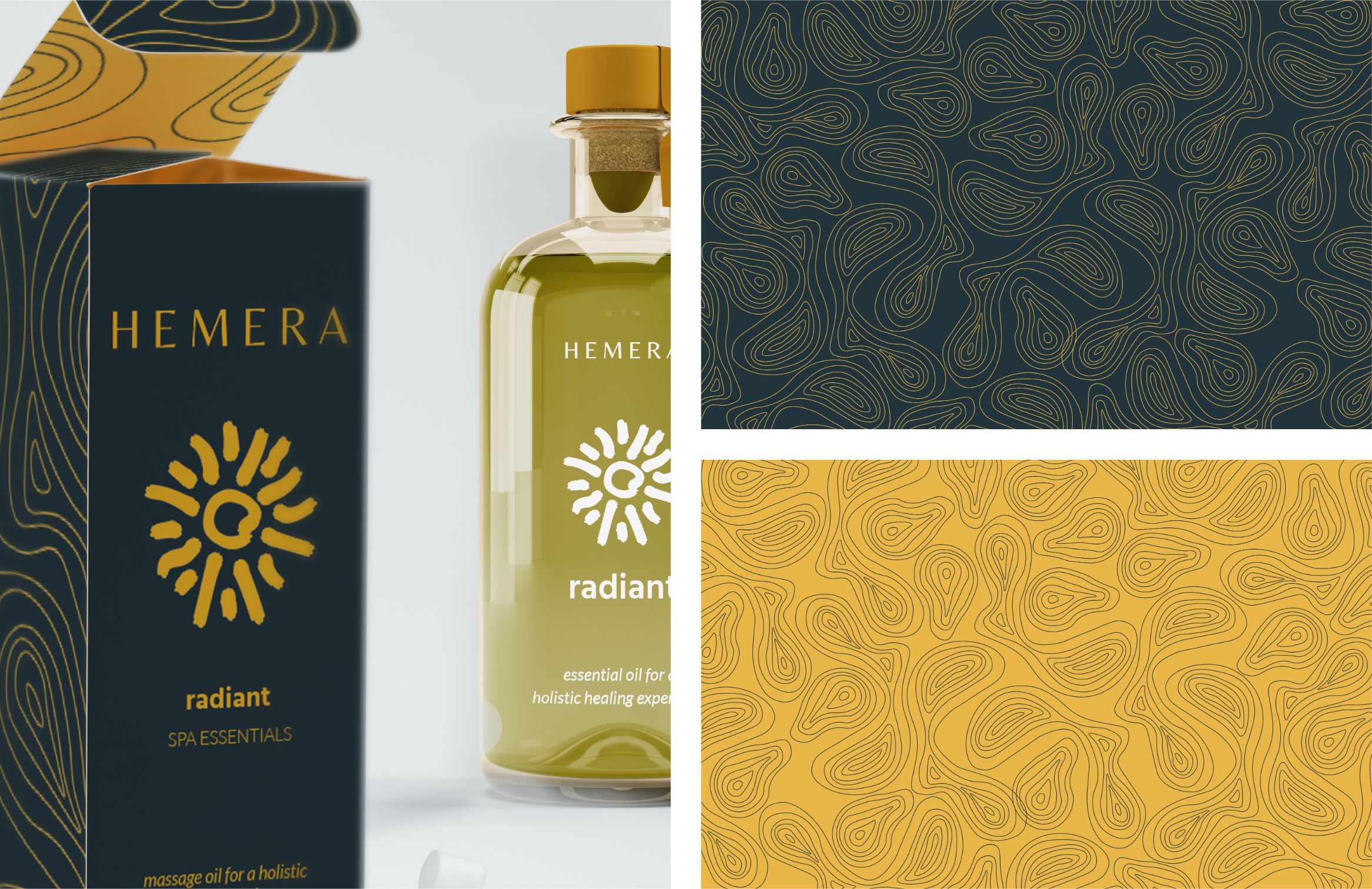
The product packaging adapted a sophisticated design to continue the narrative of Hemera being a premium brand, because first impressions are very important. Clients are treated to a very personalized experience, as they can test out the oils prior to using them and choose what they like best. 
Brand application of the logo on a business card

Like what you see?