NovoMOF is a Switzerland-based sustainable tech company that focuses on the production and commercialization of metal-organic frameworks (MOFs), a new type of highly porous absorbent. They collaborate with their clients and improve their businesses by leveraging the special properties of this material by using sustainable technology to disrupt the modern industrial complex for the better. Novomof ultimately hopes to address pressing global issues such as water scarcity, food waste, carbon capture, and raw materials recovery.
scope of work
Creative Direction
Brand Guideline
3D Mascot Design
Graphic Design
design team
Frances Enriquez
Magno Mateo
Emem Seno
design team
Morgan Tornilla
Kenneth Hicks
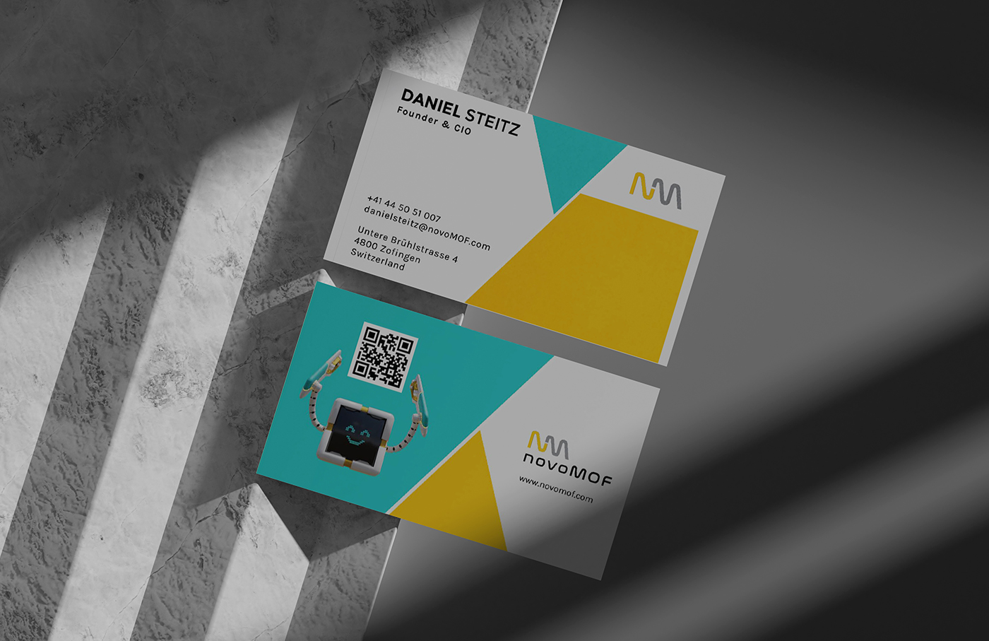
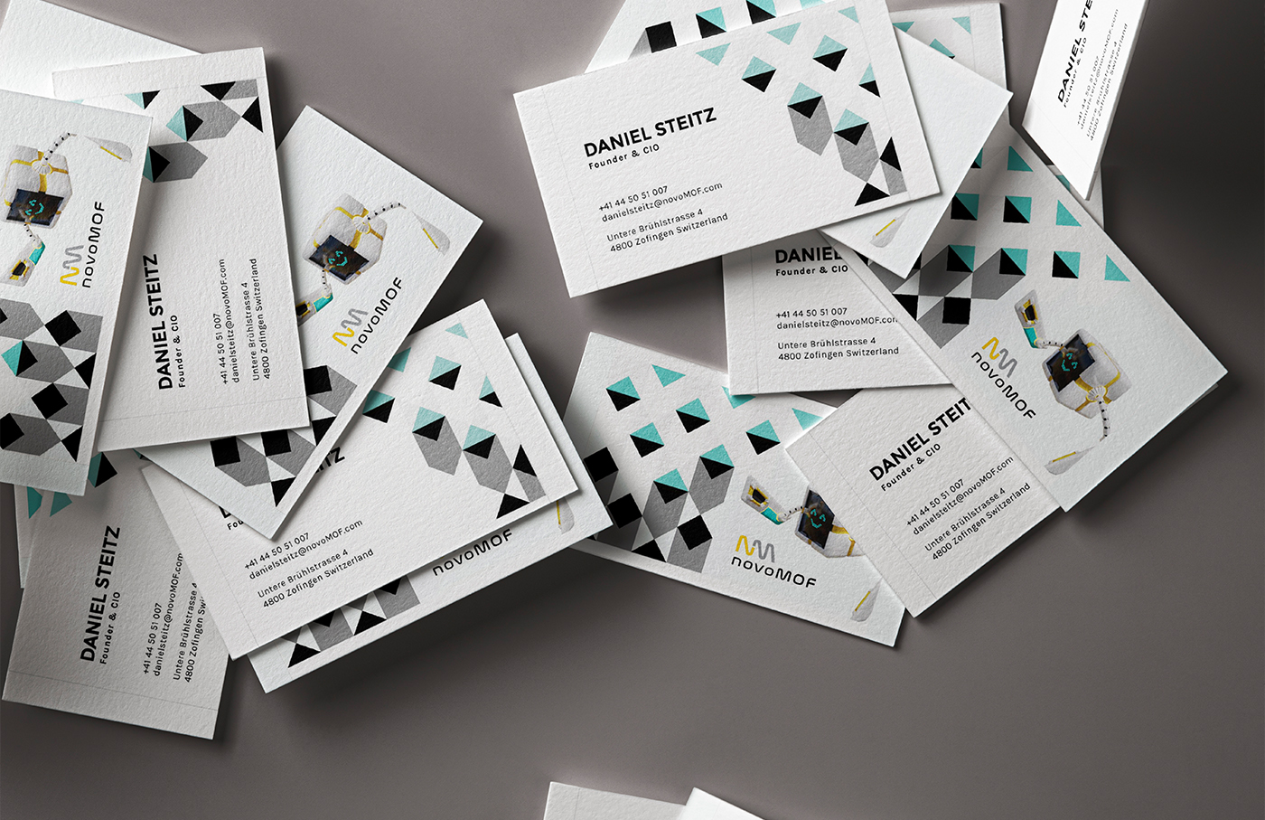
In partnering with us, their initial goal was to solidify the company’s visual branding without completely abandoning their existing logo, color scheme, and typography. We were eager to bring attention to their new technology and new ideas with a new look. One that conveys the exciting potential and novelty of what novoMOF has to offer. From building the brand guideline to business card design, and even exhibition booth design, we’ve been able to foster a long-term partnership that has only continued to flourish.
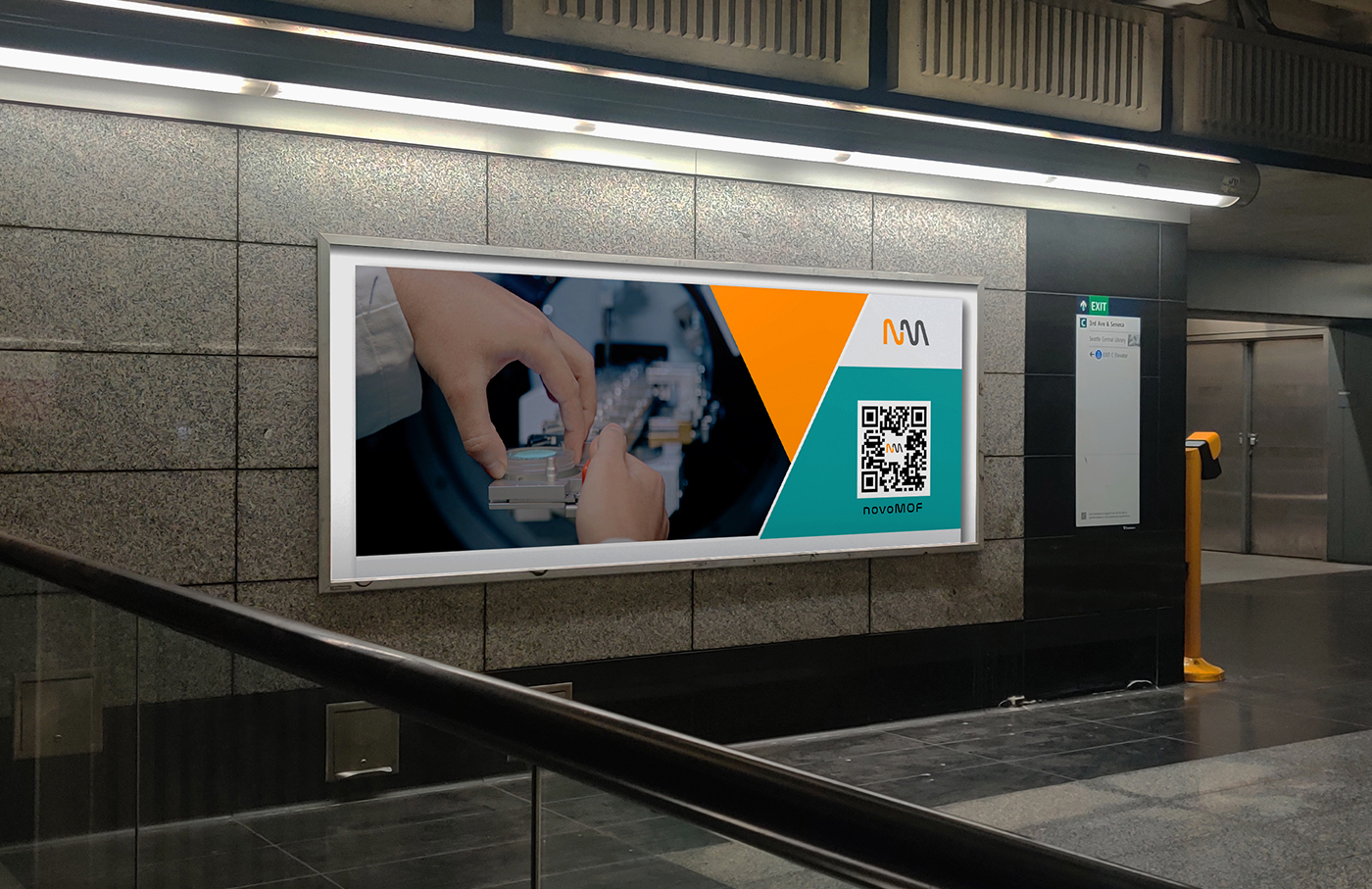
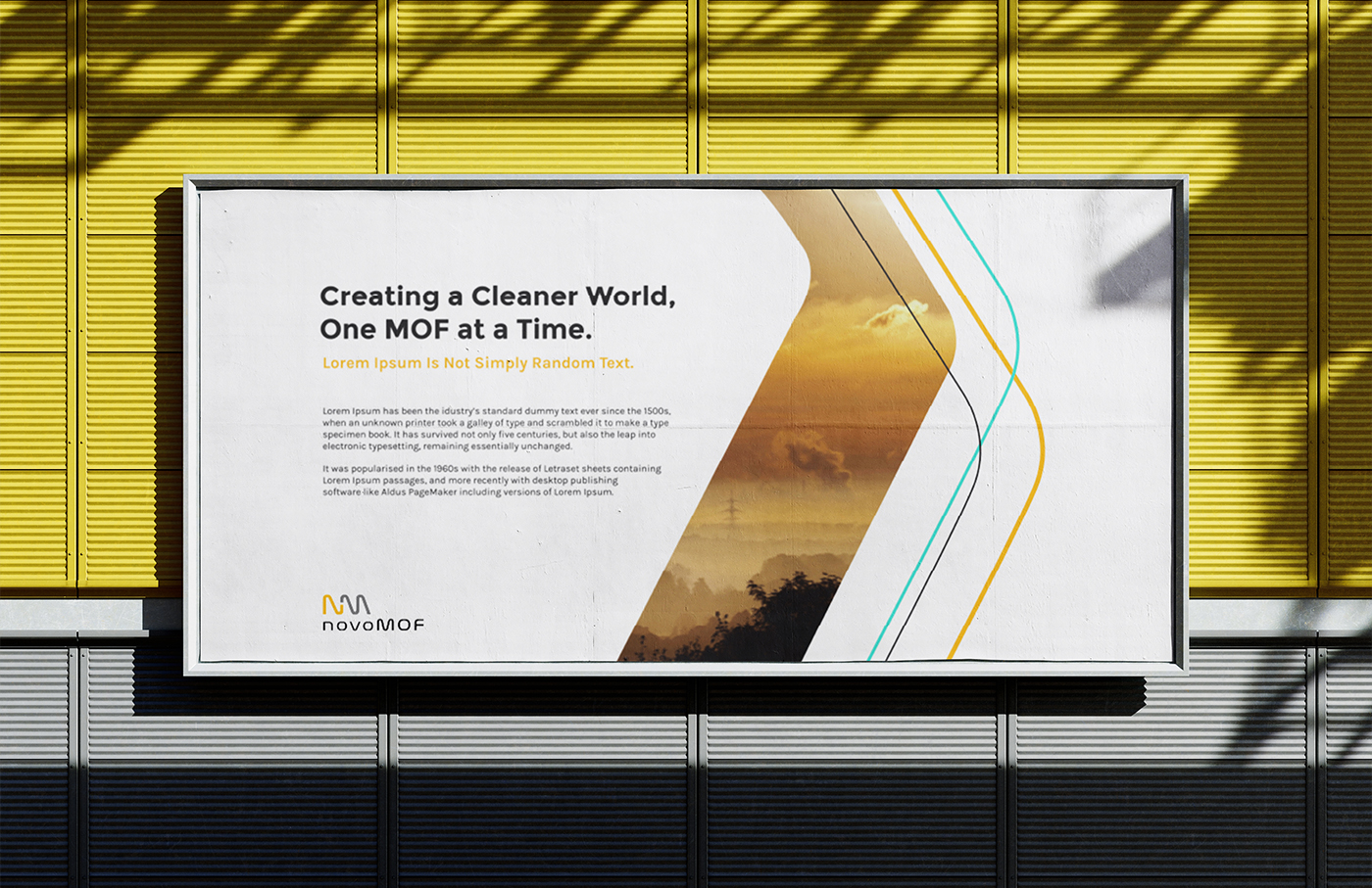
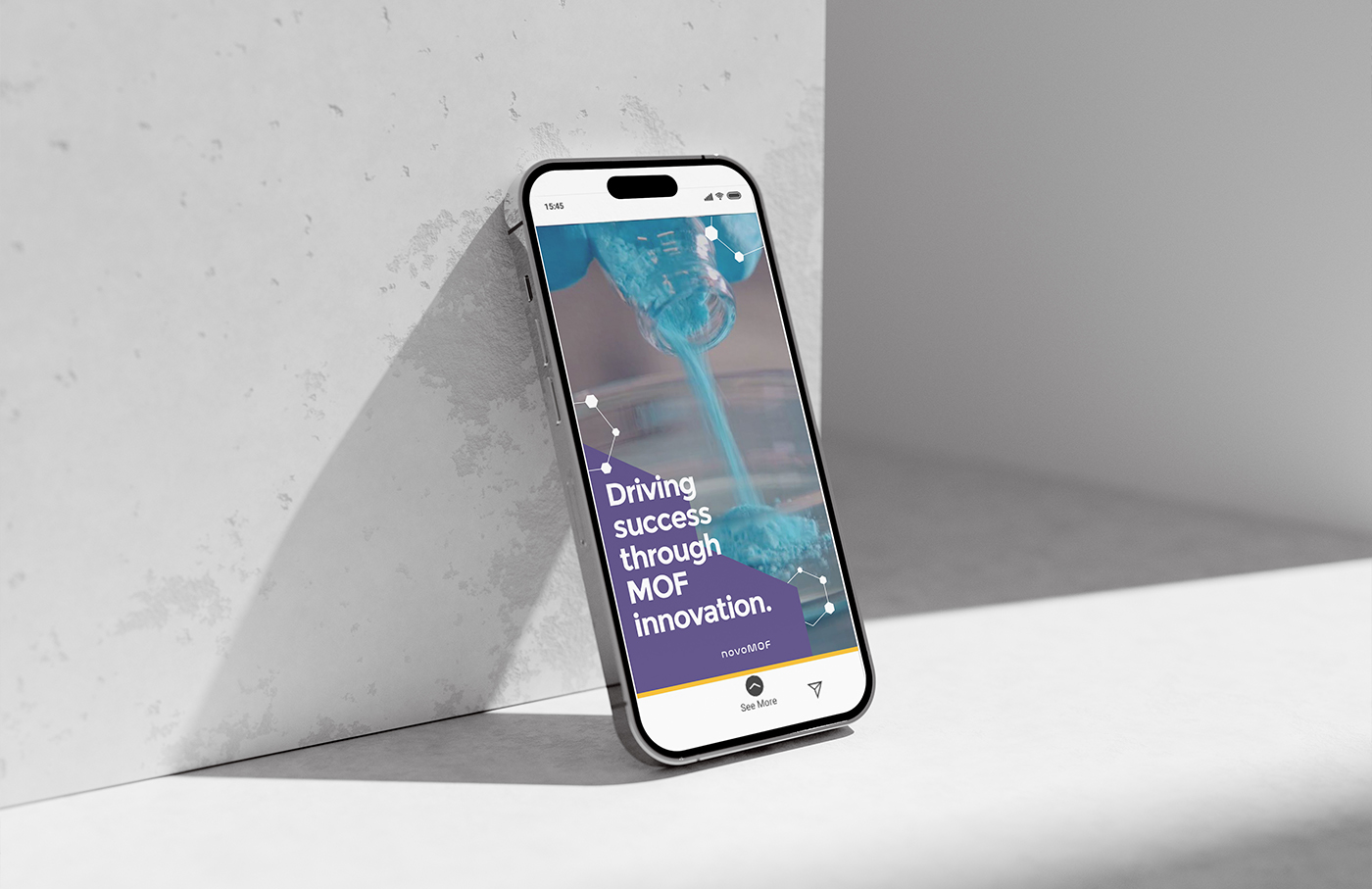
Their primary brand colors from the start were yellow, white, and black. This is a novel color combination within the sustainable technology sphere and grounds our client’s identity as a niche service provider of tech-driven solutions. We decided to embrace that while injecting a fresh new feeling with a secondary color palette of mostly bright, and contrasting colors.
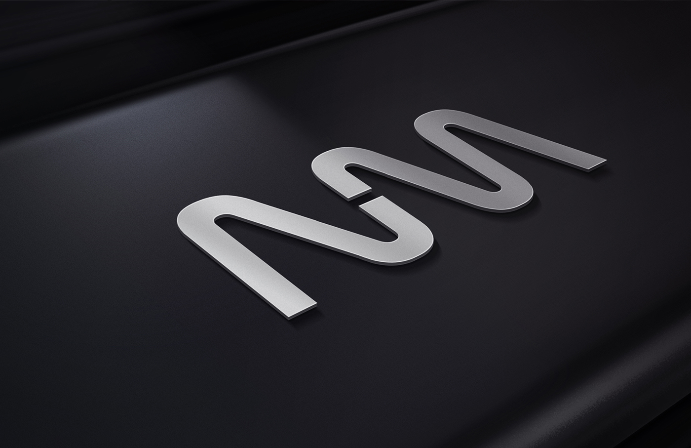
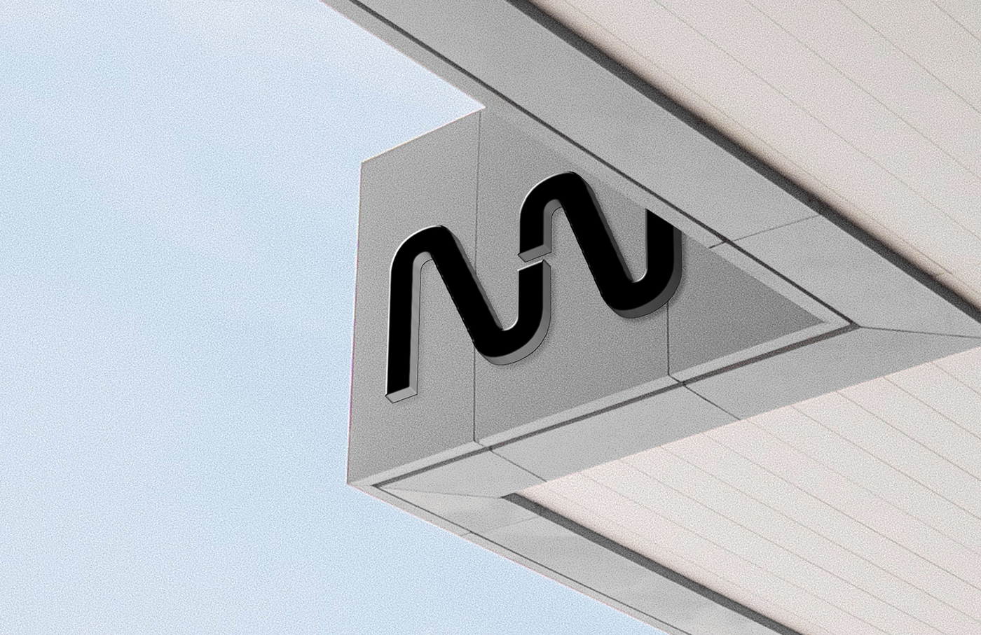
Variants of their existing logo were then created to extend its use across a wider variety of applications. A clear zone was also implemented around each iteration of the logo, and a distinct typographical hierarchy was established to reinforce a clean, modern, and professional aesthetic.
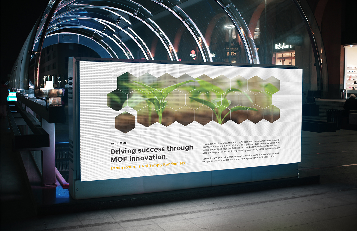
To inject a sense of dynamism into the brand identity a wide range of design elements to mix, match, and layer were developed for them as well. These elements were derived directly from the shapes and colors in the identity itself, and also inspired by the shapes and fine lines used in depictions of molecular structure. We deliberately kept the line weights fine as it creates opportunities to add a great deal of texture in a subtle, understated way.
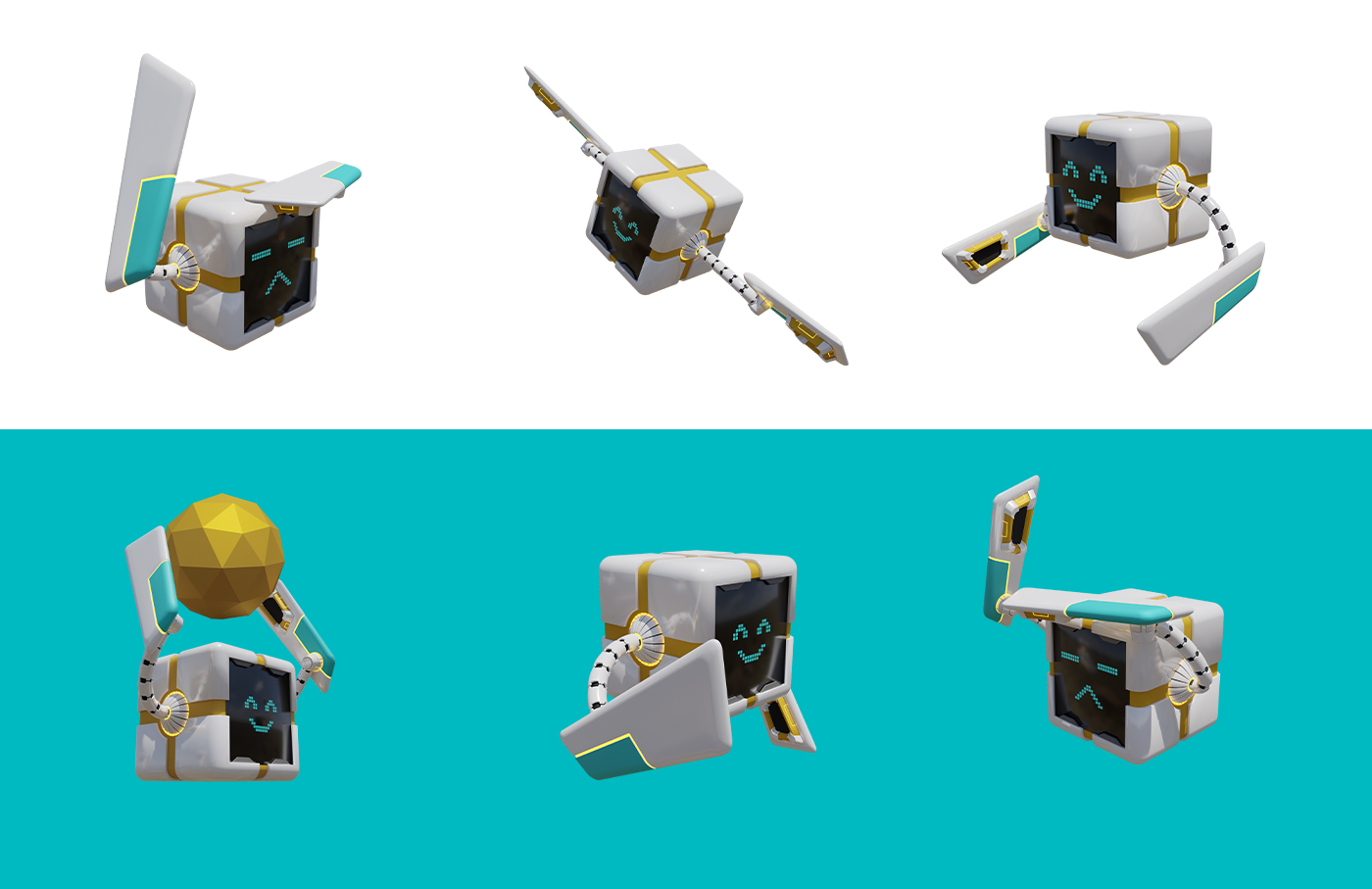
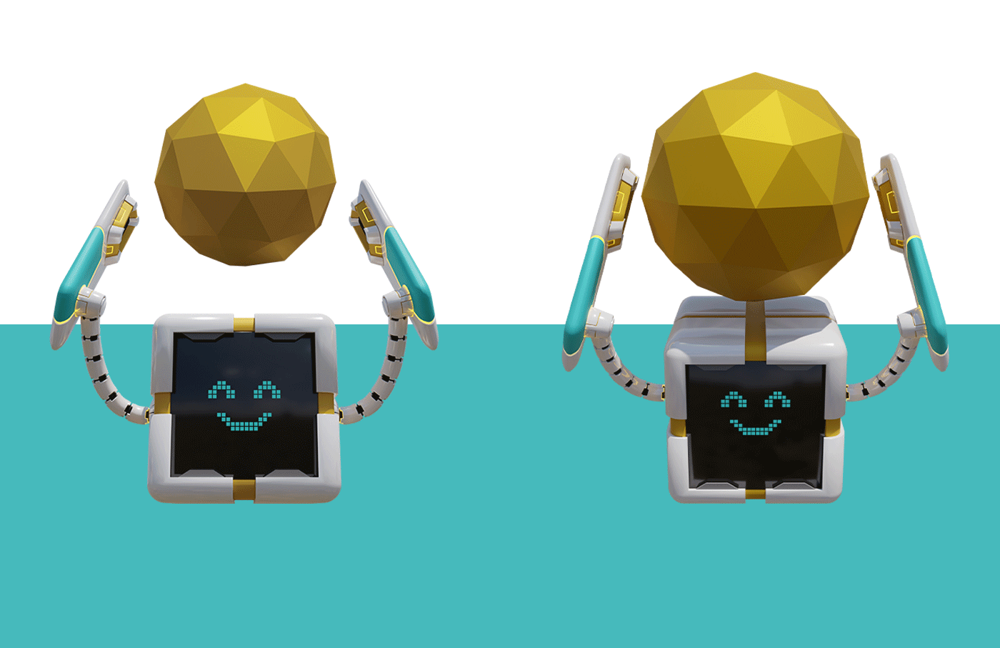
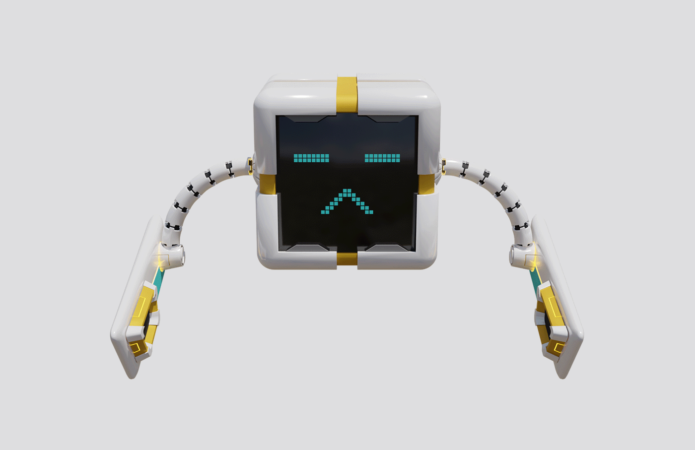
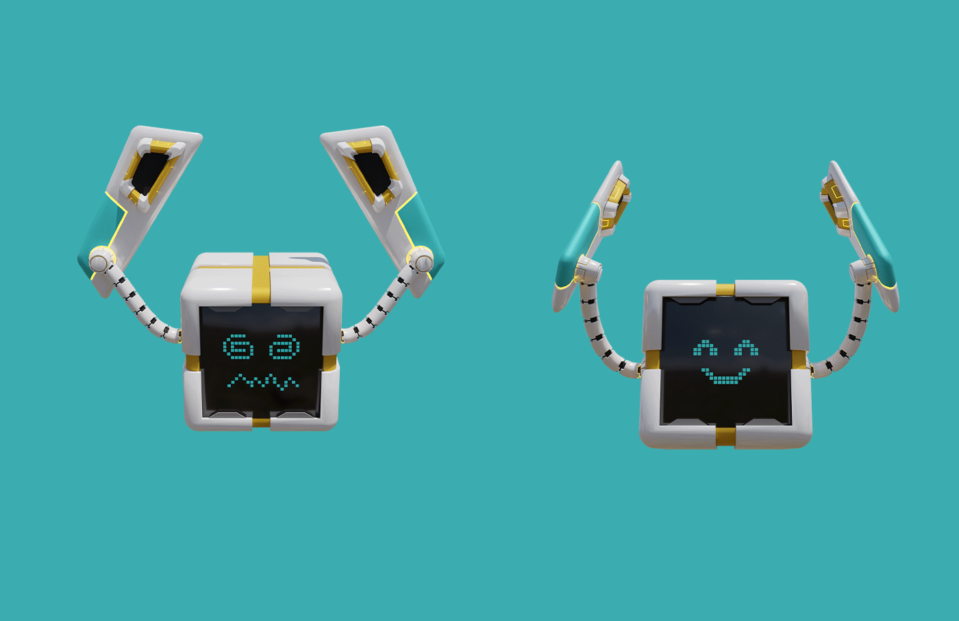
Finally, we designed a mascot called Morgan, a boxy and charmingly expressive robot whose mission is to capture carbon in the air. Taking inspiration from pixar’s Wall-E, the mascotintroduces a lighthearted counterpoint to the brand’s professional identity: an element that sets them apart from the competition. This design serves as a vessel for the human element that is still very much at the core of both Morgan the molecular guardian, and of novoMOF itself.
Overall, the new brand guidelines provide a foundation for the systematic creation of clear and cohesive brand messaging. The combination of novel color choices, human elements, and dynamic design enable them to present the wide variety of services that they offer together under a powerfully unique and unified brand identity.
“Their out-of-the-box thinking and creative approach in developing the 3D brand mascot were amazing!”