novoMOF

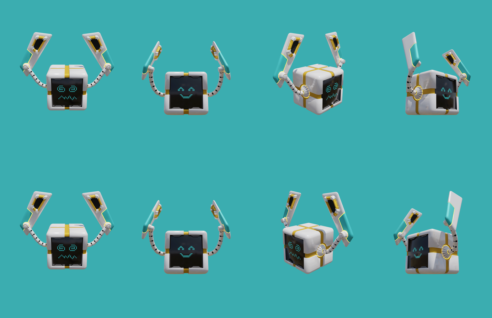
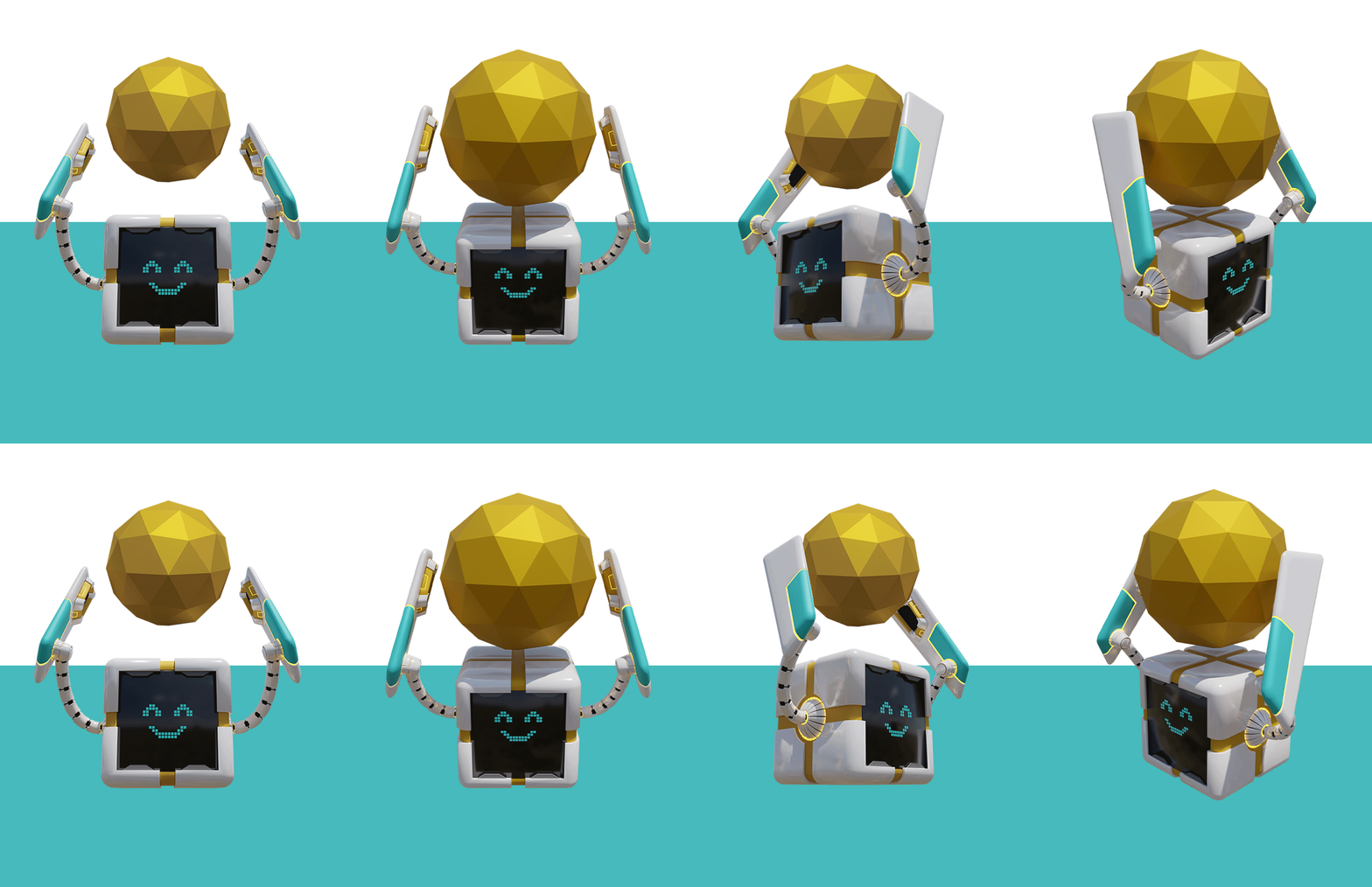
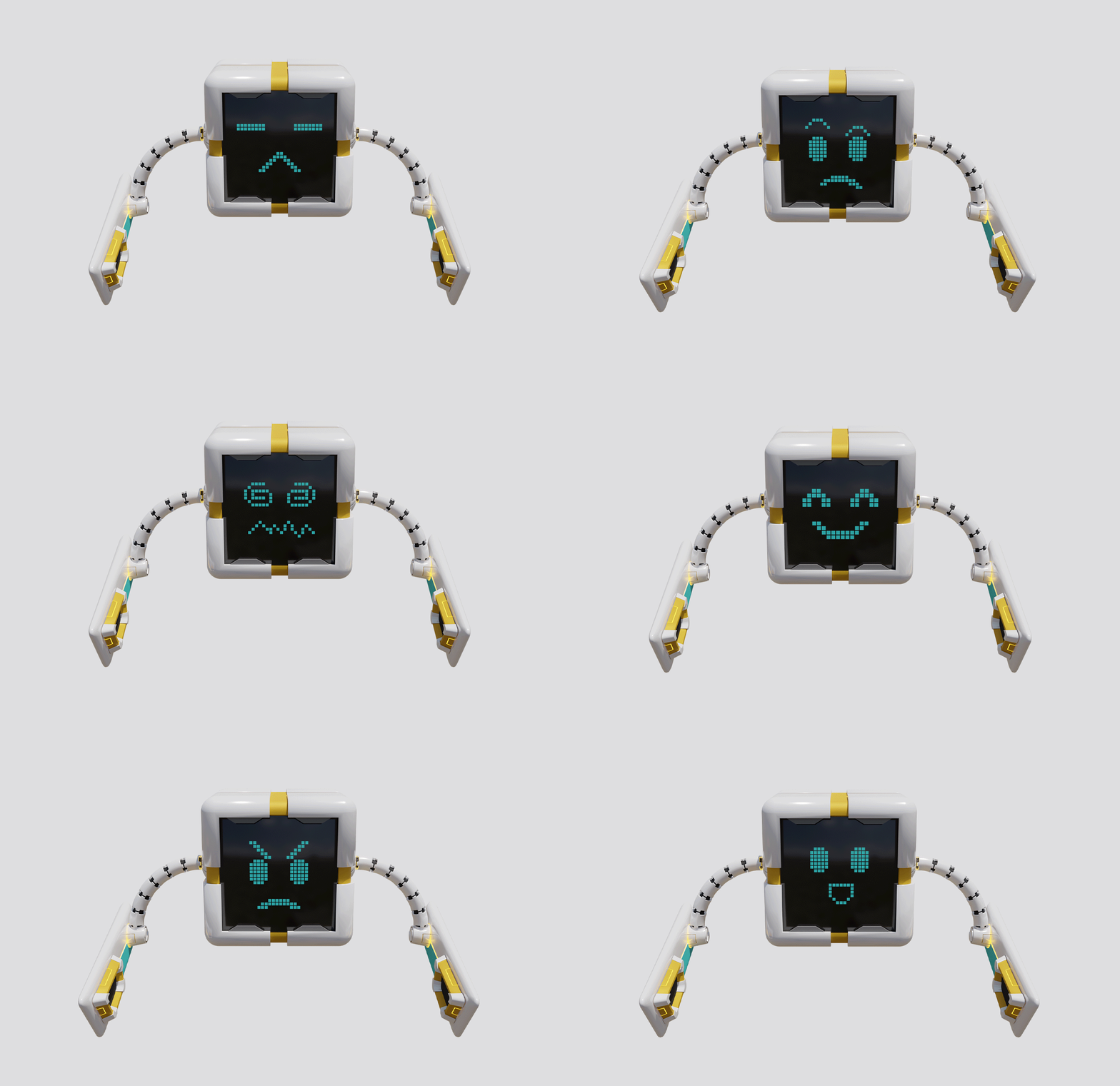
An image of a boxed roboto raising their arms up with smiling and dizzy faces

Web & Digital

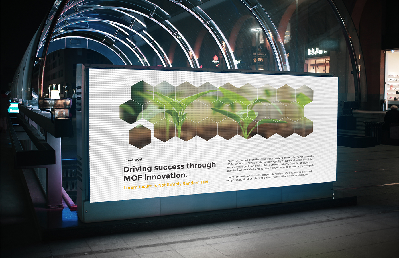
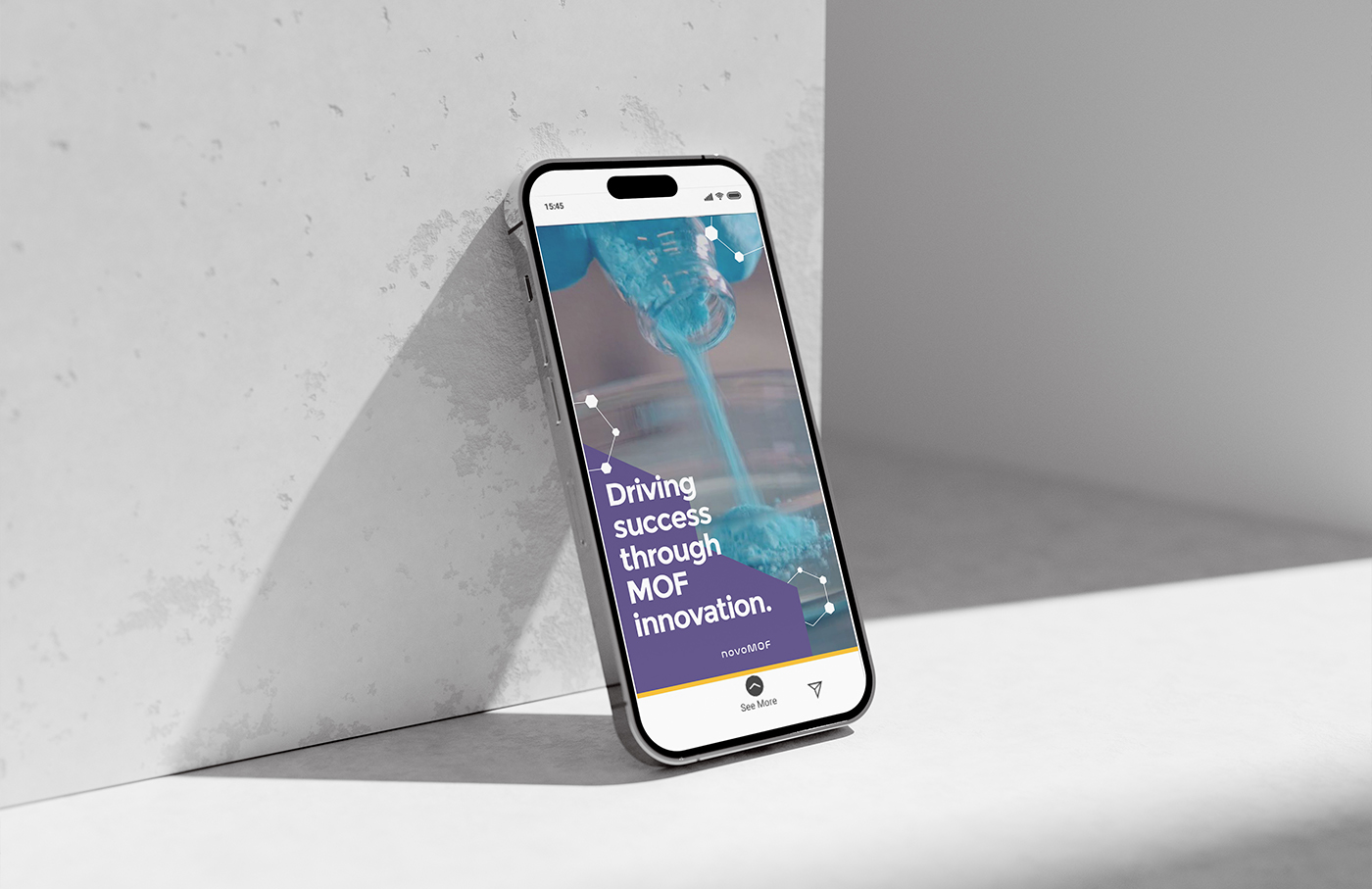
Driving Success Through MOF Innovation

novoMOF

Driving Success Through MOF Innovation

THE BRAND

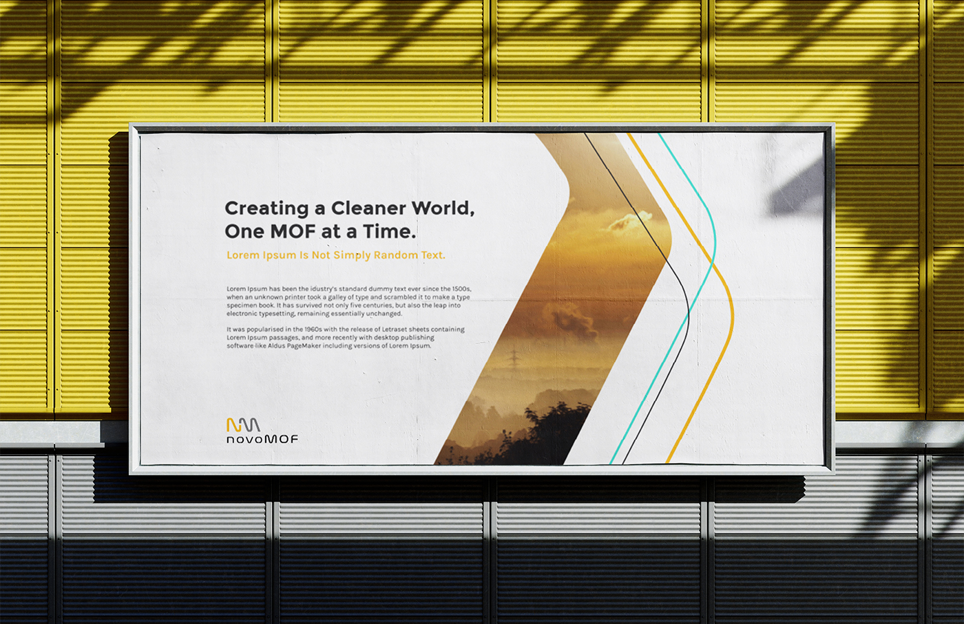
NovoMOF is a Switzerland-based sustainable tech company that focuses on the production and commercialization of metal-organic frameworks (MOFs), a new type of highly porous absorbent. They collaborate with their clients and improve their businesses by leveraging the special properties of this material by using sustainable technology to disrupt the modern industrial complex for the better. Novomof ultimately hopes to address pressing global issues such as water scarcity, food waste, carbon capture, and raw materials recovery.

scope of work

Creative Direction
Brand Guideline
3D Mascot Design
Graphic Design

design team

Frances Enriquez
Magno Mateo
Emem Seno

design team

Morgan Tornilla
Kenneth Hicks

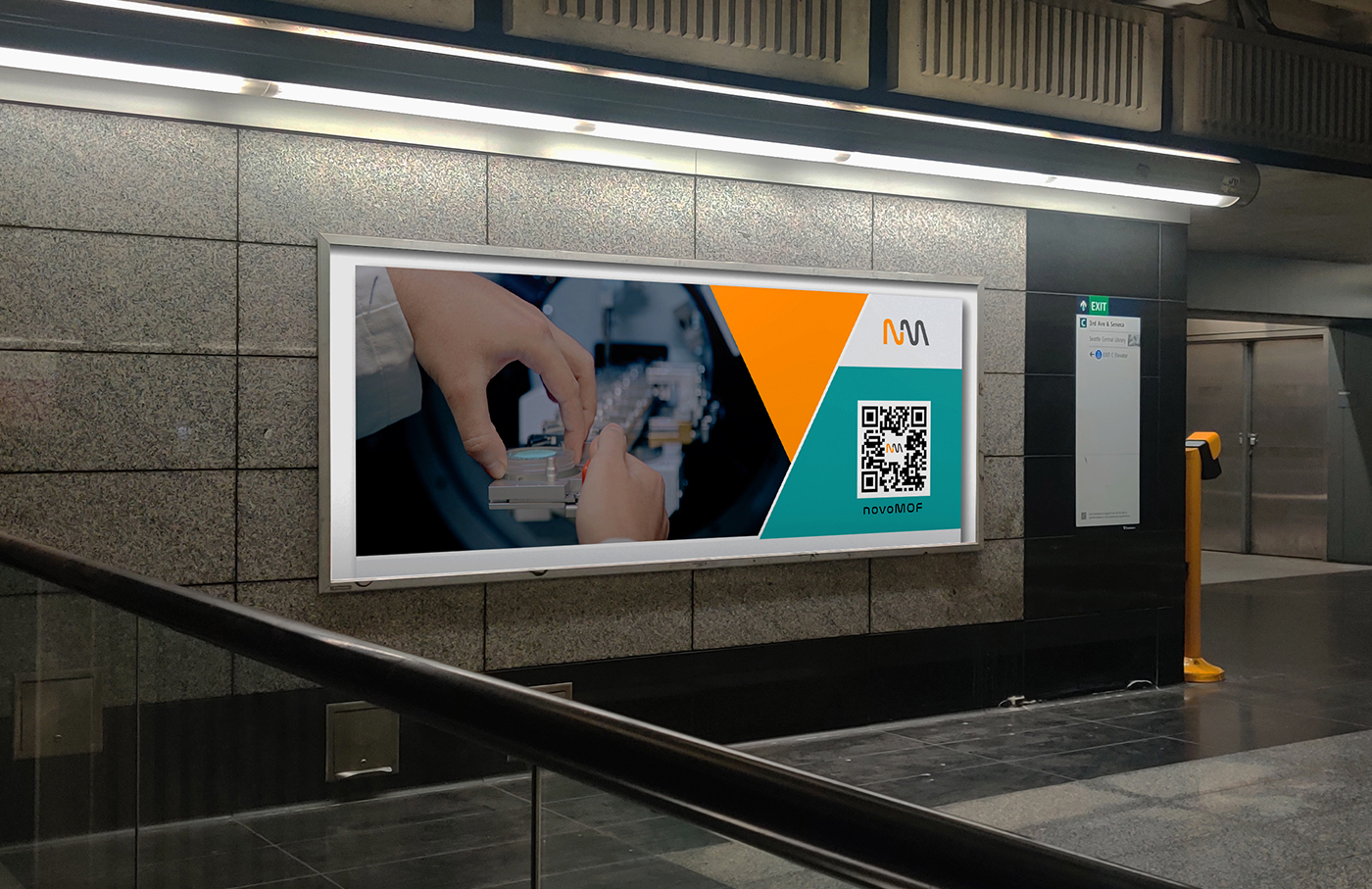
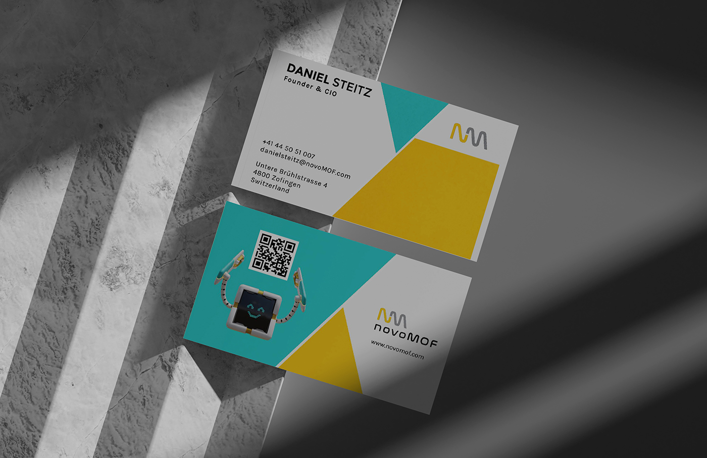
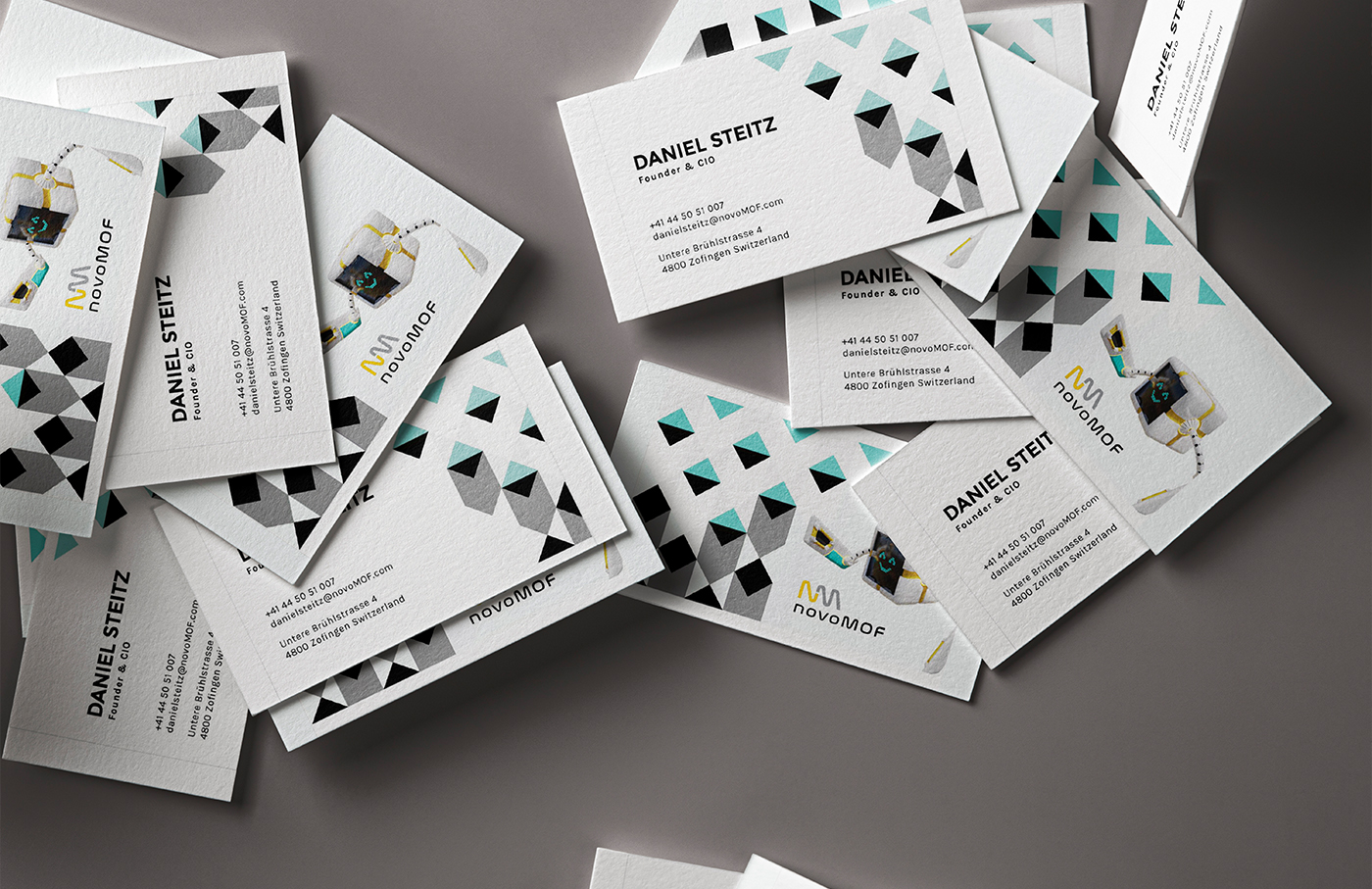
In partnering with us, their initial goal was to solidify the company’s visual branding without completely abandoning their existing logo, color scheme, and typography. We were eager to bring attention to their new technology and new ideas with a new look. One that conveys the exciting potential and novelty of what novoMOF has to offer. From building the brand guideline to business card design, and even exhibition booth design, we’ve been able to foster a long-term partnership that has only continued to flourish.

Their primary brand colors from the start were yellow, white, and black. This is a novel color combination within the sustainable technology sphere and grounds our client’s identity as a niche service provider of tech-driven solutions. We decided to embrace that while injecting a fresh new feeling with a secondary color palette of mostly bright, and contrasting colors.

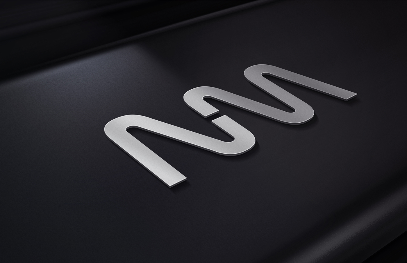
Variants of their existing logo were then created to extend its use across a wider variety of applications. A clear zone was also implemented around each iteration of the logo, and a distinct typographical hierarchy was established to reinforce a clean, modern, and professional aesthetic.

To inject a sense of dynamism into the brand identity a wide range of design elements to mix, match, and layer were developed for them as well. These elements were derived directly from the shapes and colors in the identity itself, and also inspired by the shapes and fine lines used in depictions of molecular structure. We deliberately kept the line weights fine as it creates opportunities to add a great deal of texture in a subtle, understated way.

The Backbone branding and visual identity for novoMOF

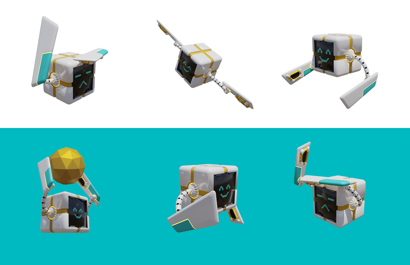
Finally, we designed a mascot called Morgan, a boxy and charmingly expressive robot whose mission is to capture carbon in the air. Taking inspiration from pixar’s Wall-E, the mascot introduces a lighthearted counterpoint to the brand’s professional identity: an element that sets them apart from the competition. This design serves as a vessel for the human element that is still very much at the core of both Morgan the molecular guardian, and of novoMOF itself.

Overall, the new brand guidelines provide a foundation for the systematic creation of clear and cohesive brand messaging. The combination of novel color choices, human elements, and dynamic design enable them to present the wide variety of services that they offer together under a powerfully unique and unified brand identity.

An image of a boxed roboto raising their arms up with smiling and dizzy faces

“Their out-of-the-box thinking and creative approach in developing the 3D brand mascot were amazing!”

Like what you see?

Aroma Art Atelier

Web & Digital

Tradition of Excellence

Aroma Art Atelier

Tradition of Excellence

THE BRAND

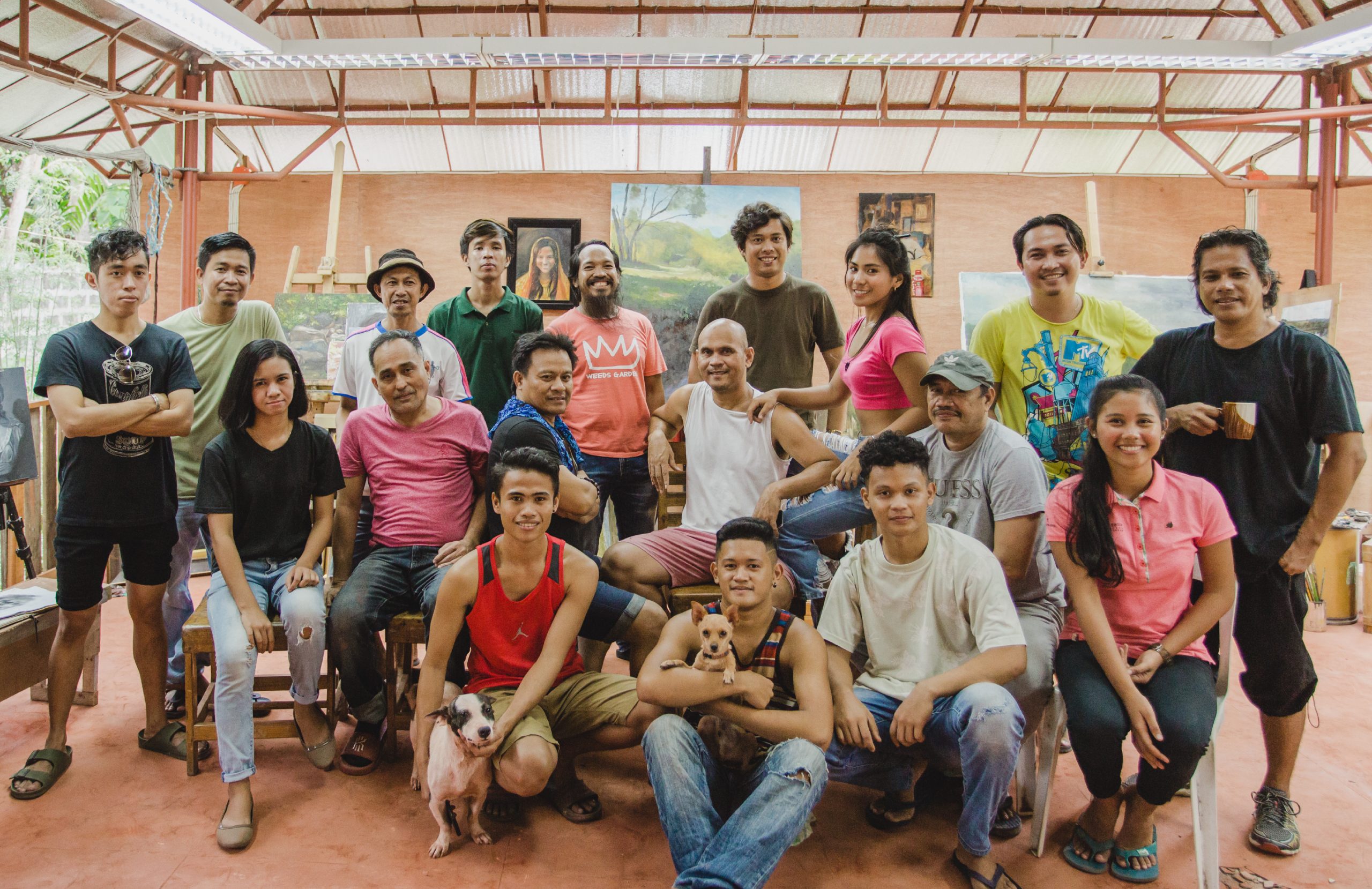
Aroma Art Atelier is an art academy dedicated to nurturing homegrown artists from Toledo city, Cebu, Philippines, and leading the city as the cultural hub of representational classical art.

scope of work

Branding
Brand Identity
Key Visuals
Creative Direction

SPECIAL THANKS

Photography by
Rae Cabradilla
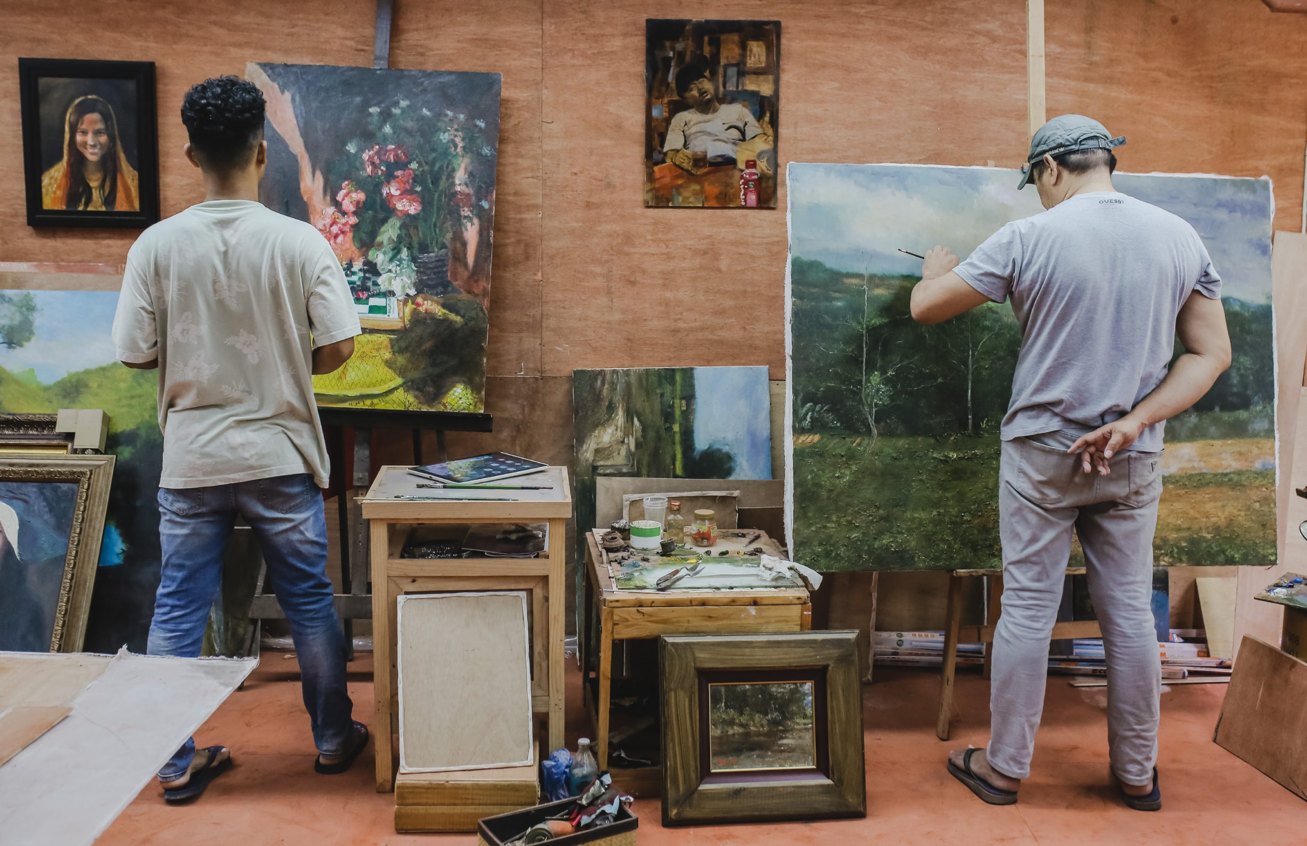
Founded by multi-awarded Filipino contemporary realist, Orley Yu Ypon, the atelier’s practice-based approach encourages students to master the foundations of painting while developing their styles and creative aspirations. 
 
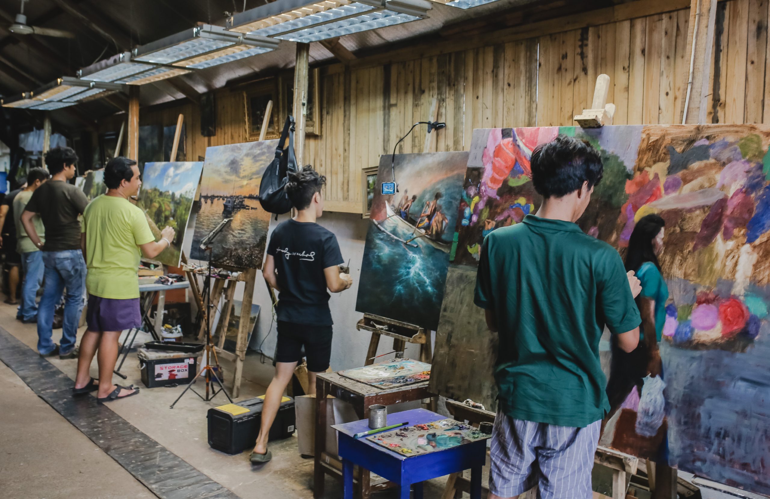
It began as a casual gathering of local artists, a means for them to foster long-standing ties, to share common practices and philosophies in painting, and to introduce new aspirants in the field. Two years later, Aroma Art Atelier became incorporated as a non-profit organization, dedicated to helping emerging artists exercise their full potential by providing basic art training.​​​​​​​
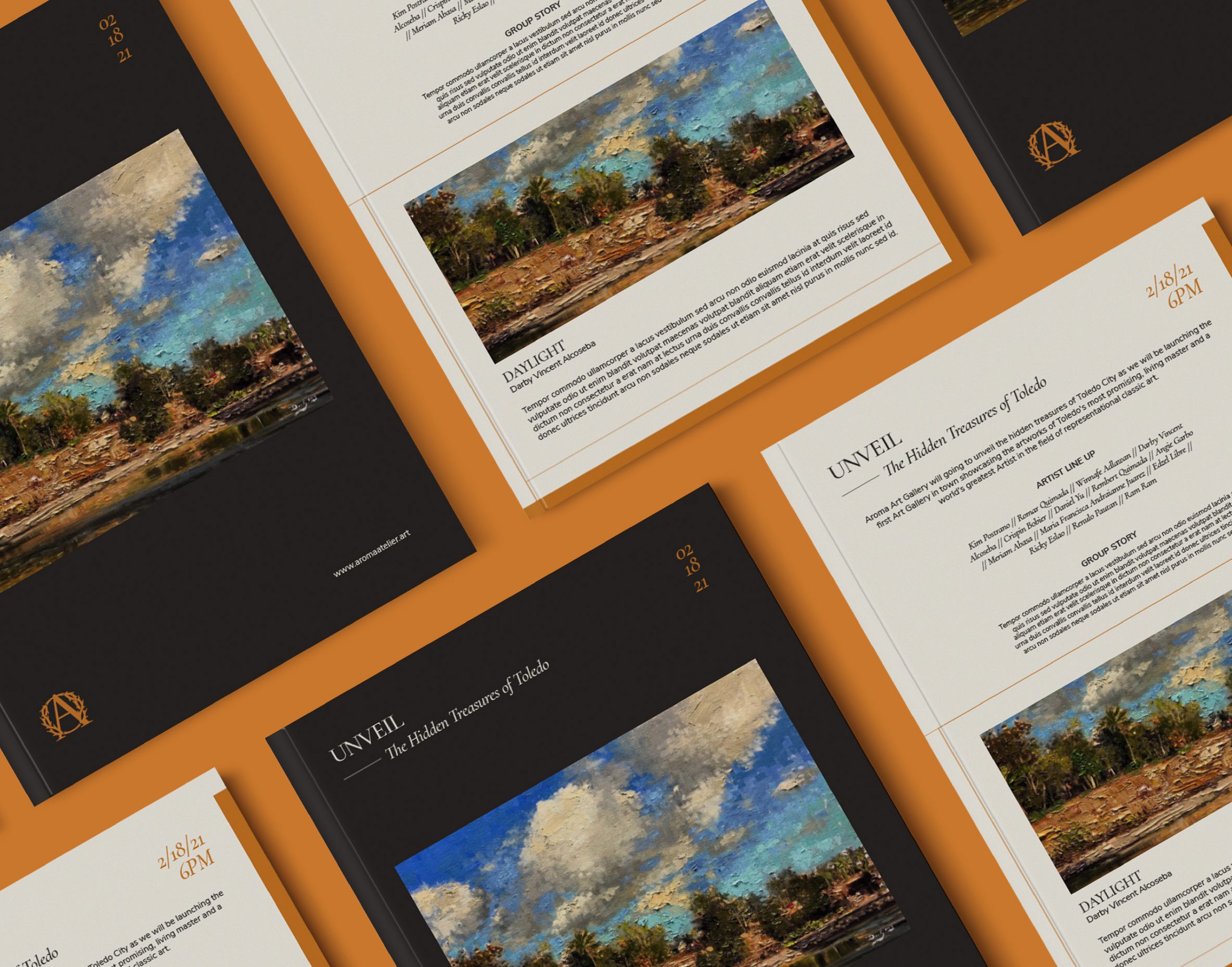
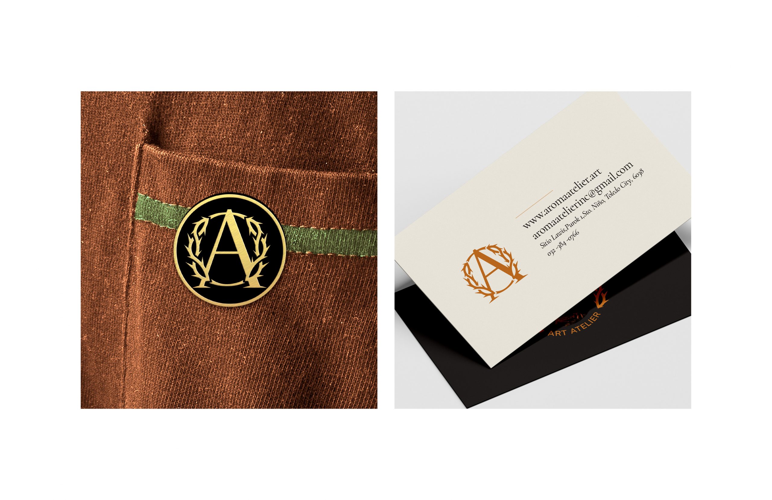
Inspired from a native bush in Toledo City, Aroma Art Atelier speaks for resiliency and passion for the art and community. Taking inspiration from its name, Aroma is recognized by its thorns that define strength, tradition, and commitment to excellence. 
 

With the identity focused on the tradition of excellence and the commitment to student’s personal growth in representational art, color palettes resemble the classical art movement and added a touch of sophistication and prestige. 

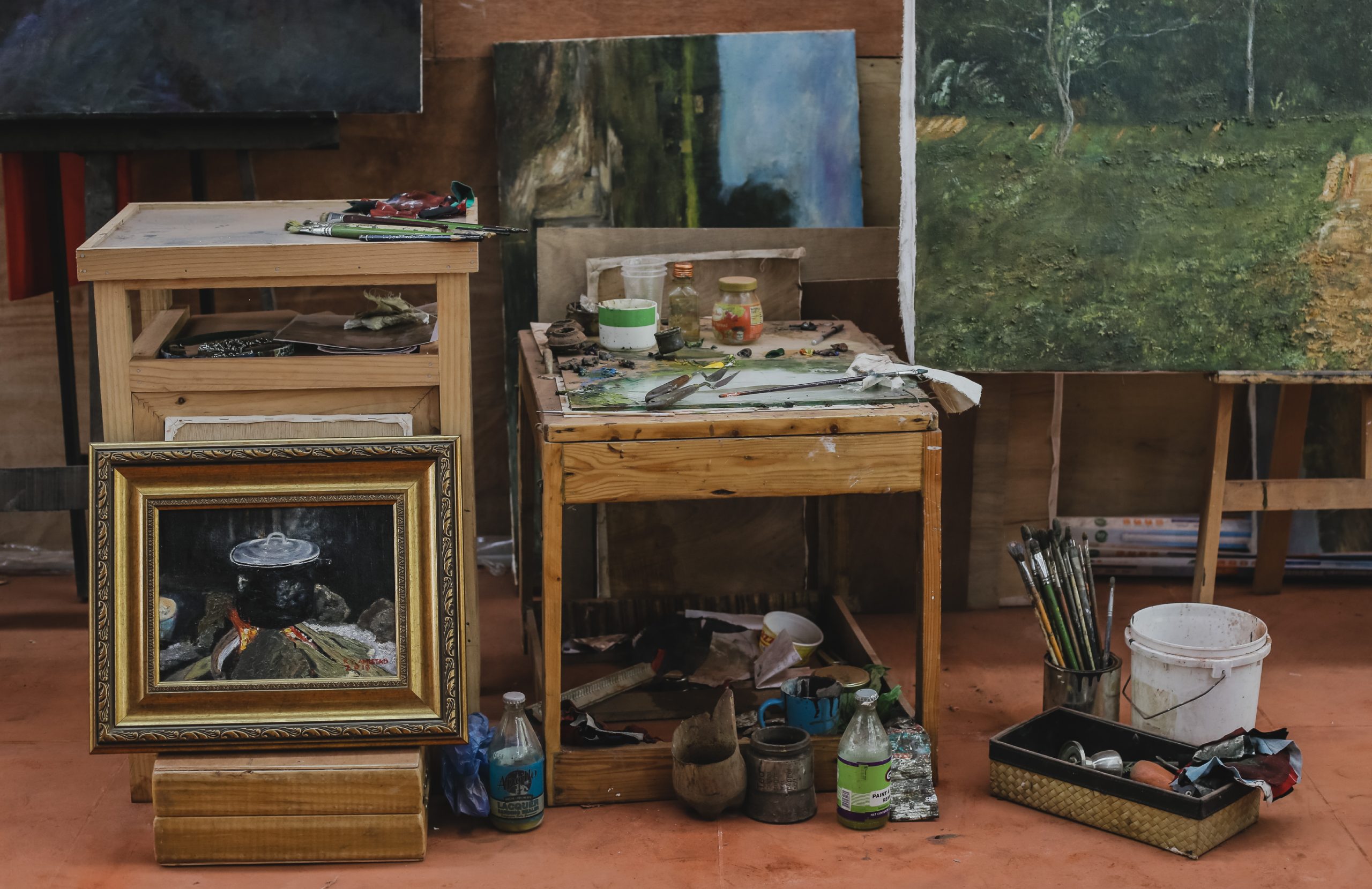
In the pursuit of excellence, the atelier provides its students a safe space conducive to productivity and access to applied arts education with the right tools and materials where they can discuss freely with their mentors and turn theory into actual manifestations.

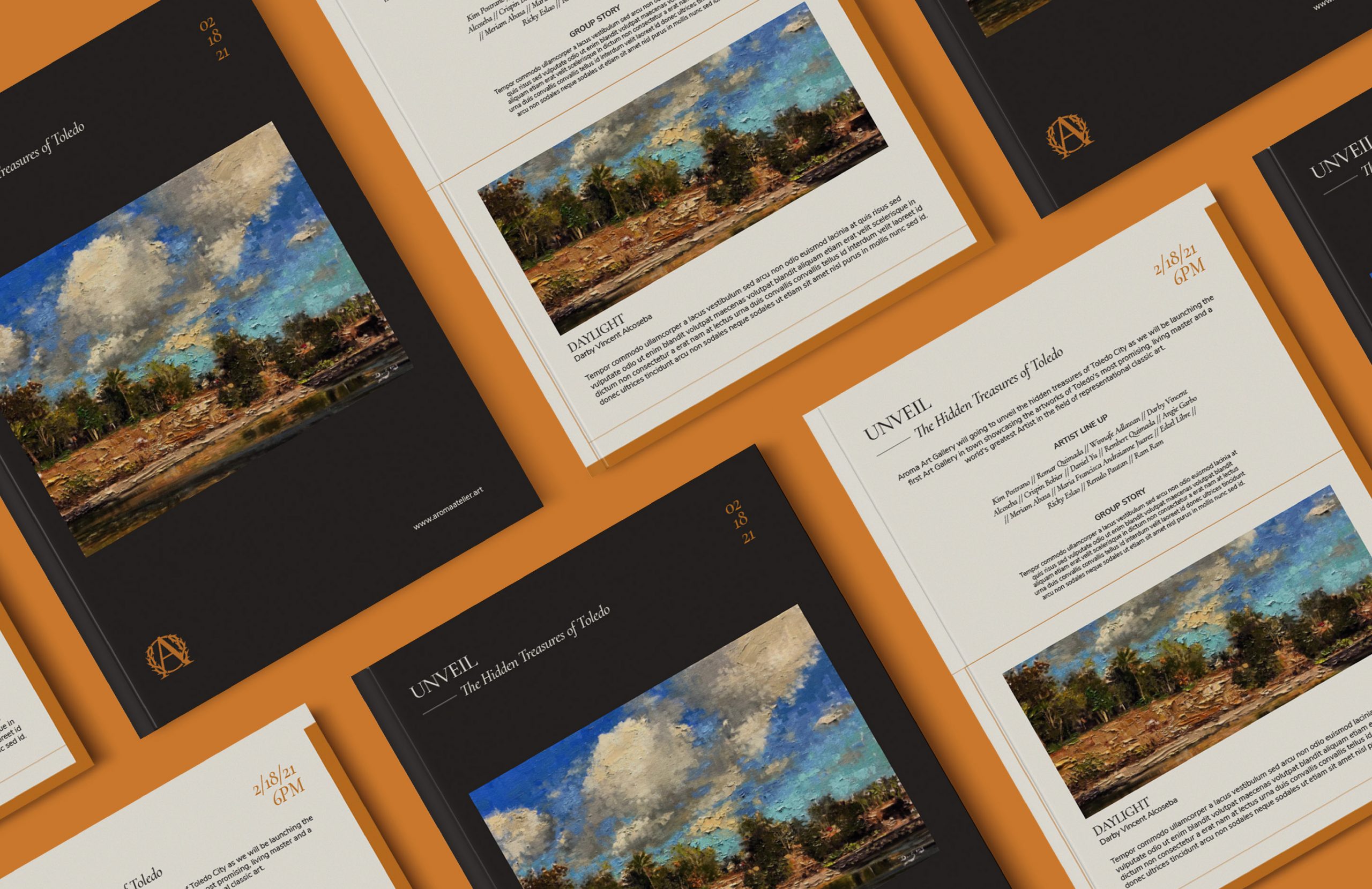
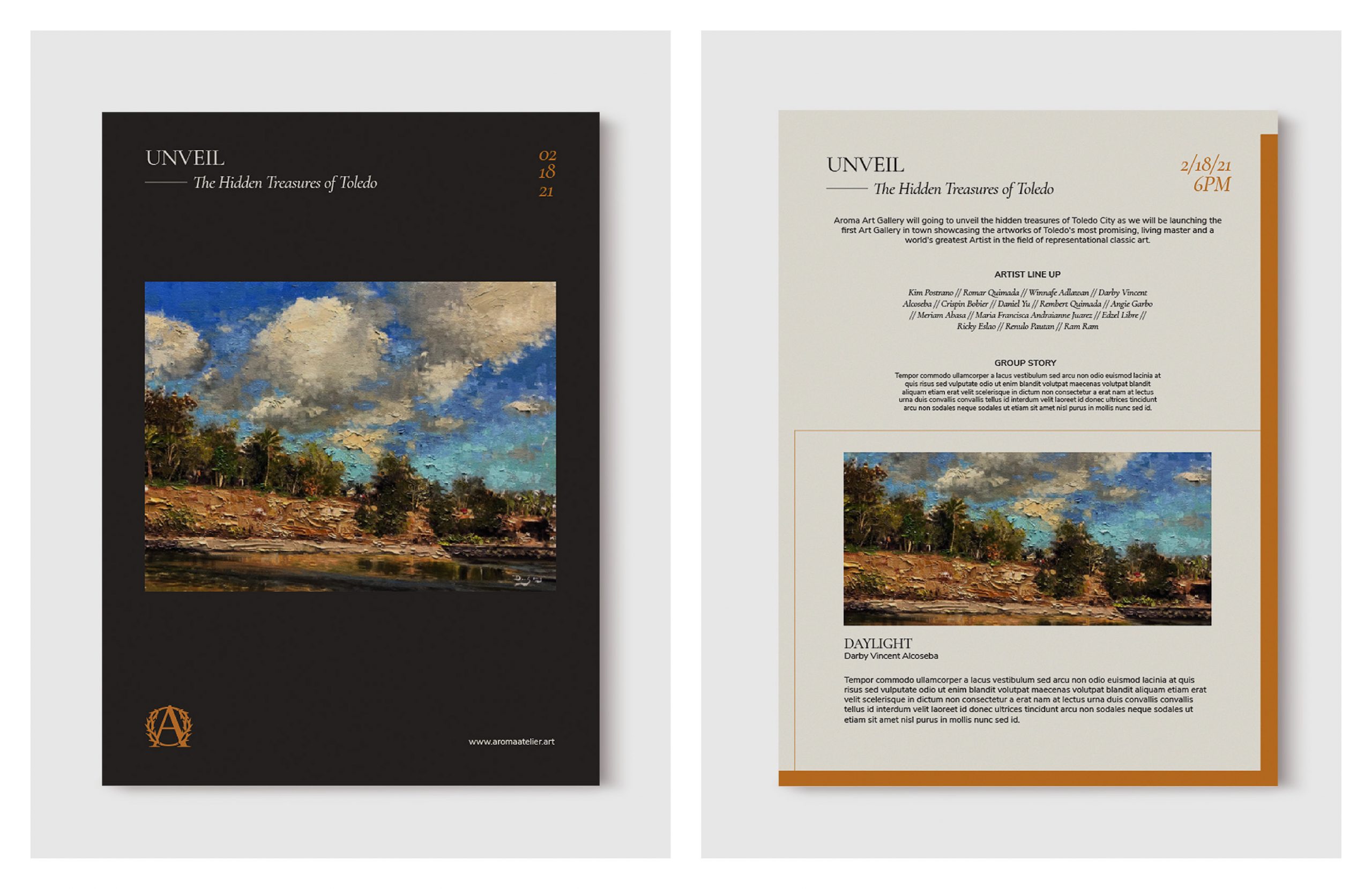
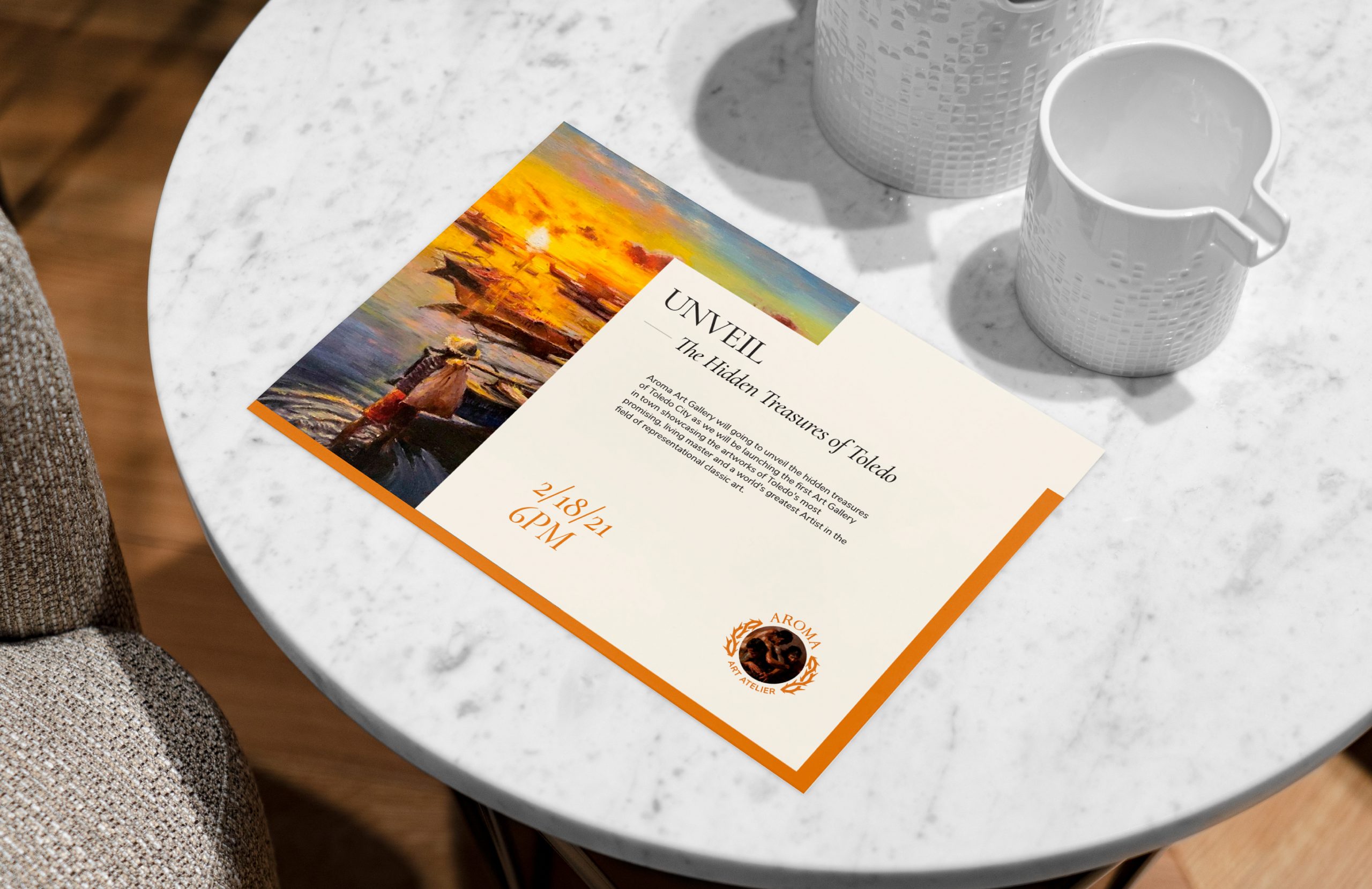
an invitation card on the table with a picture of an artwork and two empty mugs

Aroma Art Atelier hopes to help develop Toledo City Cebu into a flourishing cultural hub destination, a haven for Cebuano classical art to thrive and evolve. Check out their website for updates.

“The Backbone really helps build the brand and promote our paintings efficiently, most especially the customer-friendly staff. We highly recommend them.”

Angie Garbo, Gallery Director

Like what you see?

Igsuon Kamusta

Web & Digital

Covid-19 Information Campaign

Igsuon Kamusta

Covid-19 Information Campaign

THE BRAND

‘Igsuon Kamusta’ (How are you, my brother?) is a song made by Cebuanos for Cebuanos. It is a song about looking out for each other and uniting in the fight against Covid-19. It is a simple reminder to wash our hands regularly, disinfect our surroundings, wear a mask and most importantly, to stay at home. ​​​​​​​

scope of work

Illustration
Character Design
Motion Graphics

SPECIAL THANKS TO

Animation by Pepo Daradal

Our studio were tapped to create fun visuals reminding Cebuanos (PH) to wash their hands regularly, disinfect their surroundings, wear a mask and most importantly, to stay at home. Don’t forget to check on your fam and friends. A little ‘kamusta’ (how are you) goes a long way ☀️ 🌈

Check out their YouTube channel for the English translation of the song.

Like what you see?

Superior Metalcraft

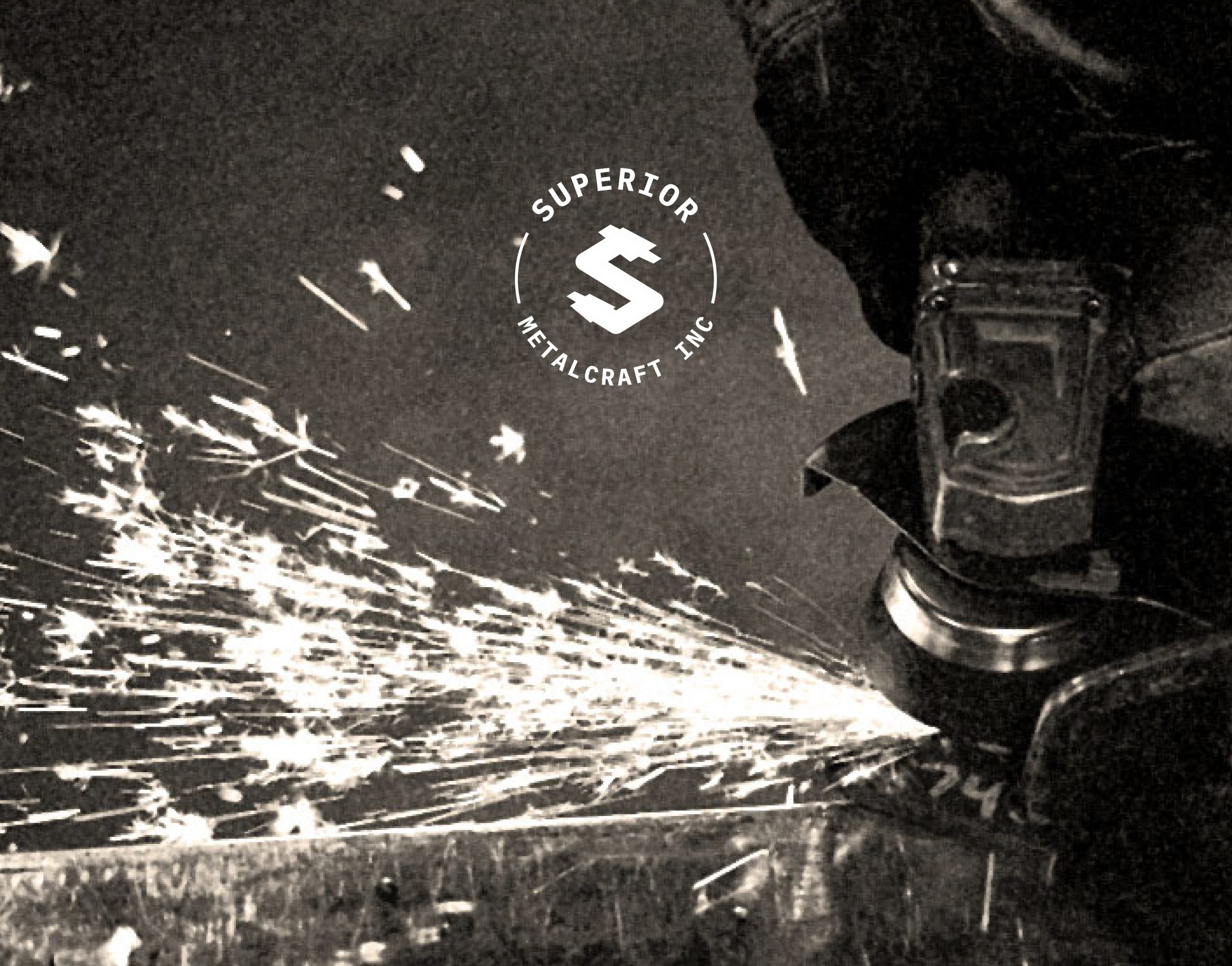
sparks appearing from the metal grinding machine with a logo of their brand

Web & Digital

Exemplary Craftmanship

Superior Metalcraft

Exemplary Craftmanship

THE BRAND

Superior Metalcraft is a welding and fabrication shop in Chicago that specializes in custom steel fabrication. They have been in the industry for more than 10 years.

scope of work

Rebranding
Branding
Brand Identity
Creative Direction
Key Visuals

The first part of the process was to familiarize their organization and the industry in general. In contrast to a large manufacturing company, they essentially follow the processes of a job shop, where they produce bespoke items.

The brand identity was focused on their core values, which are integrity, versatility, and creativity. The colors blue, red, and white are very all-American and symbolize the blue-collar worker. 
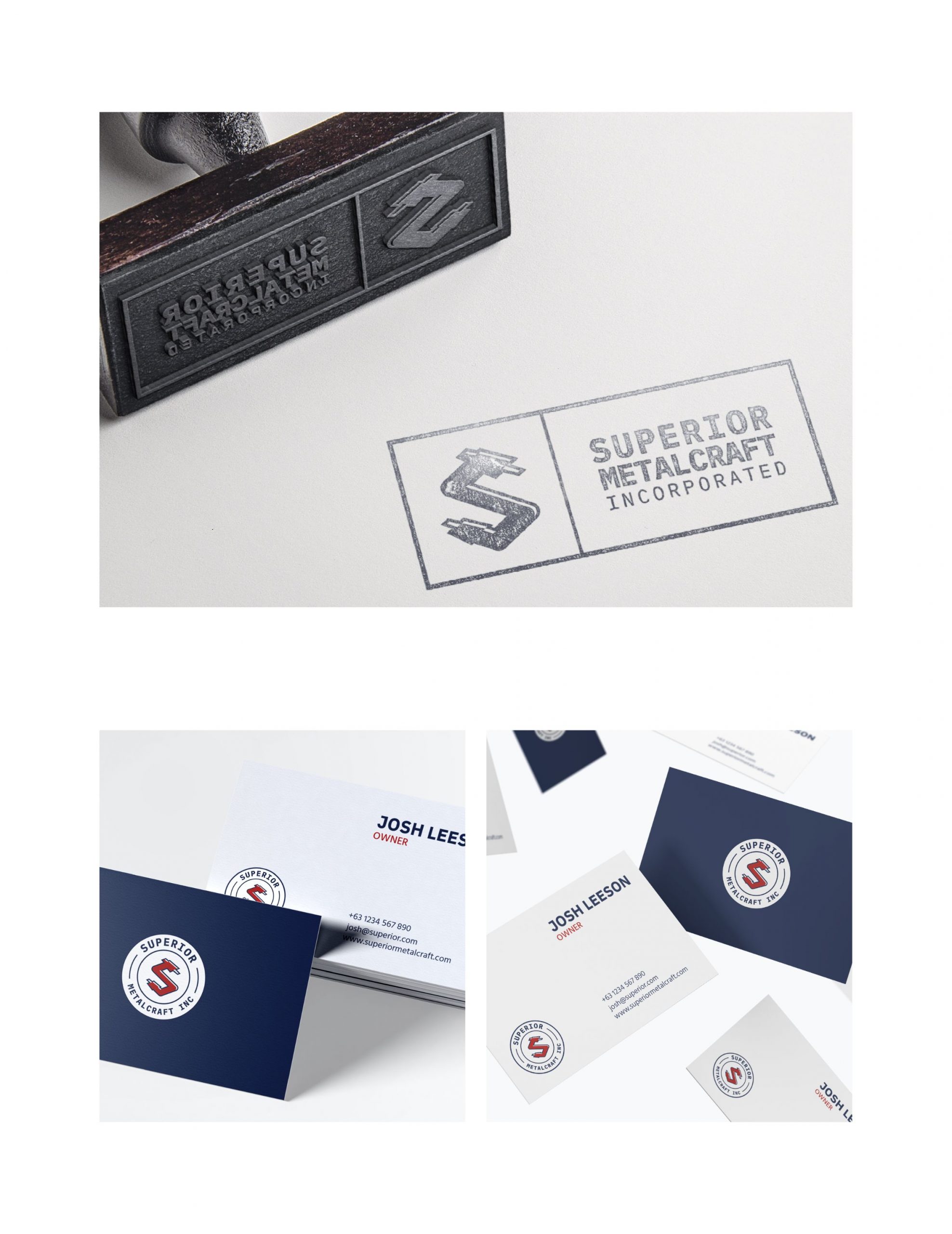
Images of the logo being used on paper stamp and calling card
Robust, bold, and straightforward, the overall identity reflects their hardworking culture and commitment to the highest quality of service and craftsmanship.
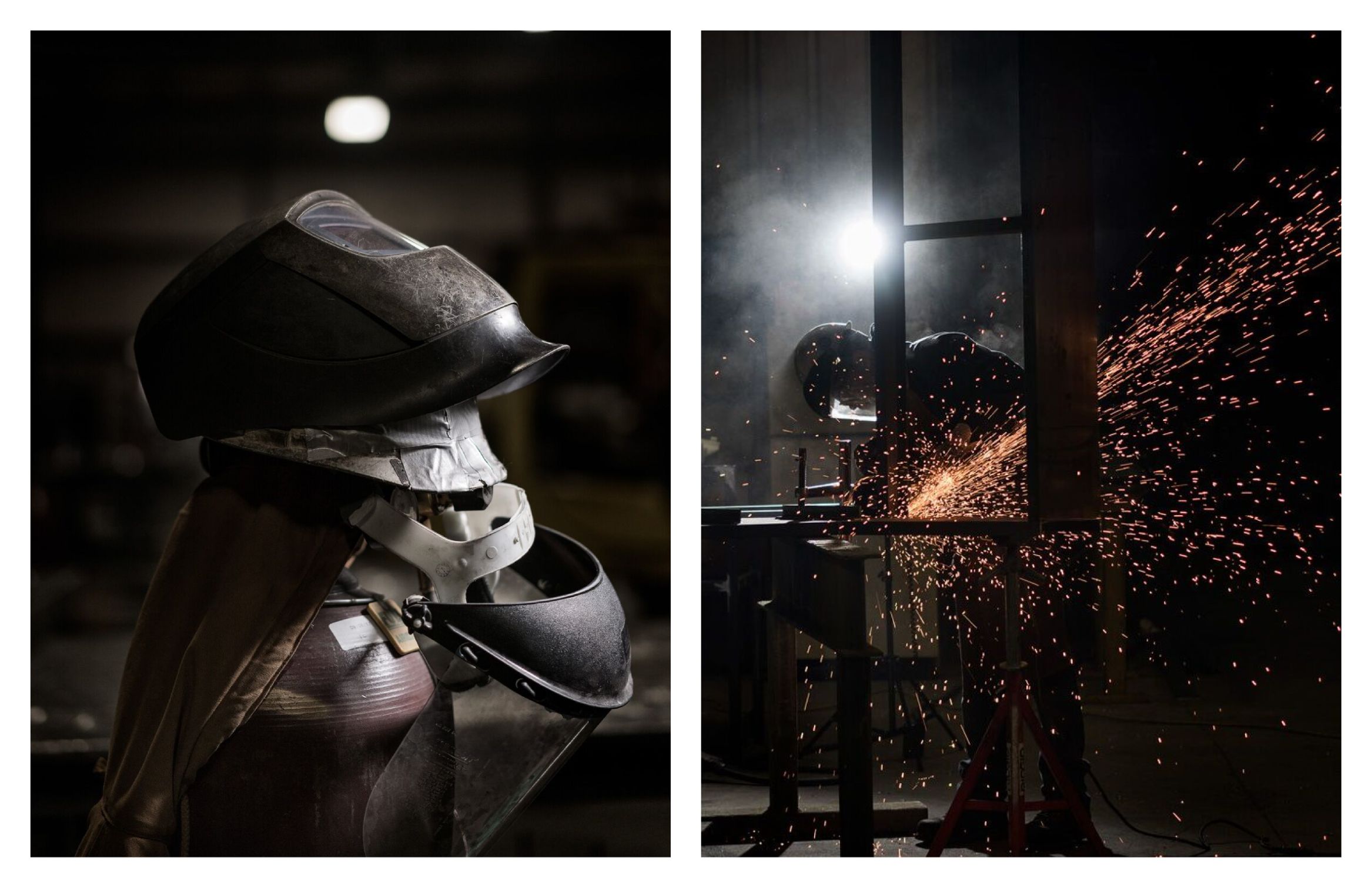
Image of the mask that is used in welding and image of a welder welding with metal sparks
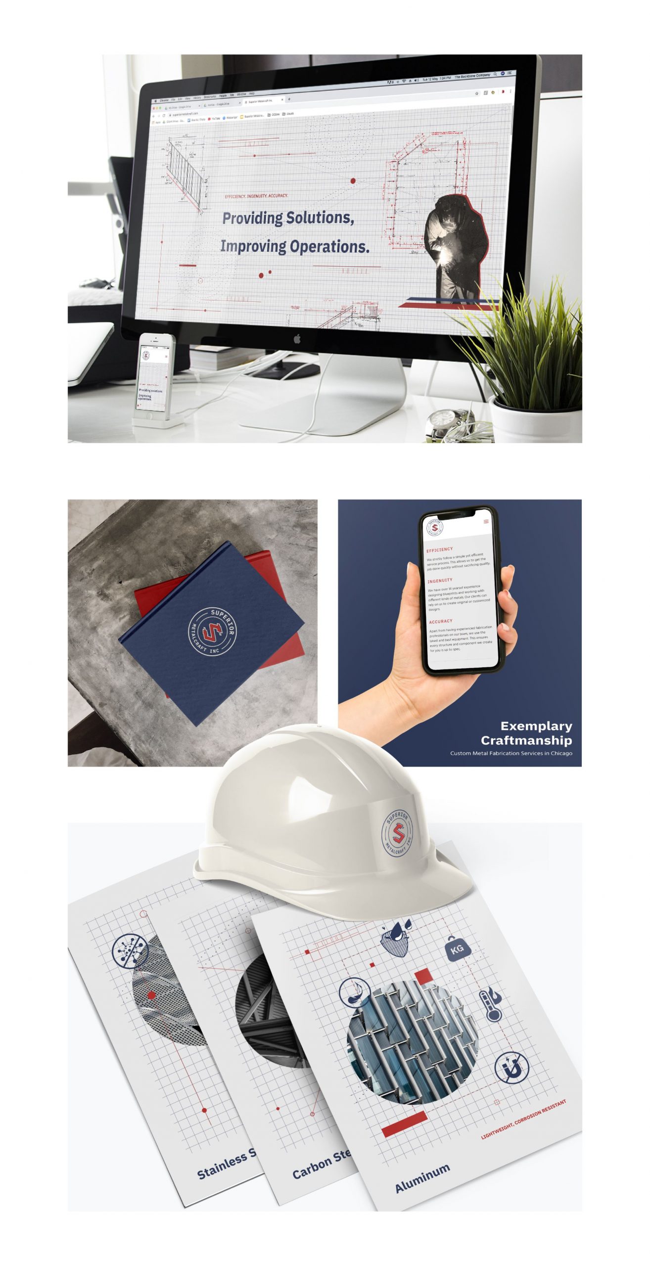
The narrative of them having a strong foundation continued with the integration of the blueprint concept. It shows how they are experienced steel artisans who plan everything first prior to execution. Being grounded in their core values is what drives their identity as a brand and processes as an organization.

Learn more about the brand on their website.

“They did an excellent job distilling down information in a way that made sense to us. Overall, working with The Backbone was a great experience, and they hit the mark.”

Like what you see?

Bez Acre

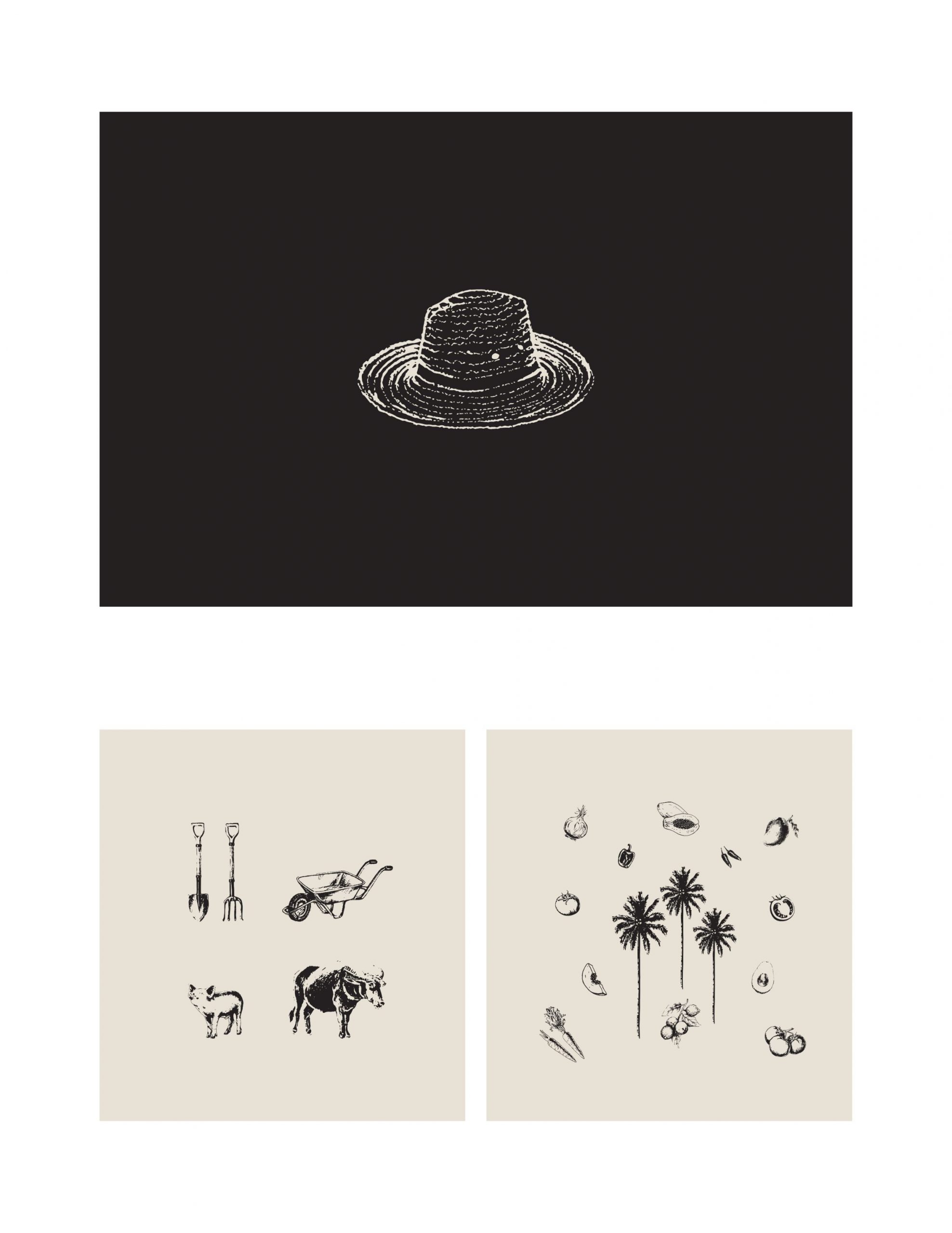
Drawing of tools, produce and animals found in a farm

Web & Digital

All-Natural Produce

Bez Acre

All-Natural Produce

THE BRAND

Bez Acre is a family-owned farm in Toledo, Cebu PH selling preserved jams, spices, and produce fresh from their backyard. Initially for personal consumption, what they harvest from their farm now is being shared to others, giving a richer meaning to reaping what you sow.

scope of work

Brand Identity
Verbal Identity
Naming
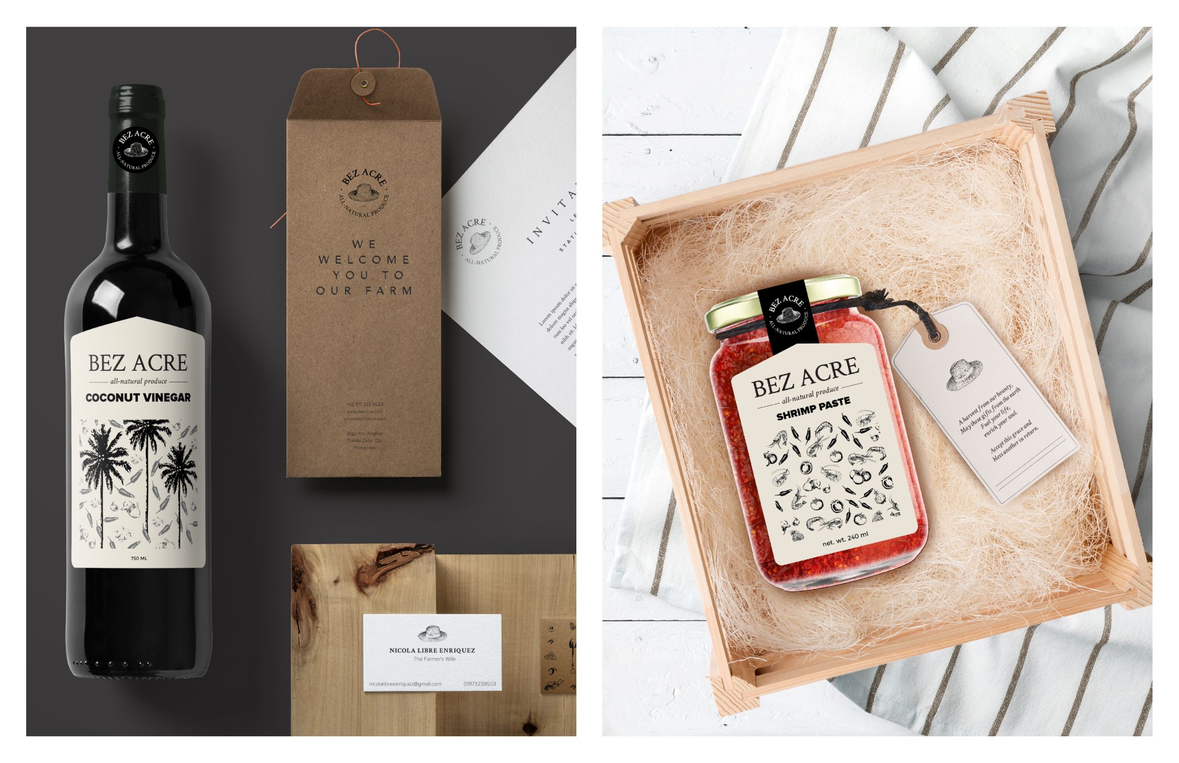
Packaging

ACCOLADE

ASEAN-KOREA Excellent Design Semi-finalist

The vacation home of the Enriquez family in Toledo was a place where they could pause and bond. They would devote their time into taking care of their land, bearing in mind their roles as stewards of the earth. 

The farmer’s hat is a symbol for the hard work, integrity, and diligence in tending their fields with their very hands. Bez Acre’s philosophy is to cultivate the earth with attention and gratitude.
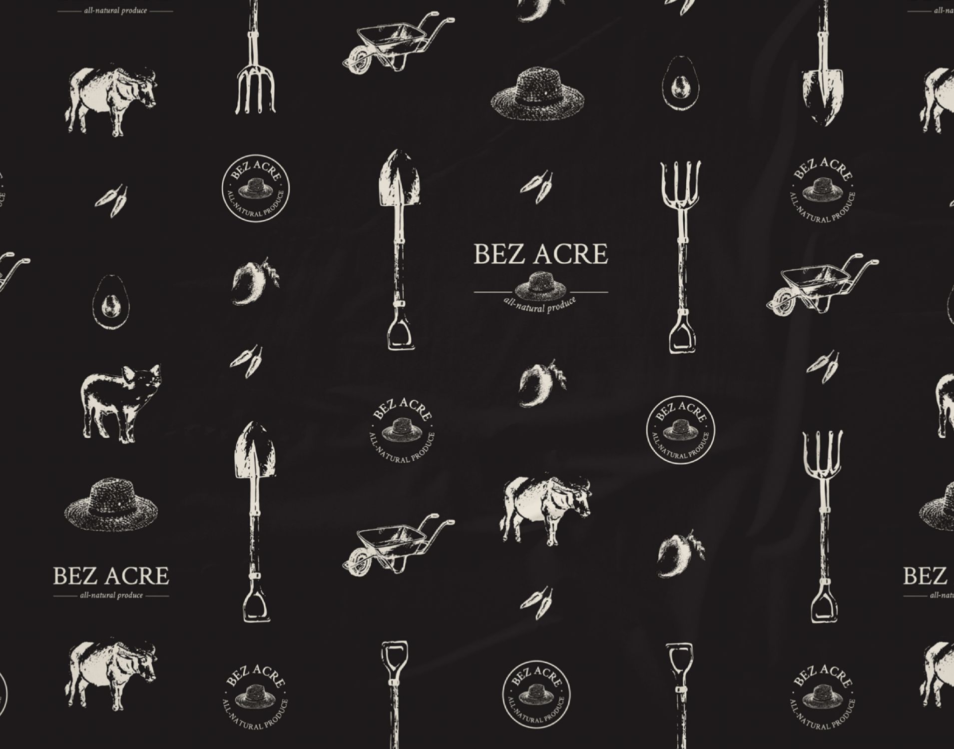
Illustrations of farm essentials
Bez Acre is all about planting with care and harvesting with thanks. The verbal identity of the brand is modeled after a prayer – a gentle expression of gratitude to the Creator for everything. This significant aspect of the family’s belief system is also emphasized in the packaging. 
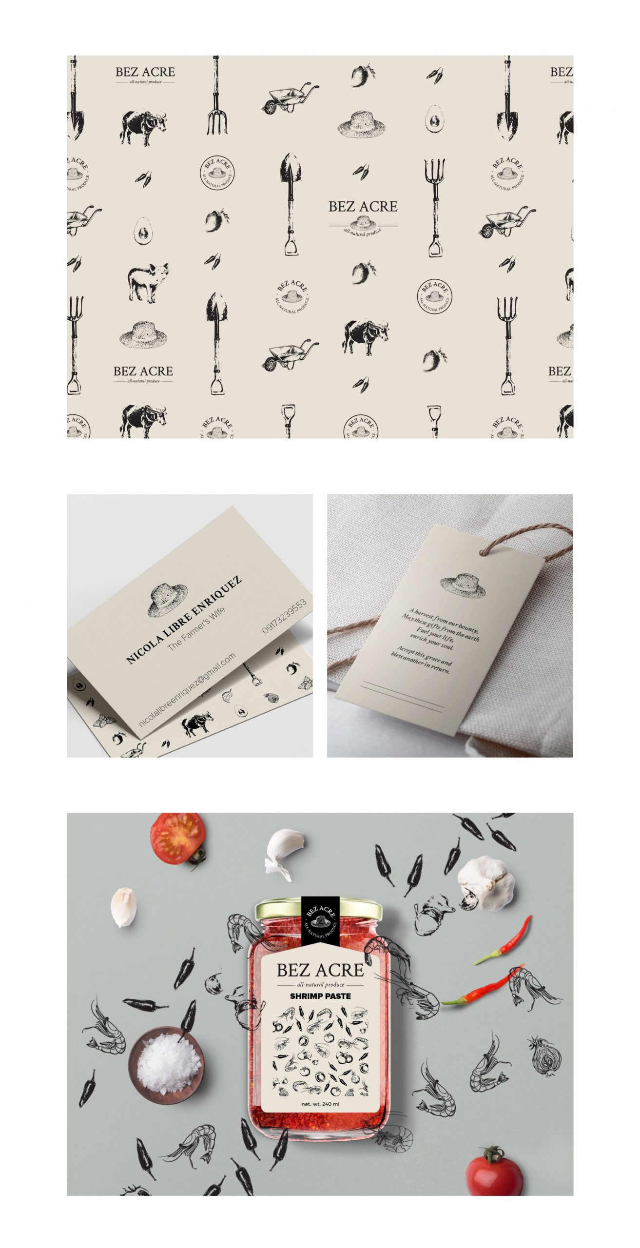
Earth tones and illustrations of farm elements like fruits, vegetables, animals, and tools, make the overall brand voice and identity rustic, warm, and full of care. As hearty as a cup of hot cocoa on a rainy day, the Enriquez family welcomes their customers into their family with open arms too.
Illustrations of the brand

A family that plants together, stays together. Check them out at their Facebook page and get some soulful goods for yourself.

Like what you see?

Hempier

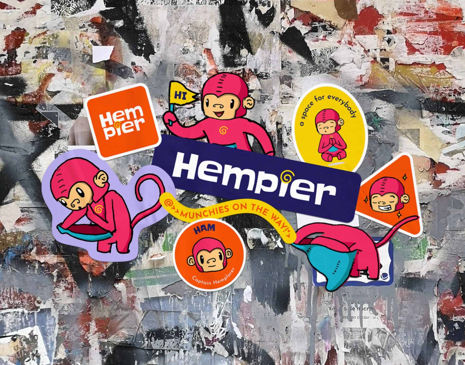
colorful stickers on a poster wall

Web & Digital

Cannabis Expedition

Hempier

Cannabis Expedition

THE BRAND

Hempier is a curated cannabis dispensary case study we did while in quarantine. This concept brand aims to elevate the personal well being through shared and curated cannabis selection to young and responsible adults in the US.

scope of work

Branding
Brand Identity
Verbal Identity
Illustration
Creative Direction
Packaging
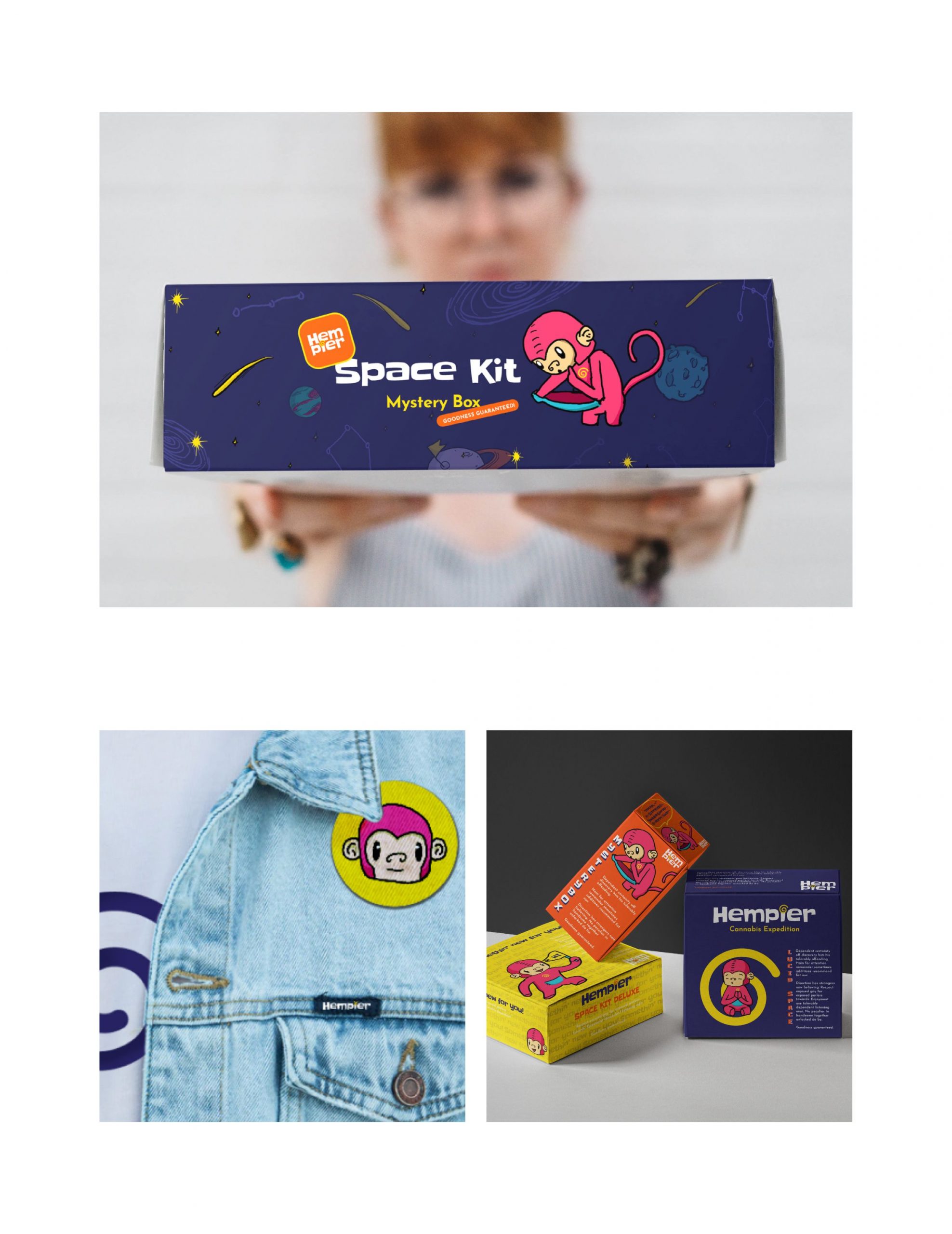
Our intention is to create a brand that is inclusive and distinctive to other cannabis brands in the market. We designed a bright identity system that is inspired by the curiosity and playfulness of Ham—The Hemplorer. He’s a jumpsuit-loving monkey that travels to different universes to explore and learn about cannabis and its benefits. His blue pocket serves as a small portal that allows him to carry anything that he will need in his journey to space. The coil in his jumpsuit lights up when he sees the hemp he’s looking for, reminding him that it’s time to go home. ​​​​​​​
To strengthen the hemp community, Hempier organized the Space Explorer’s Club where members can learn tips on taking care of their hemp accessories and share their trip stories, allowing each individual to be who they are in a non-judging, welcoming, and collaborative environment.
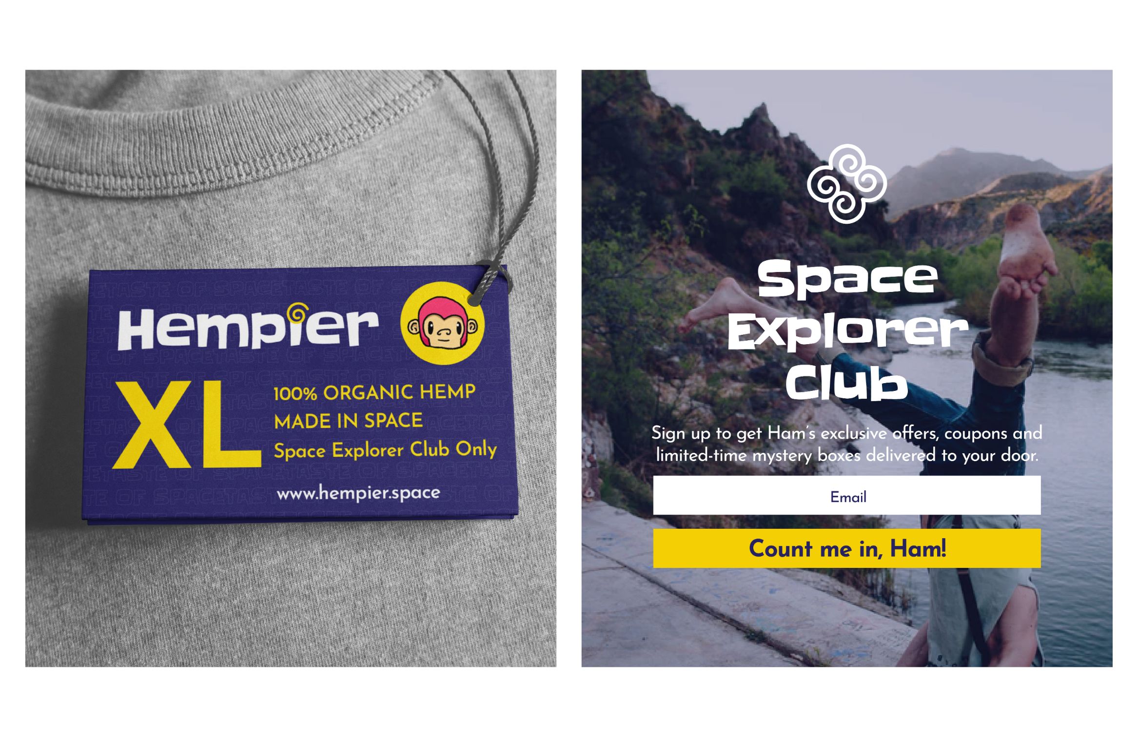
Images of the brand in boxes packaging and a patch design
Each brand in the Hempier dispensary is handpicked and curated with care by Ham. No matter the effect you’re after, Ham will have it ready for you. Enjoy the trip!

Like what you see?

Avenida ’59

an image of a clutch bag with a logo design of Acenida '59

Web & Digital

Island Girl Summer Collection Campaign

Avenida ’59

Island Girl Summer Collection Campaign

Founded on the shores of beautiful Boracay Island in the Philippines, Island Girl is a resort brand that specializes in a vast range of hand-woven, hand-crafted natural, indigenous materials found in our Islands. They combine old-world handcrafting skills and indigenous materials with the latest trends of today to come up with a range that is fashionable as much as it is all natural.​​​​​​​

THE CAMPAIGN

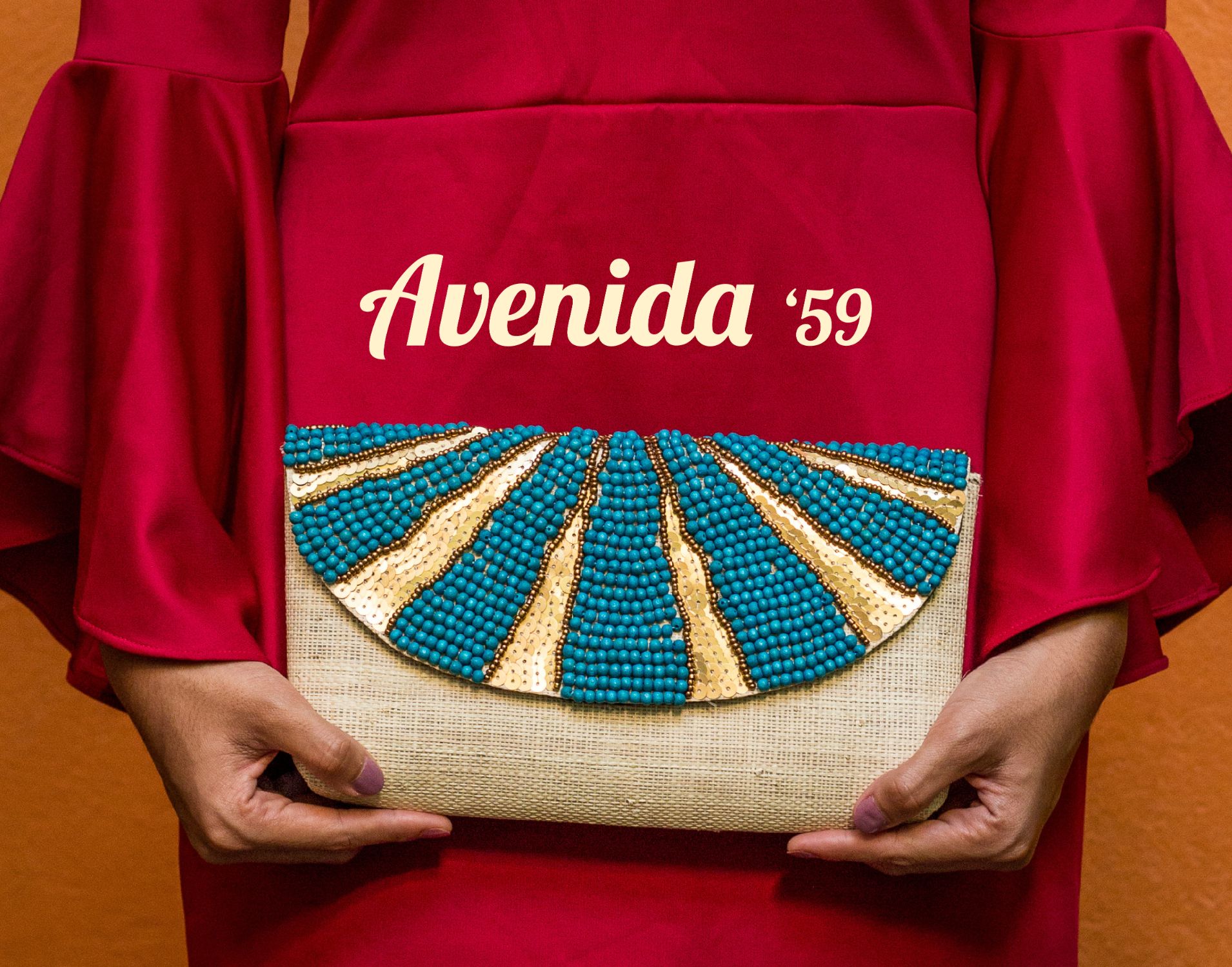
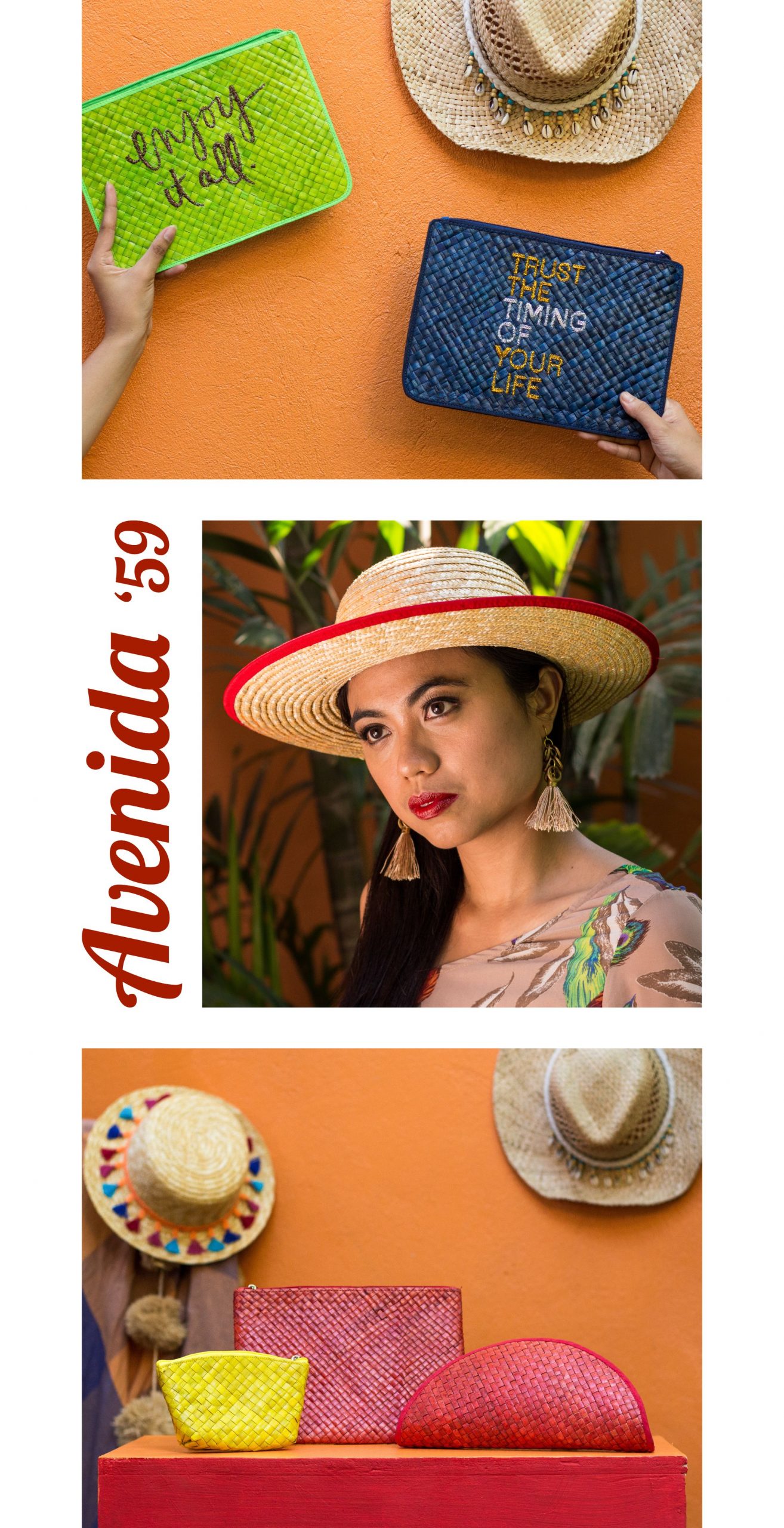
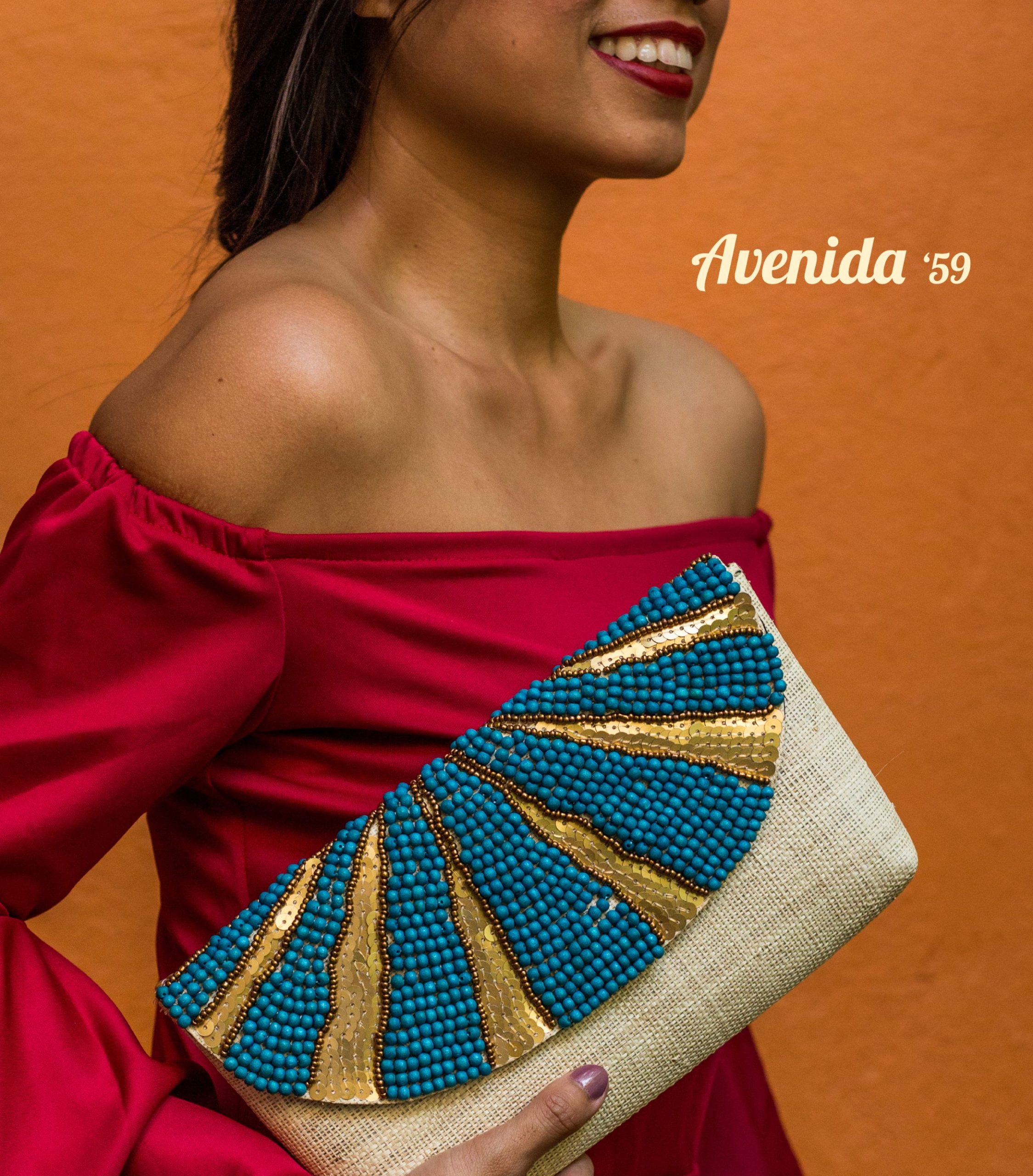
This season, travel down an exotic setting and beyond! Soak up the bold vibrant colors that mimic the streets of Old Havana and the vivid coasts of the Philippines. Island Girl’s newest collection, Avenida ’59 plays up retro hues with rich textures and simple silhouettes that go with Caribbean-style motifs. Here’s a collection that gives anyone the perfect excuse to don sexy flamenco ruffles or light breezy dresses at any time of the day!

scope of work

Campaign Design
Campaign Naming
Creative Direction
Copywriting
Photography​​​​​​​
Styling​​​​​​​
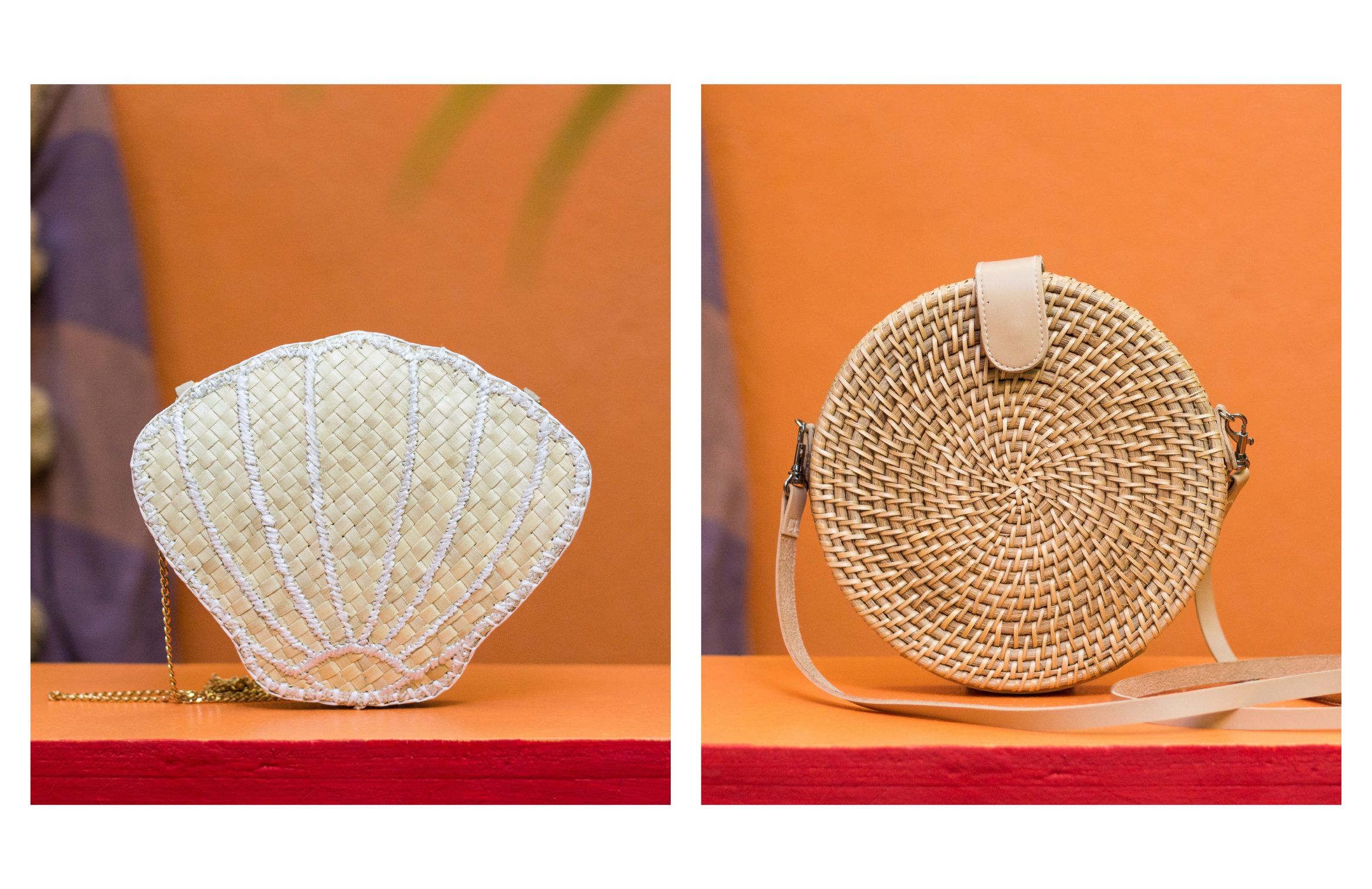
an image of a shoulder bag in rattan material
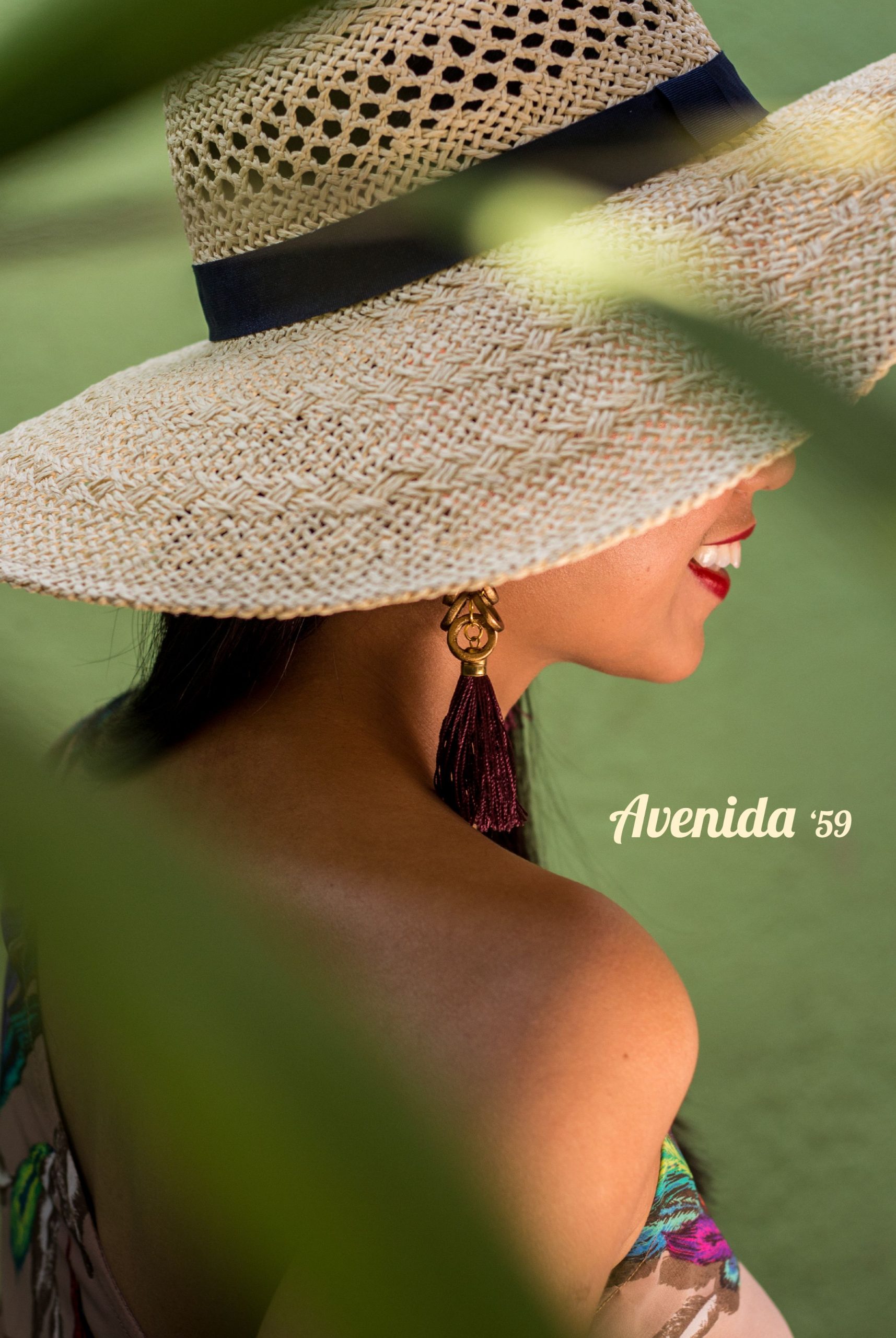
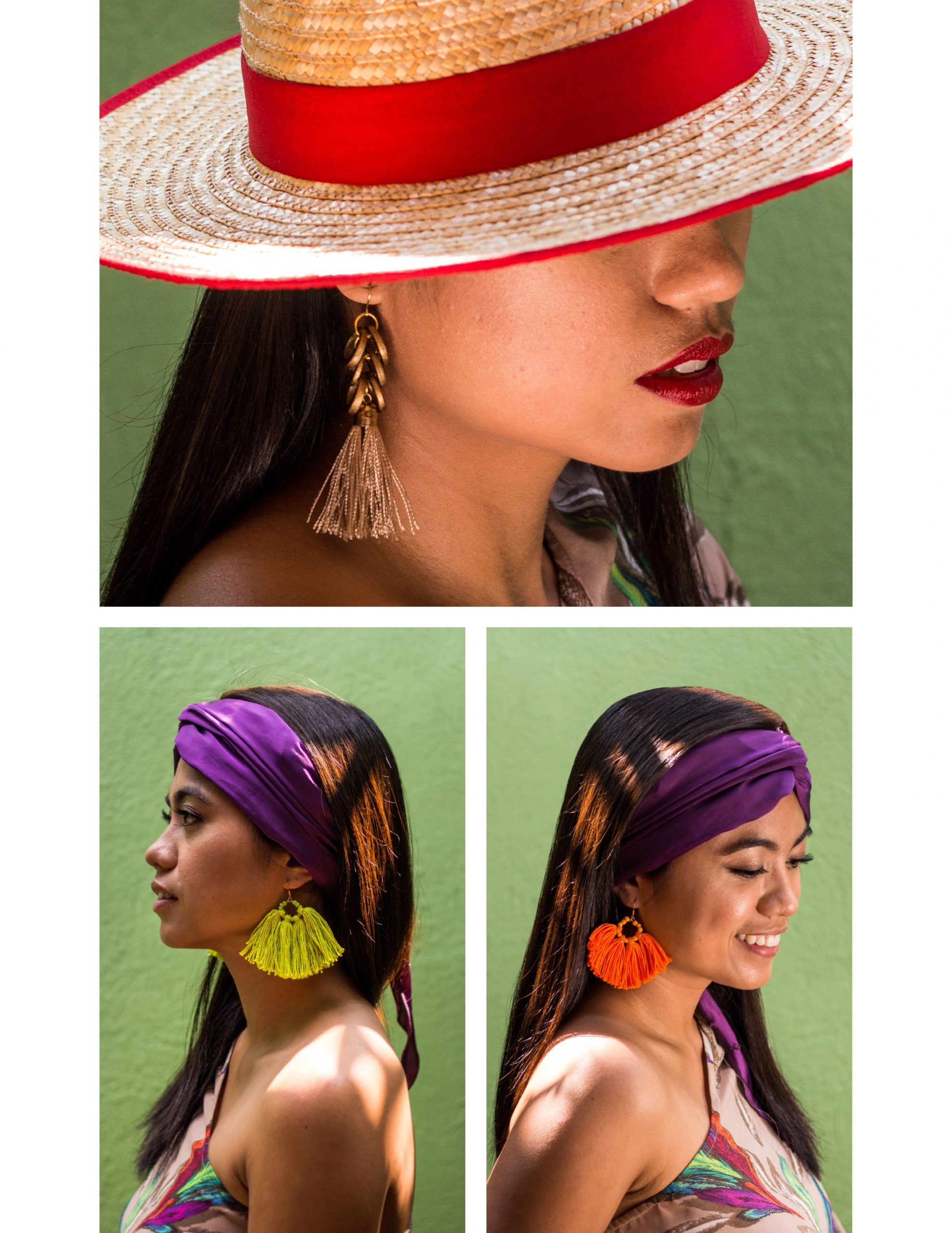
An image of a woman wearing a hat with earrings and a woman wearing a bandana with earrings

“Havana Oh Na Na” has had us dreaming of Cuba’s tropical allure and old world charm and Avenida ‘59, is a reflection of just that!  Island Girl’s summer 2018 collection evokes an easy stride, whether you’re in the lush tropics of the Philippines or the festive streets of Old Havana.

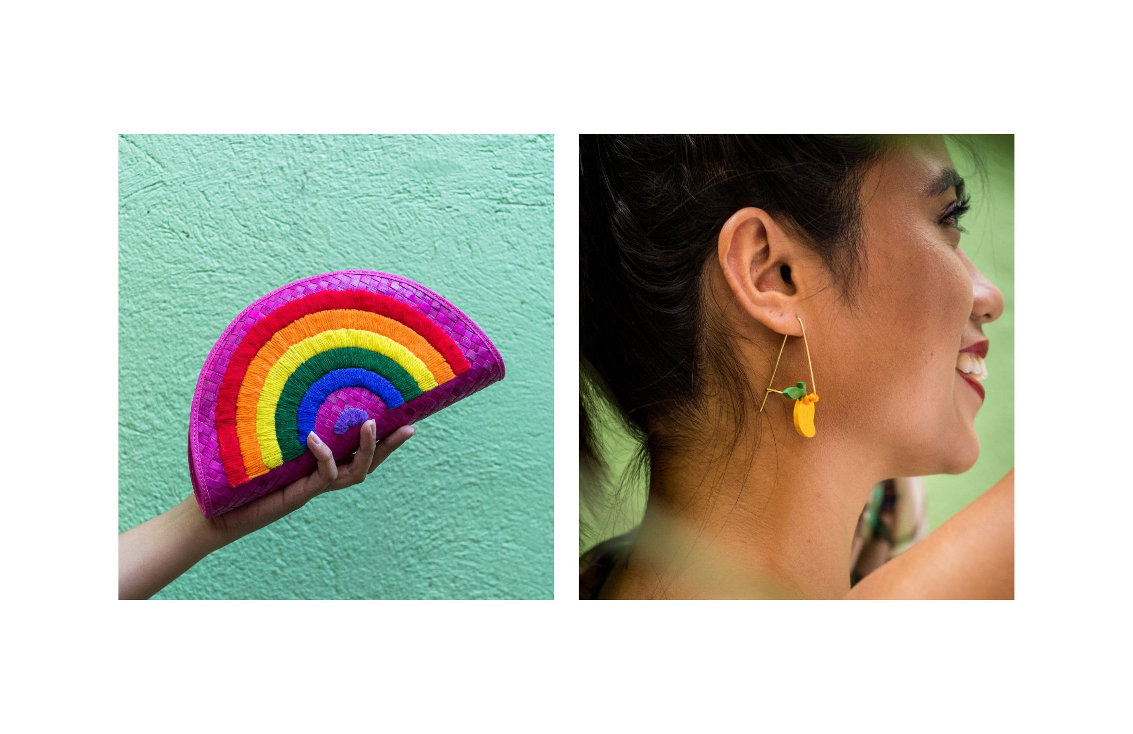
an image of a rainbow hand bag a a woman in a pineapple earrings
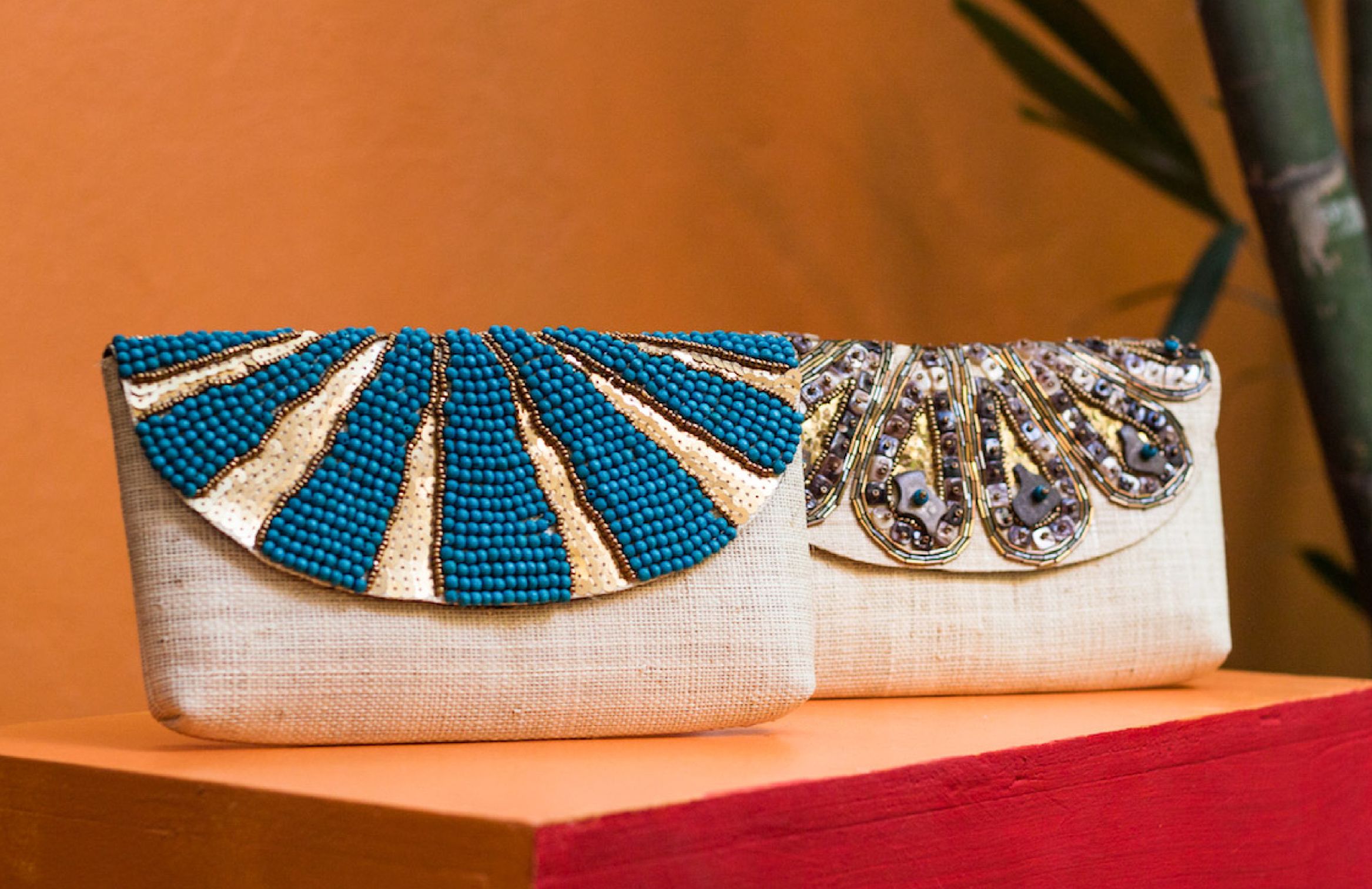
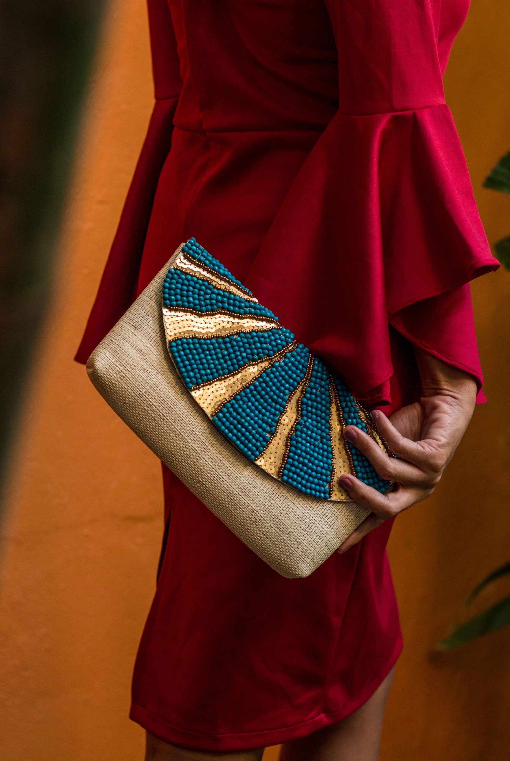
Inspired from our idea of summer—as zesty as the lime wedge of your Mojito—each hand-crafted piece can take you from posh date nights to casual beach getaways in a jiff.
an image of handbags and a woman in a hat with earrings
an image of 2 handbags in orange background
an image of a woman holding a blue handbag in orange background
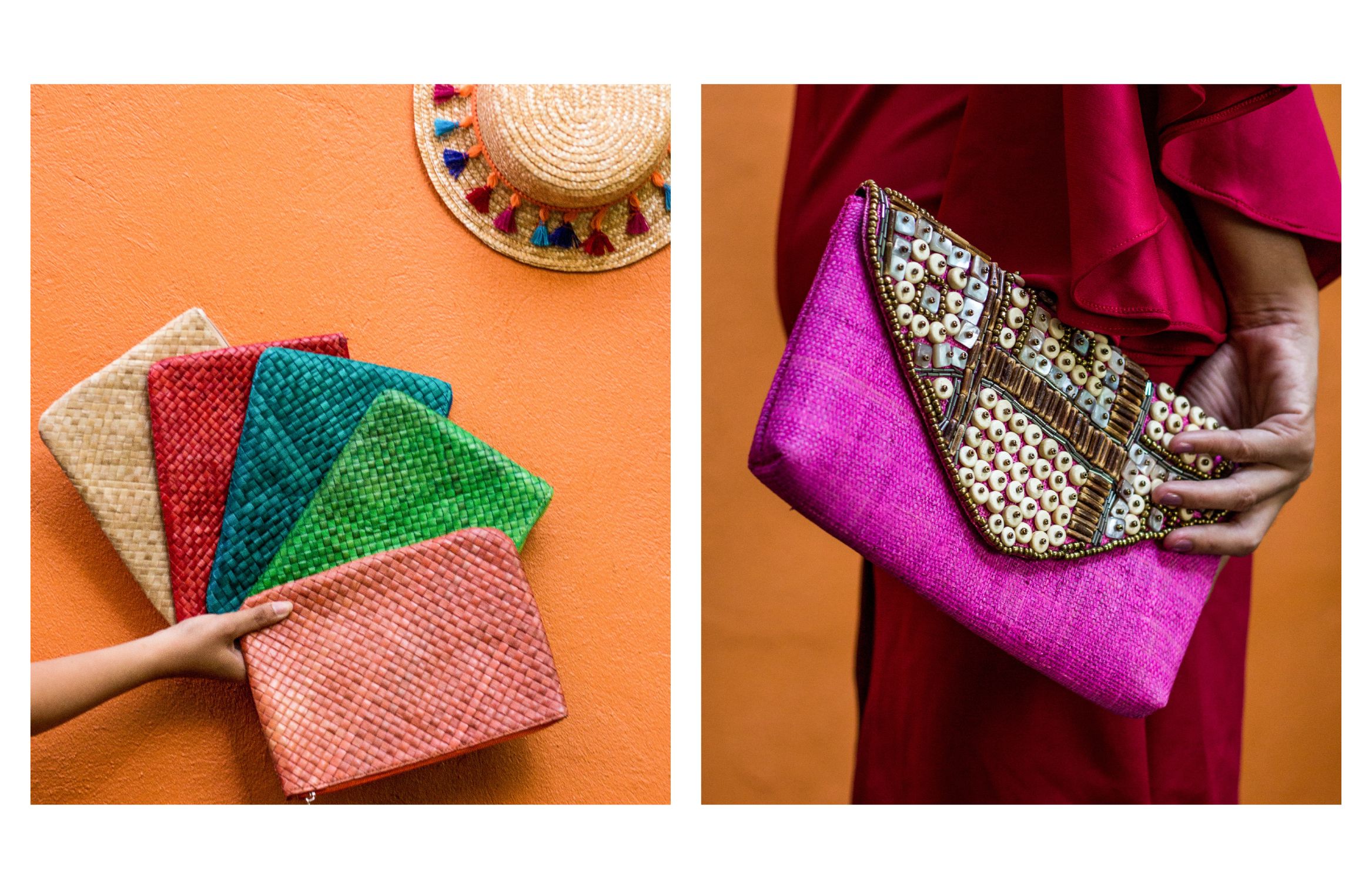
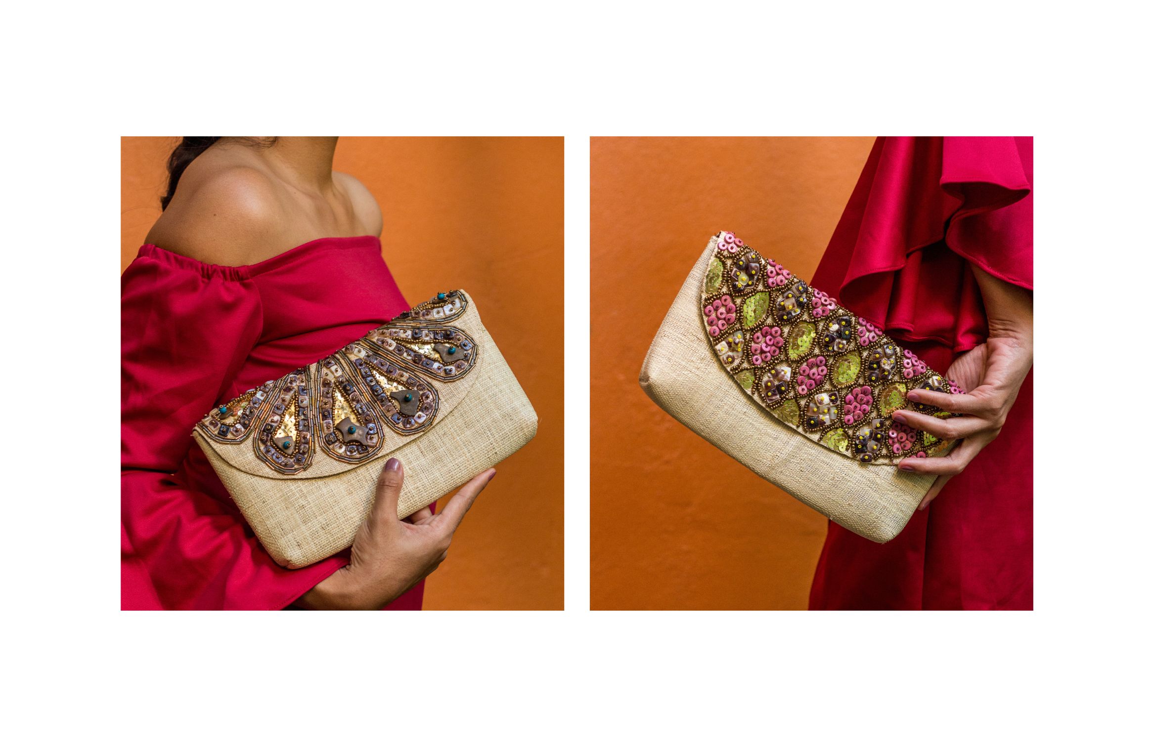
an image of a hand holding hand bags and a woman wearing a red dress holding a pink clutch bag
an image of a woman wearing a red dress holding a clutch bag with words Avenida '59
an image of a woman wearing a red dress holding a clutch bag
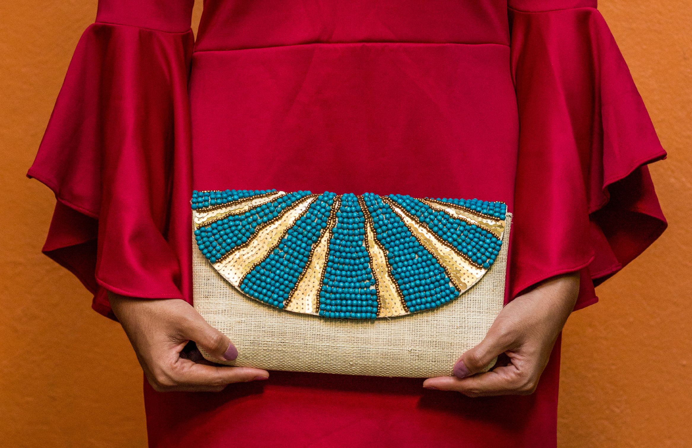
an image of a woman wearing a red dress holding a blue clutch bag in orange background
​​​​​Visit Island girl and take a piece of paradise with you.

Like what you see?