Talking Stories

Billboard image of a man in a motorcyle that says "Stories that bring people together"

Packaging

Strategy, positioning, brand identity, illustration, and brand manual for a premium audiovisual legacy storytelling service based in Brisbane, Australia.

Billboard image of a man in a motorcyle that says "Stories that bring people together"

Talking Stories

Breathing life into your memories

SCOPE OF WORK
Brand Strategy and Positioning
Brand Identity
Branding
Illustration
Key Visuals
Brand Manual
Creative Direction
INTRODUCTION

Talking Stories, a premium legacy storytelling service based in Brisbane Australia, sought to establish a brand identity that authentically reflected its core mission: to preserve and share personal narratives for future generations.

To bring this vision to life, the brand needed a visual language that exuded timelessness and a deep sense of empathy that speaks to individuals who cherish their heritage and aspire to leave a meaningful legacy, blending sophistication with the heartfelt promise of preserving life’s most precious moments.

an image of macbook with 2 people in it
Man Holding iPhone

We embarked on a branding journey that highlights intentionality, and timelessness, mirroring the very essence of Talking Stories. Every design element was meticulously chosen to evoke a sense of enduring legacy and profound personal connection.

The new identity introduces a symbol, wordmark, color palette, illustrations, and imagery style that help define the brand as both relatable, as well as trusted and established.

The symbol, depicting two figures interwoven in conversation, speaks to oral history’s intimate and personal nature. This minimalist yet evocative design allows versatility, with full and stacked wordmark variations providing flexibility across multiple applications. The independent use of the storytelling symbol as a recurring motif further strengthens brand recognition and subtly reinforces the brand’s core offering.

The selection of Caudex Regular as the primary typeface, with its classic elegance and subtle historical undertones, immediately established a sense of timelessness. The consistent use of title case for the wordmark further reinforced a sense of formality and respect for the stories being told. This typographic choice, coupled with considered tracking, created a visual rhythm that is both calming and engaging, inviting the audience to delve into the narratives.

The carefully curated color palette of Midnight Green, Hunyadi Yellow, and Seal Brown evokes a sense of nostalgia and warmth reminiscent of treasured family albums and heirlooms passed down through generations. Midnight Green, as the primary color, provides a grounding and sophisticated backdrop, symbolizing the depth and richness of personal histories. Hunyadi Yellow, used sparingly as a highlight color, adds a touch of vibrancy and optimism, hinting at the inspirational power of shared stories. With its earthy tones, Seal Brown further anchors the brand in a sense of heritage and enduring legacy.

High-quality, evocative imagery plays a crucial role in communicating the emotional resonance of Talking Stories. By prioritizing photographs that capture genuine human connection and moments of reflection, the brand visually reinforces its commitment to authenticity.

The illustrations, characterized by a modern and human style with simple lines, depict universal human experiences and memorable moments. This approach ensures that the visuals are not merely decorative but actively contribute to storytelling.

A clean, minimalist design aesthetic permeates all brand collateral, allowing the stories to take center stage. This approach avoids unnecessary distractions and ensures that the focus remains on the content’s profound nature. The cohesive visual language, from logo and typography to color palette and imagery, creates an elegant and inviting brand experience.

Billboard image of a man in a motorcyle that says "Stories that bring people together"

Their new identity captures Talking Stories’ essence and builds on memories with a timeless look and feel that speaks to people of all ages, cultures, and backgrounds. By visually embodying the values of authenticity and empathy, the brand invites individuals to embark on a journey of self-discovery and connection, ensuring that their stories live on for generations to come

"I was impressed by their work and deliverables. They were prompt, and I'm really impressed with the assets."

Special Thanks

Case study write-up by Dale Jo
Photos by Navin Sam Regi

Share
Facebook
Email
LinkedIn

Like what you see?

Hemera Spa Lounge

box packaging for Hemera Spa Lounge.

Packaging

Your Wellness Escape

Hemera Spa Lounge

Your Wellness Escape

THE BRAND

Positioning itself to be the ultimate wellness destination, Hemera promotes accessible luxury, signature services, and an overall experience of warmth and comfort. Their goal is to give your weary spirit a glow-up you never thought you needed.

scope of work

Naming
Brand Identity
Print Design
Verbal Identity

ACCOLADE

ASEAN-KOREA Excellent Design Semi-finalists

‘Hemera’ came about when we played around with the idea of clients as royals taking a break from their queenly and kingly duties. Hemera is the goddess of daytime or the sun, a symbol for energy and vitality, which what the brand is all about – a place to relax, rejuvenate, and pamper oneself.

Images of a marble top, ocean see and gold dust from above
The identity is inspired by lightness and fluidity. As its namesake stands for life, the brand encourages a lifestyle of wellness and skincare through creating novel relaxation experiences unique to them.
Image of the brand logo on a glass wall
Brand application on calling card, envelope, and letterform
Brand logo on menu design and calling card
It was a natural progression to use the sun as the emblem of the logo, which denotes strength and good energy. We paired it with a sleek sans-serif font for sophistication and professionalism. The color landscape is composed of earth tones with a more quiet shade of yellow to maintain the brand’s position of being gender-neutral.
Image of the Brand Illustration on a box
The product packaging adapted a sophisticated design to continue the narrative of Hemera being a premium brand, because first impressions are very important. Clients are treated to a very personalized experience, as they can test out the oils prior to using them and choose what they like best. 
Brand application of the logo on a business card

Like what you see?

Eckers

An image of a logo of the brand on top of the colorful illustrations of fruits

Packaging

Just The Good Juice

Eckers

Just The Good Juice

THE BRAND

Eckers is a native fruit juice bar that glorifies the natural flavors of fruits by not using preservatives or additives. Eckergenis Elnar, the man behind Eckers, is a self-confessed foodie and jetsetter who always pairs his snacks with juice.

scope of work

Branding
Brand identity
Packaging design
Space design
Illustration
Creative consultancy

Special thanks to

Photography by Zack Aldave
Logo of the brand in orange hues
The basis of the product, which was fruits, inspired the direction of the brand identity. The color palette is very bright and happy to match the vibrancy of citrus fruits. 
Illustrations of fruits in line art and vector art
An image of a logo of the brand on top of the colorful illustrations of fruits
The basis of the product, which was fruits, inspired the direction of the brand identity. The color palette is very bright and happy to match the vibrancy of citrus fruits. 
Images of Illustration of fruits, Tshirt design, poster design and product design
What started as a family business with his kids making the recipes and mixing the juices now has grown into a full-fledged business. In the span of 3 years, they already have a warehouse and 5 kiosks around Cebu and 1 kiosk in Cagayan de Oro, PH.
An image of a rectangular signage with light in the background
Images of the Kiosk, menu design, cups and products of the brand
Quench your thirst with healthy drinks from Eckers. Check out their Facebook page.

Like what you see?

Ooh!Mami

images of the brands menu design, calling card and food packaging

Packaging

Ooh!maapaw sa sarap!

Ooh!Mami

Ooh!maapaw sa sarap!

THE BRAND

Mix street food with a pinch of Asian fusion, and you get Ooh! Mami, a hole-in-the-wall restaurant that serves Filipino comfort food. Their goal is for their diners to have a dining experience that is both affordable and enjoyable, wrapped in a nicely branded package.

scope of work

Branding
Brand Identity
Illustration
Creative Direction

SPECIAL THANKS

Food Photography by Zack Aldave
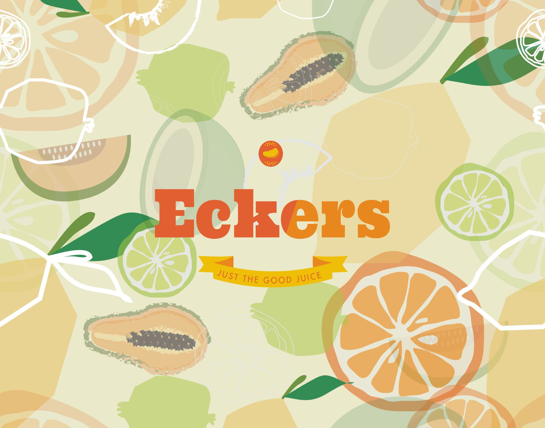
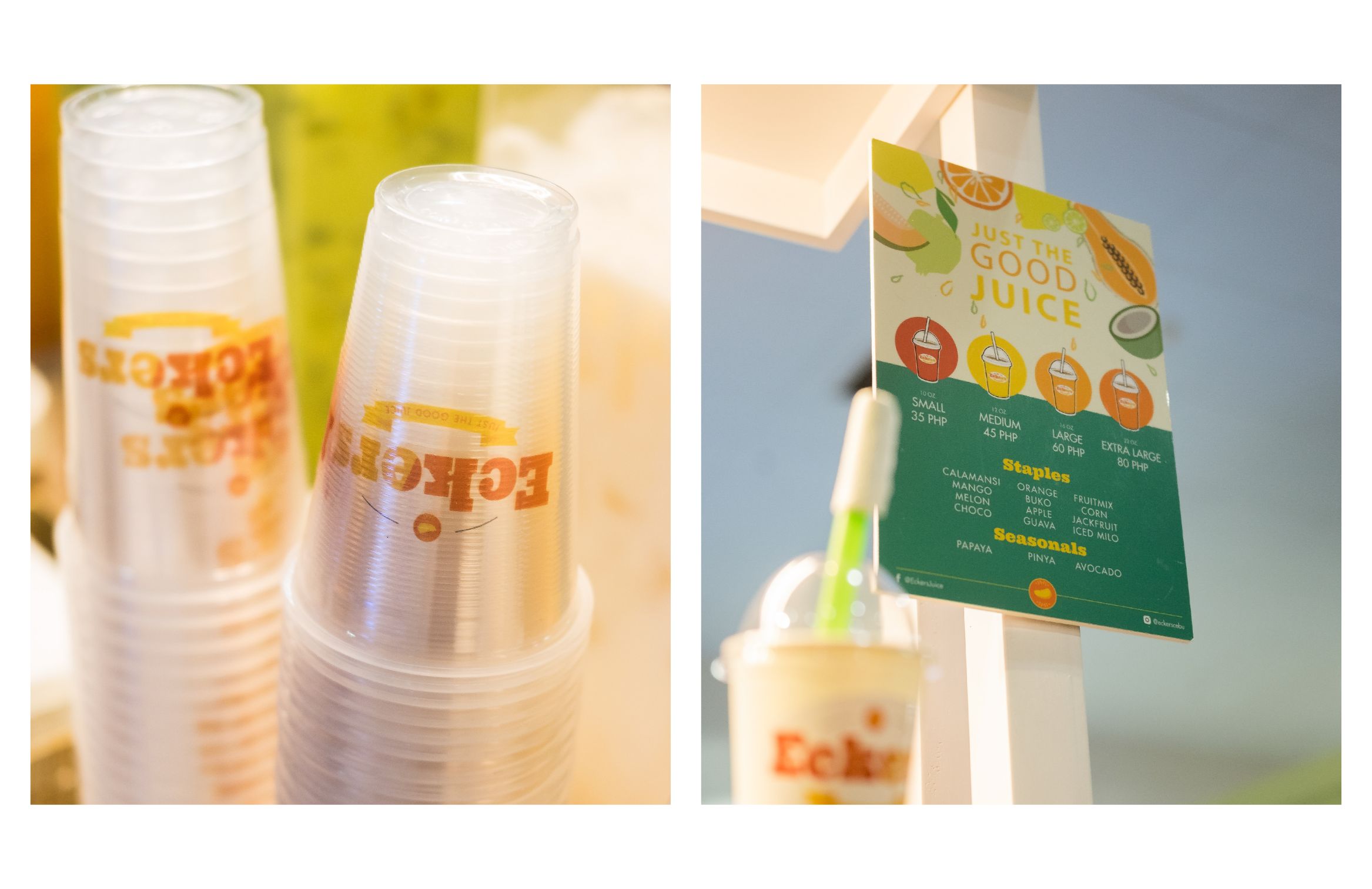
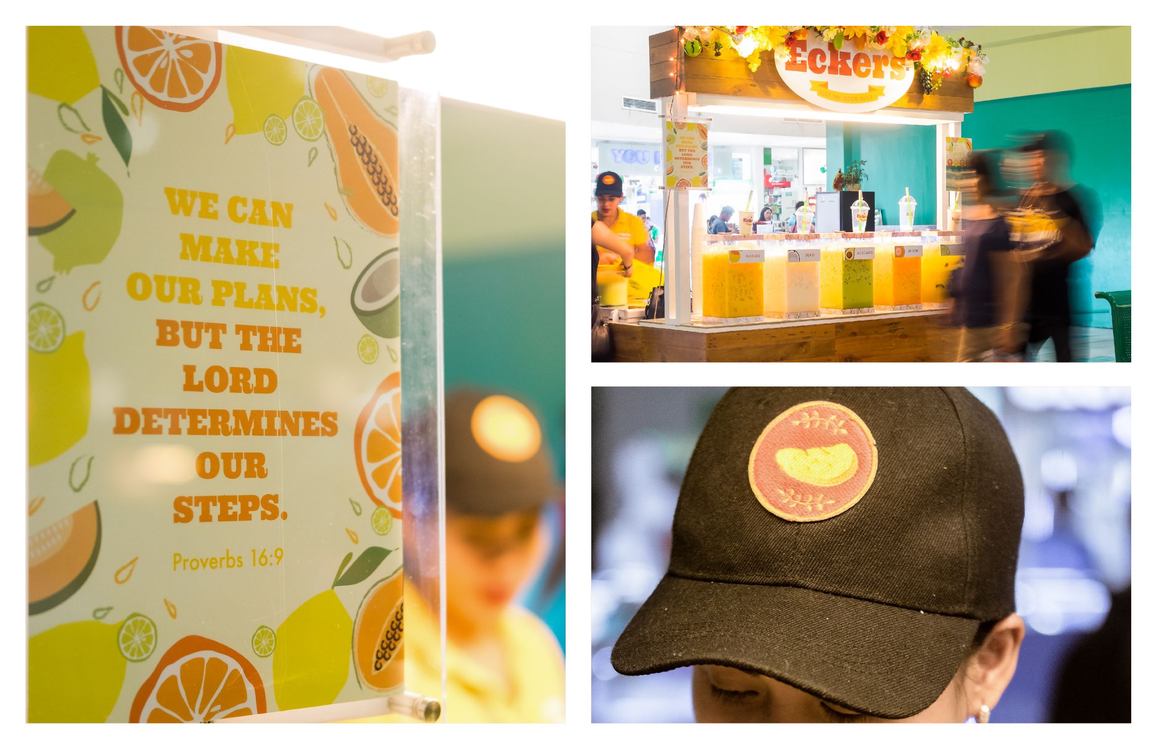
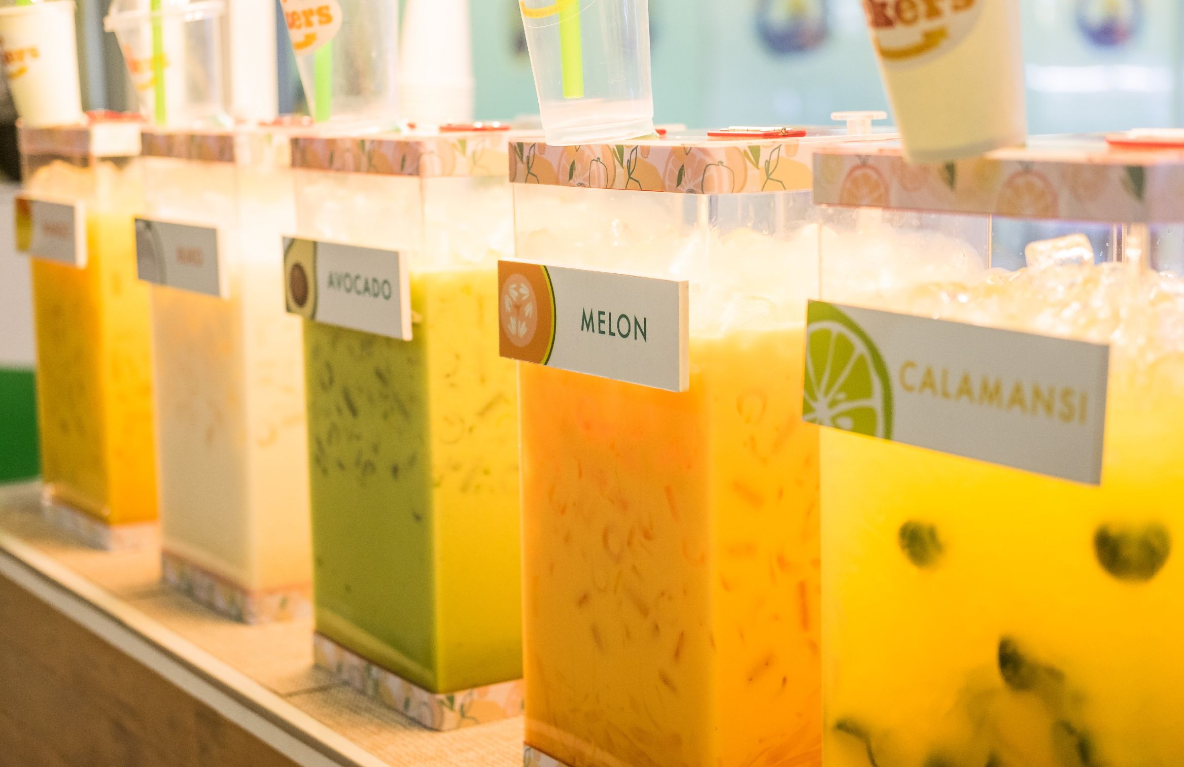
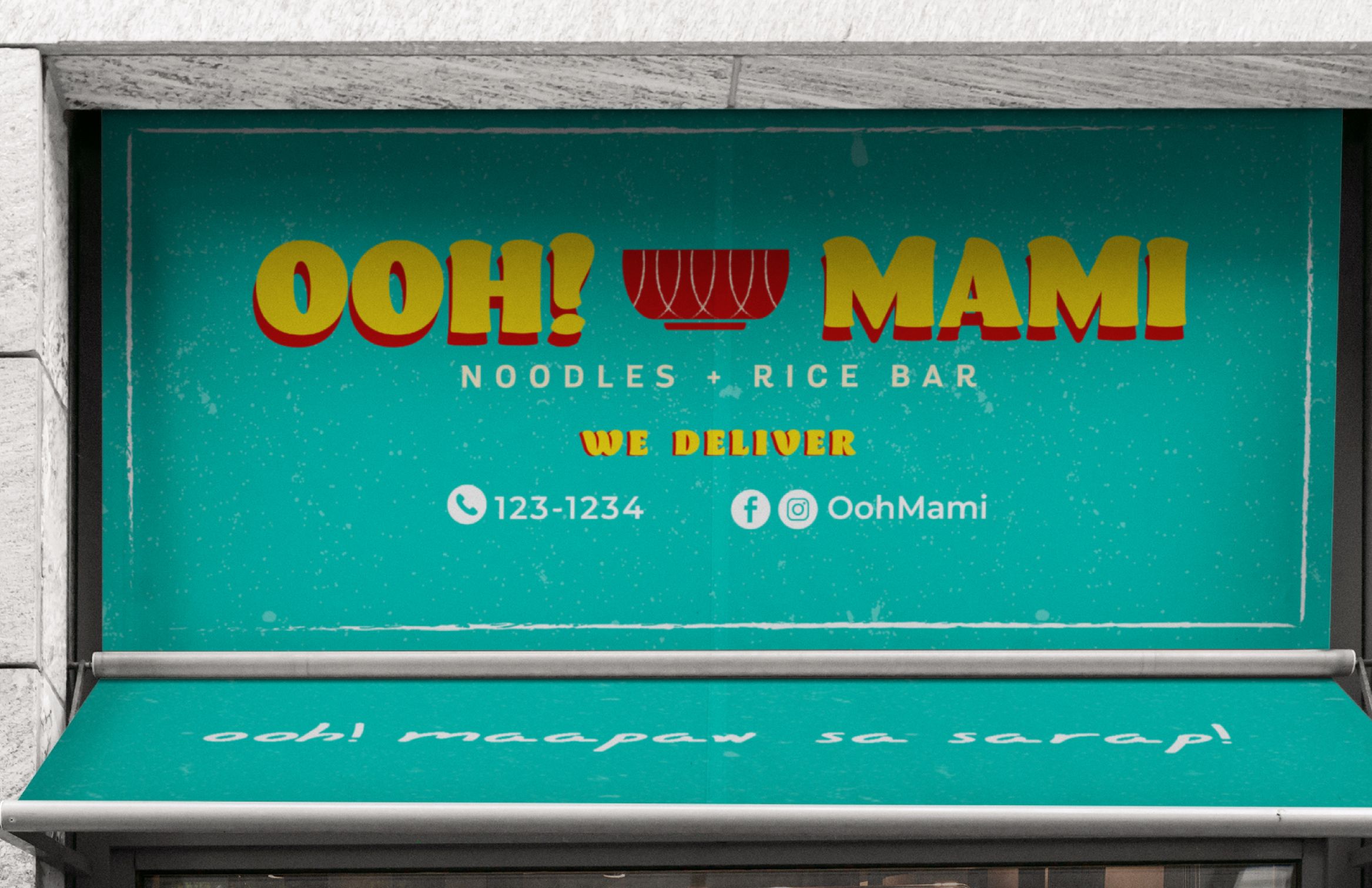
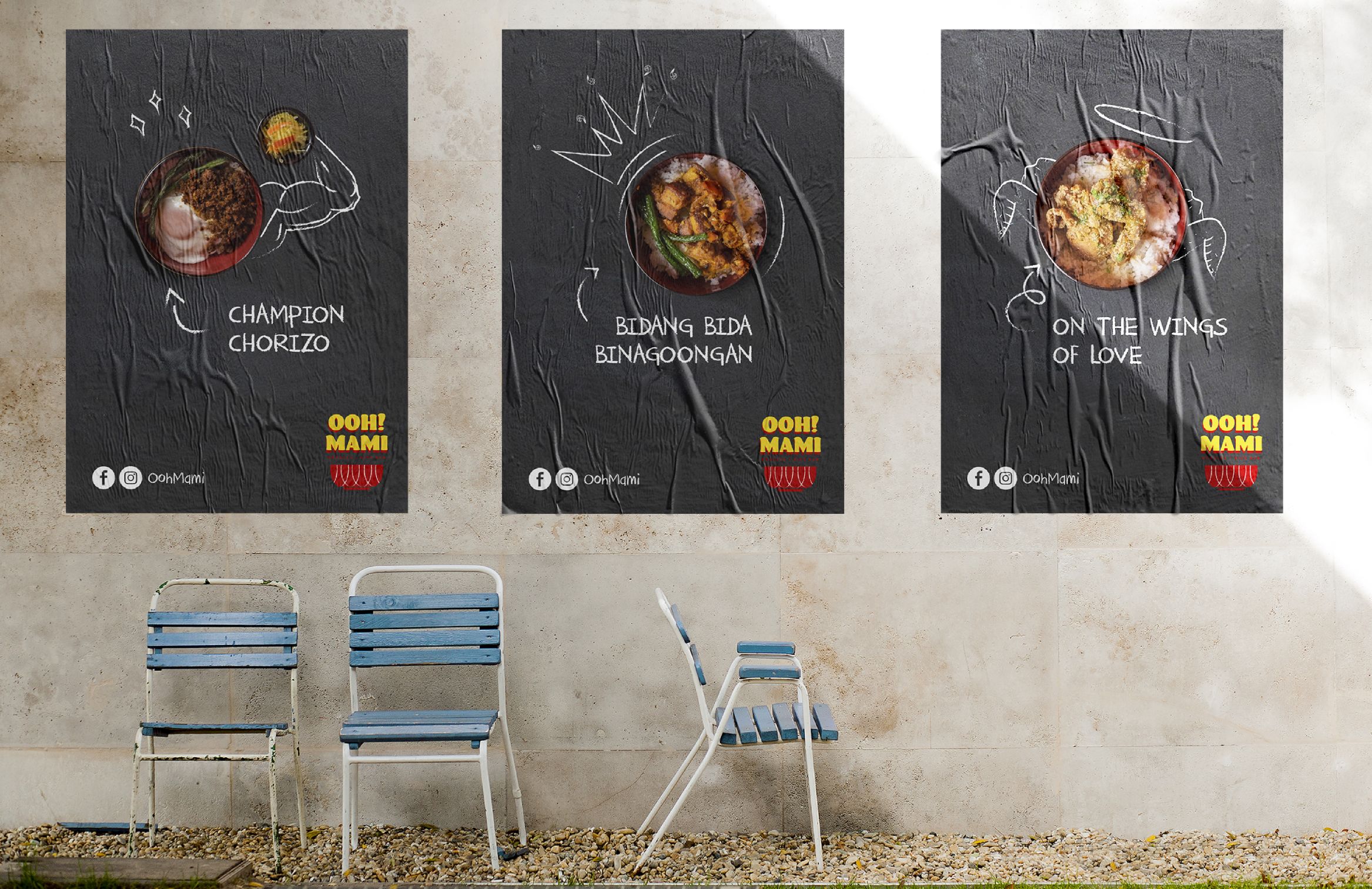
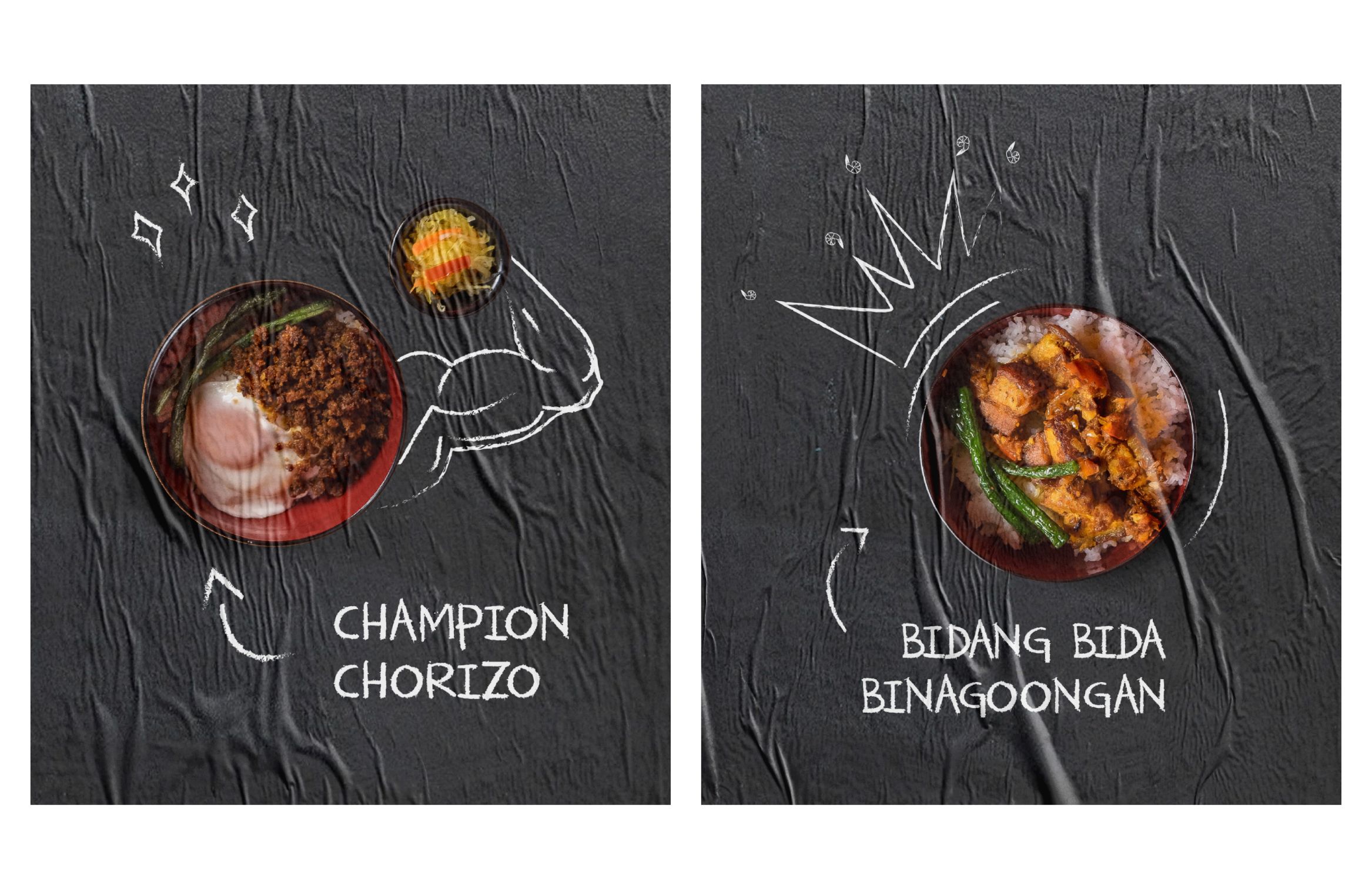
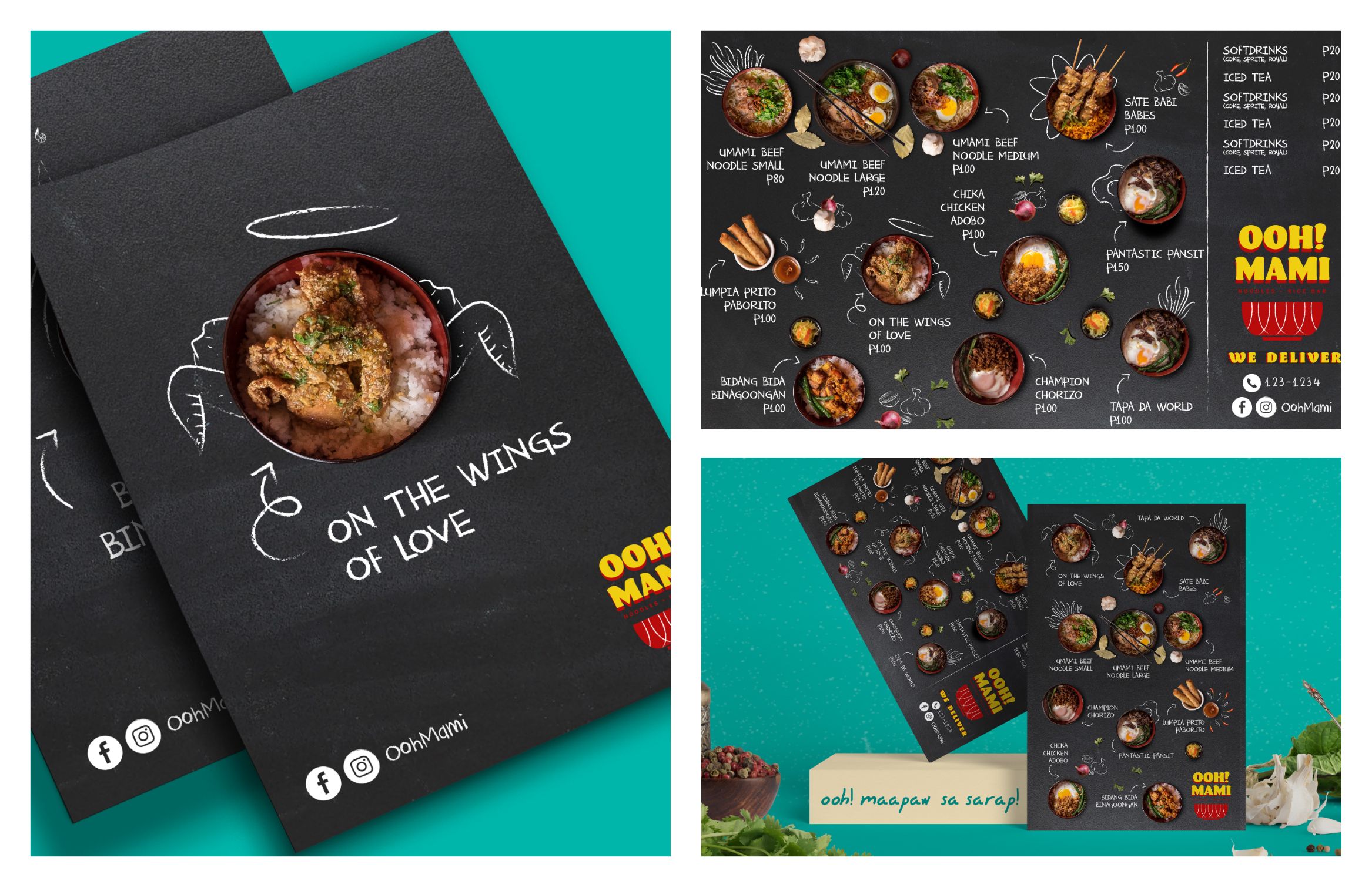
The colors are inspired by Filipino sorbetes and the font is reminiscent of the typography on street carts and jeepneys. 
 
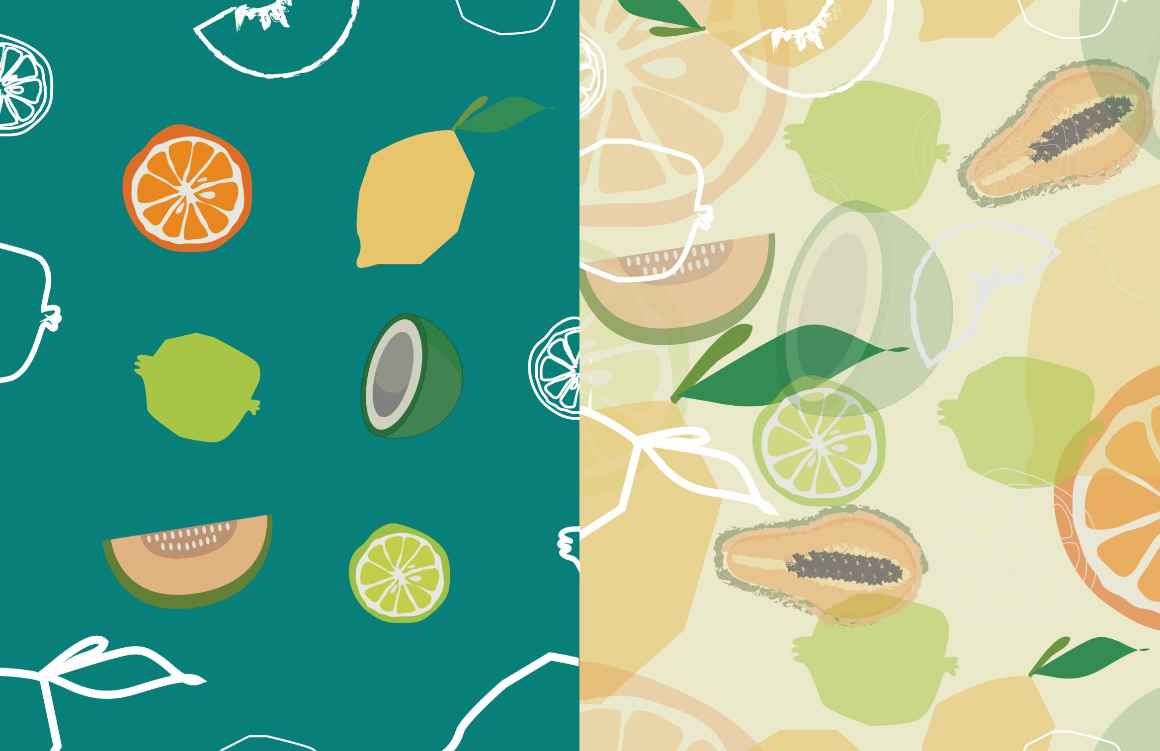
We had to look back on our own experiences as kids, like what Filipino shows we’d watch and the different colors we’d see on the streets where we used to play.
​​​​​​​
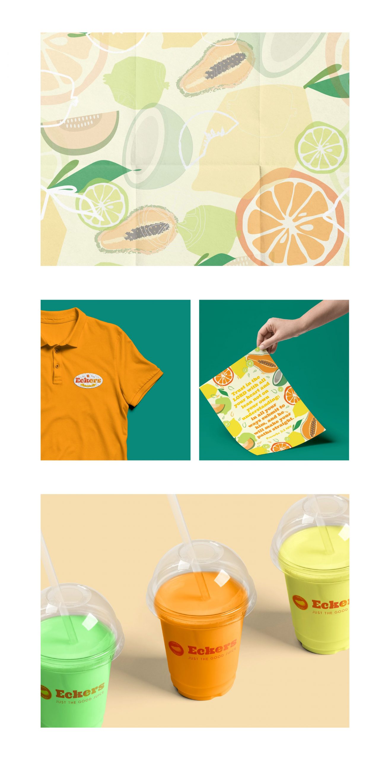
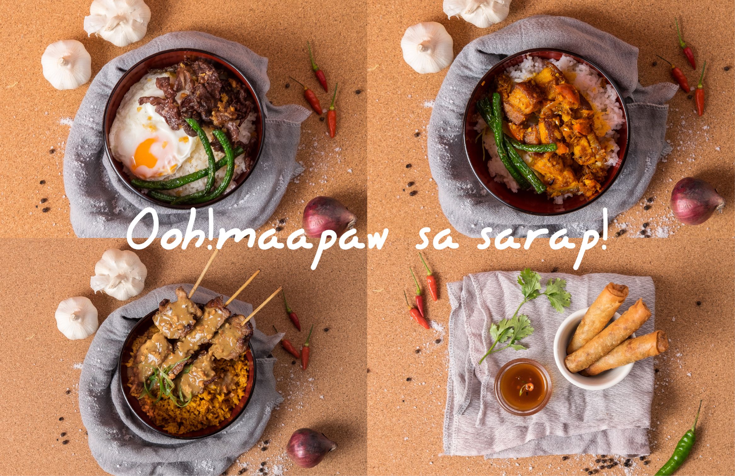
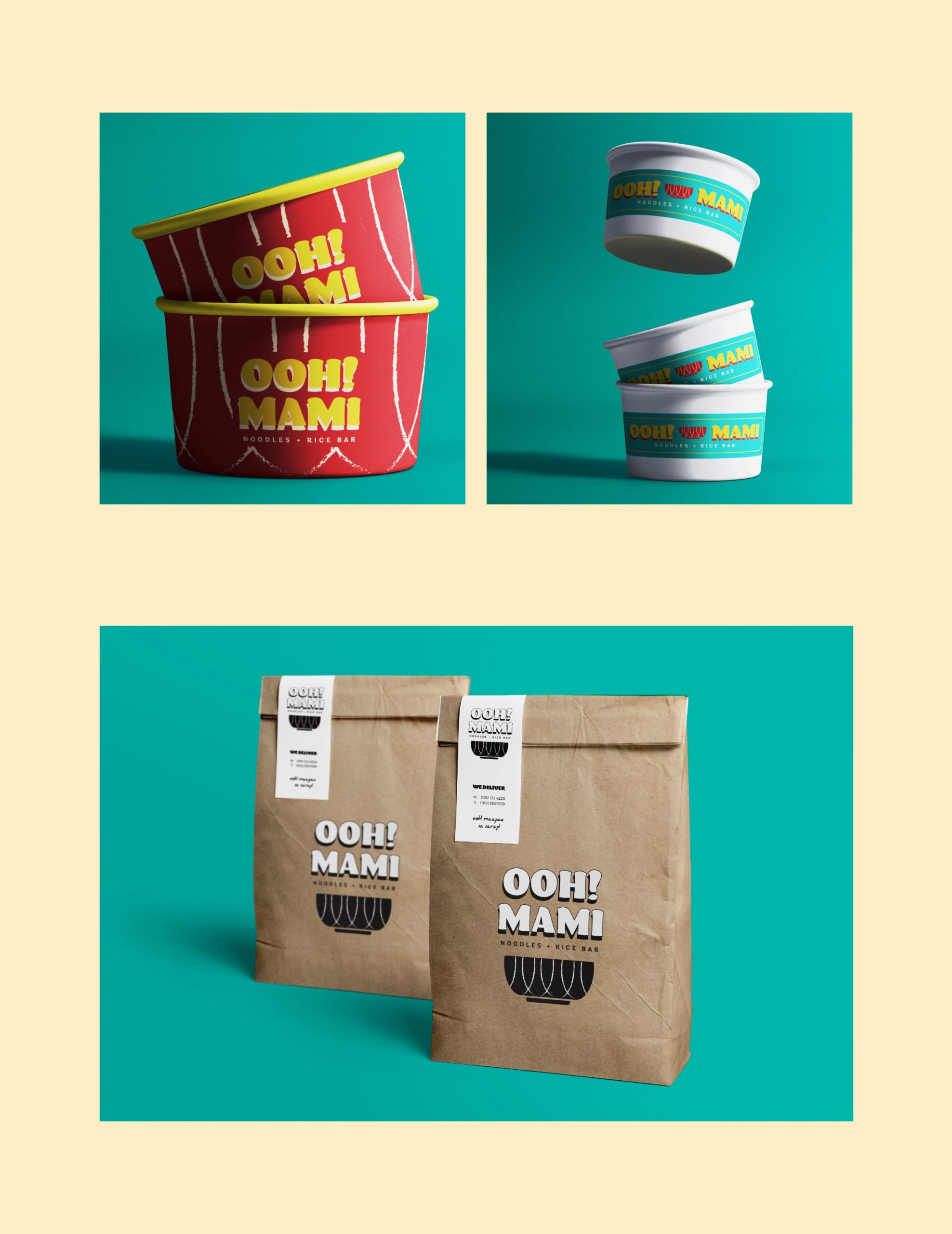
The overall feel is fun and casual.
images of the brands menu design, calling card and food packaging
Image of the store sign

The bowl had a lot of significance in our approach to food styling and in the essence of the restaurant itself. The food would be served in a bowl because of its convenience. You could enjoy your food standing up, with or without sauce or soup. The design of the bowl is simple with a hint of elegance to keep it functional and looking nice.

Images of the Asian food in a bowl
Images of the Food packaging in bowl and take out bahs
Stylized photo of Asian food in a bowl

Overall, the concept of the restaurant, which also drove the branding direction, was very much rooted in the richness of the Filipino culture. It was important that the language and look be consistently relatable, so the dish names had a little twist to keep it light and quirky. The illustrations are doodles on a chalkboard, as inspired by the idea to leave room for imagination and discovery.

Images of poster design pasted on a wall with 3 chairs
Poster design of the brand with Filipino food puns
Images of menu design of the brand

Like what you see?