Strategy, positioning, brand identity, illustration, and brand manual for a premium audiovisual legacy storytelling service based in Brisbane, Australia.
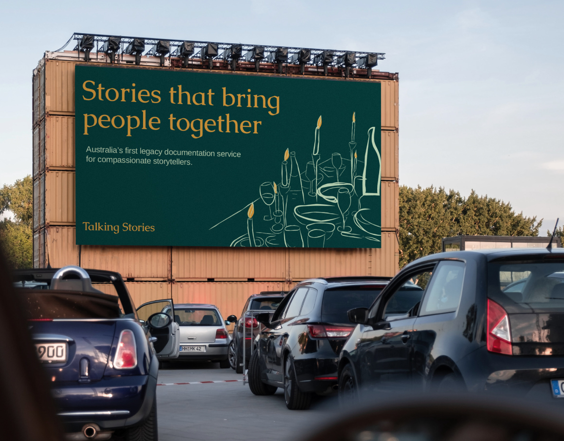
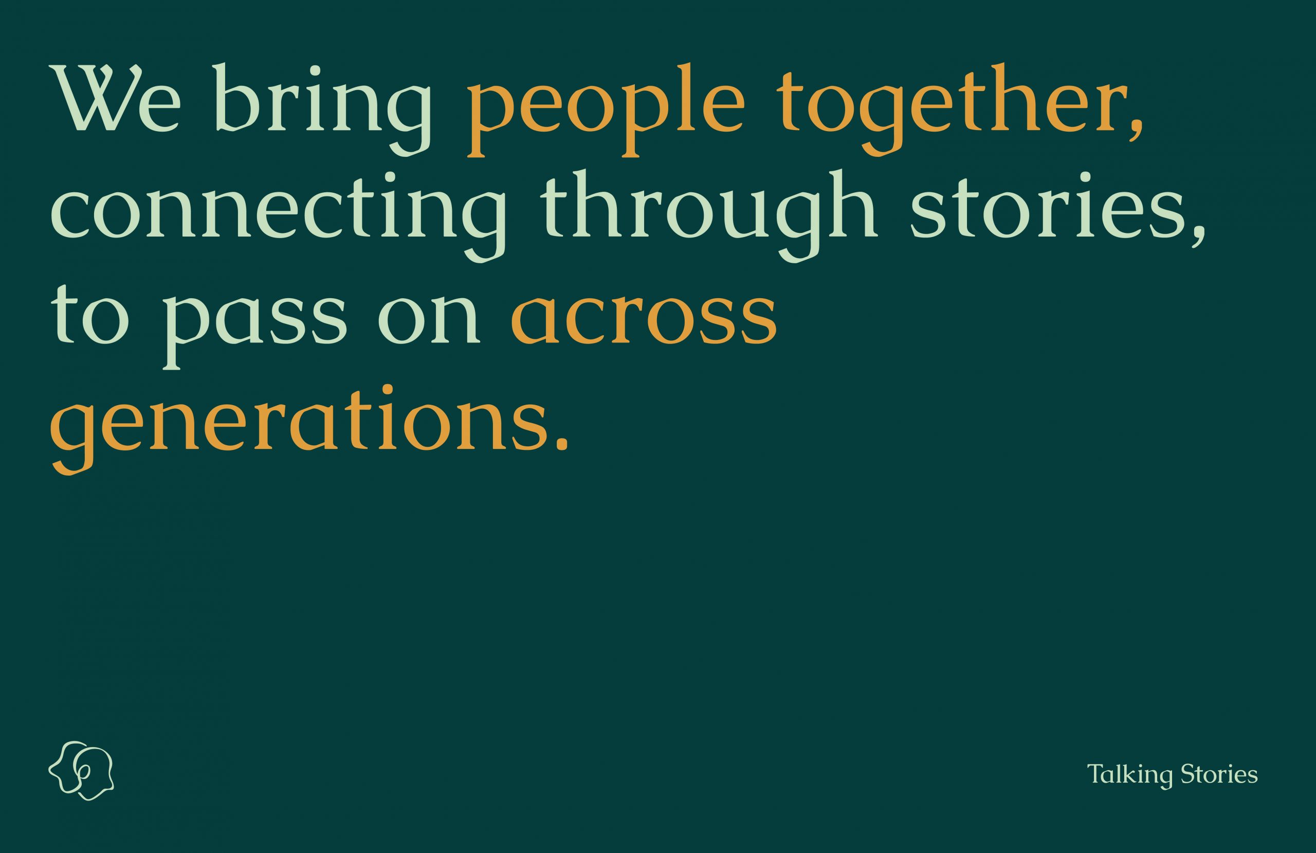
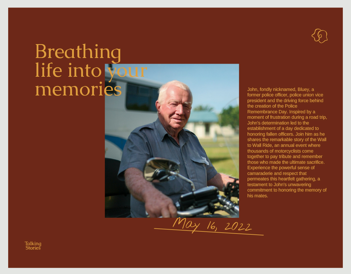
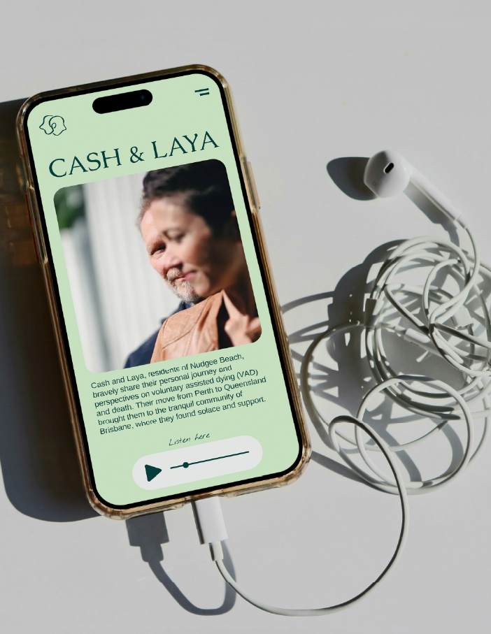
Talking Stories
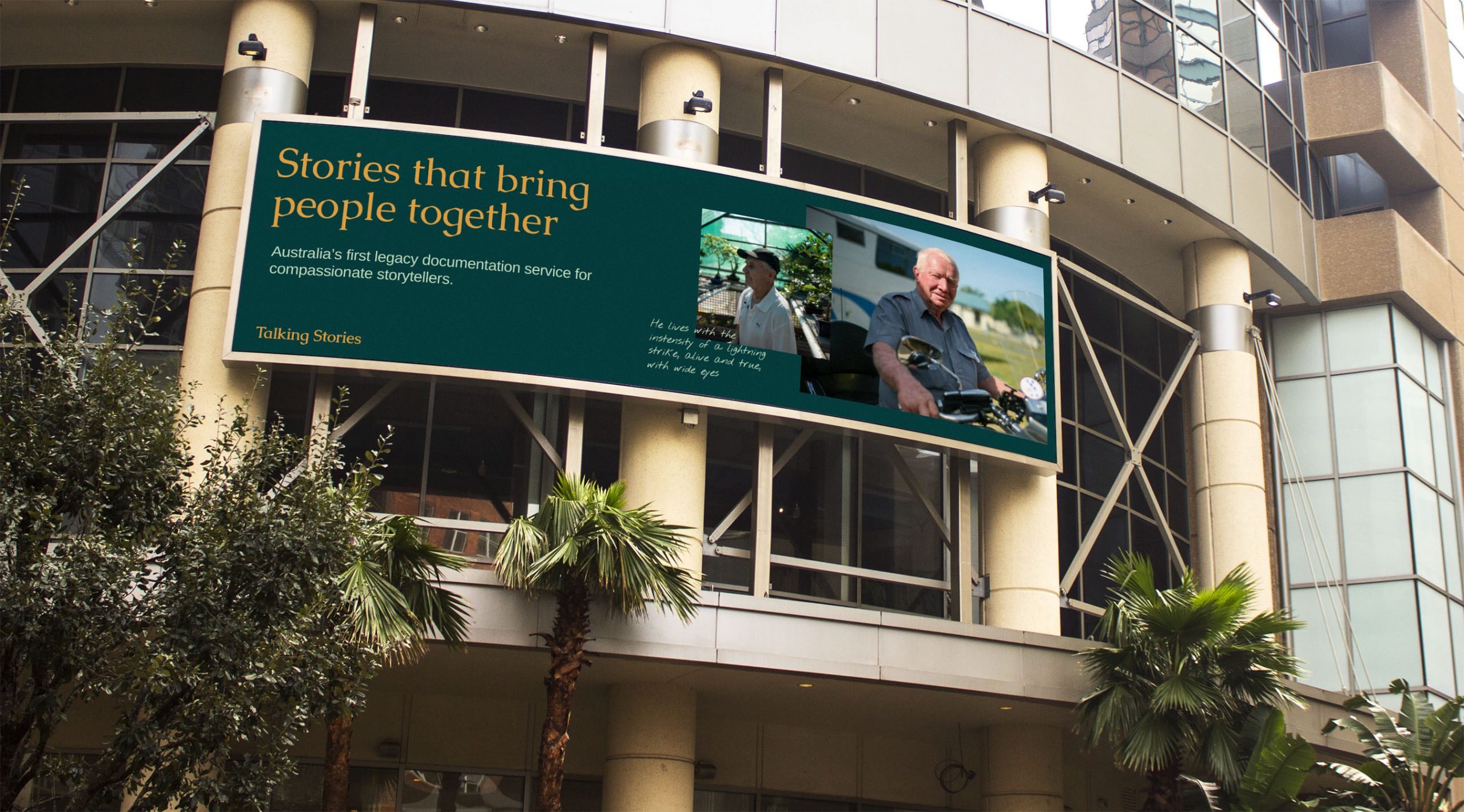
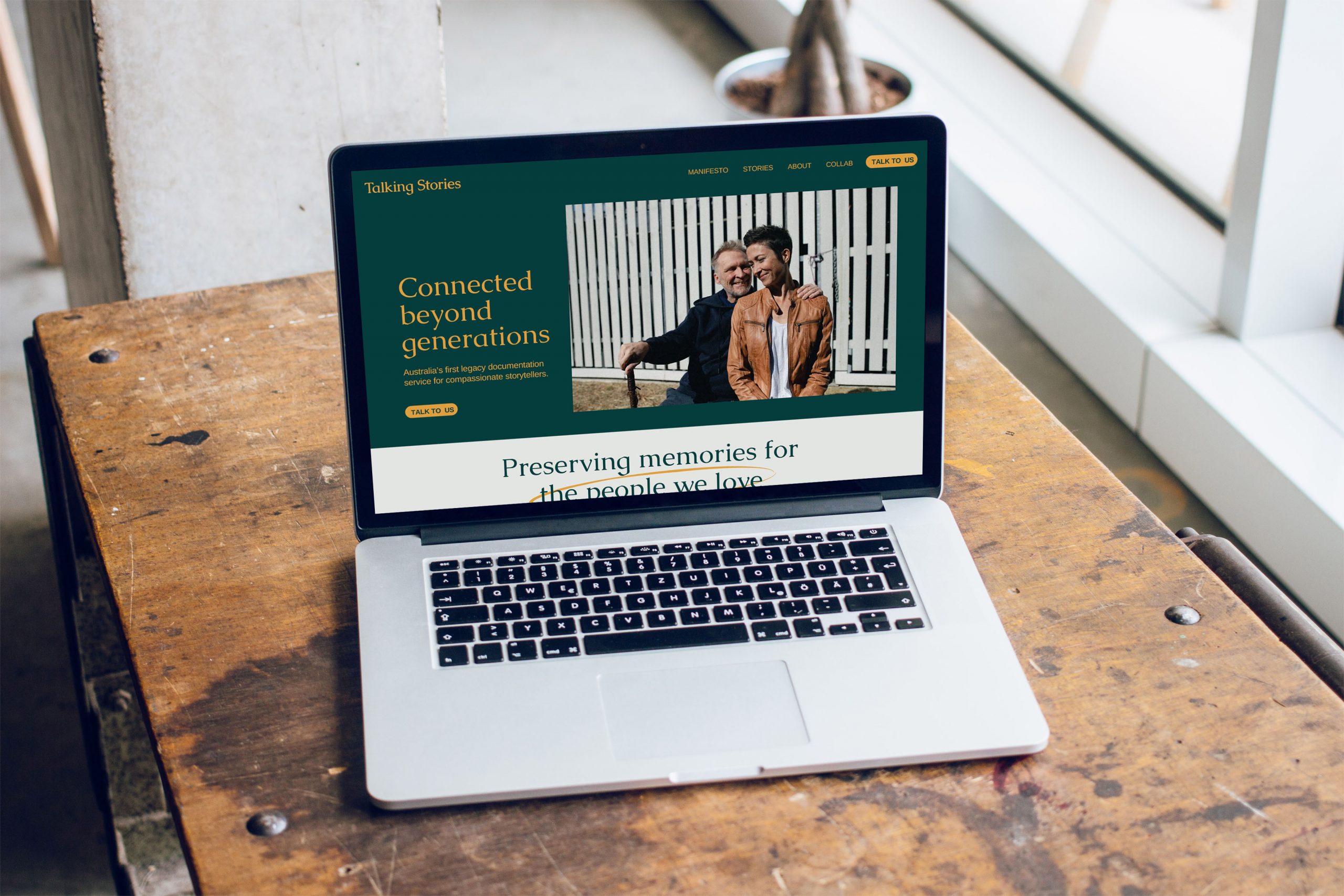
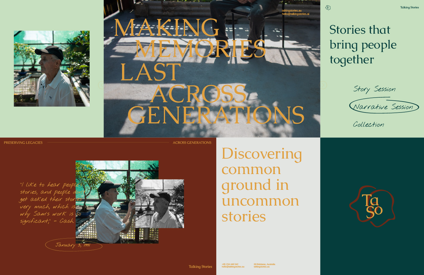
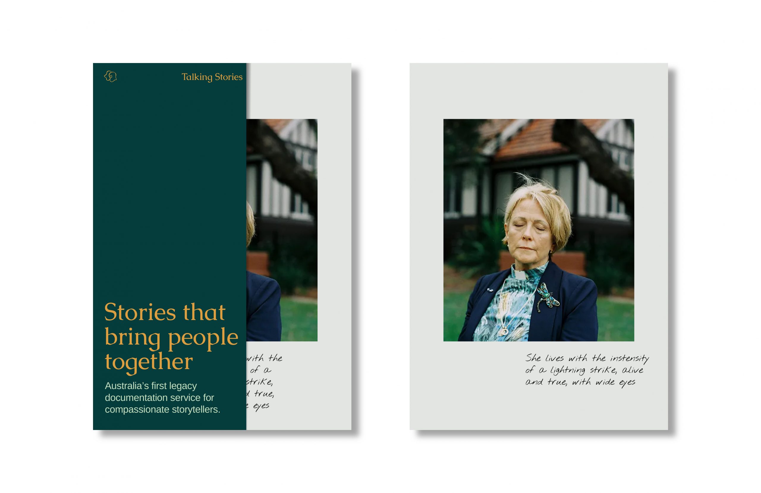
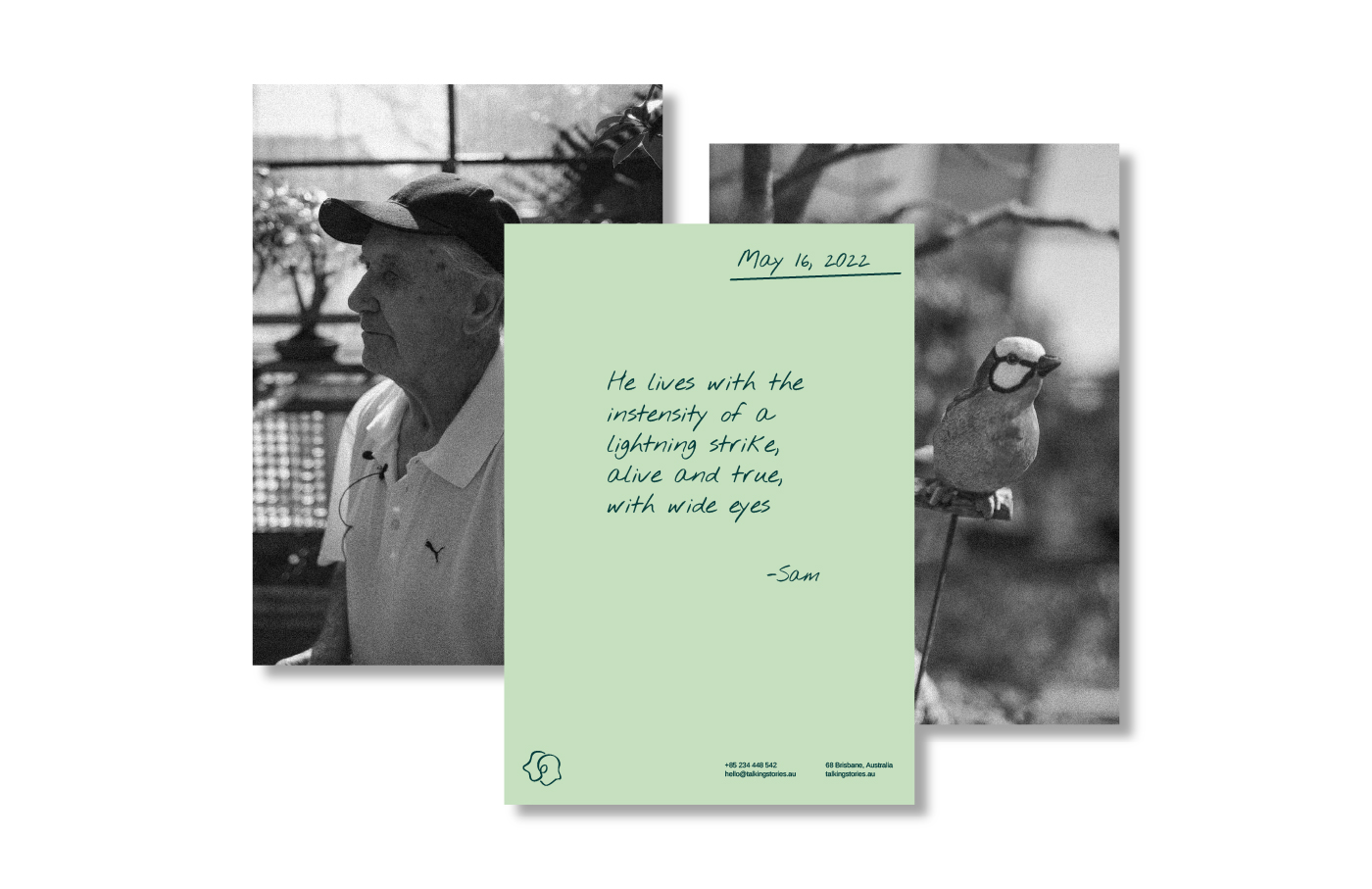
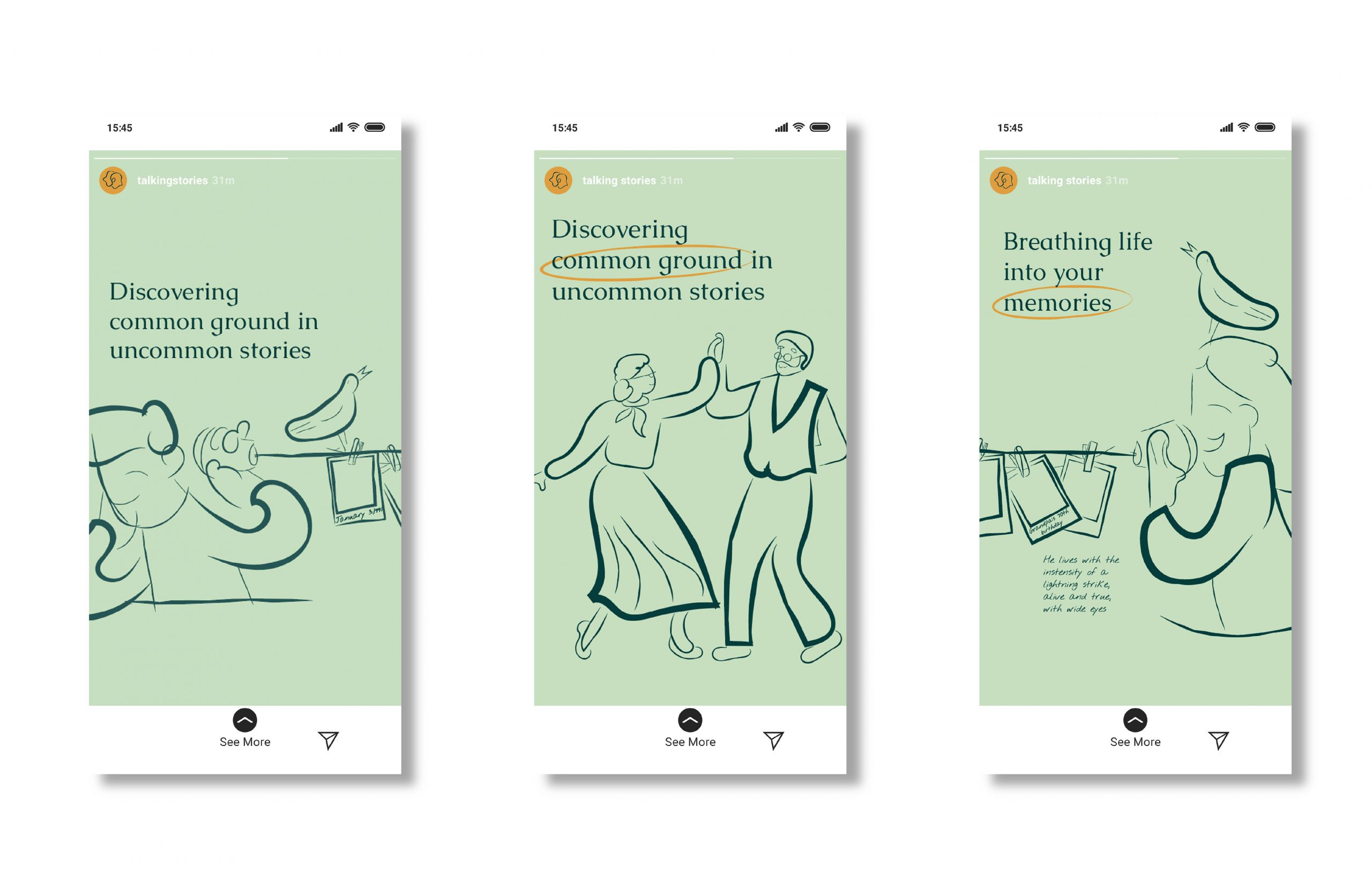
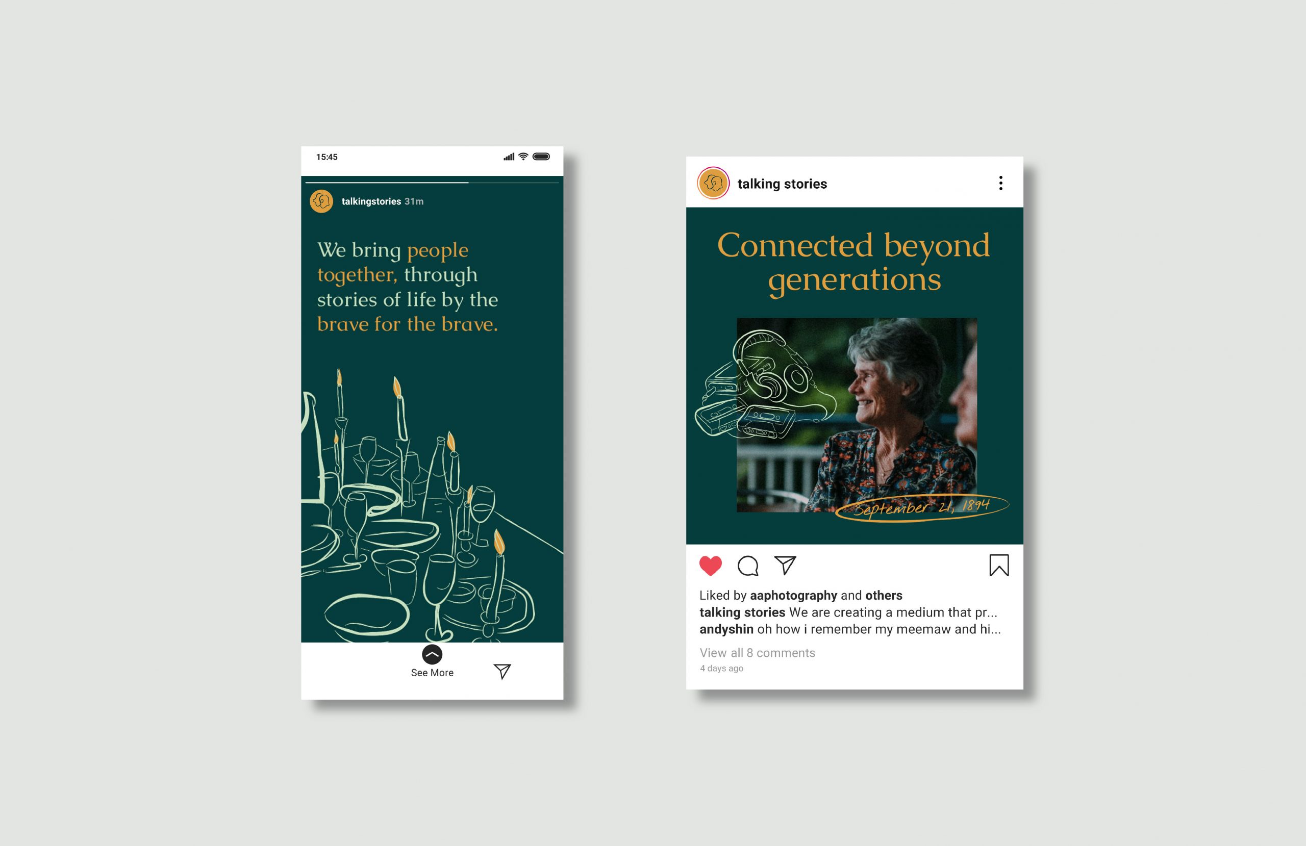
Breathing life into your memories
SCOPE OF WORK
Brand Strategy and Positioning
Brand Identity
Branding
Illustration
Key Visuals
Brand Manual
Creative Direction
INTRODUCTION
Talking Stories, a premium legacy storytelling service based in Brisbane Australia, sought to establish a brand identity that authentically reflected its core mission: to preserve and share personal narratives for future generations.
To bring this vision to life, the brand needed a visual language that exuded timelessness and a deep sense of empathy that speaks to individuals who cherish their heritage and aspire to leave a meaningful legacy, blending sophistication with the heartfelt promise of preserving life’s most precious moments.
We embarked on a branding journey that highlights intentionality, and timelessness, mirroring the very essence of Talking Stories. Every design element was meticulously chosen to evoke a sense of enduring legacy and profound personal connection.
The new identity introduces a symbol, wordmark, color palette, illustrations, and imagery style that help define the brand as both relatable, as well as trusted and established.
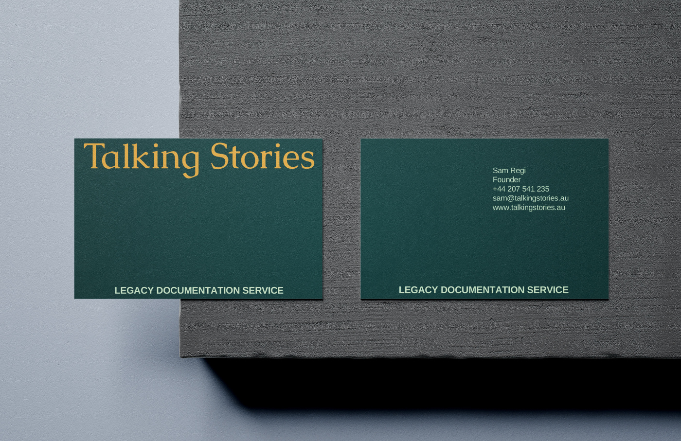
The symbol, depicting two figures interwoven in conversation, speaks to oral history’s intimate and personal nature. This minimalist yet evocative design allows versatility, with full and stacked wordmark variations providing flexibility across multiple applications. The independent use of the storytelling symbol as a recurring motif further strengthens brand recognition and subtly reinforces the brand’s core offering.
The selection of Caudex Regular as the primary typeface, with its classic elegance and subtle historical undertones, immediately established a sense of timelessness. The consistent use of title case for the wordmark further reinforced a sense of formality and respect for the stories being told. This typographic choice, coupled with considered tracking, created a visual rhythm that is both calming and engaging, inviting the audience to delve into the narratives.
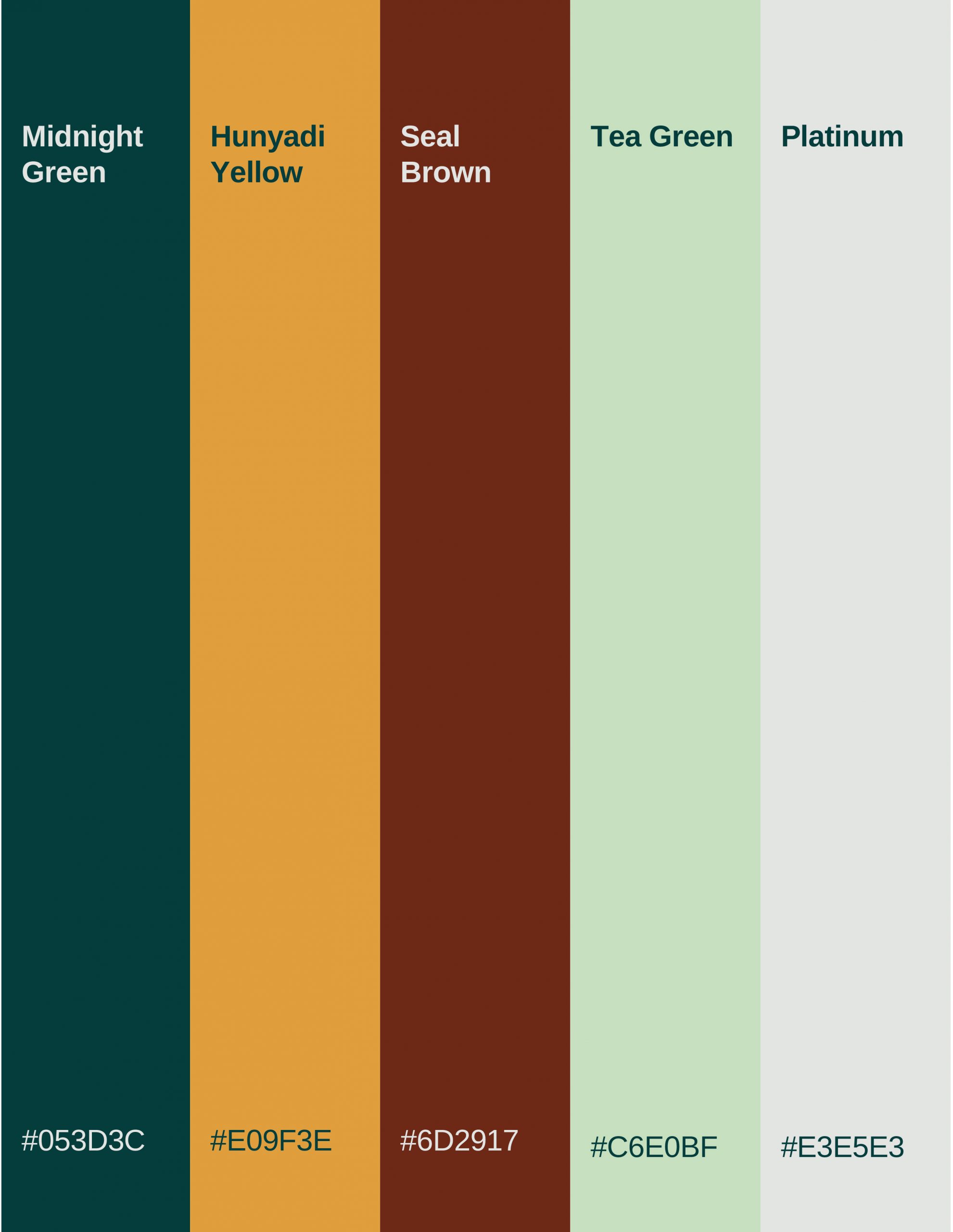
The carefully curated color palette of Midnight Green, Hunyadi Yellow, and Seal Brown evokes a sense of nostalgia and warmth reminiscent of treasured family albums and heirlooms passed down through generations. Midnight Green, as the primary color, provides a grounding and sophisticated backdrop, symbolizing the depth and richness of personal histories. Hunyadi Yellow, used sparingly as a highlight color, adds a touch of vibrancy and optimism, hinting at the inspirational power of shared stories. With its earthy tones, Seal Brown further anchors the brand in a sense of heritage and enduring legacy.
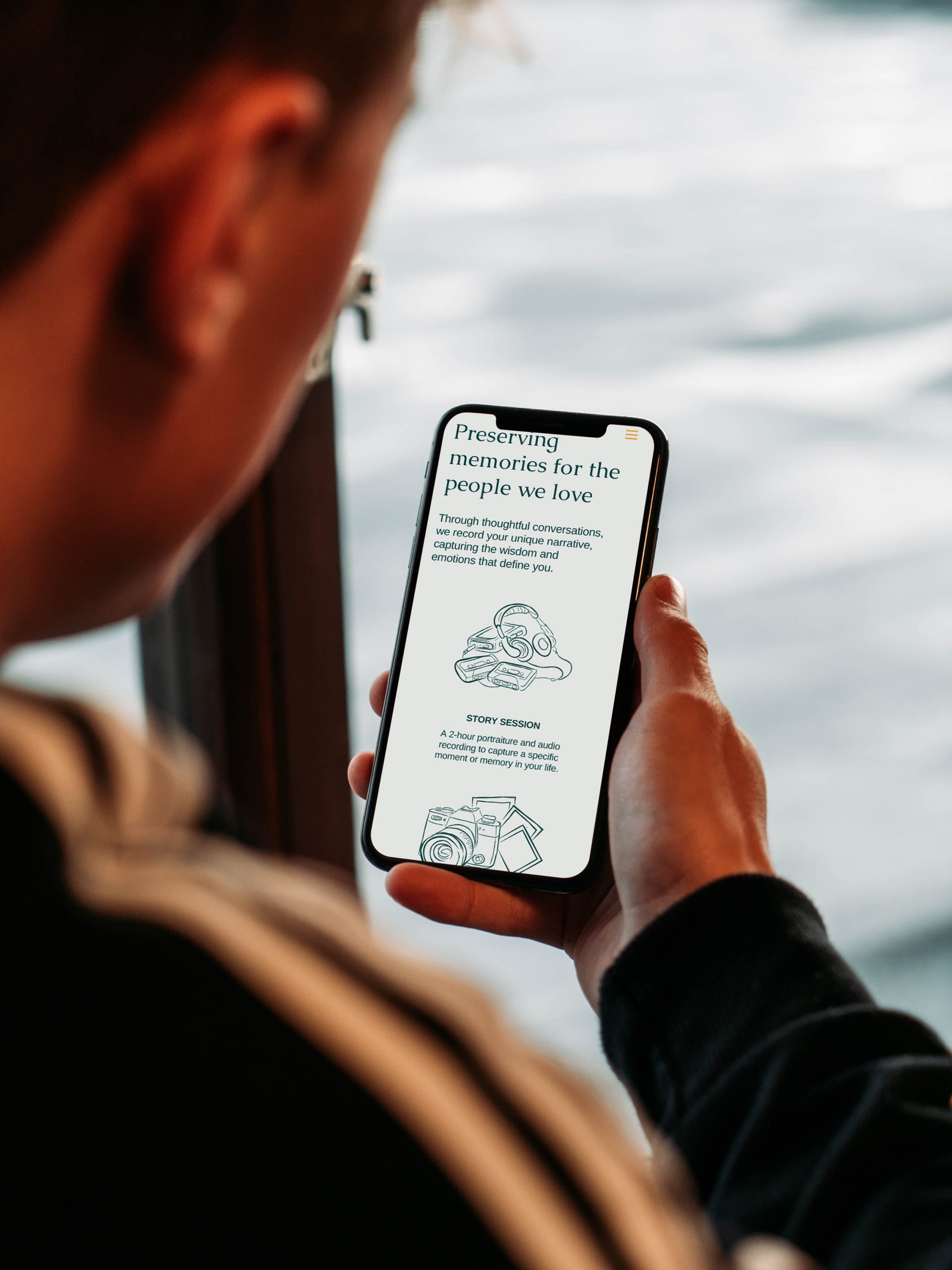
High-quality, evocative imagery plays a crucial role in communicating the emotional resonance of Talking Stories. By prioritizing photographs that capture genuine human connection and moments of reflection, the brand visually reinforces its commitment to authenticity.
The illustrations, characterized by a modern and human style with simple lines, depict universal human experiences and memorable moments. This approach ensures that the visuals are not merely decorative but actively contribute to storytelling.
A clean, minimalist design aesthetic permeates all brand collateral, allowing the stories to take center stage. This approach avoids unnecessary distractions and ensures that the focus remains on the content’s profound nature. The cohesive visual language, from logo and typography to color palette and imagery, creates an elegant and inviting brand experience.
Their new identity captures Talking Stories’ essence and builds on memories with a timeless look and feel that speaks to people of all ages, cultures, and backgrounds. By visually embodying the values of authenticity and empathy, the brand invites individuals to embark on a journey of self-discovery and connection, ensuring that their stories live on for generations to come
"I was impressed by their work and deliverables. They were prompt, and I'm really impressed with the assets."
Graphic design, illustration and design support for one of the largest retail chain in the Philippines.
SM Seaside Cebu
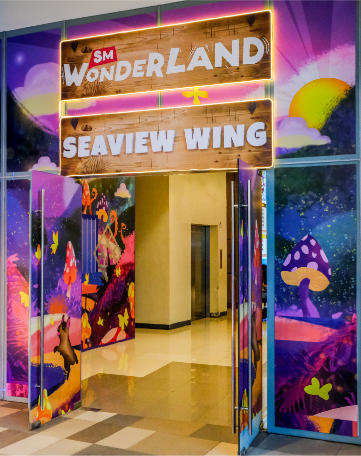
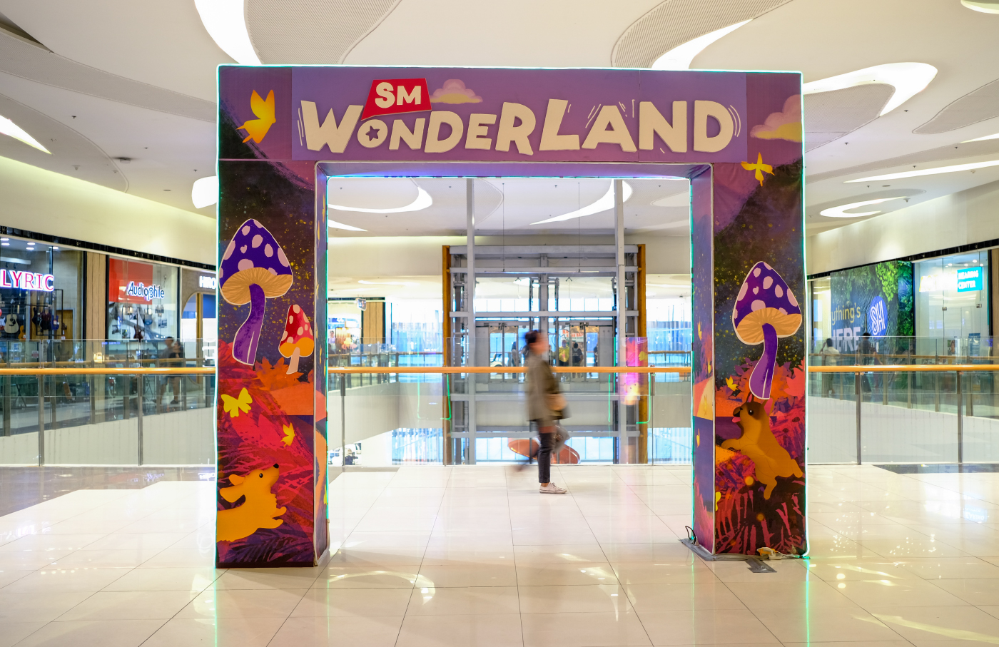
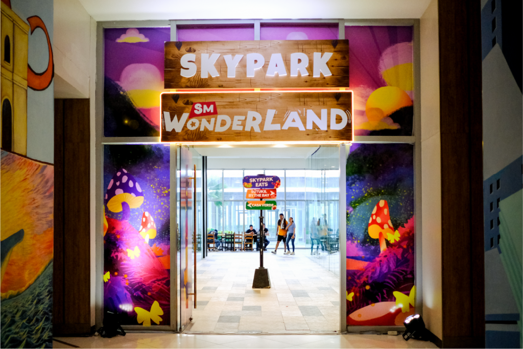
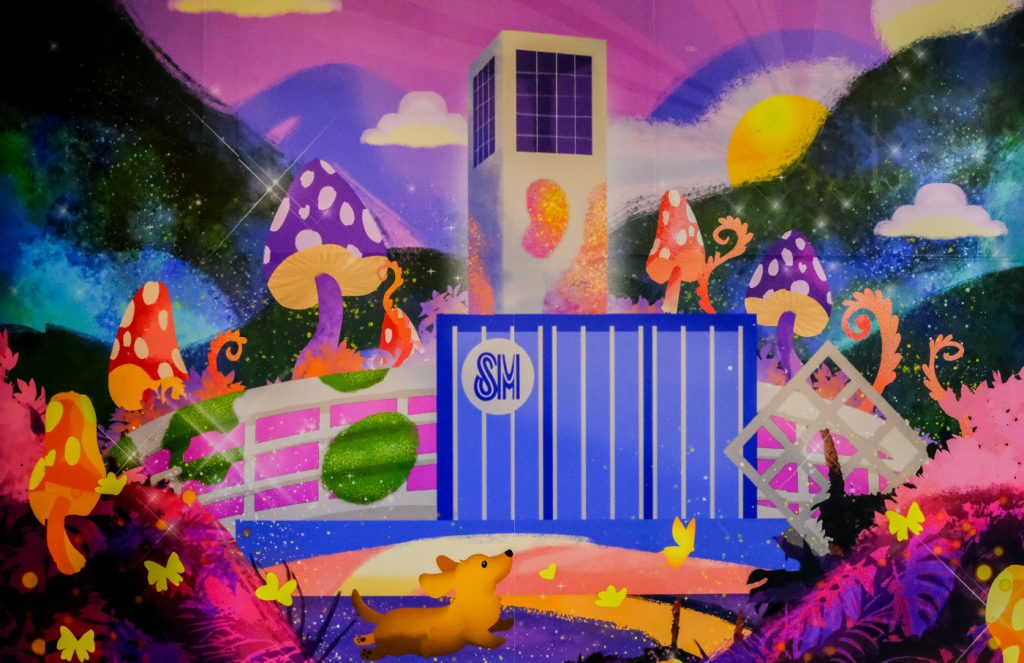
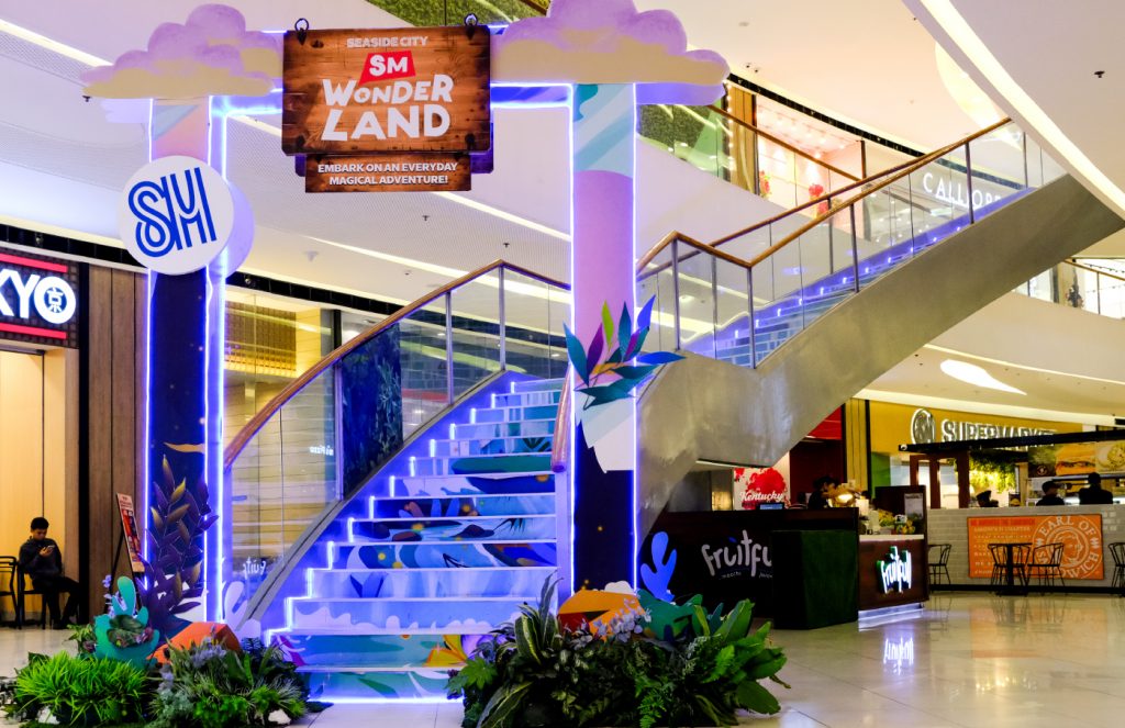
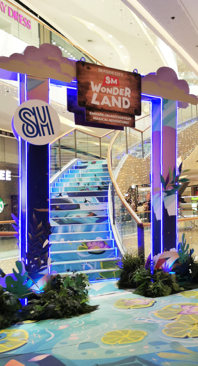
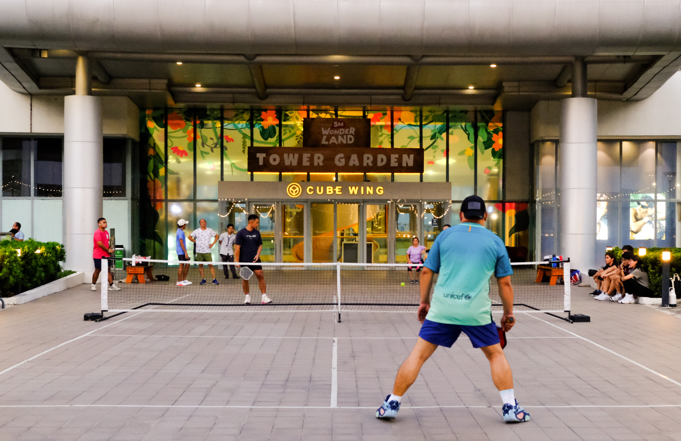
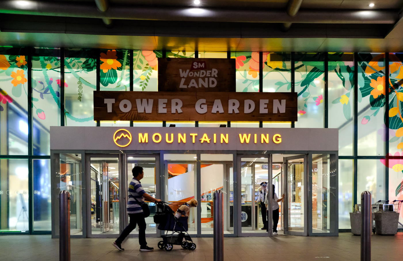
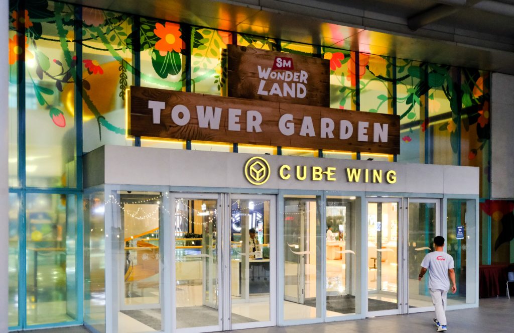
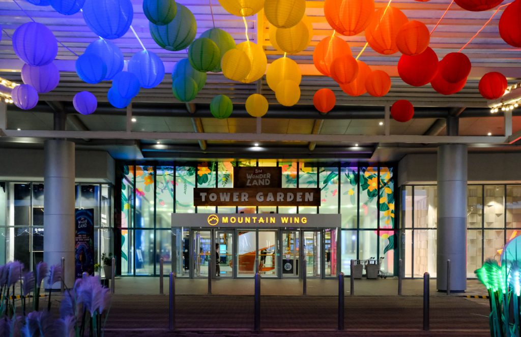
SM Wonderland
SCOPE OF WORK
Key Visuals Campaign Illustration Design Support
INTRODUCTION
SM Supermalls is one of the biggest chains of malls in the Philippines. Given that their malls are household names and the go-to for most Filipinos, SM continuously generates themes, events, and activities aimed at families and the public. As the Philippines’s most popular mall, our client aims to provide family fun experiences daily to improve the quality of life for all in a socially responsible and environmentally sustainable way.
Our collaboration with SM allowed us to make key visuals for their marketing events and promotions. Our goal is to create fun, nature and family-centric themed illustrations that align with the SM Supermall branding.
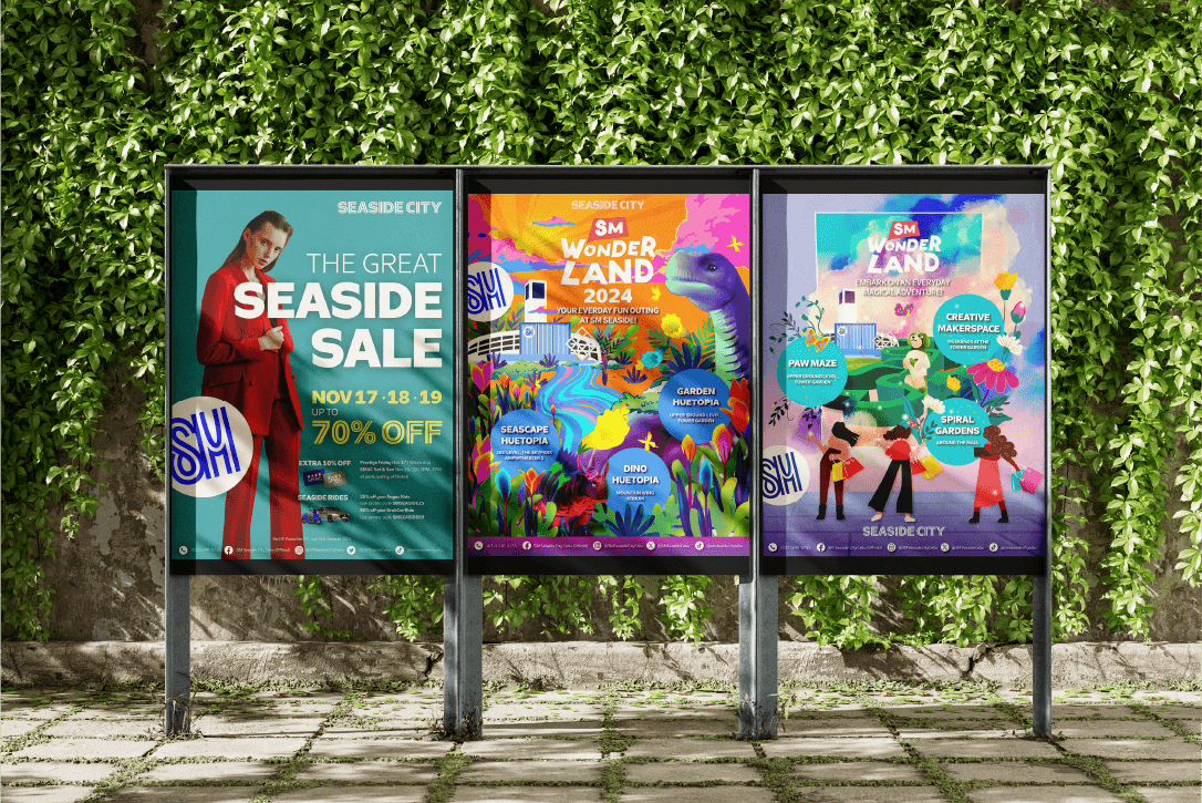
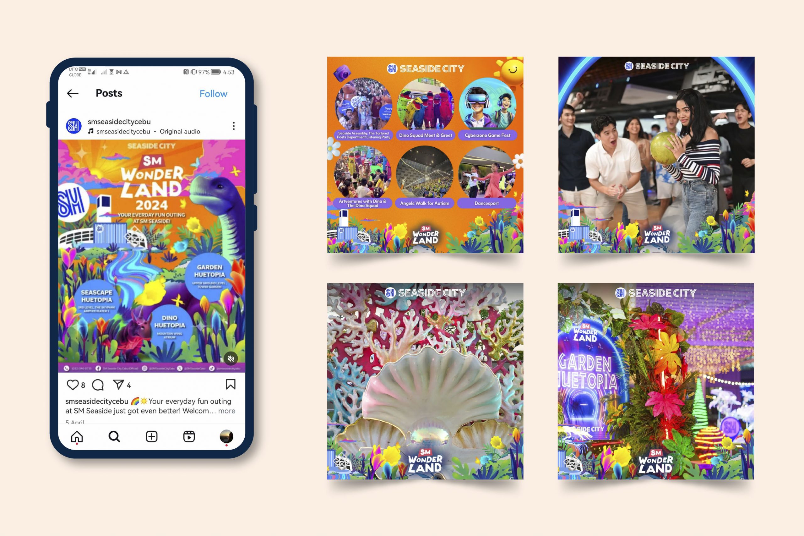
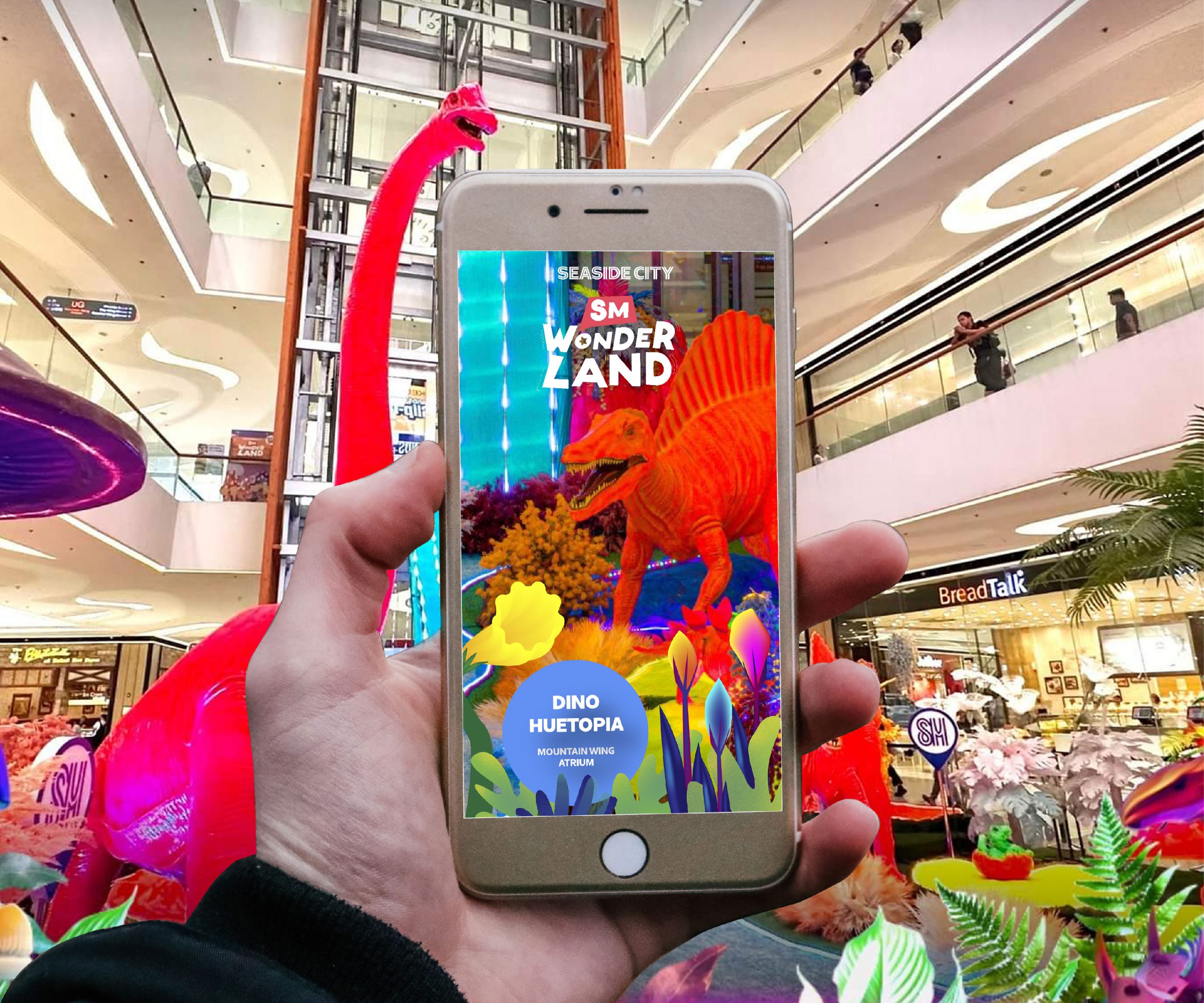
We started by developing illustrations for SM Seaside Cebu’s upcoming project to redirect the brand and the mall to a nature adventure theme. Based on our briefings with the brand marketing team, there was an emphasis on “family-friendly” and “all-around” designs intended to resonate with their customers. The SM Seaside Marketing Team provided digital and visual assets, which were approved to be part of the project beforehand, as a reference.
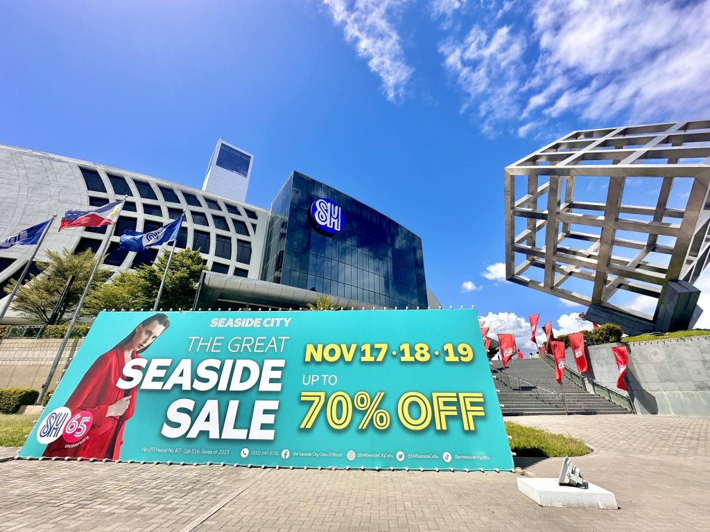
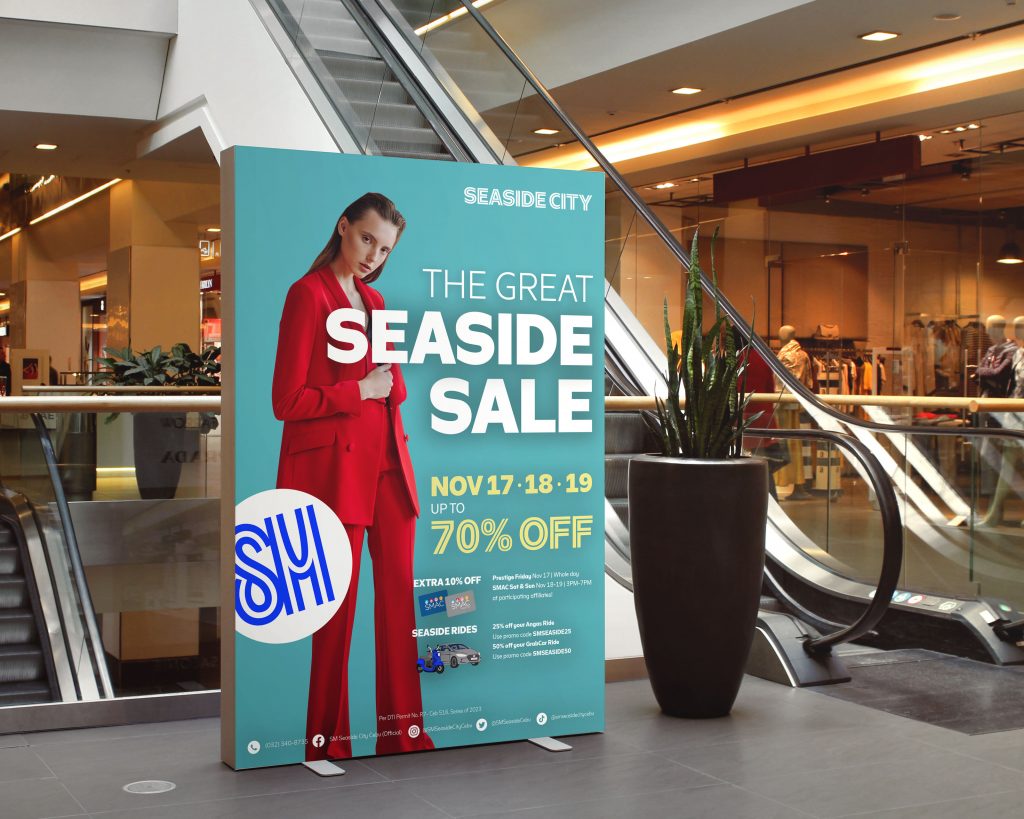
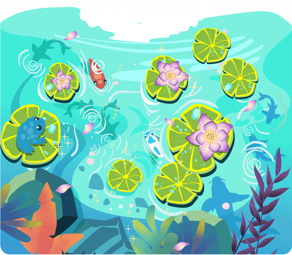
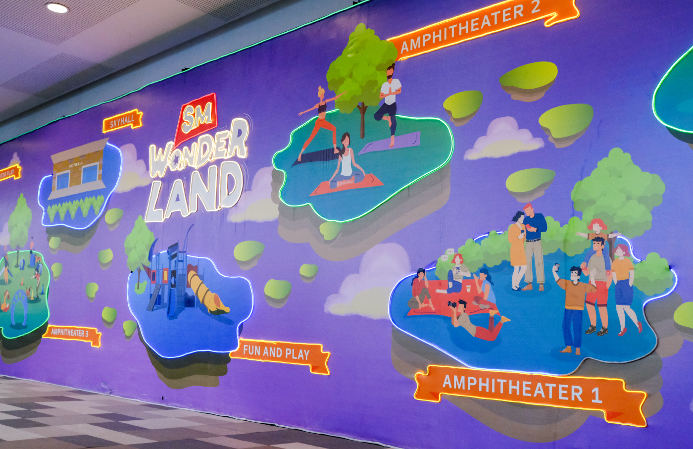
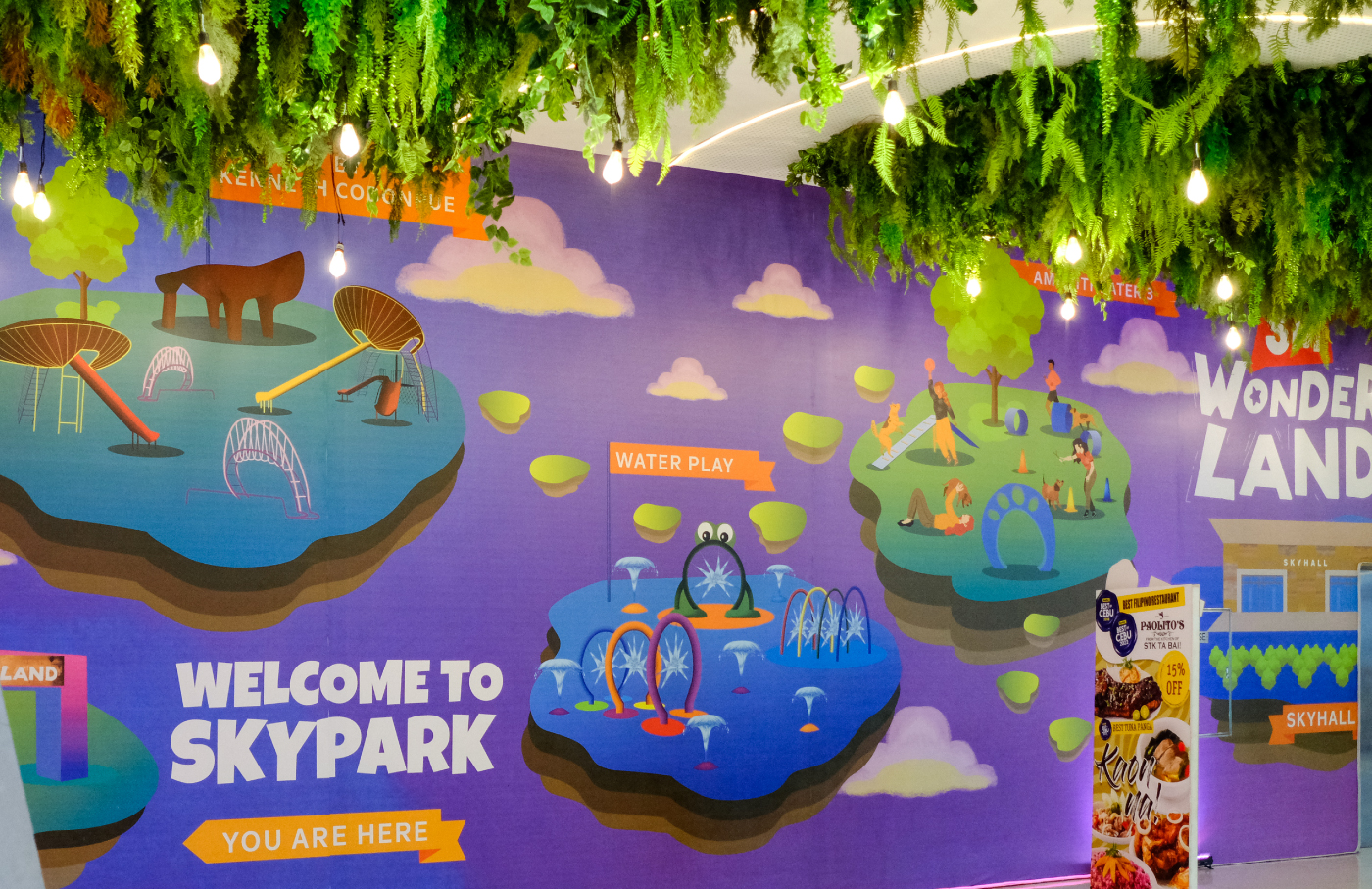
The first assets we created followed the theme of mystical nature adventure. We designed new illustrations to resemble and enhance their current assets that were carried over from the previous theme. Outputs of this project were shown as digital collaterals (social media posts and banners) and print media (posters, signages, arches, and window prints) that are exhibited around the mall.
In line with the idea of a family-friendly aesthetic, the illustration had a children’s morning show style that was attractive to a much younger audience and appreciated by different ages. We incorporated shades of blue into our designs to match SM Supermall’s iconic brand color and central palette in their establishments.
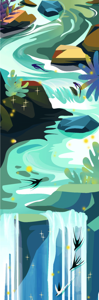
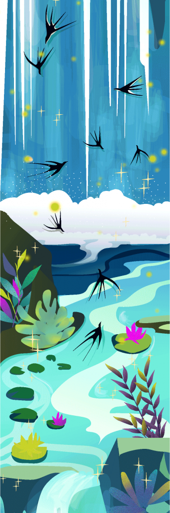
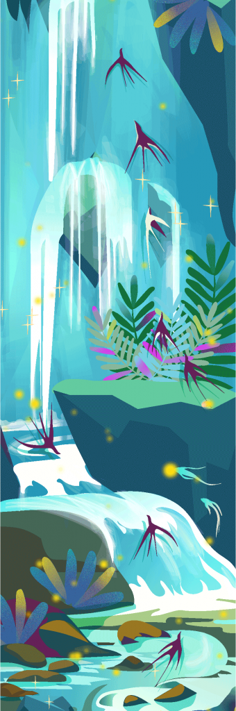
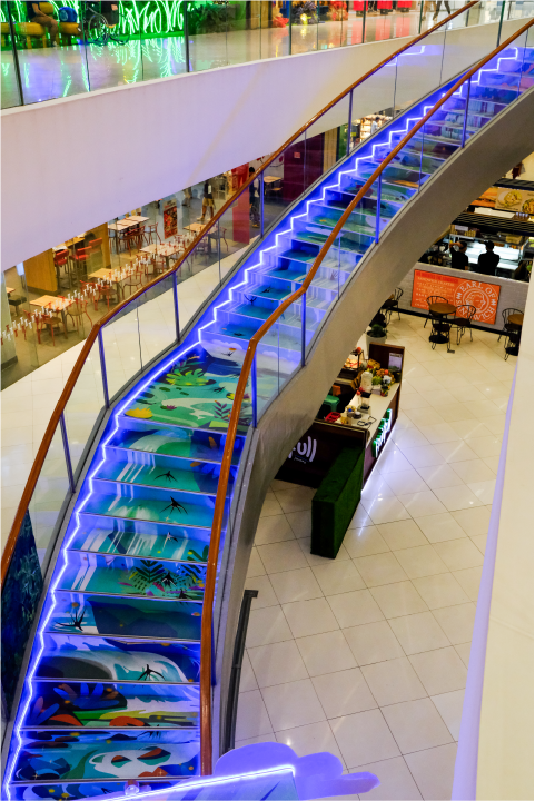
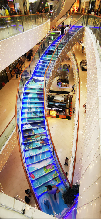
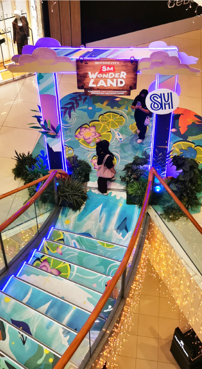
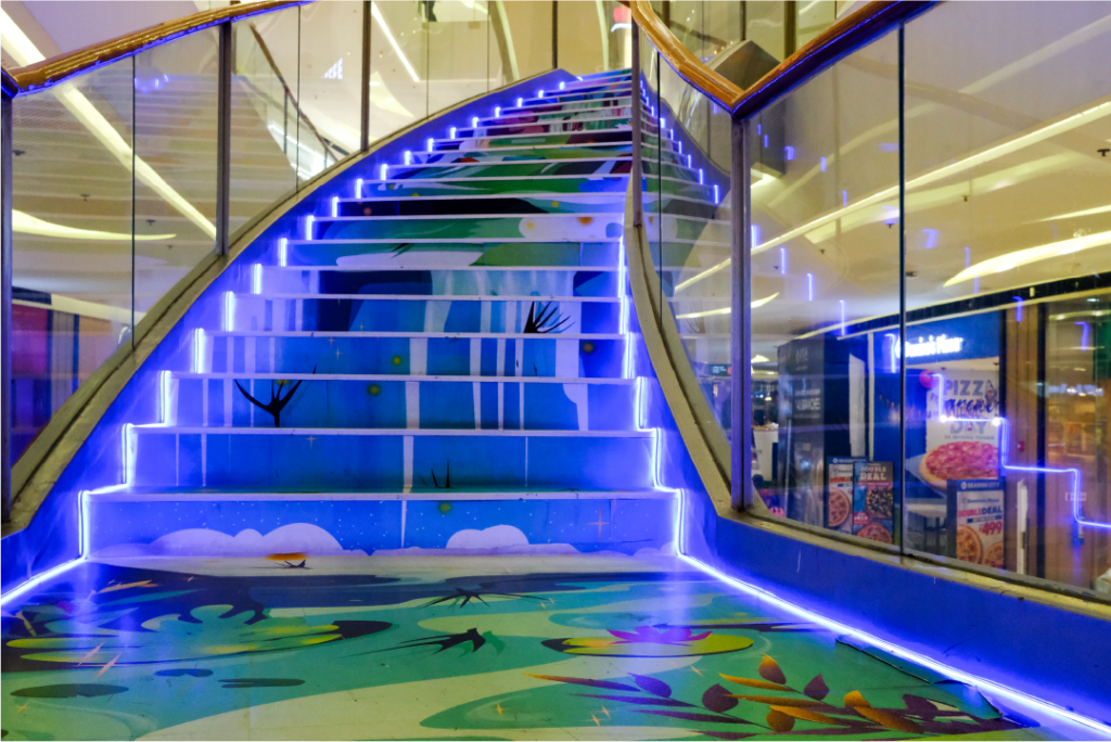
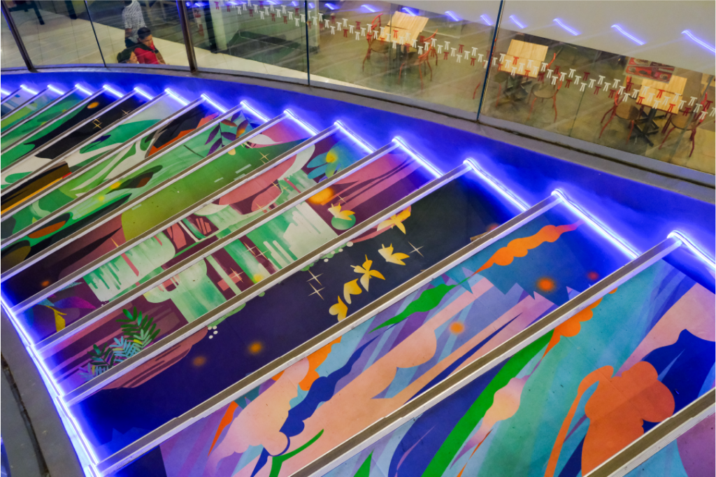
After the successful design support, they reached out for a bolder task of creating illustrations for SM Seaside’s Cinderella Staircase.
The curved staircases connecting circular levels flowed, imitating a small body of water. Following the same principles and art style, we designed a waterfall illustration that curves and flows perfectly as the mall’s staircase shape.
The SM Seaside Design Team was able to change the colors of the waterfall illustrations to match the mall’s navigation system.
It is a standard operating procedure in large-scale corporate systems that approval of designs and copies requires specific levels before launch. Considering their internal system and SOPs for external project engagements, we designed our graphic and illustration assets to be easy to use so the SM Seaside Design Team can freely adjust any changes when needed.
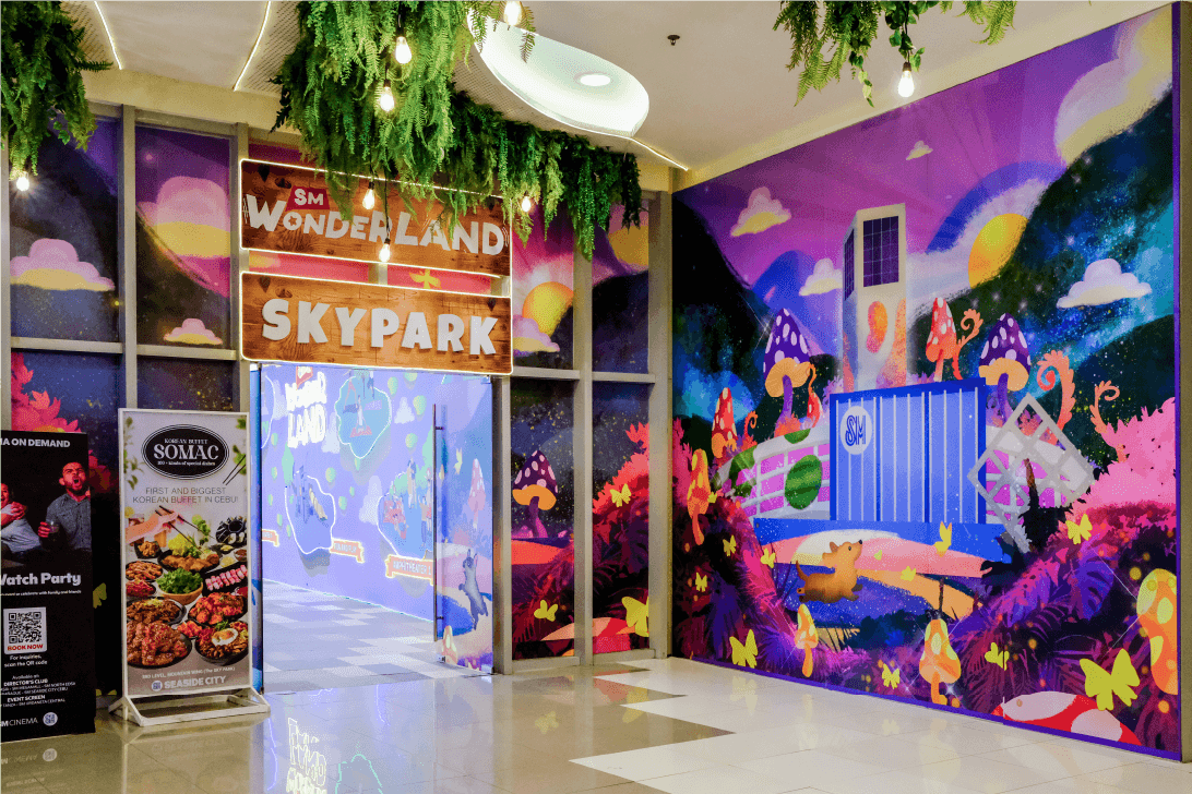
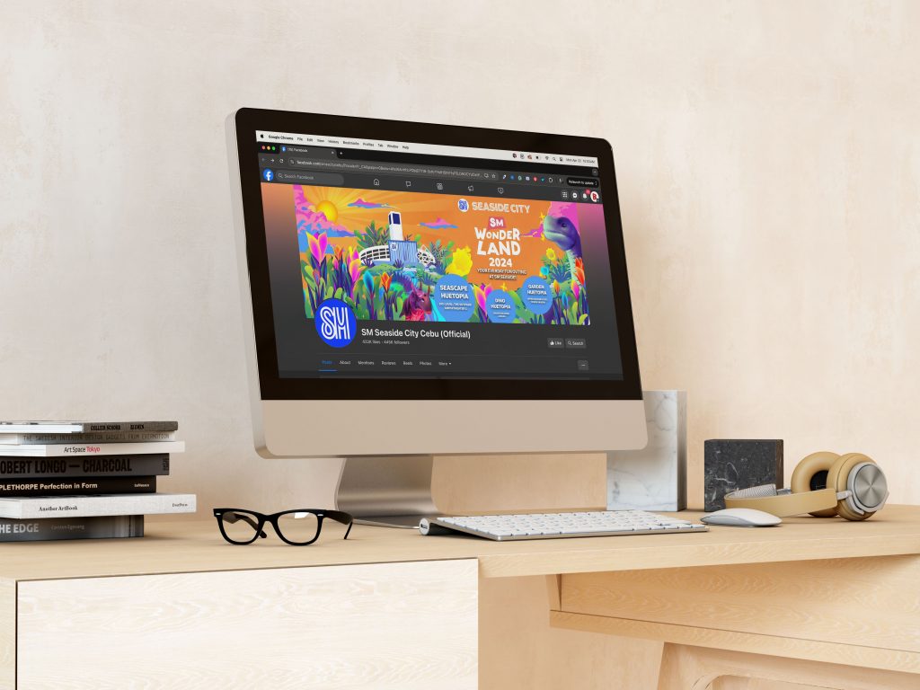
The SM Seaside Cebu‘s Marketing team has been able to build new collaterals independently such as posters, signages, social media posts, and wallpapers, based on the graphic and illustration assets we created for them. This has allowed us to continue and expand our collaboration to support marketing key visuals and collaterals for “Dinotopia” and “SM Wonderland” themes.
Since 2022, we have continuously collaborated with SM Seaside Cebu in creating illustrations, graphic design, and branding projects for their events, spaces, and promotions.
"Designs and final outcome were commended by upper management and VIPs from HO."
Brand refresh and iconography design for a social enterprise working to preserve local weaves.
ANTHILL
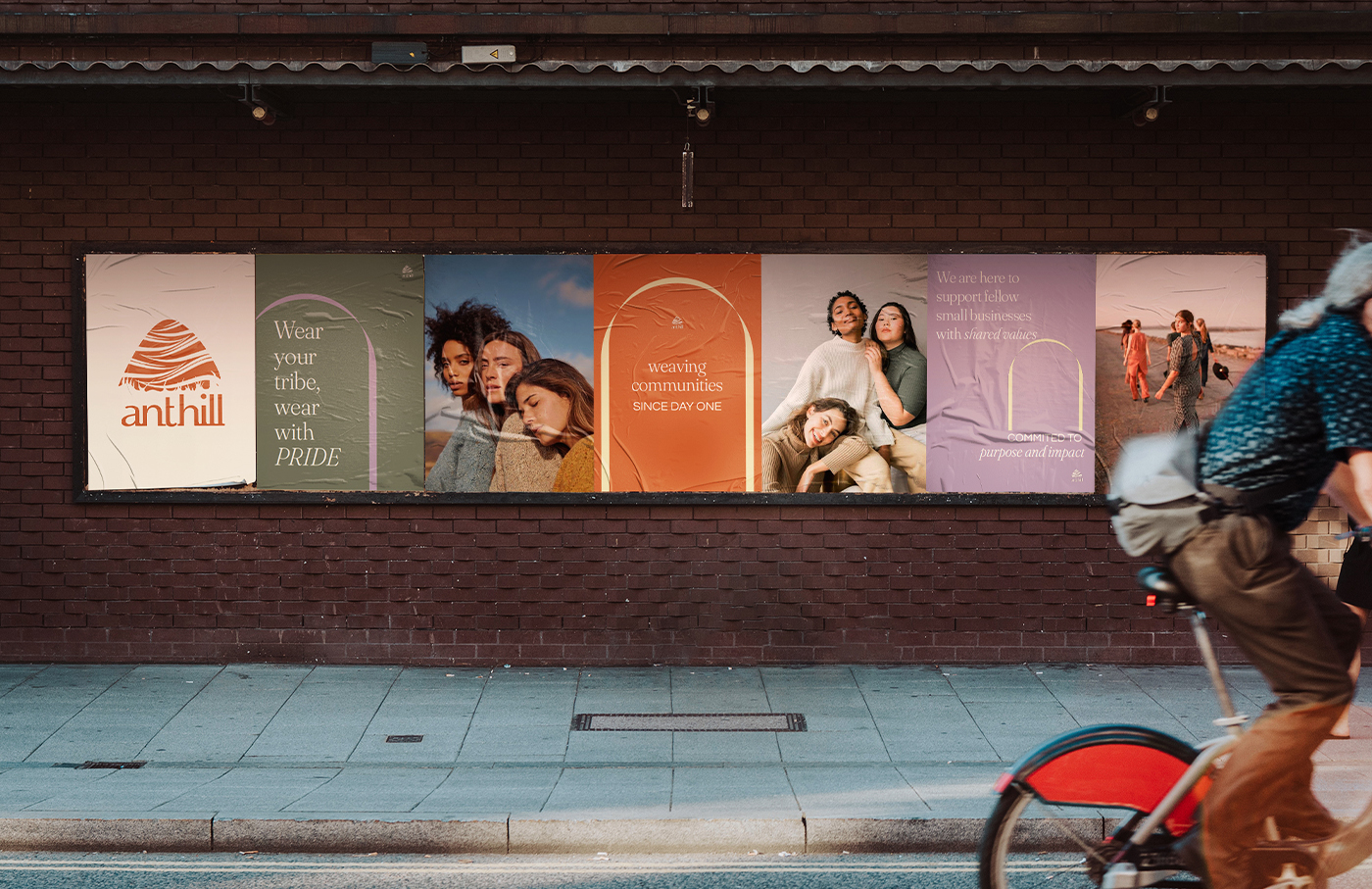
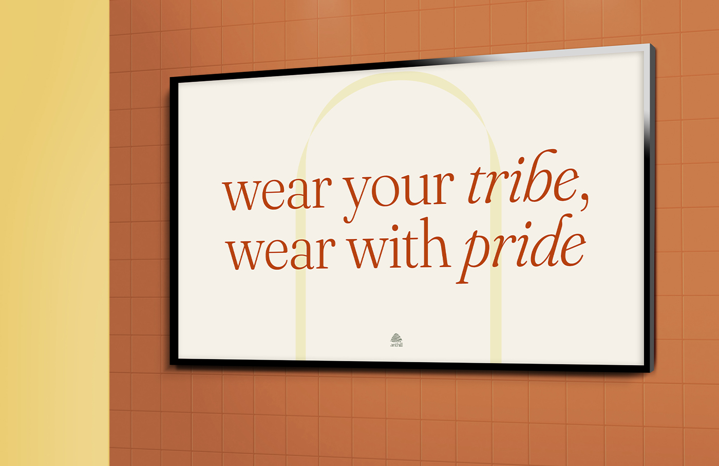
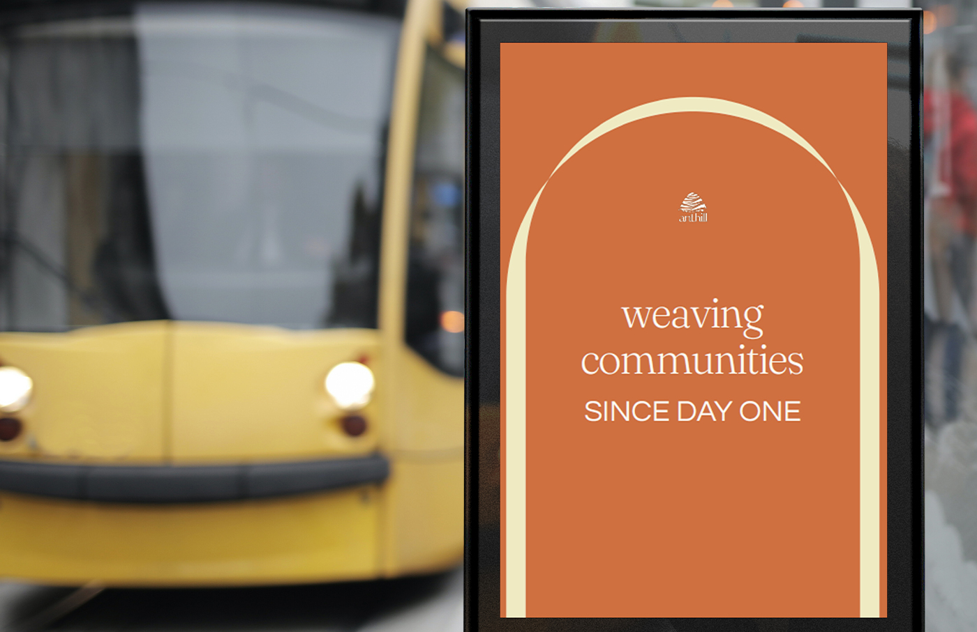
Wear Your Tribe, Wear With Pride
SCOPE OF WORK
Brand Refresh
Brand Identity
Creative Direction
Iconography
Brand Manual
INTRODUCTION
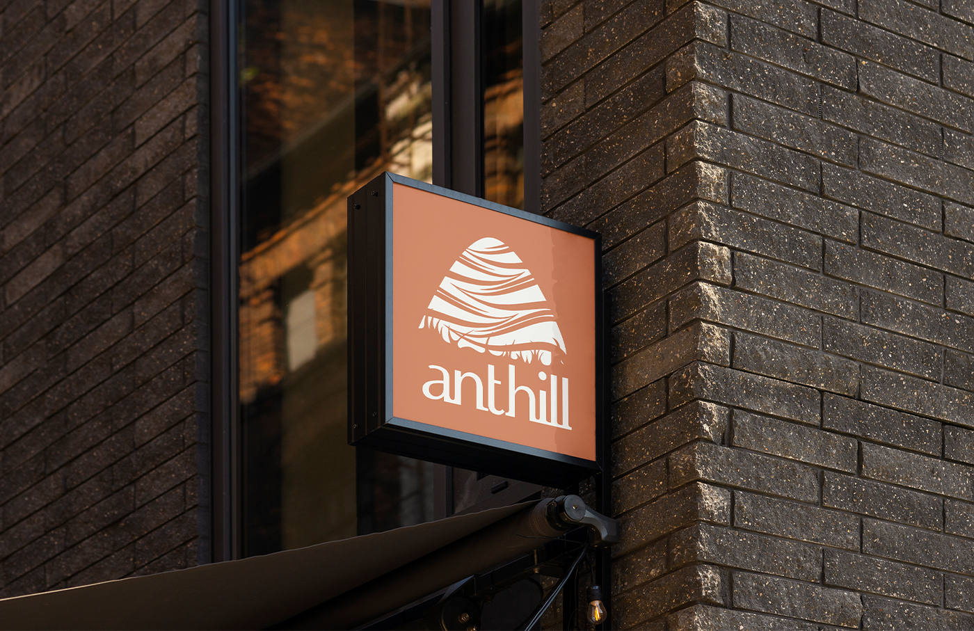
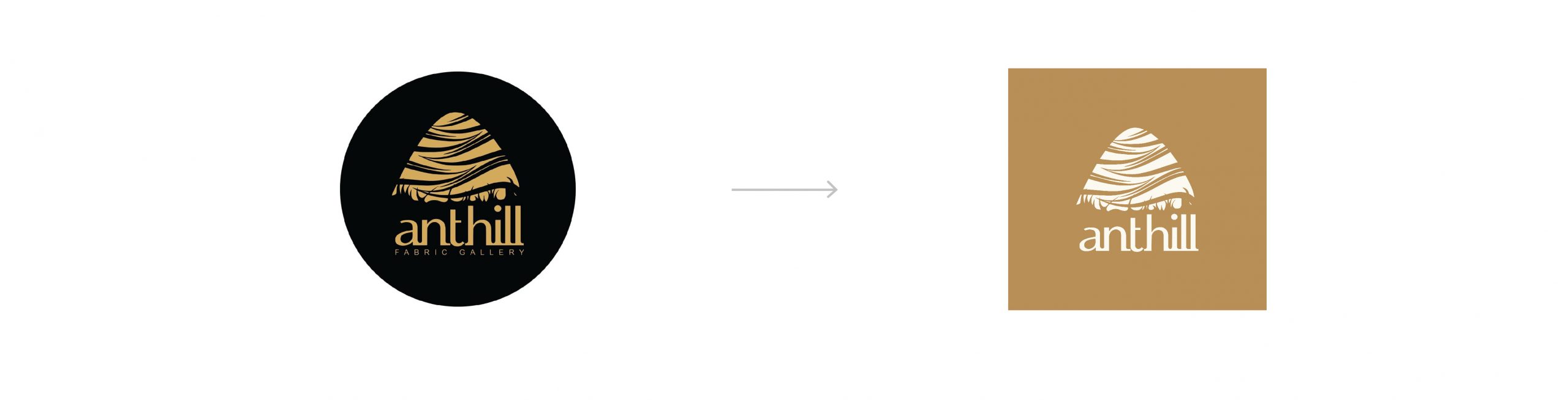
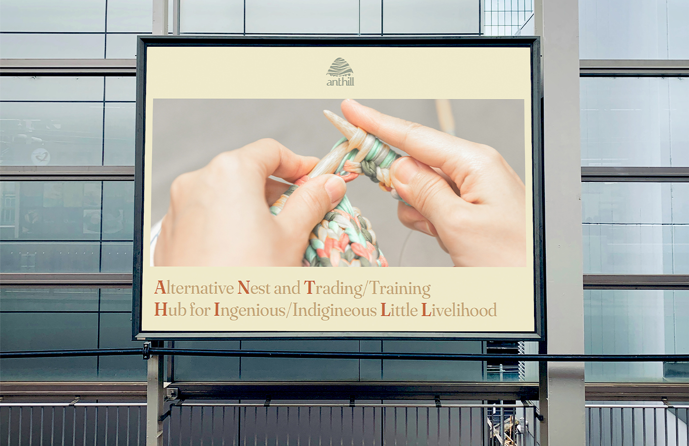
From day one, our partner ANTHILL has sought the preservation of Philippine weaving traditions through the creation of sustainable livelihood opportunities. After 13 years of growth in the pursuit of this goal, they wanted to celebrate with a refreshed brand identity. Our job was to help them embrace a new chapter in their business journey while retaining the integrity of the brand’s roots and core values.
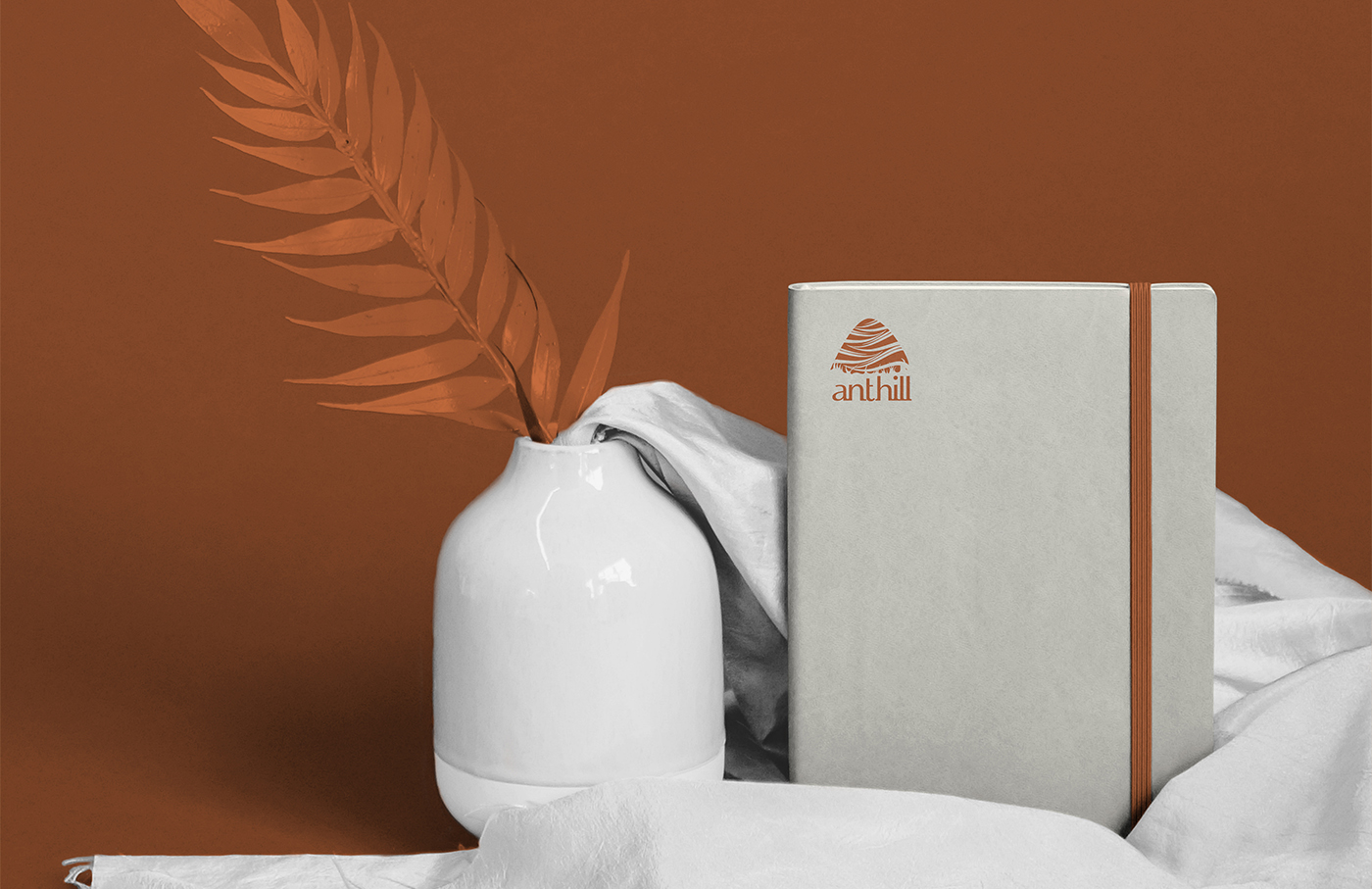
To do this, the original logo was maintained, and for primary brand colors we gave them a palette of complimentary earth tones supported by crisp, contrasting hues to convey the fresh, modern energy that our client brings to their work. These would be further accented by mostly neutral secondary colors.
Due to the nature of their products, our client often deals with a large variety of textures and media. So, when it came to typography they needed fonts that were clean and legible, with a variety of options for line weight. It was equally important that the brand’s typography set be easily available online based on the workflow needs of their growing team. Flexibility and accessibility were a must.
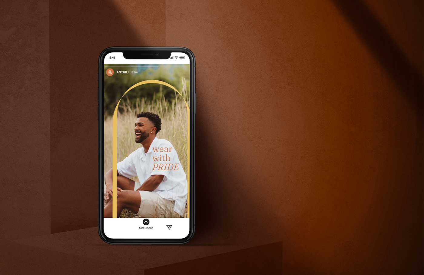
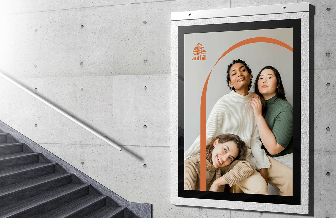
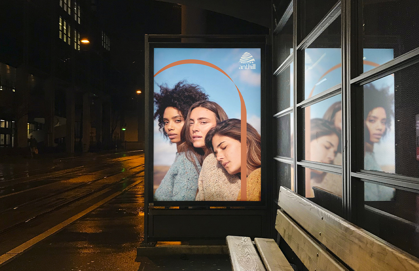
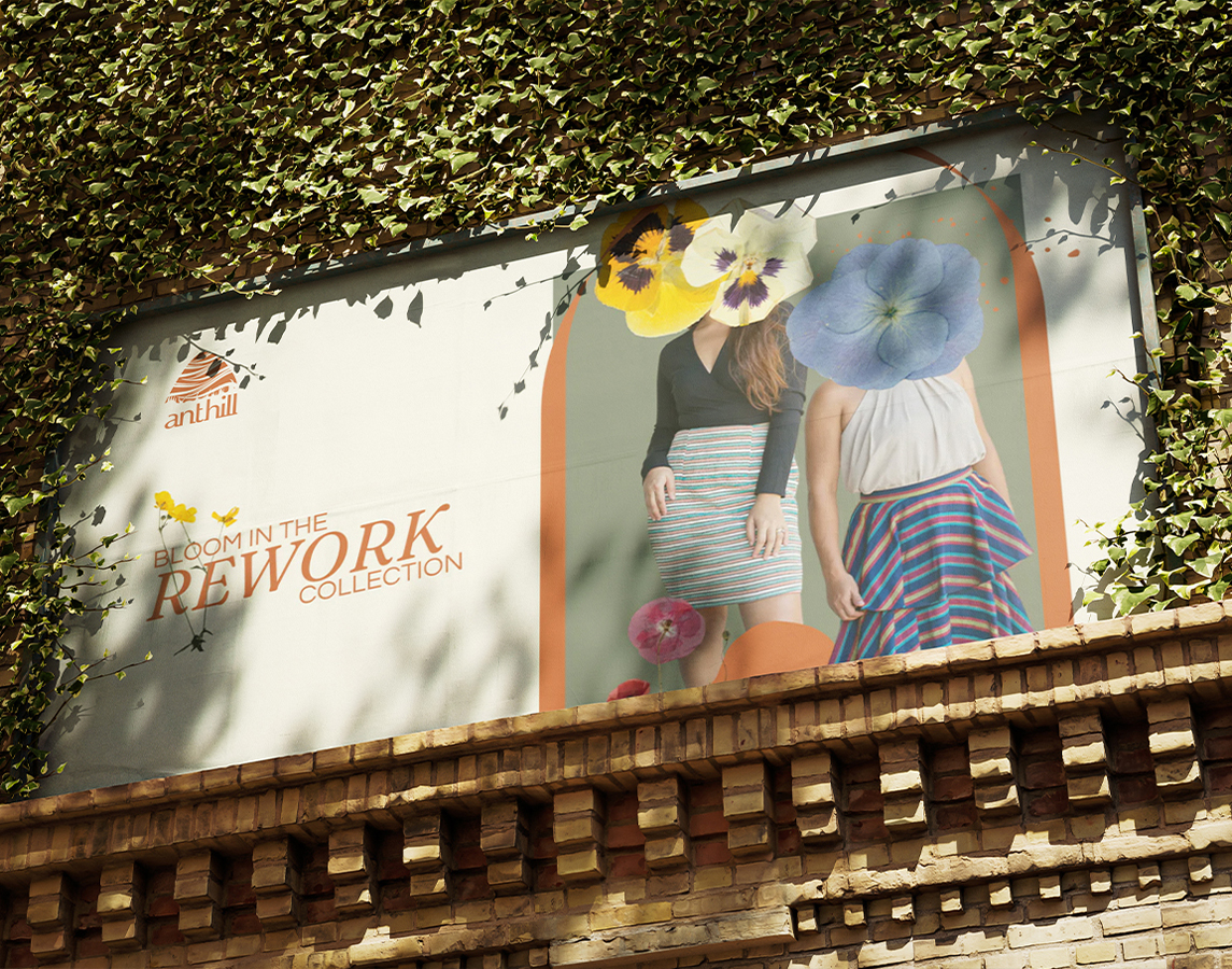
A ribbon-like arc was designed to serve as the brand’s primary graphic asset. This kept a reference to textiles at the heart of their visual identity. The arch shape also symbolizes a window, both a space for the celebration and elevation of Philippine weaving traditions and a window opening for those traditions to meet new, global opportunities.
We also supplied them with new icons for their website utilizing minimal line art with rounded edges to imbue the iconography with a sense of motion and flow as well as echo the curves in the arc.
The photography guidelines for brand heroes and styling cues emphasize their intention to reach a more diverse, worldwide audience. The characteristics that we aimed to convey were warm and colorful, but mature and inclusive.
Upon completion, we were immediately able to put the brand guide to use as the basis for their B2B pitch decks.
Beyond that, it’s been wonderful to see the ANTHILL team empowered, and eagerly using the guide to create their own collaterals, confident in the impact of their message as they continue to champion Philippine weaves and craftsmanship.
Special Thanks
Mockup design by Kenneth Hicks Case study write-up by Morgan Tornilla
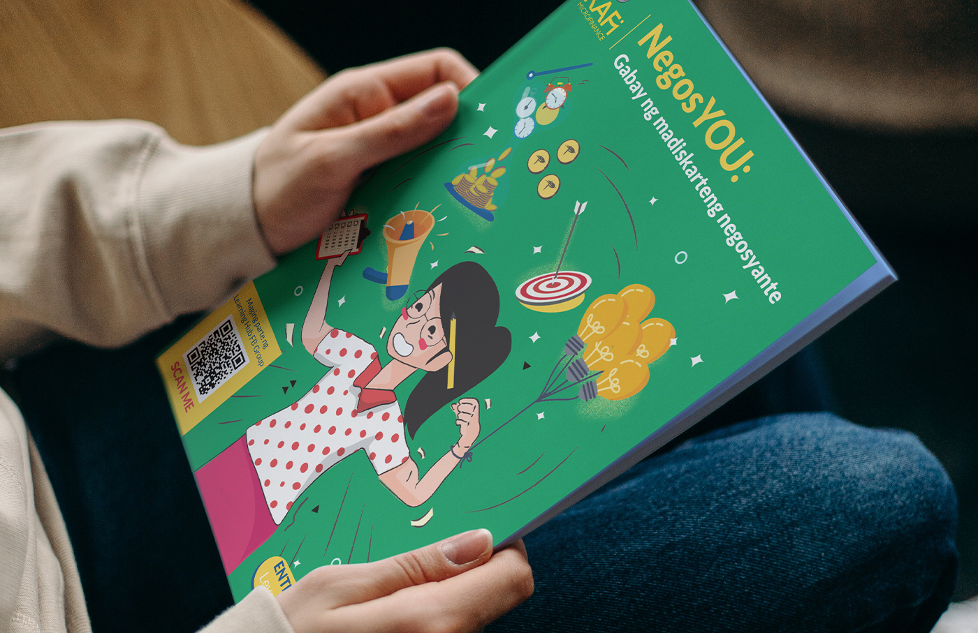
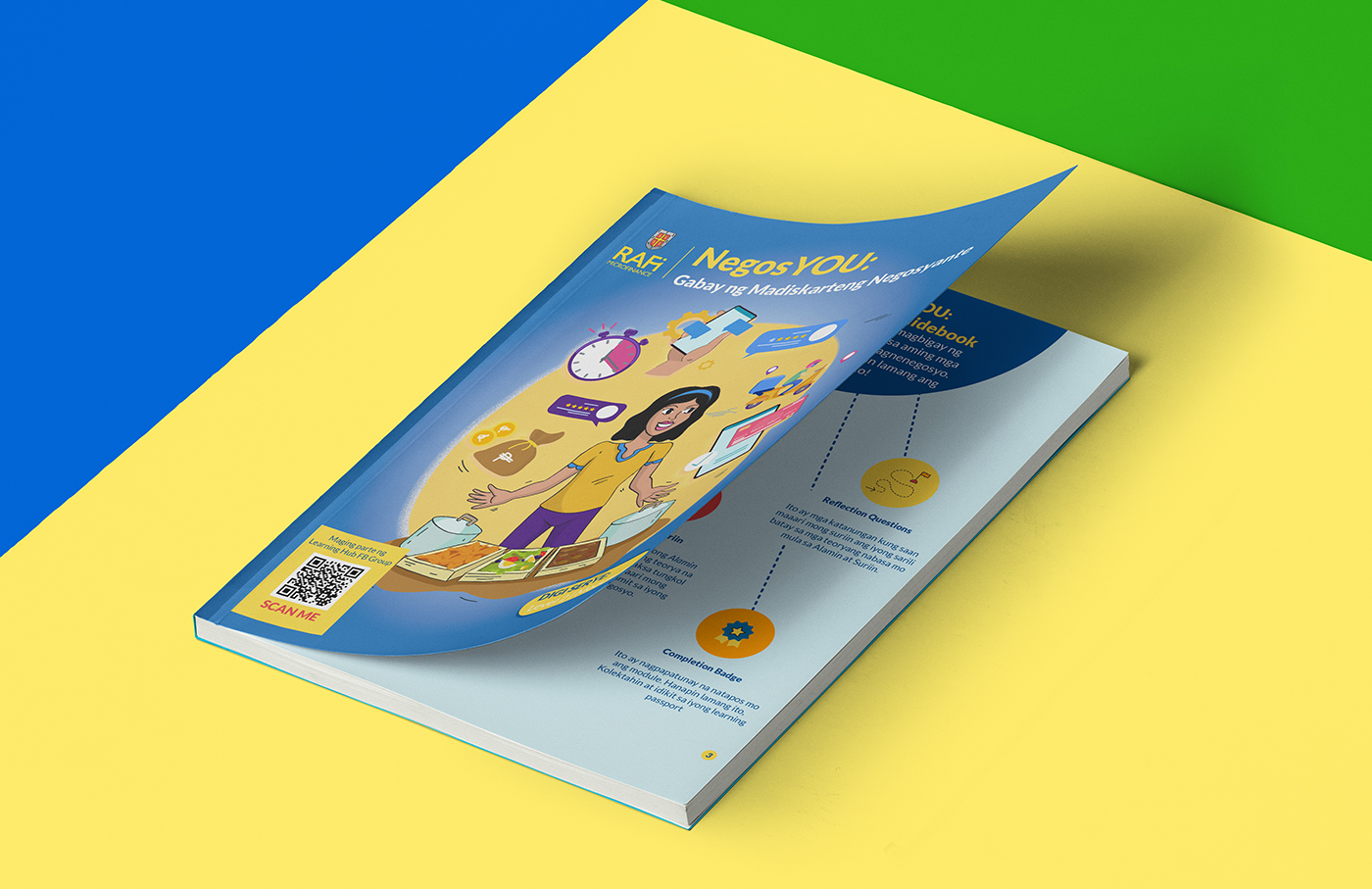
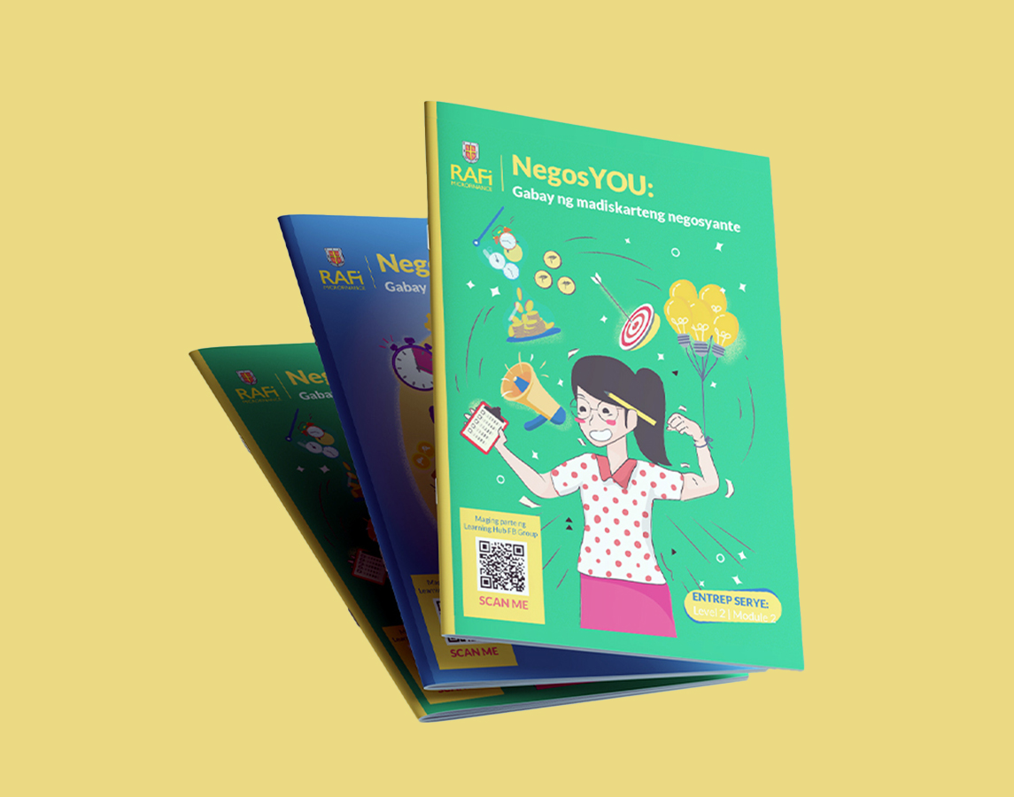
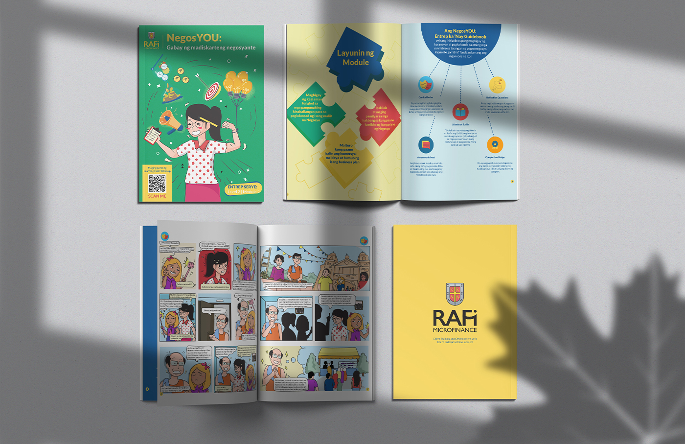
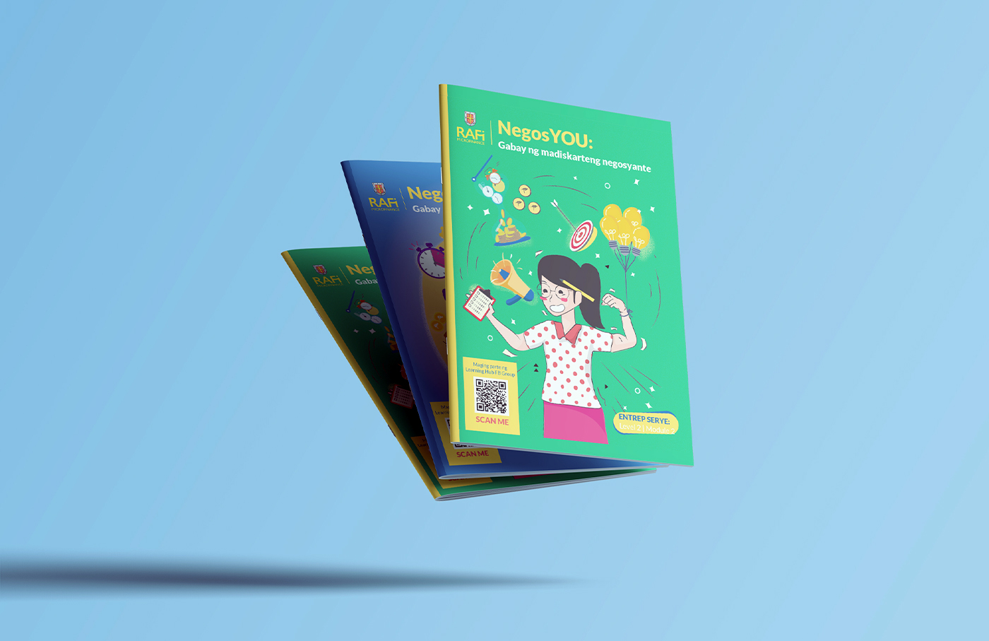
RAFI Microfinance, Inc. (RAFI MFI) is a program under the Economic Well-Being Cluster of the Ramon Aboitiz Foundation Inc. (RAFI) that seeks to empower micro-entrepreneurs all across the Philippines. We helped them craft visuals for the NegosYou training modules to deliver an informative yet enjoyable reading experience.
scope of work
Creative Direction
Illustration
Character Design
Key Visuals
design team
Frances Enriquez
Jane Sayson
Emem Seno
special thanks
Morgan Tornilla
Kenneth Hicks
RAFI MFI’s goal for the modules was to provide practical, actionable information, boost financial literacy, and nurture a business mindset in their clients: traditional mom and pop entrepreneurs (lovingly referred to as Nanays and Tatays) who built their businesses from scratch, most of whom with little to no formal business education.
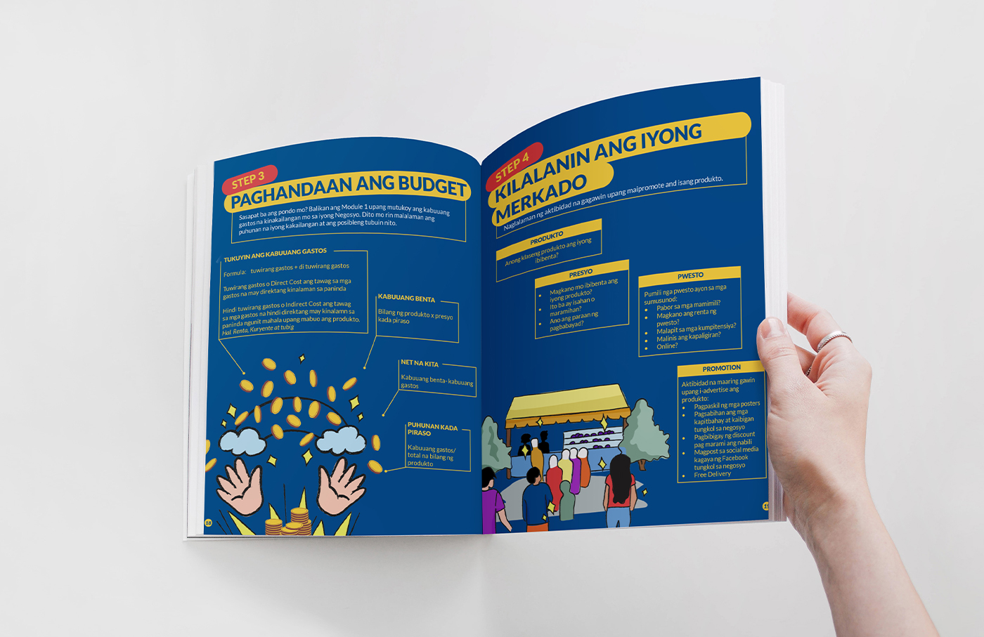
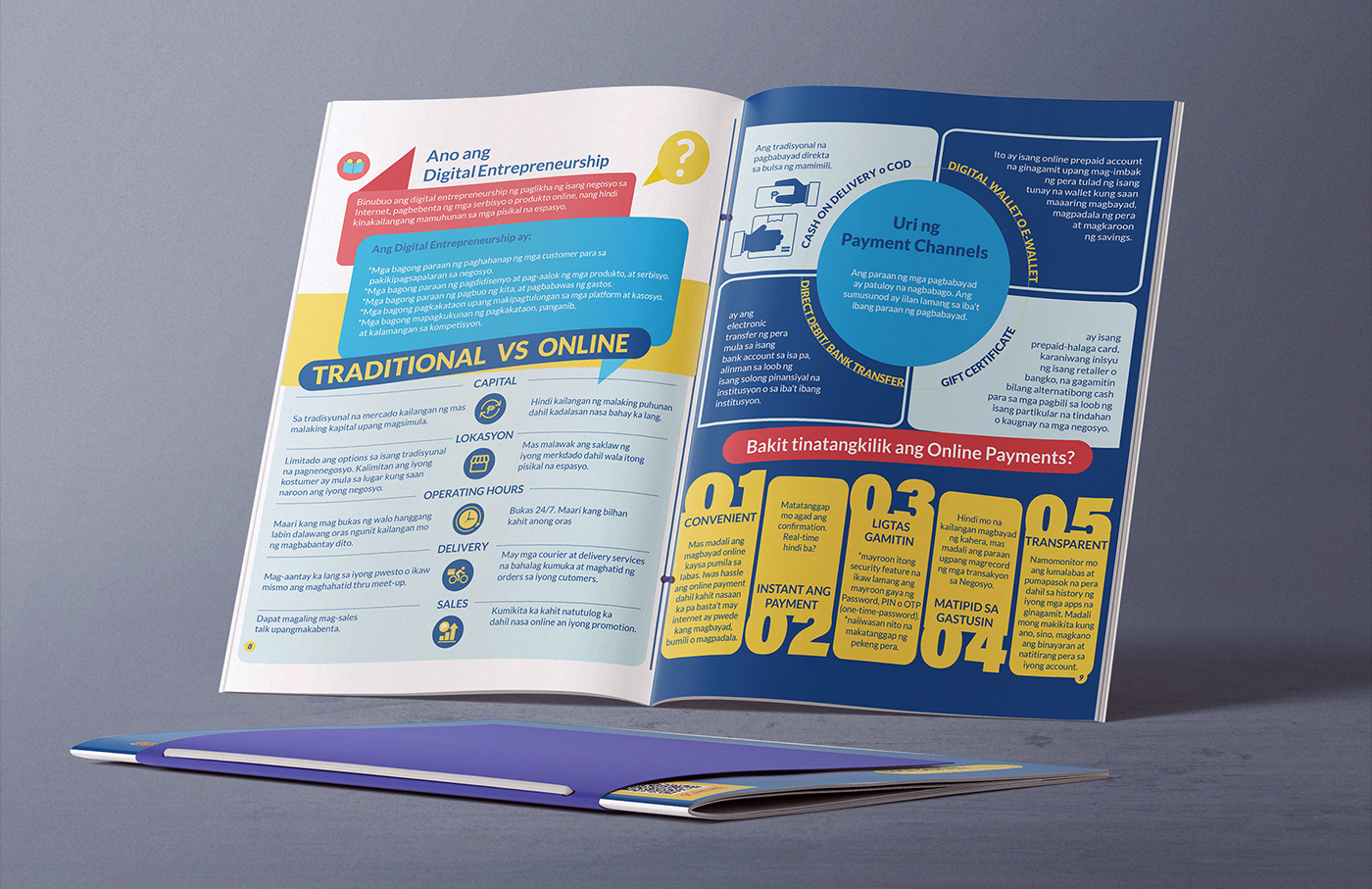
As part of our research and design process, we met with the RAFI MFI team to understand what challenges their clients faced with the modules. They revealed that the most common concern raised in Focus Group Discussions was feeling intimidated or overwhelmed by text-heavy material. To address this, we focused on creating distinctive visuals that would evoke curiosity and make the educational content of the modules as approachable and engaging as possible.
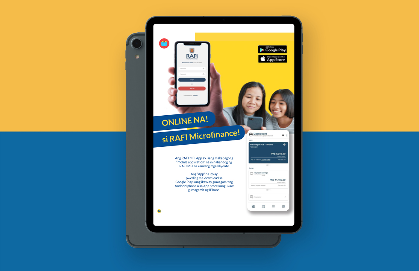
Clear and bright infographics were designed to enhance each module’s effectiveness as an educational tool. This involved using contrasting colors and various design elements to visually break down the information into more easily digestible chunks. Additional graphic elements such as minimal icons were created to visually reinforce the content and mark each section of the module based on their respective learning objectives.
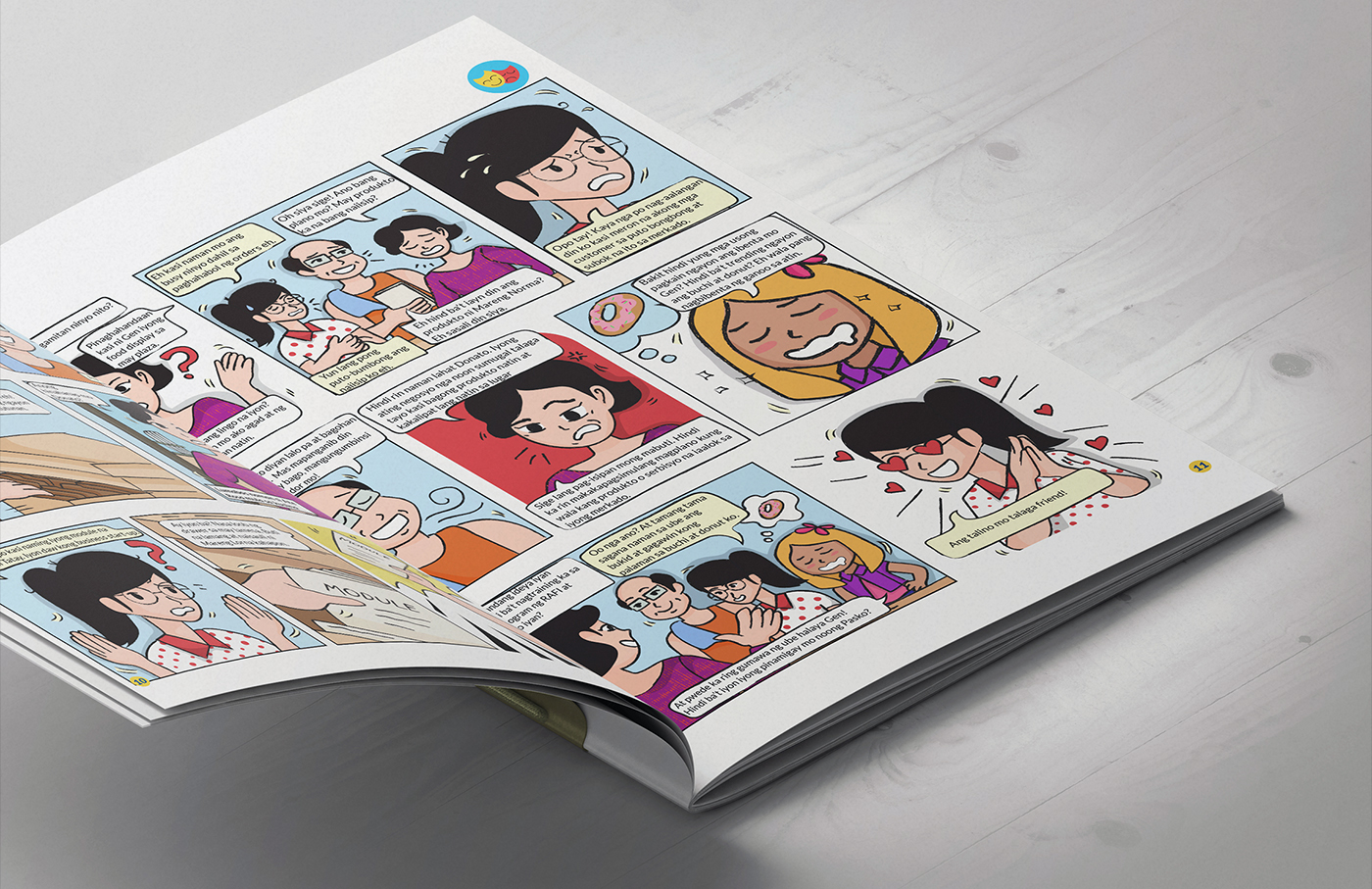
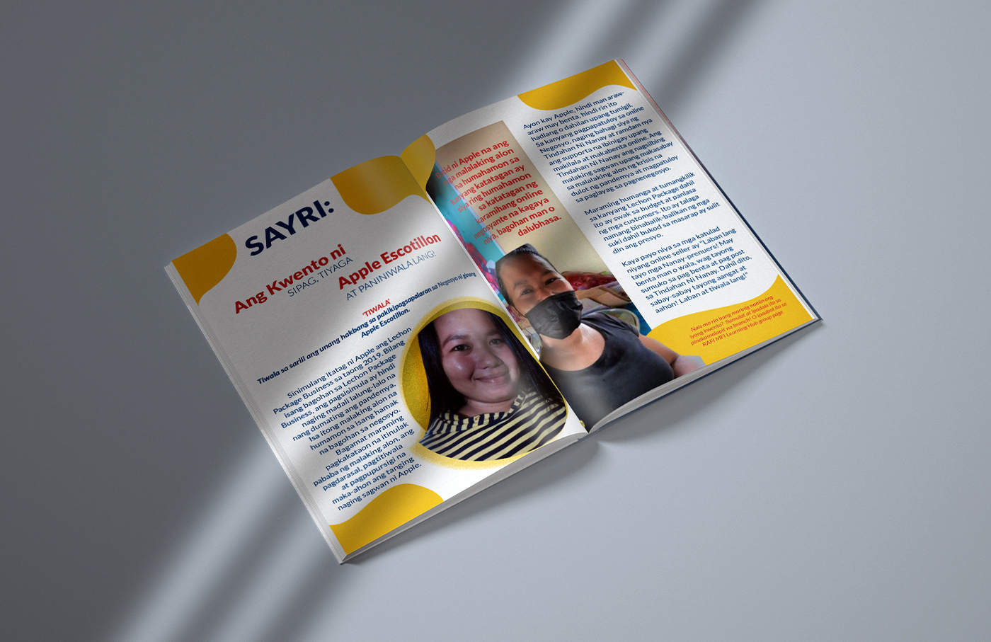
In one of these sections, a comic was used to contextualize the concepts within the module in an entertaining and relatable way. We took charge of paneling/storyboarding, character design, and illustration. Hand-drawn characters and illustrations paired with a bold color palette give the module a sense of familiarity, while capturing genuine enthusiasm.
Lastly, it was important to our client that the modules be able to serve as long-term reference material. So, careful consideration was given to the printed nature of the final output. We chose to use bright, highly saturated colors that would be able to withstand a considerable amount of wear and tear and encourage the Nanays and Tatays to come back to the information in the modules as many times as needed.
After designing 2 NegosYou modules we were invited back to continue work on their third series. RAFI MFI has always been committed to supporting their clients throughout the entire course of their business journey. This extended collaboration allows us to support them in turn, utilizing creativity to make each NegosYou module a truly transformational learning experience.
“We received good feedback from clients because their promotional content and the graphics were very reader-friendly, considering our clients are an average of 30–40 years old. Overall, their output was great.”
Dafnie Relampagos, Client Training & Development Specialist, RAFI Microfinance