5 Brand Building Lessons From a Proud Cebuano Design Studio
- Written by: Leu Manuel
- Graphics by: Aaron Bayer
- Posted on: Sept. 20,2025
- Get In Touch
Branding and product design firms are often seen working behind the scenes, quietly shaping the foundation of brands that stand tall. Like a backbone, they provide the structure and support that enables businesses to grow, connect, and thrive in their markets.
The Backbone, true to its name, represents this philosophy of creating meaningful work that authentically expresses a business’ foundation and core values. We exist to empower and inspire business leaders to take action in creating positive experiences that build genuine connections within the organization and towards the communities they serve or represent. With every project, we begin by establishing the fundamentals that support the entire business – “the backbone”, as we like to call it, becomes the structure upon which all future growth and success can be built.
Founded by Industrial Design graduates in Cebu, The Backbone set out to help businesses build authentic, sustainable, and human-centered brand experiences. Over the past years, we’ve had the privilege of working with brands both locally and globally, bringing their stories to life through thoughtful design, and along this journey, here are five brand lessons we’ve learned so far:
#1. Intention Drives Direction
Every brand has a story. Understanding its why’s and how’s are essential in getting a clear picture of what truly drives a client’s business. In return, it also becomes a powerful tool in establishing a unique brand position that drives a strategy forward – whether at a sales or marketing standpoint. We count on these narratives when curating a brand. Aside from it’s truly exciting to learn about them, it is fulfilling to discover brands that genuinely value their origins and authenticity, embedding these elements into their core values and purpose, rather than just a mere display on the logo or slogan.
Castle Keep, a family-owned enterprise with ventures in transportation, real estate, agriculture, and finance, needed a visual identity that symbolized continuity and optimism. By understanding their legacy and aspirations, we developed a cohesive closed-loop design with a clover-like silhouette representing their four main ventures. The interconnected loops also symbolized unity and perpetuity, reinforcing their commitment to growth across generations.
Similarly, Fresh Daily needed to communicate freshness and sensibility in the competitive food delivery space. We envisioned Fresh Daily as a “meal planning assistant” and so we developed a vibrant, people-centric brand identity aimed at helping customers to be in control of their lives at home. Through delightful imagery, honest typography, and a sophisticated color palette, the brand became a symbol of healthier, smarter choices when it comes to food.
By immersing ourselves in their stories and aligning our brand-building strategy to the core of these narratives, we created designs that fostered relatability. We believe relatability is the first step to building a connection – and we know we’ve achieved it when audiences see their aspirations reflected in the brands we helped build.

#2. Collaboration Fuels Innovation
Collaboration defines the essence of our design studio. We position ourselves not merely as service providers but as dedicated co-creators alongside our clients, sharing both the challenges and triumphs of building brands with lasting impact. Beyond simply maintaining a collaborative spirit, it’s our deep sense of accountability – our commitment to championing each brand’s success – that pushes us to think critically and venture beyond the conventional boundaries.
Hand in hand with founders, CEOs, and executive teams, this approach not only helps us produce better creative outputs; it forges lasting relationships built on shared vision and mutual investment for excellence.
Our approach to collaboration is apparent with our rebranding work for the Grow Cebu Music campaign – an immersive initiative spearheaded by 22 Tango Records, an independent Cebuano record label, in partnership with Create Cebu. With the vision of cultivating appreciation for homegrown music, this project engaged directly with schools, facilitated open dialogues, and amplified inspiring stories from local artists. It represented a unified effort to celebrate Cebu’s vibrant music landscape.
Sharing the same sense of appreciation for Cebu’s music scene, we collaborated with these creative organizations in crafting a brand identity that authentically captures the community’s dynamic spirit. The result was a design language that resonated with young audiences while elevating local music talent.
Collaboration and co-creation ensures brand identities remain anchored to our partner’s core mission while pushing our own creative boundaries.

#3. Designing for People Creates Better Products
Brands exist to be experienced, and people shape those experiences. While visuals matter, it’s the human interaction that creates lasting impact. From product packaging to digital interfaces, effective branding prioritizes the end-user, transforming everyday interactions into experiences that are easier, more enjoyable, and meaningful.
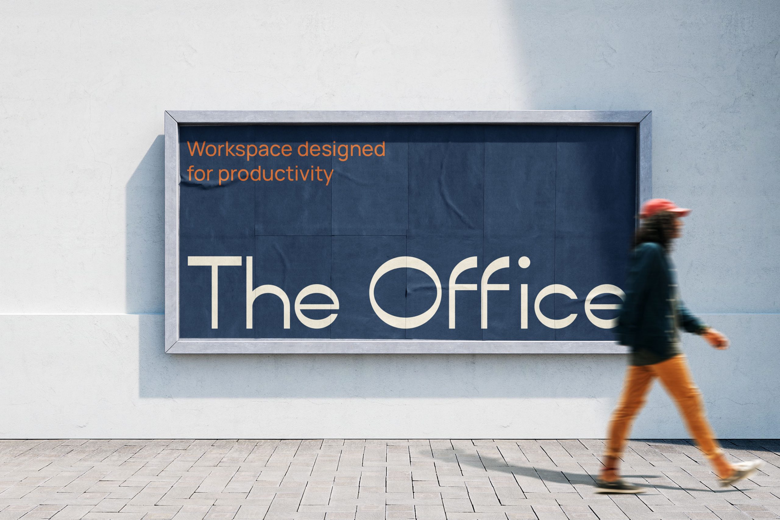
This branding philosophy is centered on our work for The Office. Before designing any visual elements, we immersed ourselves in understanding the entrepreneurs and freelancers who would interact with this brand on a daily basis. This insight guided every aspect of our deliverables – from logo design to brand manual to key visuals. Although we didn’t design the physical space, we prioritized creating a visual identity system that would complement and enhance the user experience within it.
The logo design features “The Office” in a custom font with “o” in “Office” playfully tilted on its side. This intentional disruption to an otherwise straightforward wordmark symbolizes the balance The Office strikes – professional, yet unconventional; structured, yet creative. The subtle visual cue reflects the brand’s commitment to fostering connection and collaboration among like-minded individuals in a space that’s both functional and inspiring.
User-centric design must extend to every brand touchpoint, including purely visual ones. Because a thoughtfully designed visual identity doesn't just represent the brand, it creates meaningful connections with the people who interact with it.

#4. Alignment Creates Clarity, Clarity Creates Momentum
Establishing solid brand foundations is essential, but integrating built-in adaptability ensures brands have room to stay relevant in an ever-changing market.
Consider our work for Hemera Spa. The brand concept stemmed from a royal metaphor – treating clients like kings and queens deserving of a luxurious break from daily responsibilities. We anchored the identity in Greek mythology, naming it after Hemera, the goddess of daylight and sun, symbolizing the energy and vitality central to the spa experience. The sophisticated visual system maintains consistency across Hemera’s treatment menus, digital experience and other brand applications, while also communicating about rejuvenation.
By establishing a solid structure for Hemera, we enabled the flexibility for future design applications, while ensuring it remained true to its core. This approach demonstrates that consistency and adaptability are complementary strengths in effective brand design – allowing the identity to evolve alongside the business for years to come.

#5. Purpose and Profit in Sync
Whether supporting local businesses or global brands, aligning design choices with a brand’s purpose is crucial for moving people, businesses, and culture forward. Purpose and profit aren’t rivals; they thrive together when brands lead with authenticity, creating loyal communities and resilient revenue streams that endure market shifts.
When we had the opportunity to work with Your Story Immigration Consulting, we faced the challenge of balancing professionalism and hospitality. Serving primarily Filipino and Chinese applicants navigating Canadian immigration law, the brand needed to find a way to make an intimidating process look and feel accessible. By emphasizing that “Your Story” transforms bureaucracy into a life-changing journey, we knew we had to create a brand that felt trustworthy and supportive for its clients. Through purposeful typography, strategic color choices, and inclusive visual storytelling, we were able to position YSIC as a guide that makes the immigration path clearer and more achievable.
Similarly, Anthill, a Cebu-based social enterprise that empowers artisans through sustainable craft, required an amplified narrative of cultural preservation and resilience. Our design work celebrated the beauty of traditional weaving by thoughtfully blending contemporary aesthetics with indigenous patterns. The resulting visual identity honored the hands that create the fabrics while reinforcing the community’s story. Through authentic photography, warm earthy tones, and respectful design elements, Anthill’s purpose became immediately visible— showing how design can serve as a powerful bridge between tradition and modern markets.
Synergy is key: purpose and profit coexist when design amplifies a brand’s mission while driving commercial success. By embedding empathy and cultural resonance into our design strategies, we create brands that connect authentically with audiences. At The Backbone, we craft identities that inspire trust and loyalty, ensuring purpose strengthens profitability by fostering meaningful connections that sustain businesses.

