Round Table
Brand identity and naming for a people-focused leadership training in management, marketing, and human resources.

Round Table
Masterclass
SCOPE OF WORK
INTRODUCTION
In the dynamic world of business, continuous development of leadership and management skills is crucial for any organization to evolve with new techniques and practices. Round Table is designed to empower internal employees with comprehensive leadership training and workshops.
Recognizing this, CastleKeep’s leadership team, an investment platform, contacted us to create a new identity for Round Table. This identity, with its unique selling points of reflecting Round Table’s vision of professional development and aligning with CastleKeep’s commitment to investing in its people, is designed to attract a wider group of future leaders and connect with executives. It will also nurture a culture of learning and growth within the organization.
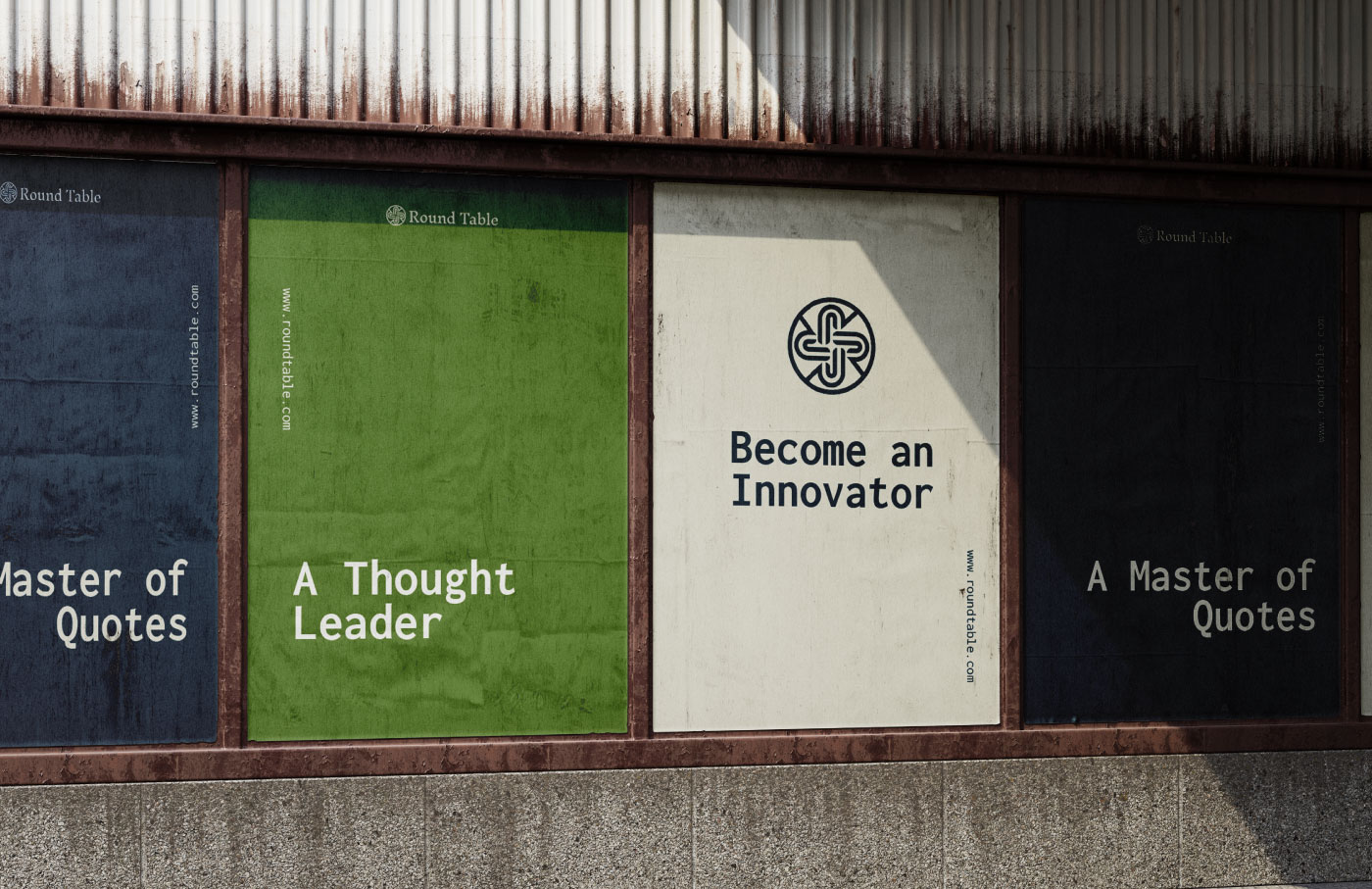
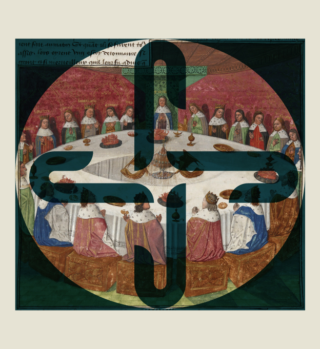
Inspired by the early medieval figures, King Arthur and Knights of the Round Table mythos, we developed a brand identity for Round Table, highlighting the platform’s empowering and people-focused approach. The project encompassed brand naming, brand strategy, brand identity, a complete visual system, and various applications. Creative direction needed to be professional, confident, and straightforward, avoiding any imagery that was cluttered and ambiguous.
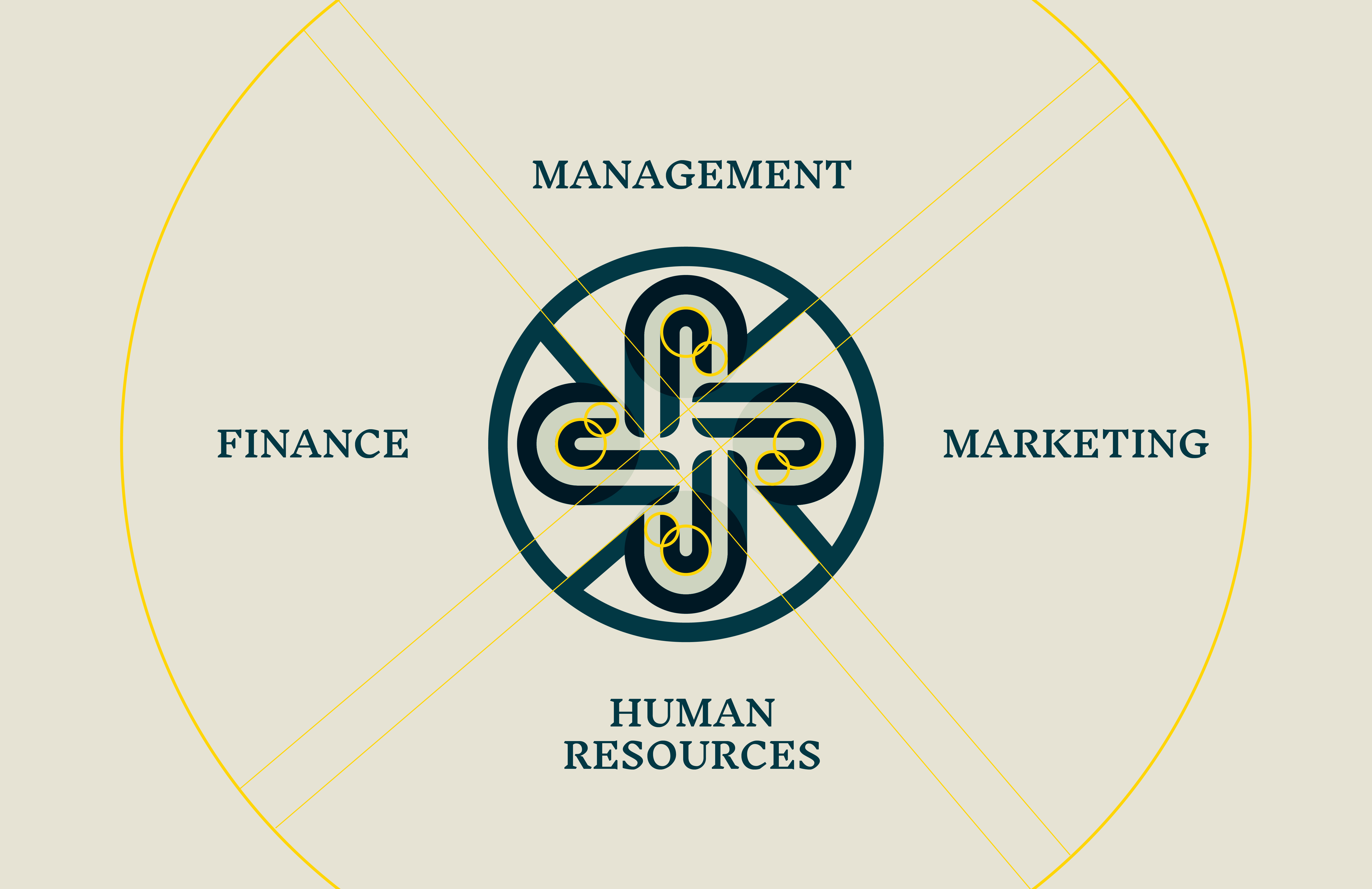
The identity system introduces a clean and sophisticated wordmark, symbol, color palette, and imagery style that help define the brand as a trusted organization and relatable at the same time. The symbol is a play of the “R,” which signifies the Round Table. Four R positioned inside a circle (round table) symbolize the four cardinal directions in finance, human resources, marketing, and management training. As a Masterclass, we design the emblem to show elegance, equality, and professional growth.
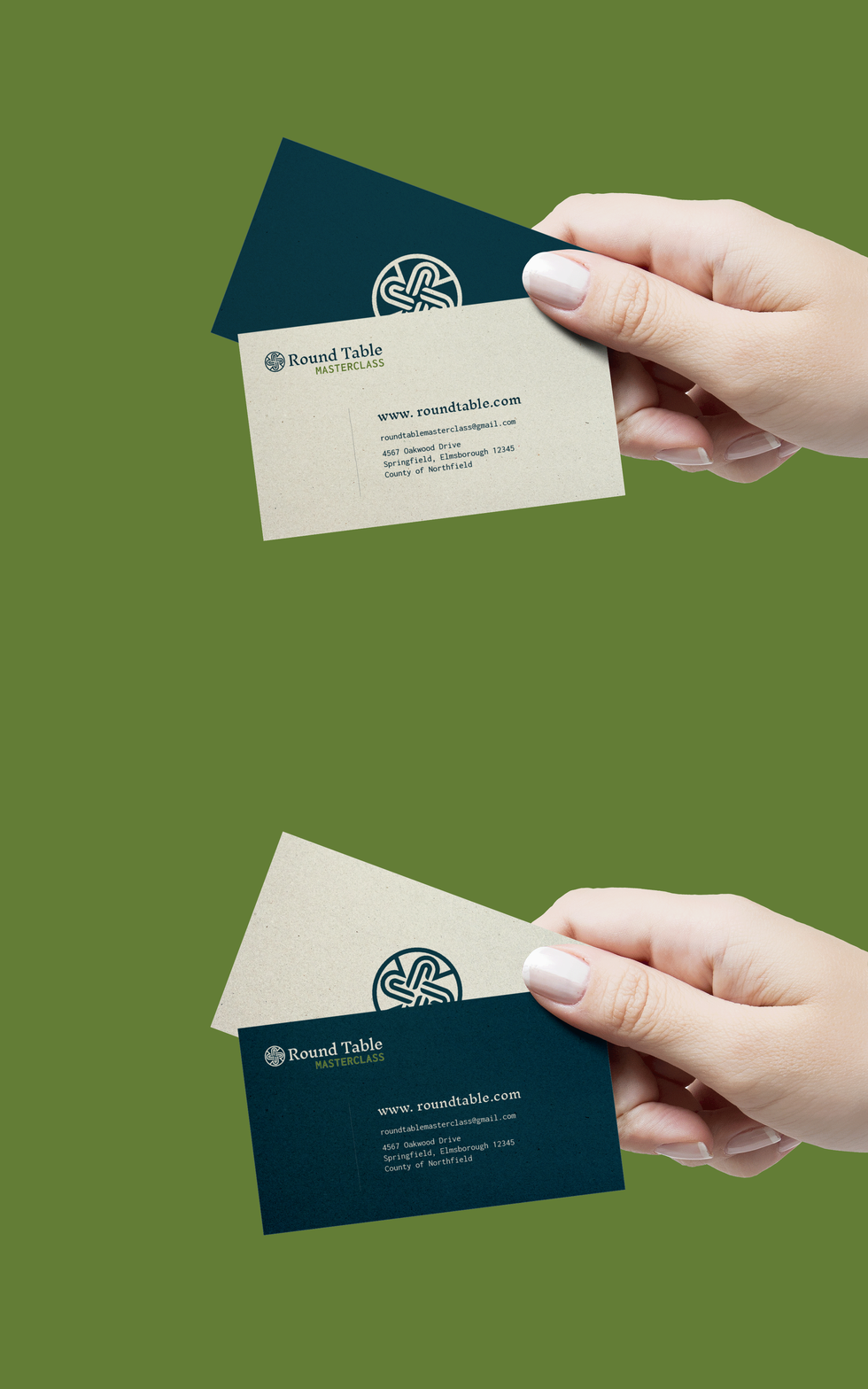
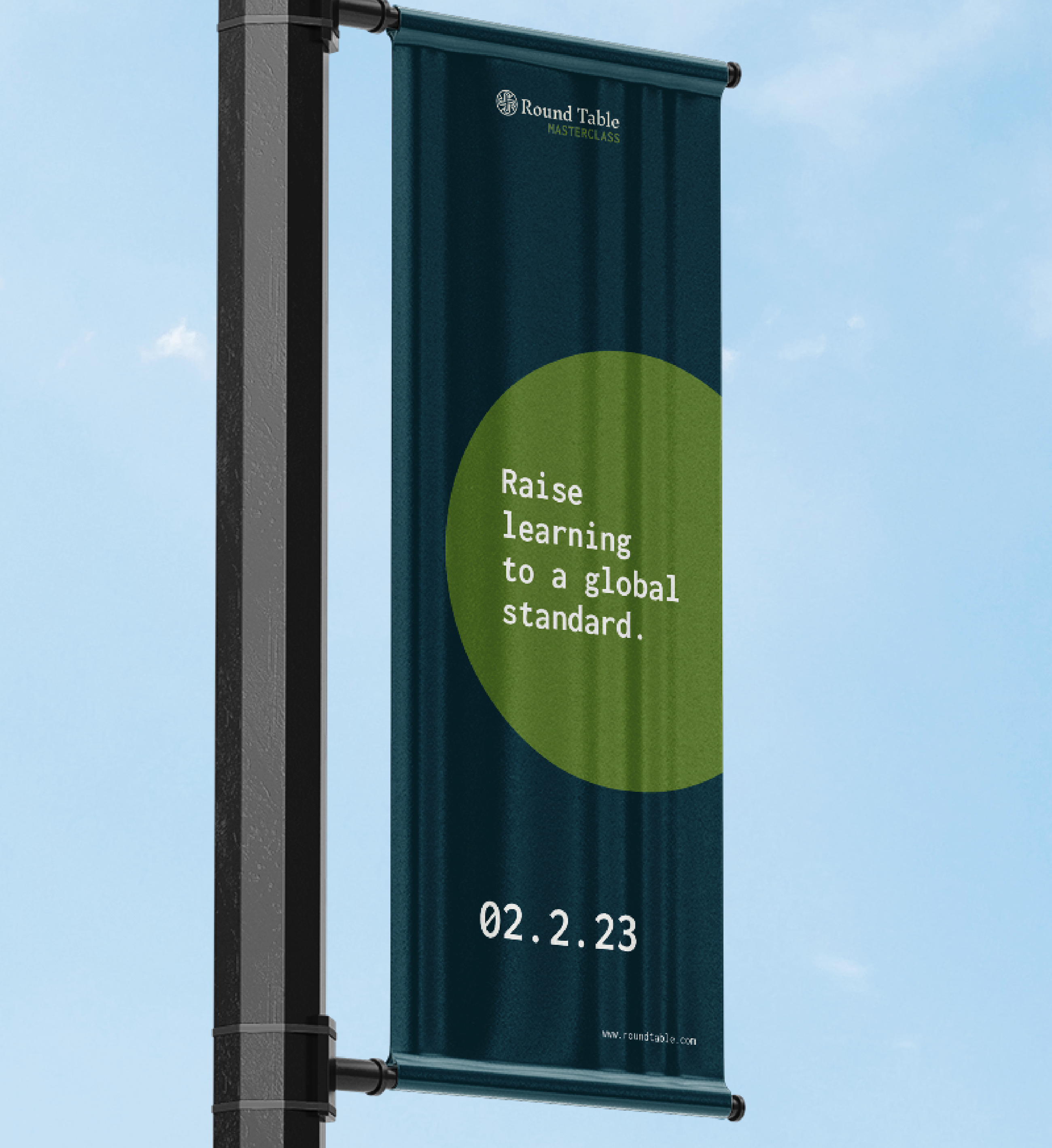
Along with the visual symbol, we choose brand attributes and messages that embody the mission and character of Round Table. We want to use expressions that are proactive, insightful, straightforward, and dignitary. As a brand that encourages growth and learning, we set brand messaging templates to execute their message on point.
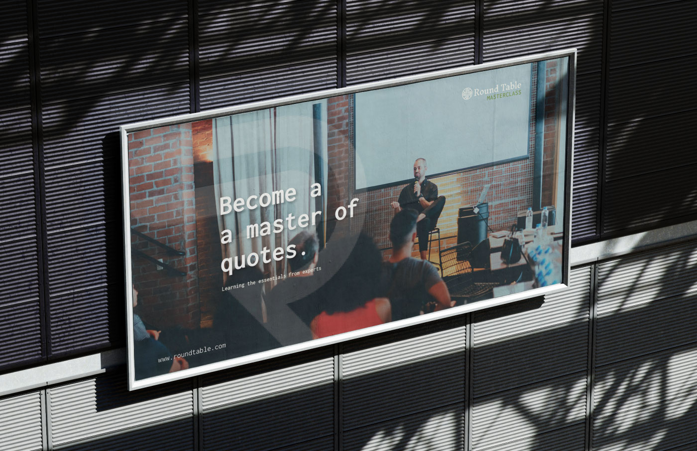
Another critical element in the visual identity is a straightforward and refined typography. We used a combination of a sans-serif and serif font that is a perfect balance between modernity and classical aesthetics. The typography visualizes a professional, and authoritative tone that works across all platforms, ensuring an engaging and immersive experience for the audience. Paired with bright photography and candid moments centered around people, it communicates the personal successes and motivations of the brand.
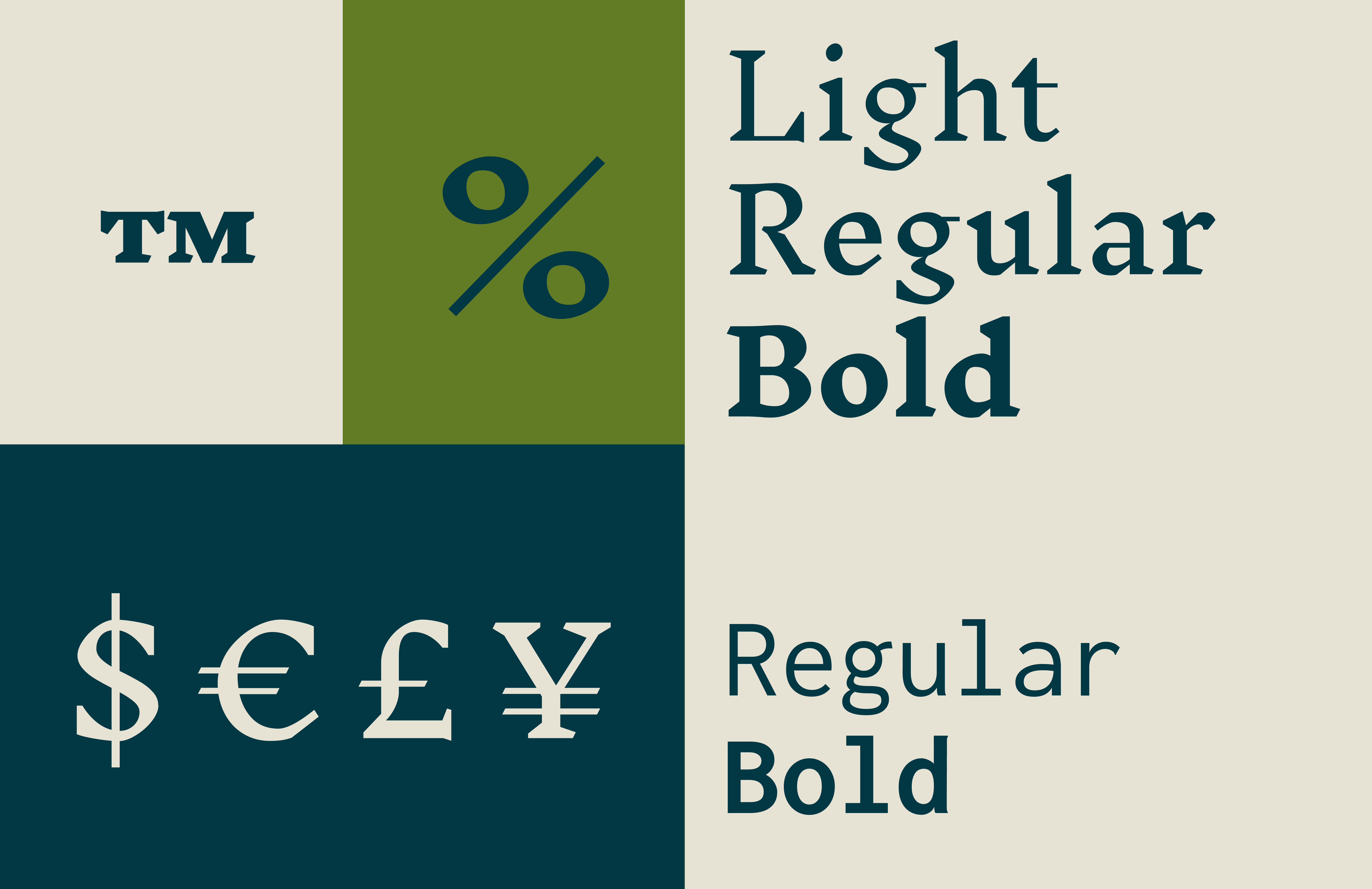
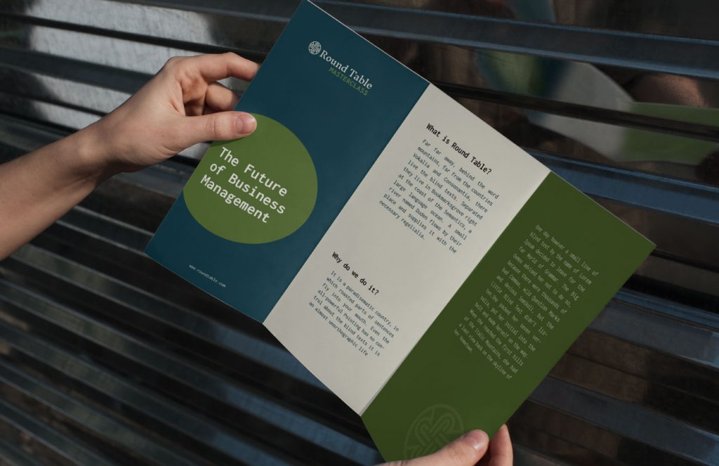
The geometric graphic and color palettes distinctively and compellingly reflect the brand principles. Midnight Green intuitively signals the brand’s unique approach to guiding producers and leaders in various fields of expertise. Along with the symbol and concise branding, the Round Table’s new identity is a powerful symbol of the transformative power that leadership training can create, inspiring and motivating all who encounter it.
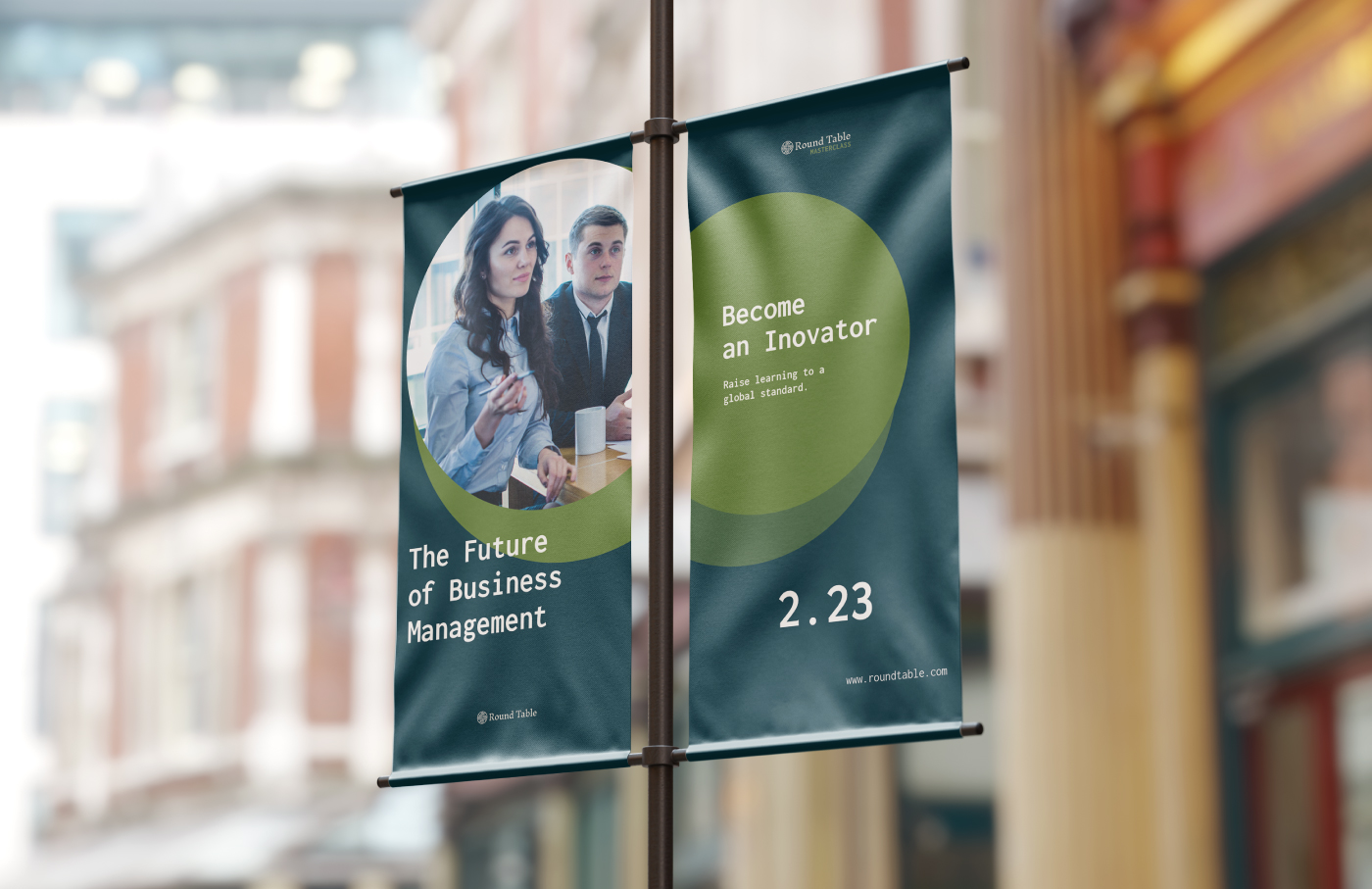
The first combined example of the Round Table branding is the introductory AVP. The use of branding visuals, implementation of message templates and attitude, and graphics and palettes made a medium that reflected the character of the organization. This is one of many future branding implementations that reveal the organization’s value to its audience.
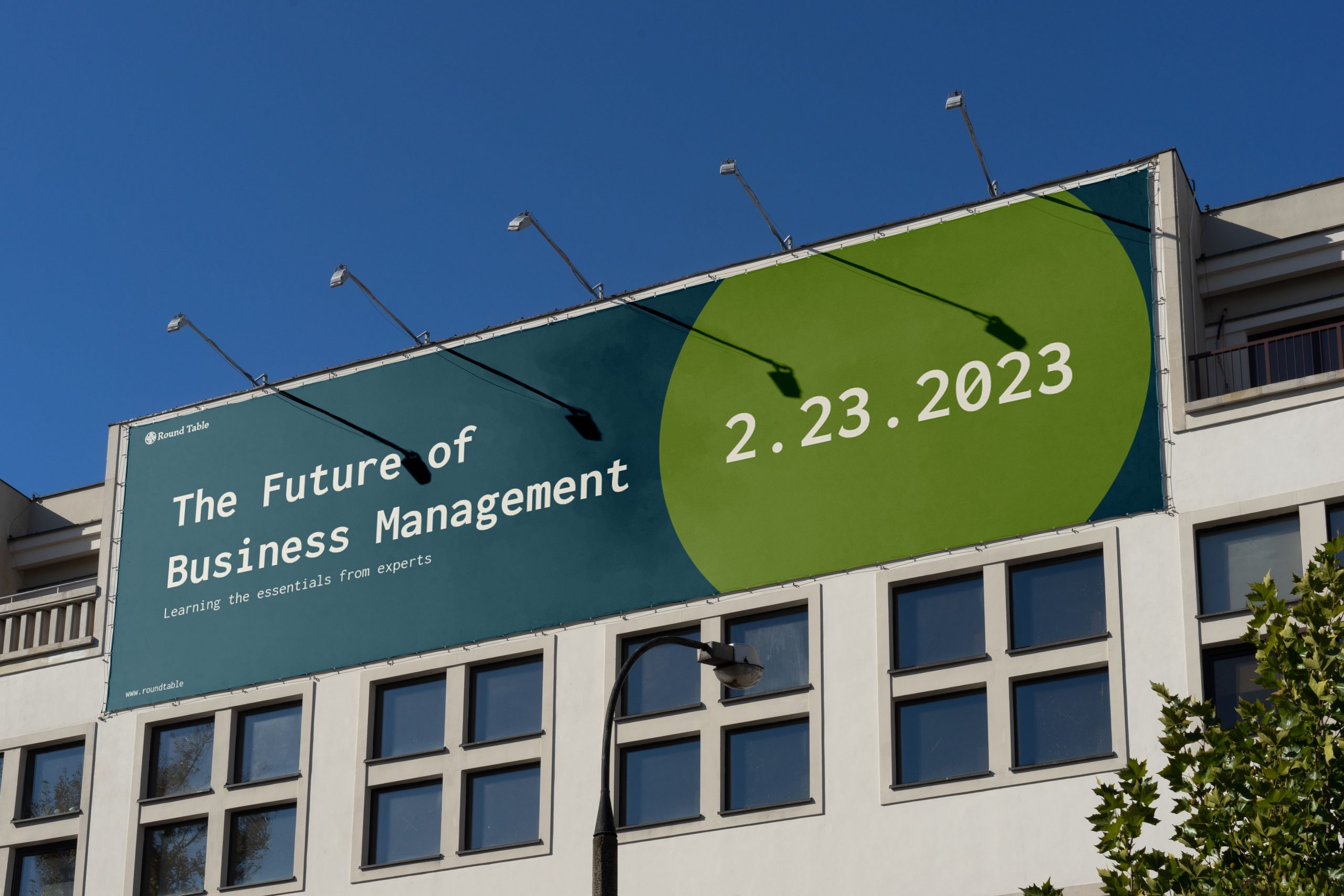
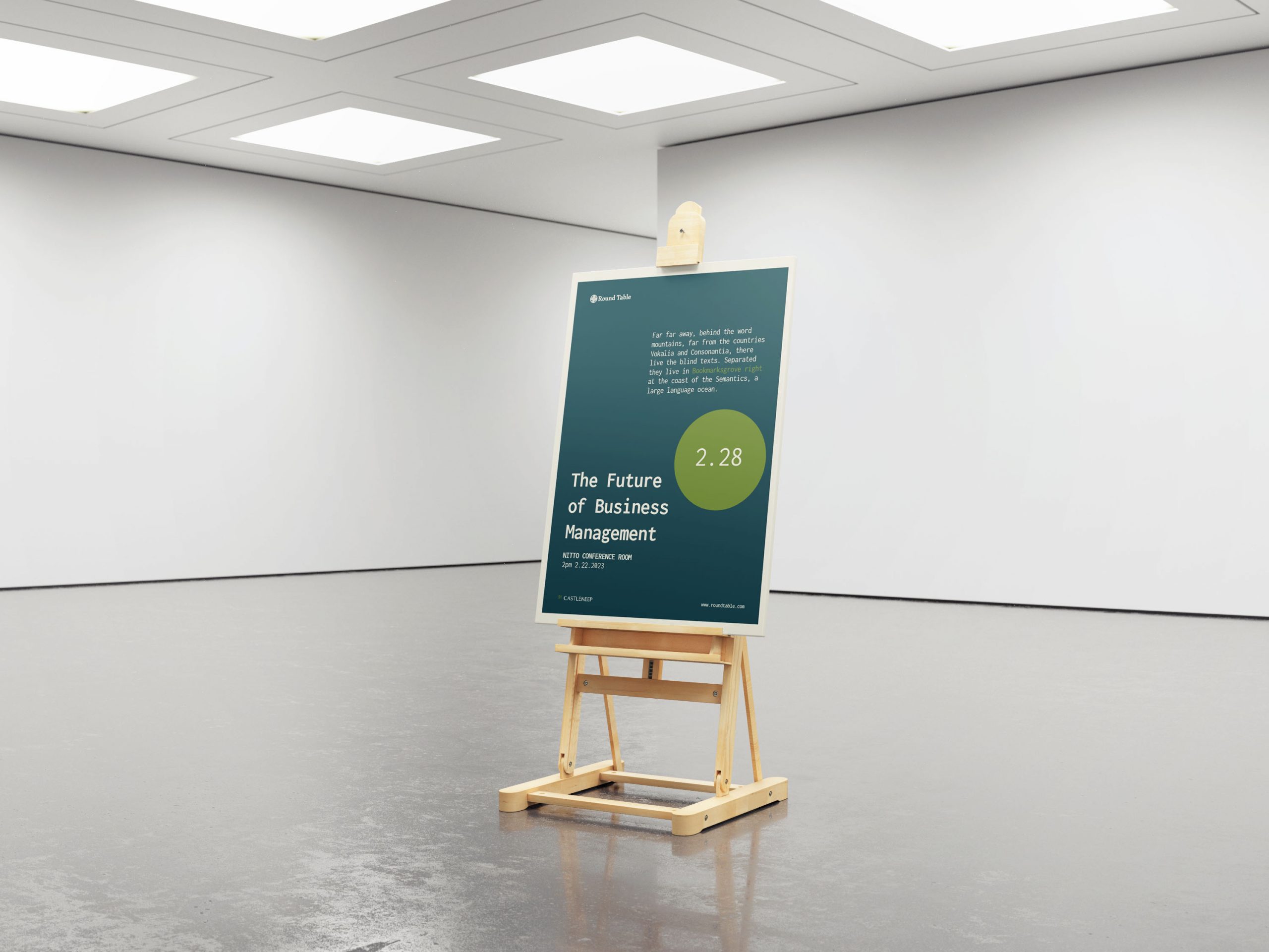
As with other entities, the goal of our branding with Round Table is to let the brand speak for the organization’s vision and goal and use multiple facets of communication and stimuli to create the character the organization wants to emanate.
Special Thanks
Mockup design by Natasha Alferez
Case study write-up by Dale Jo
AVP animation by Pepo Daradal

