Strategy, positioning and identity for a business investment platform that represents that diverse portfolio of purpose-driven businesses.
CastleKeep
Business Investment Empire
SCOPE OF WORK
Brand Strategy and Positioning
Brand Identity
Branding
Illustration
Key Visuals
Brand Manual
Creative Direction
INTRODUCTION
Our long-time client is part of a large family of entrepreneurs with dreams of sustainable growth, expansion, and legacy. What started as a single retail store has evolved into a business empire spanning several industries. CastleKeep is the holding company that represents that diverse portfolio of purpose-driven businesses.
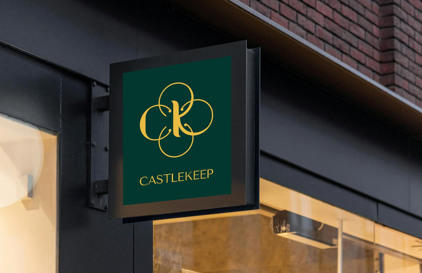
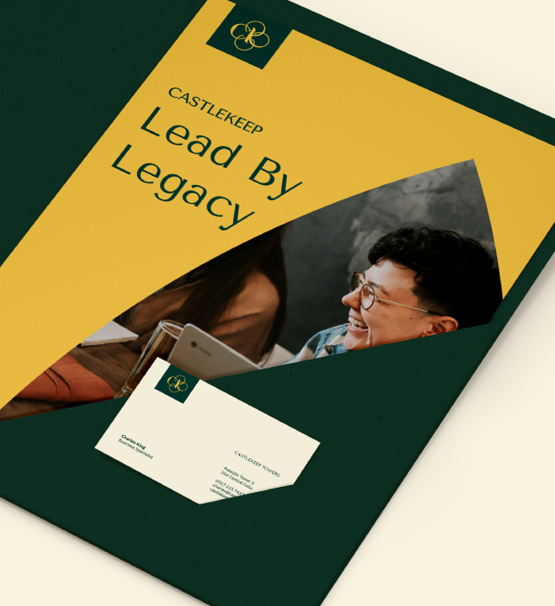
As the name suggests, CastleKeep is the central stronghold of a medieval castle: a fortified structure symbolizing strength, a center of command, and the last bastion of strategic visionaries and innovative thinking. The brand’s bold ambitions are firmly captured by its name but they needed a new identity system that would stand out in the investment platform industry.
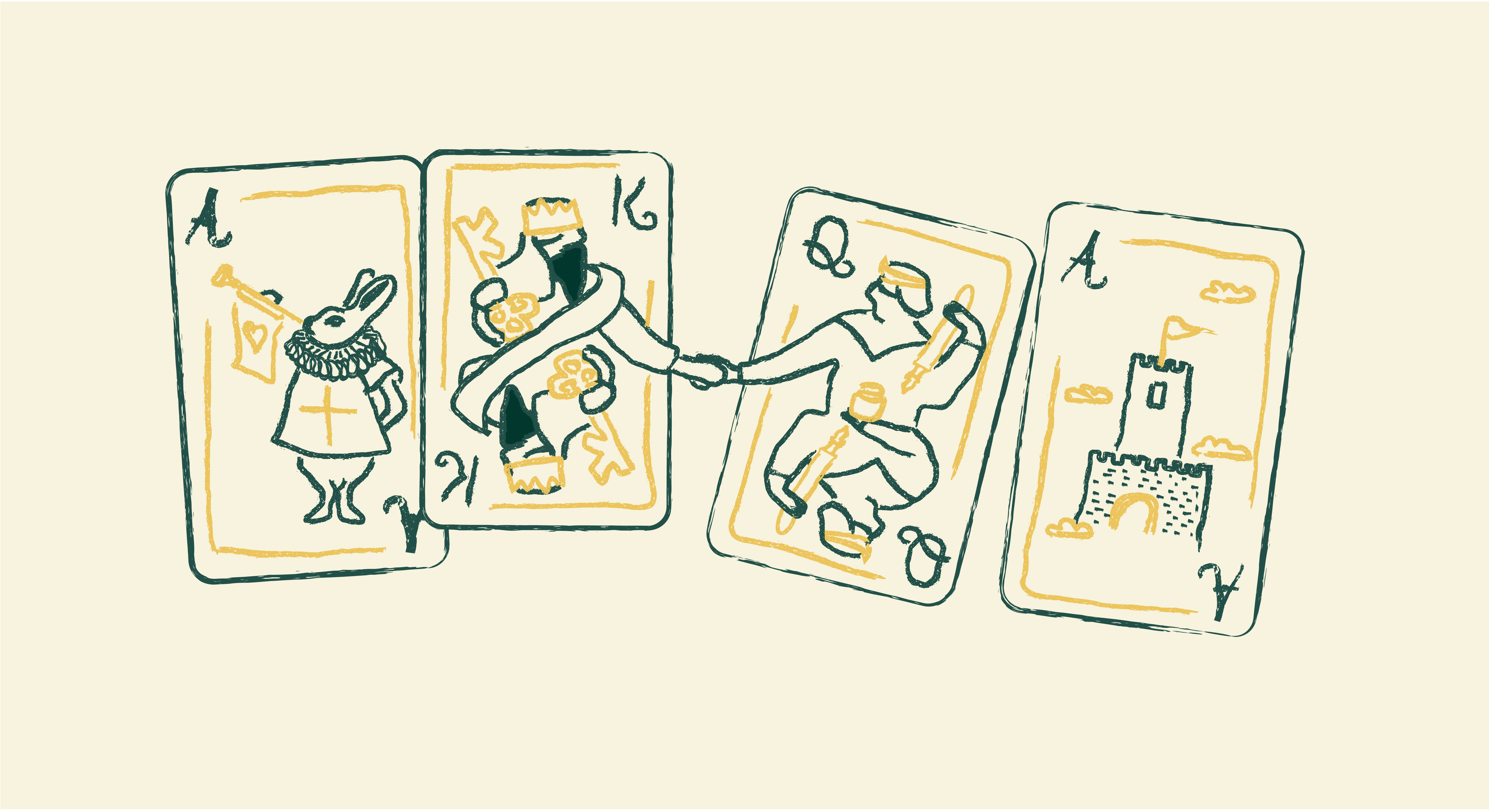
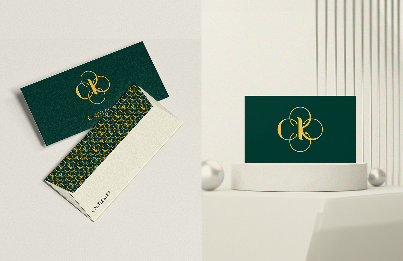
Insights gleaned over the course of several previous projects with them allowed us to create an elegant symbol centered around the family initials C&K.
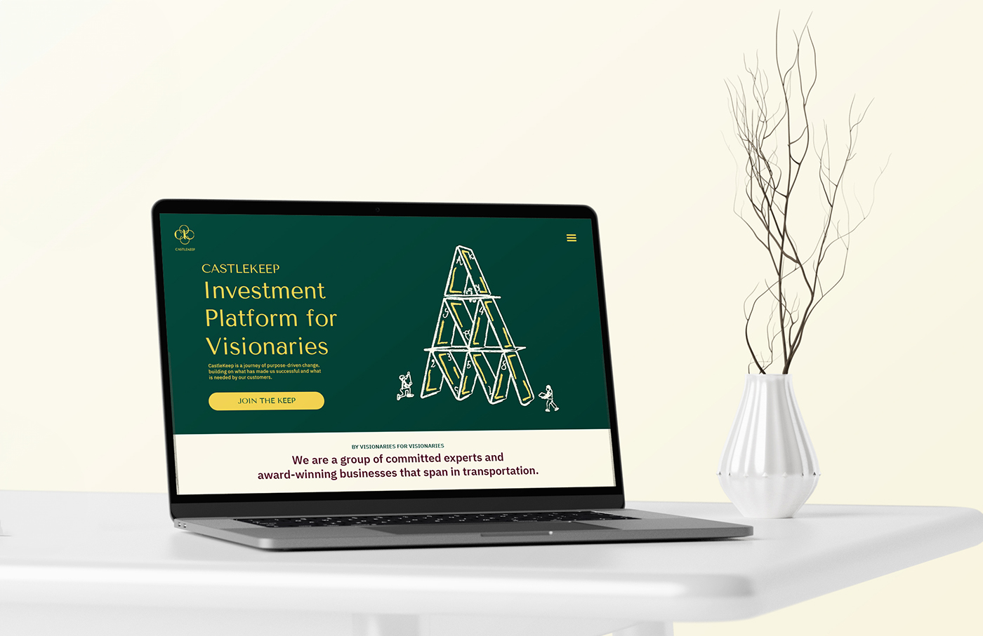
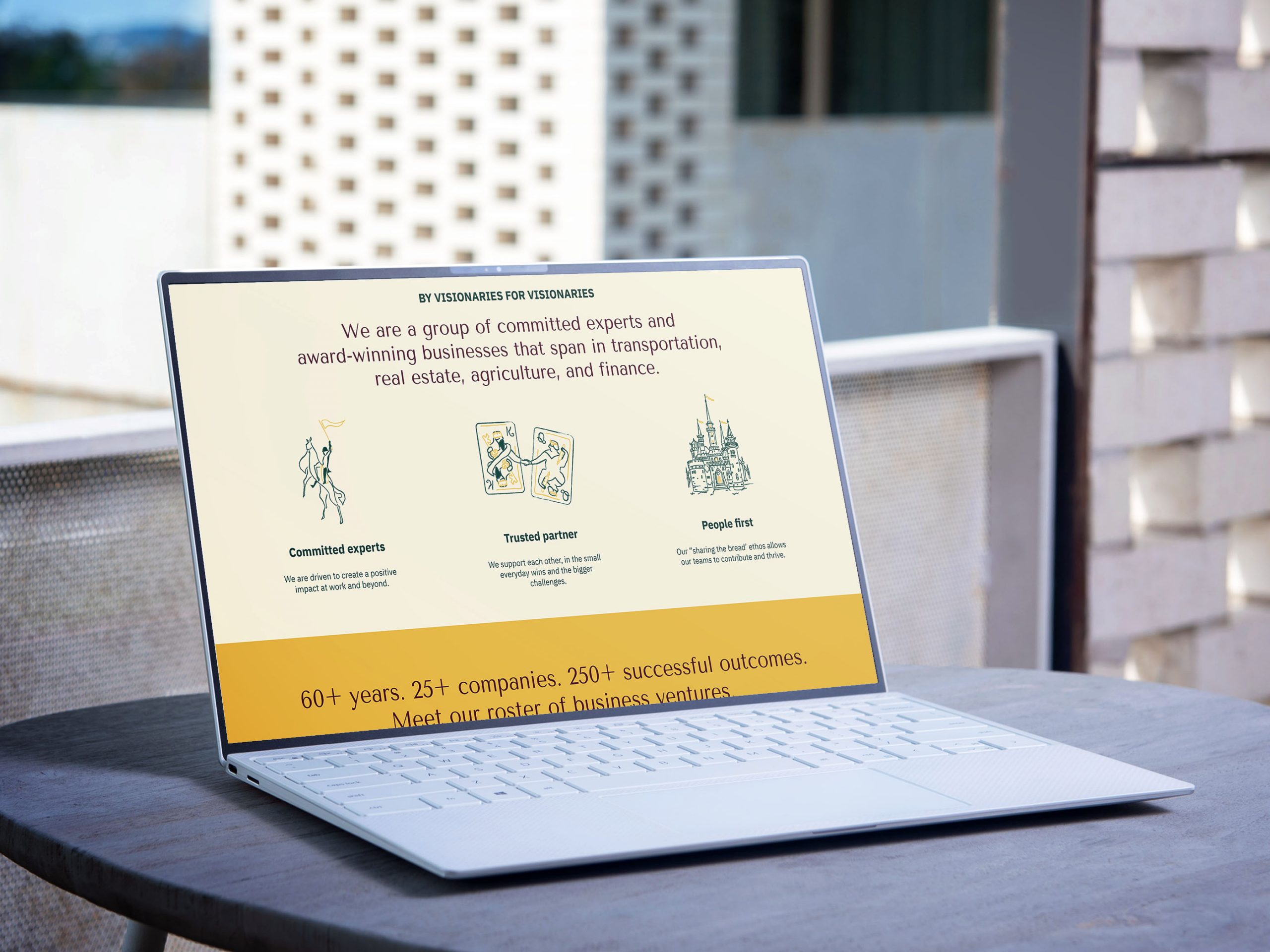
We aimed to convey a sense of optimism and continuance within a cohesive closed loop design. The symbol’s line work resulted in a clover-like silhouette, with each leaf representing one of the family’s 4 main business ventures in Transportation, Real Estate, Agriculture, and Finance. The closed loops also resemble an infinity sign, reinforcing the idea of continuity, and perpetuity assured by a unified commitment to growth.
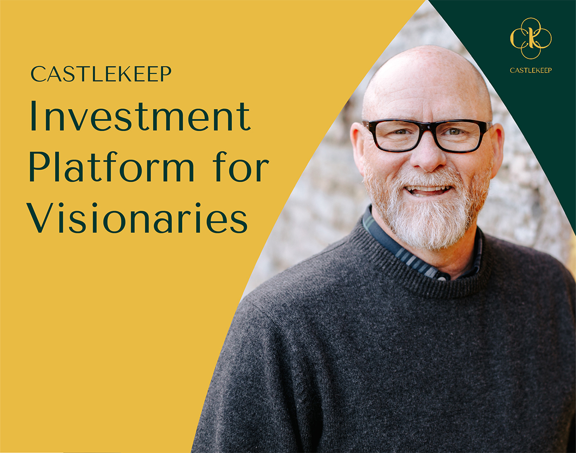
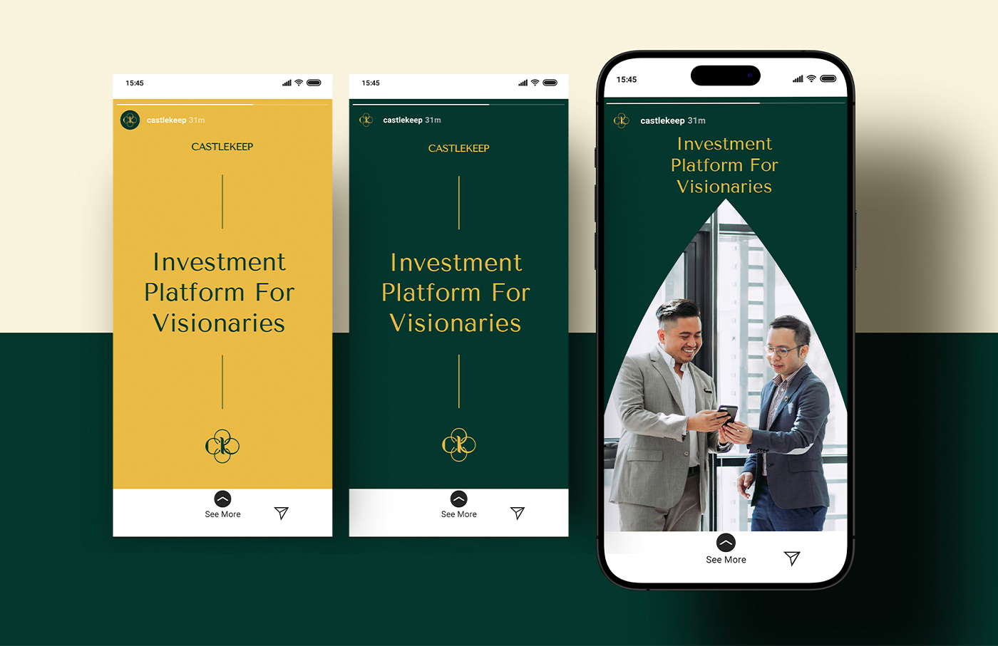
For the brand’s colors, a classy yet modern green was paired with gold. This was a nod to a visionary personality at the core of CastleKeep that also served to strengthen the refined look and feel of the brand identity. A layer of flexibility was added in through the expanded color palette featuring rich, earthy tones. This results in an overall identity system that is able to convey prestige, institutional strength, and groundedness consistently– in print or digital.
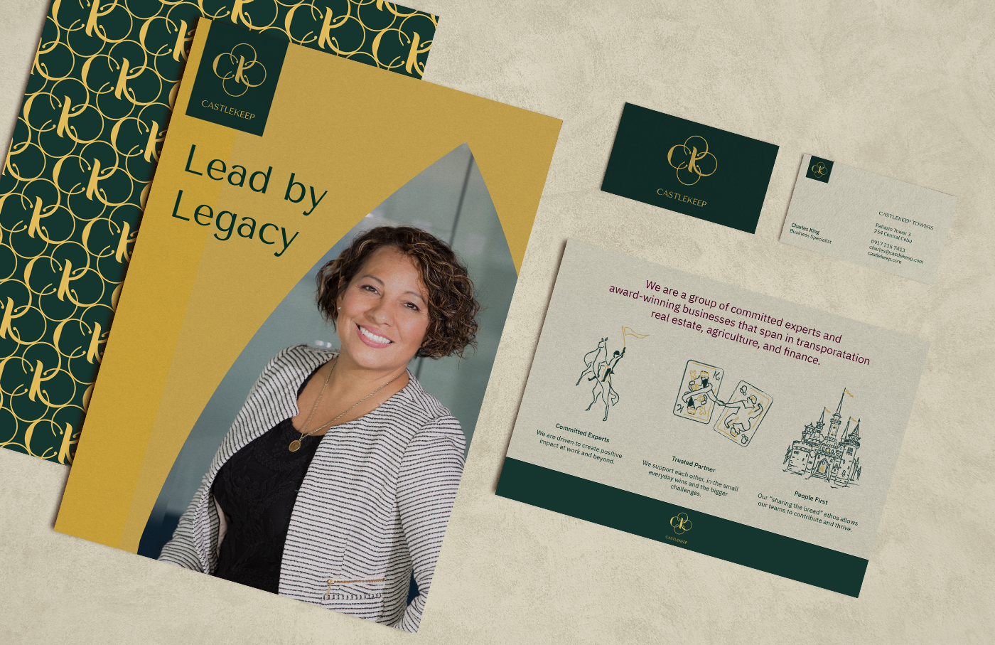
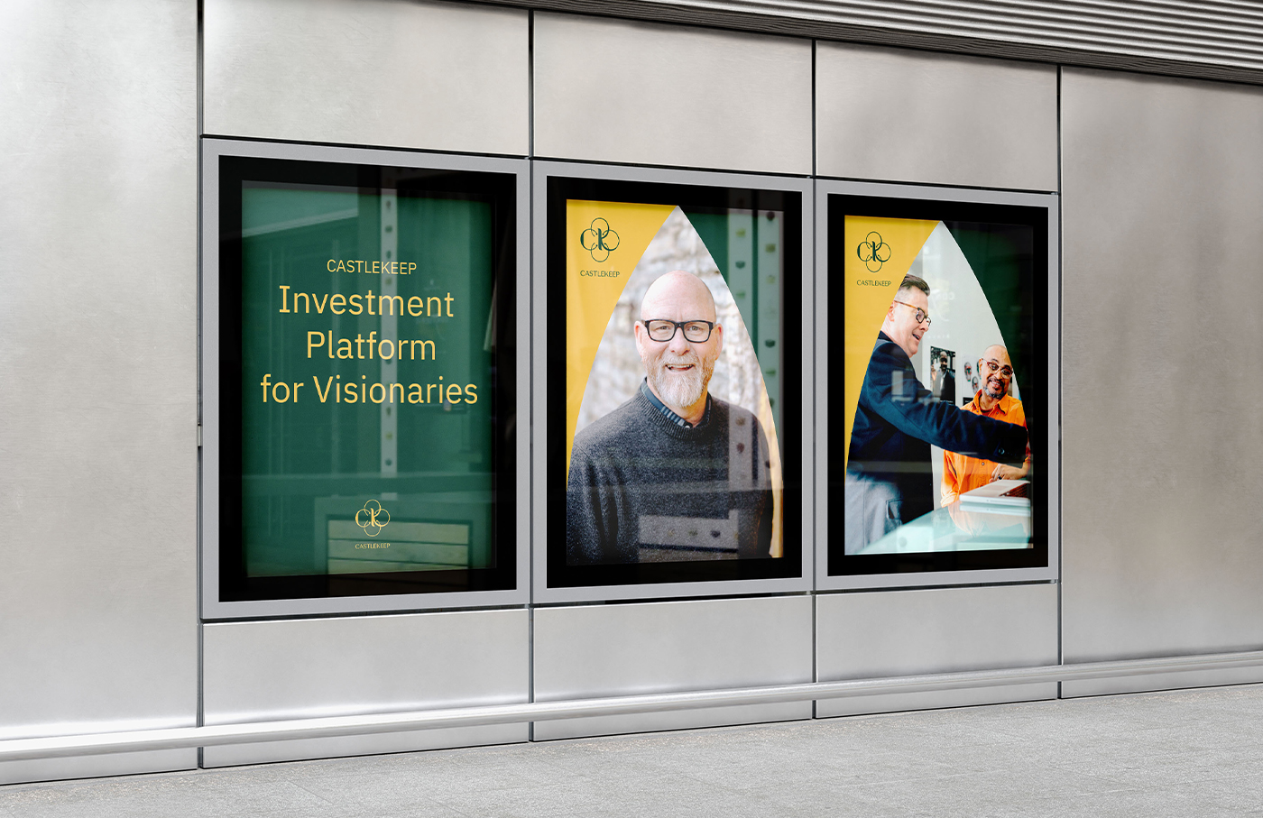
Additional graphic elements were created for the brand, all inspired by medieval times. Structured arc patterns and line elements communicate stability: something trusted and established, while hand-drawn illustrations add a touch of whimsy to evoke relatability.
The identity is fully expressed with a versatile humanist typography set, and a warm photography style that captures their core culture of being People-first Professionals.
Since its completion, the new identity has been successfully implemented through all major touchpoints of the brand, including their new office which now houses a capable team dedicated to creating lasting value for their stakeholders.
Special Thanks
Mockup design by Kenneth Hicks Case study write-up by Morgan Tornilla